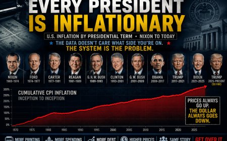
A Pattern Nexus breakdown of U.S. inflation by presidential term from Nixon to today, showing why the argument over which party “caused inflation” misses the deeper system. Every modern president has governed inside an …
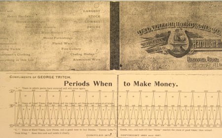
A deep Pattern Nexus breakdown of Samuel Benner’s 19th-century market cycle chart and why it still aligns with modern financial stress windows. This article explains the mechanics behind the “2026 crash chart,” why it a…
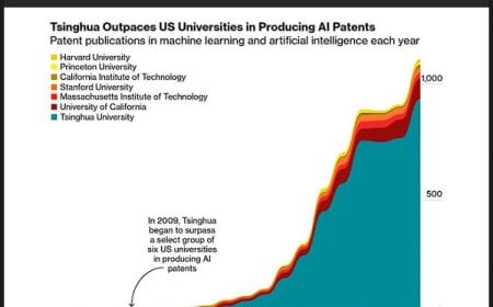
This article breaks down why Tsinghua University’s surge in AI patents doesn’t mean China is winning the AI race. Patent charts measure universities—not compute, chips, cloud infrastructure, power, or frontier model lea…
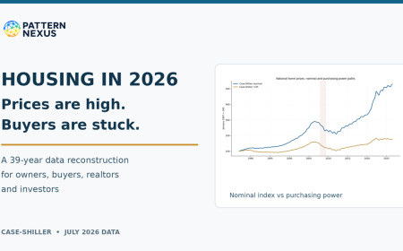
The July Case-Shiller index reached another nominal high, but inflation, financing costs and weak sales tell a different story for the marginal buyer. Pattern Nexus reconstructs national prices from 1987, tests pre-2008…
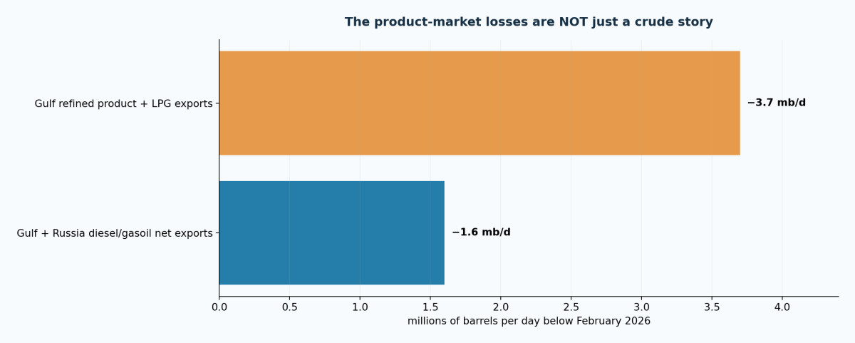
An extensive Pattern Nexus reconstruction linking the Iran/Hormuz disruption with Ukrainian refinery attacks, diesel shortages, Saudi pipeline damage, U.S. and Venezuelan supply, Cuba’s grid, the dollar system, Treasur…
Context
76% relevance · 39 cited sources · 4 assets
Updated
Sep 21, 2026
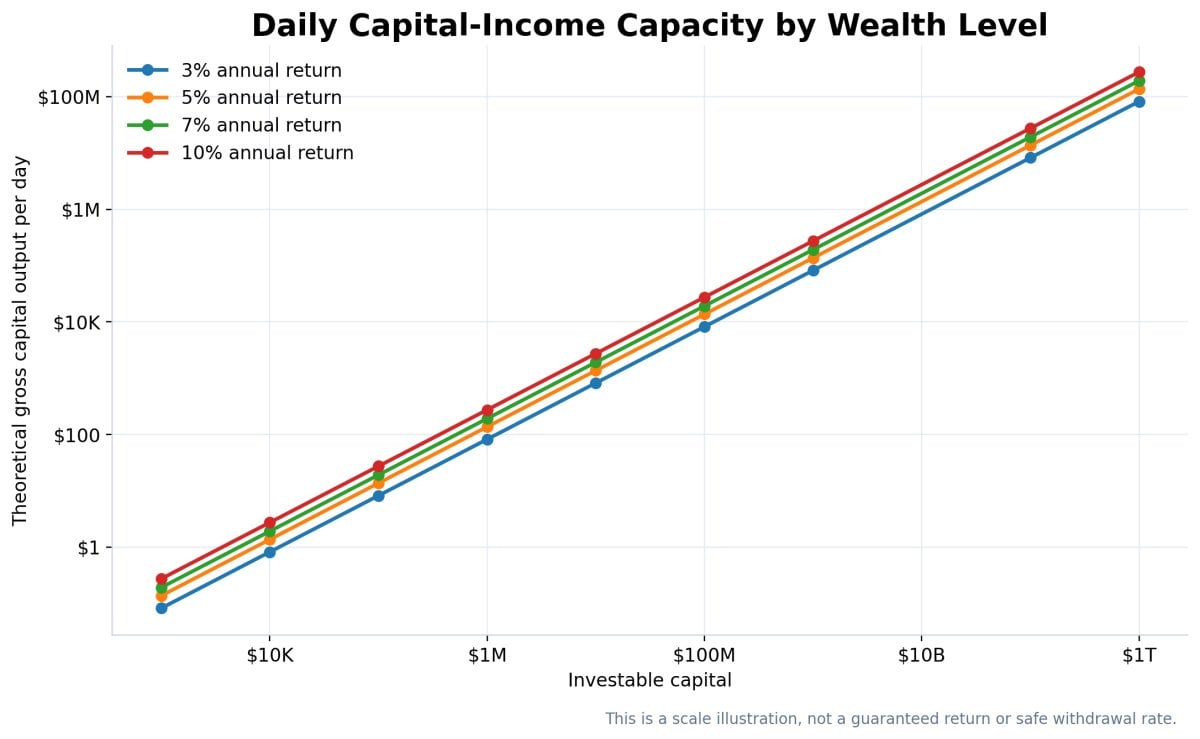
Open original research and sources →The chart shows theoretical gross output at 3%, 5%, 7%, and 10%. It is not a guaranteed return, a safe withdrawal rate, or a statement that all net worth is investable.Chart-led research
A deep Pattern Nexus regression and data analysis mapping where net worth levels from $100 to $1 trillion place an individual within the global and American wealth distributions. The research separates actual net worth …
Pattern Nexus Market Radar is being built as a scanner-first trading dashboard that helps users read market pressure before chasing a move. It does not promise magic signals. It organizes live market data, chart context…
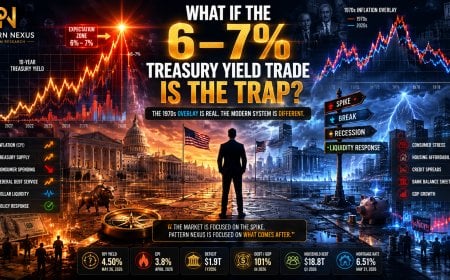
A lot of smart money is starting to position for a 1970s-style inflation repeat where the 10-year Treasury yield spikes toward 6% or 7%. The chart overlay looks convincing. Inflation today can be lined up against the 19…
Context
76% relevance · 9 cited sources · 6 assets
Updated
May 27, 2026
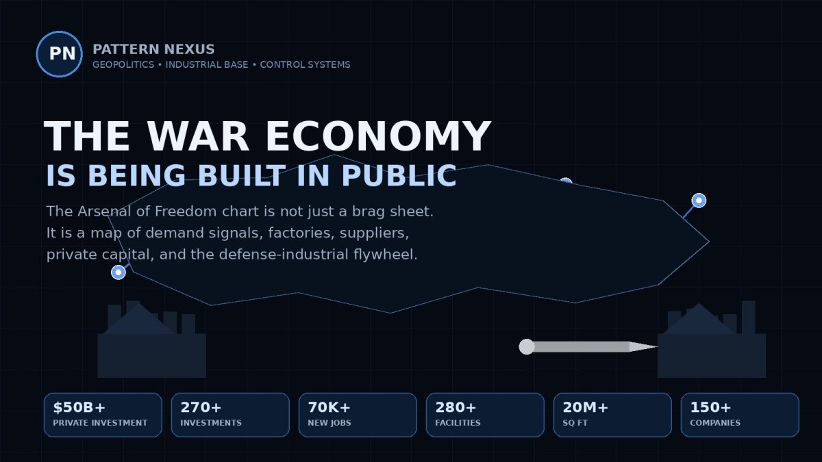
Open original research and sources →The official Arsenal of Freedom chart is the public-facing dashboard. The numbers matter, but the real story is the system underneath them: capital, factories, suppliers, jobs, cities, states, and procurement signals moving together.Chart-led research
The Arsenal of Freedom chart is not just a defense graphic. It shows the United States shifting from peacetime procurement into a public-private war economy built around factories, missiles, suppliers, and long-term dem…
Silver can be structurally bullish while becoming tactically dangerous. This Pattern Nexus analysis breaks down four historical and modern silver charts to explain why vertical moves change risk, even when the long-term…
In January 2012 I stared at a 350-year price chart and wondered what all the post-2008 “money printing” would do to inflation. More than a decade, a pandemic, and a historic rate shock later, this is the answer I wish I…
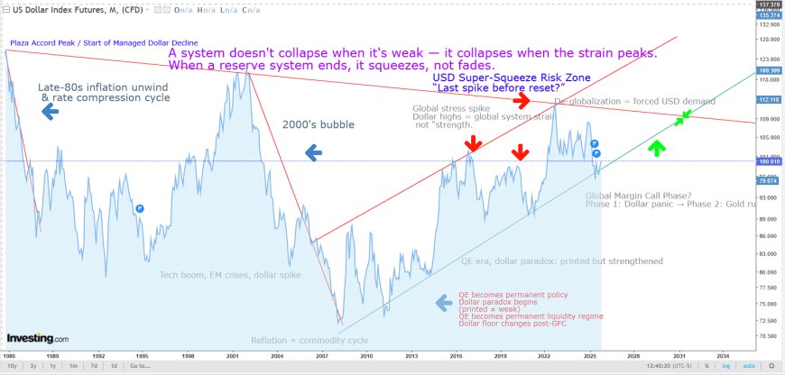
The dollar doesn’t collapse when it’s weak — it spikes under maximum strain. This is the final squeeze phase of the global monetary system before transition. When reserve systems end, they don’t fade — they compress, su…
If Pattern Nexus has been useful to you, help keep it growing.
Pattern Nexus is independently built and operated.
Most of the research remains publicly available,
but the data, servers, tools, research and time behind it all
have real costs.
Books, memberships and direct support help fund the next stage
without putting everything behind a paywall.