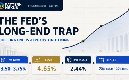
A full July 2026 data reconstruction of the Federal Reserve’s next policy path, showing how a 4.65% nominal 10-year, 2.44% real 10-year, Treasury supply, oil risk and uneven liquidity conditions create a hawkish-hold tr…
Context
62% relevance · 28 cited sources · 6 assets
Updated
Jul 29, 2026
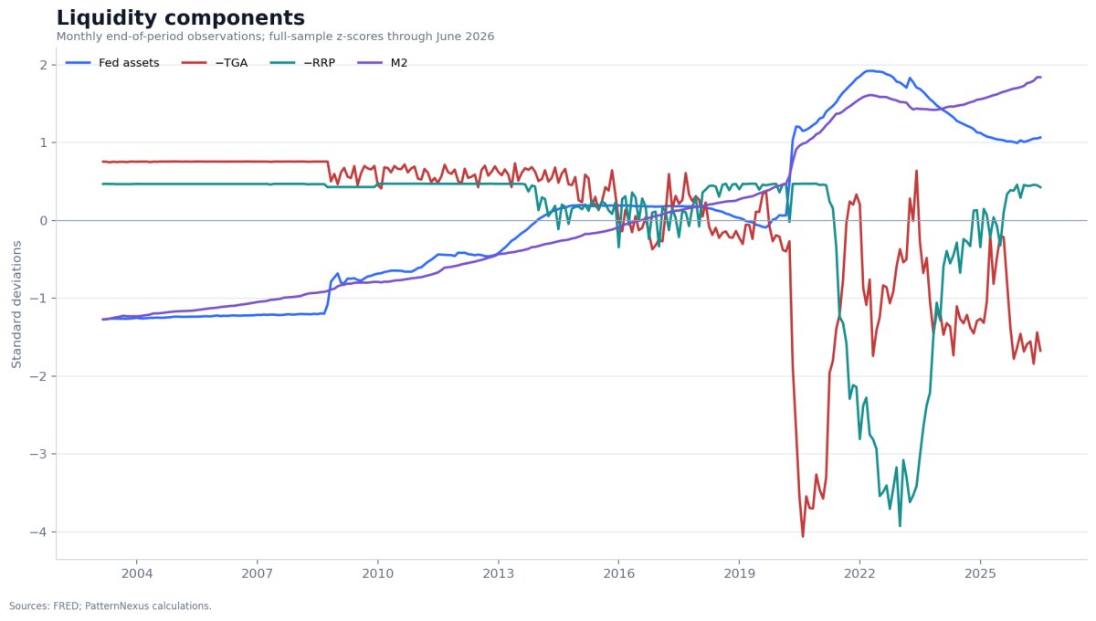
Open original research and sources →Figure 1 · The four standardized liquidity inputs. Federal Reserve assets and M2 carry strong structural trends. The inverted TGA and inverted RRP series are episodic, reflecting Treasury cash management and money-market operations. July 2026 is a partial live row.Chart-led research
A 2003–2026 reconstruction of Fed liquidity, gold, housing and NASDAQ data, plus an experimental stablecoin-augmented liquidity index.
Meta tags: liquidity conditions index, hard assets, gold, Federal Reserve balance s…
Context
62% relevance · 13 cited sources · 4 assets
Updated
Aug 25, 2026
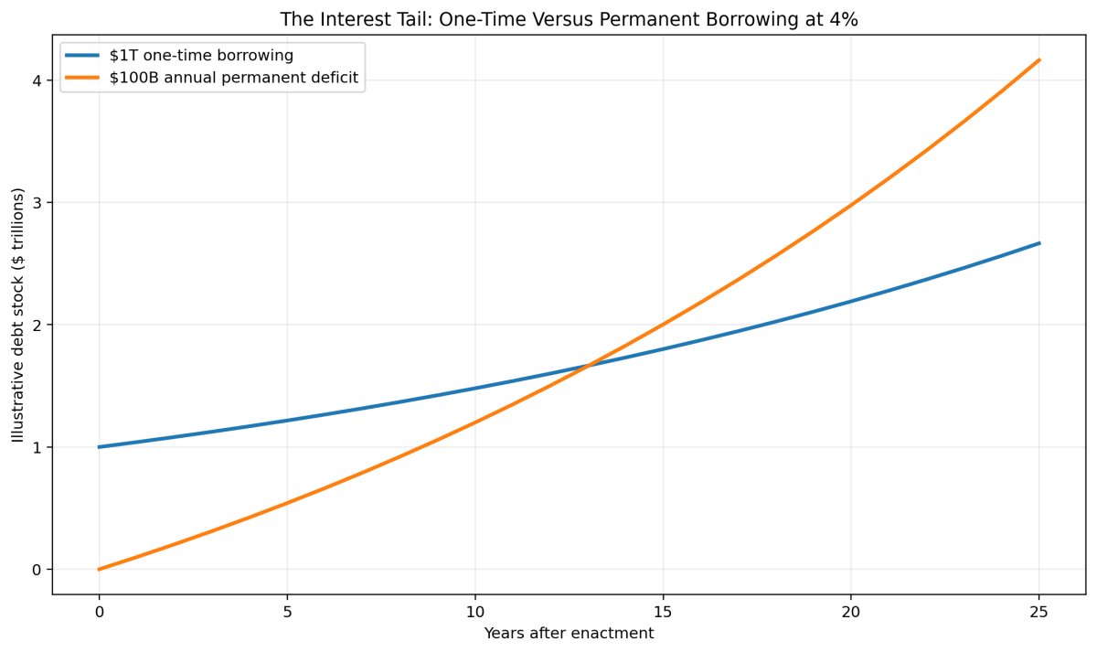
Open original research and sources →Figure 1. Illustrative—not a historical score. At a constant 4 percent financing rate, a one-time $1 trillion borrowing becomes about $2.67 trillion after 25 years. A permanent $100 billion annual deficit accumulates to about $4.17 trillion, including roughly $1.67 trillion of i…Chart-led research
A 70-year counterfactual audit of presidential policy, inherited law, tax cuts, entitlements, crisis packages, and the compounding interest tail. The analysis separates who originated a policy from who expanded, extende…
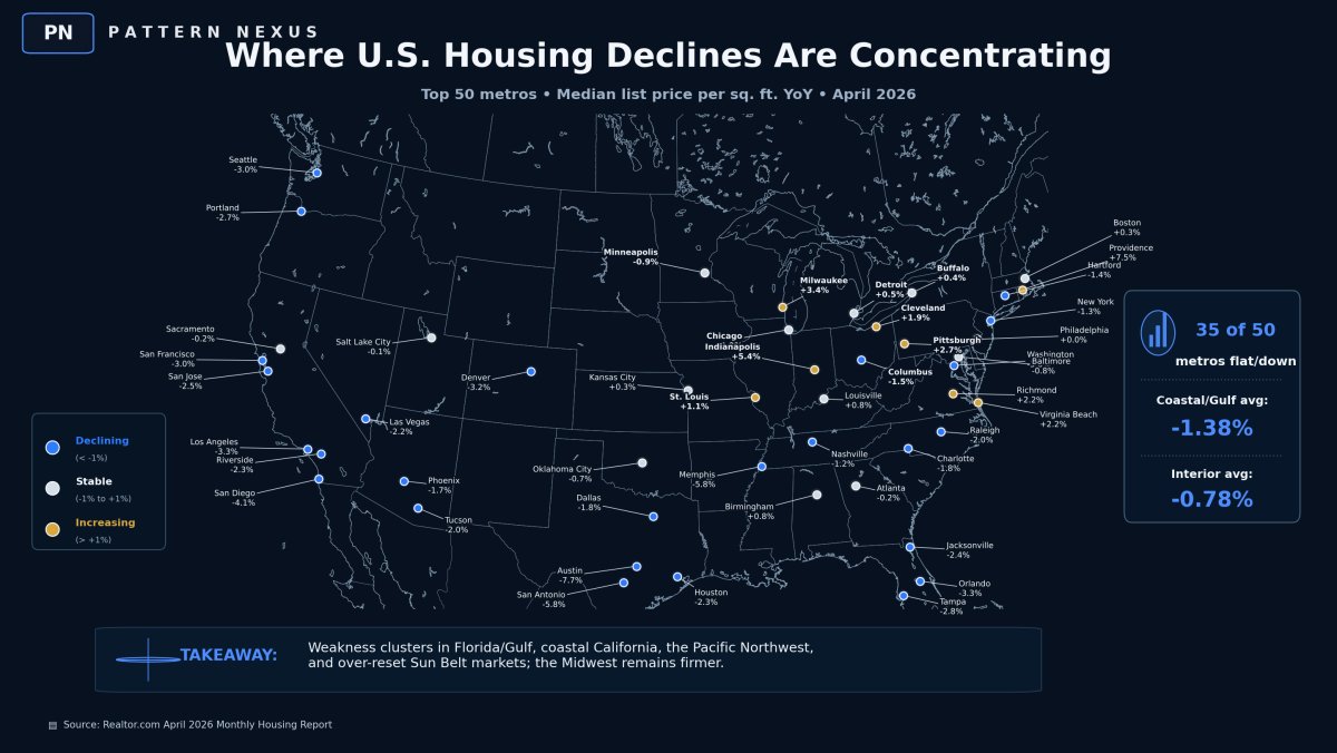
The U.S. housing market is not crashing everywhere. It is repricing where the affordability stack broke first: coastal price towers, insurance-stressed Florida and Gulf markets, high-rate West Coast metros, and over-res…
2026 is moving in whiplash mode. The dollar is pressing 100, yields are back in “you’re not supposed to be here” territory, oil is flirting with $100 again, and the Hormuz layer is no longer theoretical. China is negoti…
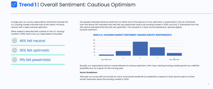
A Pattern Nexus breakdown of Innago’s 2026 landlord survey showing cautious optimism, portfolio expansion plans, multifamily dominance, Midwest and South rotation, and rising AI adoption in rental ownership.
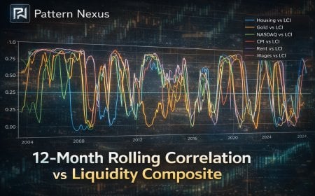
A full rebuild of the Pattern Nexus liquidity framework using end-of-month data, z-scores, and a PCA composite (WALCL, TGA, RRP, M2). If you want to understand housing, gold, and tech, stop arguing CPI and start watchin…
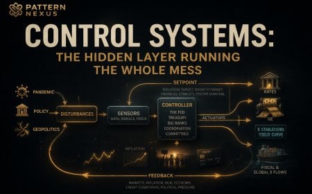
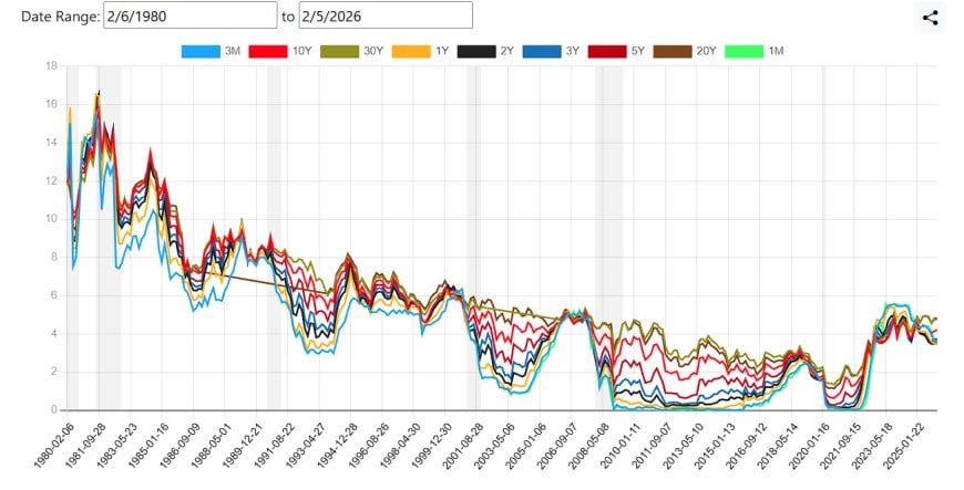
A Pattern Nexus control-systems read tying the yield curve, dollar regime, metals, crypto, and equities into one machine: why inversions lead recessions, why recessions can be strategically useful for policy, how 2020 p…
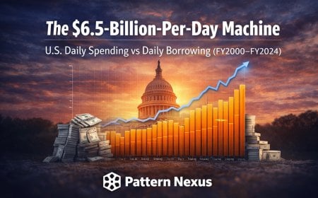
A Pattern Nexus structural read of U.S. federal average daily outlays versus average daily deficit financing since 2000 — and why persistent daily borrowing shows up in groceries, housing, metals, and equity valuations.
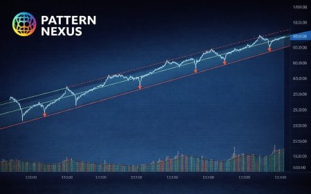
The Dow’s secular uptrend remains intact, but repeated failures to break above its long-term trajectory are historically significant. A Pattern Nexus framework read of structure, regime support, and what failed breakout…
If Pattern Nexus has been useful to you, help keep it growing.
Pattern Nexus is independently built and operated.
Most of the research remains publicly available,
but the data, servers, tools, research and time behind it all
have real costs.
Books, memberships and direct support help fund the next stage
without putting everything behind a paywall.