
The Coastal Housing Repricing Map: Where the U.S. Housing Plateau Is Starting to Crack
The U.S. housing market is not crashing everywhere. It is repricing where the affordability stack broke first: coastal price towers, insurance-stressed Florida and Gulf markets, high-rate West Coast metros, and over-reset Sun Belt cities where sellers are finally forced to meet buyers where they are. Realtor.com’s April 2026 top-50 metro data shows 35 of 50 major metros flat or down on median list price per square foot. Case-Shiller confirms the same slowdown through repeat-sales data. Pattern Nexus called this structure months ago: not a clean 2008-style collapse, but a fragmented housing plateau where geography, rates, insurance, taxes, liquidity, and cash-flow math decide which markets hold and which markets reprice.
Pick the version that matches how deep you want to go.
Pattern Nexus is written in layers because not every reader wants the same level of detail. The thesis does not change between versions. What changes is the level of technical depth. Choose the reader-friendly version for the cleanest explanation, the non-technical advanced version for the deeper systems read, or the technical advanced version for the full data-heavy research brief.
The U.S. housing market is not moving as one single national market. Some areas are still holding up, while others are already seeing real price pressure. The better way to understand it is through a map, not one national headline.
The biggest weakness is showing up in places where the total cost of owning a home has become too heavy for regular buyers. That includes high prices, higher mortgage rates, insurance, property taxes, maintenance, HOA fees, and local income limits.
This does not mean every housing market is crashing. It means the market is splitting. Coastal California, Florida and Gulf markets, parts of Texas, the Pacific Northwest, and some Sun Belt cities are under more pressure. Several Midwest and interior markets are holding better because the payment math is still more realistic.
The Main Point
The housing market is not simply good or bad right now. It is uneven. Some markets are softening because buyers cannot afford the full monthly cost anymore. Other markets are still stable because prices are lower, local incomes line up better with home values, or supply is tighter.
This is why national averages can be misleading. A national number blends together places that are weakening with places that are still functioning. That can make the overall market look calmer than it feels in the markets already under pressure.
The better read is this: housing is going through a regional repricing. The markets that became the most expensive, the most insurance-stressed, or the most dependent on cheap mortgage rates are adjusting first.
The national average is the blur. The local payment is the signal.
Why Some Places Are Falling and Others Are Not
A home price is not just a number on a listing. For most buyers, it becomes a monthly payment. That payment includes the mortgage, interest, insurance, taxes, and other costs. When all of those costs rise together, the buyer may no longer qualify or may simply walk away.
That is why expensive markets are more sensitive. A higher mortgage rate hurts everywhere, but it hurts more in places where home prices were already stretched. A buyer in a high-cost coastal market may face a payment shock that is far larger in dollar terms than a buyer in a lower-cost interior market.
Insurance also changes the picture. In Florida, the Gulf, and parts of California, insurance is no longer a small background cost. It can be a major part of whether the home still makes financial sense.
The Map Pattern
The weakness is not random. It is showing up in clusters. Texas reset markets such as Austin and San Antonio are under pressure. Coastal California markets such as San Diego, Los Angeles, San Francisco, San Jose, and Riverside are weaker. Florida and Gulf markets such as Tampa, Jacksonville, Miami, Houston, and Orlando are also showing stress.
At the same time, places like Indianapolis, Milwaukee, Pittsburgh, Cleveland, St. Louis, Chicago, Kansas City, Detroit, Louisville, Buffalo, and some other interior or Midwest markets are holding better. That does not mean they are risk-free. It means the affordability stack has not broken in the same way.
The split is important because it shows that housing is local. The same national mortgage rate can hit two cities very differently depending on starting prices, wages, insurance, taxes, and available supply.
The Payment Problem
The main pressure point is the monthly payment. During the low-rate period, buyers could support much higher home prices because the cost of borrowing was low. When mortgage rates rose, the same buyer could not afford the same home at the same price.
That does not always cause an immediate crash. Sellers often hold onto the old price in their head. Buyers are stuck with the new payment reality. When those two sides are too far apart, the market slows. Homes sit longer. Price cuts rise. Deals fall through. Eventually, the local market has to find a new clearing price.
This is why price cuts matter. A price cut is not just a seller changing a number. It is a signal that the old price did not clear the market.
Why Insurance Matters Now
Insurance has become a major part of the housing story. A home can look affordable by price alone but become much less affordable once insurance is included. This is especially important in places with hurricane, flood, wildfire, or other risk-related insurance pressure.
If insurance rises sharply, the buyer’s monthly cost rises even if the home price stays flat. That means the effective price of the home has gone up. When property taxes, HOA fees, maintenance, and repair costs are added, the full ownership cost can become too heavy.
This is why Florida, Gulf, and California markets need to be analyzed differently than lower-risk interior markets. The home is not just the house. It is the full cost stack attached to the house.
Who This Affects
| Group | What this means |
|---|---|
| Buyers | More price cuts may create opportunity, but only if the full monthly cost still works. |
| Sellers | Old price expectations may no longer match buyer payment reality. |
| Landlords | Insurance, taxes, repairs, and financing costs can compress cash flow. |
| Investors | The opportunity is not just a lower price. The deal still has to survive the operating costs. |
| Agents | Pricing discipline matters more because unrealistic listings may sit longer. |
| Local governments | Slower sales and weaker prices can eventually affect local revenue and tax pressure. |
What to Watch Next
The next signals are price cuts, days on market, inventory, contract fall-throughs, insurance renewals, local job conditions, and whether mortgage rates stay high enough to keep buyers constrained.
If rates fall, some markets may stabilize because buyers regain payment capacity. If rates stay high and insurance keeps rising, the pressure can continue spreading. The key is not whether one national number rises or falls. The key is whether local buyers can still afford the full cost of ownership.
Pattern Nexus Note: The housing market is not giving one clean headline. It is giving a map. The places with the weakest payment stack are repricing first, while markets with more survivable affordability are holding better for now.
The current housing data is not showing a clean national crash. It is showing a regional repricing map. The pressure is appearing first where the full ownership stack became least affordable: home price, mortgage rate, insurance, taxes, maintenance, HOA costs, and local income.
The important signal is not simply whether the national median price is up or down. The important signal is where sellers are losing pricing power and where buyers no longer clear the monthly payment. That is why price per square foot, price cuts, days on market, and local cost pressures matter more than one national headline.
This version keeps the systems read but removes the heavier regression and formula layer. The full technical version is available above for readers who want the complete data stack.
Housing is not one market. It is a local payment system built out of credit, geography, insurance, taxes, wages, zoning, migration, and investor behavior.
That is why the market can look stable nationally while specific metros are already softening. National averages blend the strong markets with the weak ones. The metro map shows where the payment stack is breaking first.
The current data is not a new thesis. It is the map catching up to the Pattern Nexus framework.
Housing Is Fragmenting
The two easiest housing takes are both incomplete. One says the market is crashing. The other says the market is fine because national indexes are still positive. The better read is that housing is fragmenting by metro, by cost structure, and by buyer payment capacity.
Housing adjusts slowly because sellers do not instantly accept the new price reality. They remember 2021 and 2022. Buyers, however, are living inside today’s mortgage rates, today’s insurance quotes, today’s taxes, and today’s income limits.
That mismatch creates the plateau. Volume slows first. Homes sit longer. Price cuts rise. Seller concessions appear. Then, later, the national data catches up.
The housing market is not one national body. It is a network of local payment systems.
What the Data Is Really Saying
The key measurement here is median list price per square foot across the top 50 metros. Price per square foot is useful because it gives a cleaner read on whether sellers are losing pricing power at the unit-of-housing level. It is not perfect, but it helps reduce some of the noise that can distort median list prices.
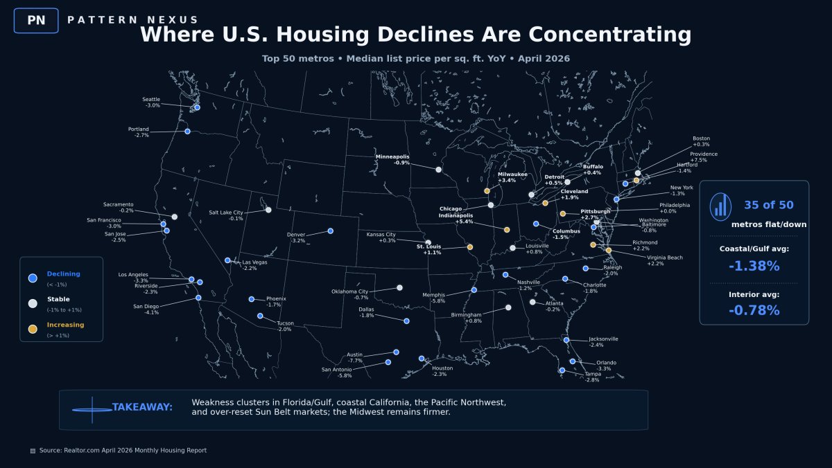
Realtor.com’s April 2026 top-50 metro data shows broad weakness: many large metros are flat or down on price per square foot. The largest declines are concentrated in Austin, San Antonio, Memphis, San Diego, Washington, Los Angeles, Orlando, Denver, Seattle, San Francisco, Tampa, Portland, San Jose, Jacksonville, and Houston.
The pattern matters more than any single city. The pressure is clustering in expensive coastal markets, insurance-stressed Florida and Gulf markets, rate-sensitive Western metros, and pandemic-boom Sun Belt markets.
The Metro Map
The map matters because the weakness is clustered, not random. Texas reset markets are showing visible pressure. California coastal markets are broadly weaker. Florida and Gulf markets are under stress from the combined weight of price, insurance, taxes, and storm-risk repricing. Several Western and Sun Belt markets are dealing with the aftereffects of pandemic-era price surges and investor-driven demand.
The markets holding better are generally places where the payment stack is less broken. That includes several Midwest and interior metros where prices started lower, insurance pressure is less extreme, and local buyers can still clear the monthly payment more easily.
This does not make those markets immune. It means the same national mortgage rate does not create the same local result everywhere.
The Coastal/Gulf Split
The coastal and Gulf story is real, but it has to be framed precisely. It is not that every coastal market is weak and every interior market is strong. The point is that coastal and Gulf markets often carry heavier cost stacks.
Coastal California has extreme price-to-income pressure. Florida and Gulf markets have insurance and storm-risk pressure. The Pacific Northwest has high starting prices and rate sensitivity. Sun Belt boom markets have new supply, investor exposure, and pandemic-era price memory.
Geography is not the whole explanation. It is the carrier for different cost pressures. The market signal appears when sellers begin cutting prices because buyers no longer clear the payment at the old level.
The Payment Stack
The buyer does not experience a house as a national price chart. The buyer experiences it as a monthly obligation. That obligation includes mortgage principal, interest, taxes, insurance, HOA fees, maintenance, utilities, and reserves for repairs.
When mortgage rates rise, the same home becomes more expensive even if the list price does not change. When insurance also rises, the effective cost rises again. When taxes and maintenance rise, the stack gets heavier.
This is why high-cost markets are more fragile. A buyer in an expensive market may face a much larger dollar shock even if the percentage move is similar. The same interest-rate environment can be survivable in one metro and destructive in another.
The seller remembers the old home value. The buyer is constrained by the new monthly payment.
Insurance as Housing Price
Insurance is no longer a side issue in housing analysis. In Florida, the Gulf, California, and other risk-exposed markets, insurance directly affects affordability.
A house can be flat in price while becoming more expensive to own. If insurance premiums rise, the buyer’s monthly payment rises. If taxes rise too, the payment rises again. That means the effective price of the home has increased even if the listing price has not.
This is why the insurance layer belongs in the housing map. It helps explain why some markets are weakening even before a traditional crash appears in the national data.
Stakeholder Breakdown
| Stakeholder | Main exposure | Pattern Nexus read |
|---|---|---|
| Buyers | Payment, insurance, appraisal risk, future liquidity | Do not buy the national average. Buy the local clearing price. |
| Sellers | Price anchoring, stale listings, failed contracts | The first realistic seller clears. The stubborn seller becomes inventory. |
| Landlords | Cash flow, insurance, taxes, repairs, vacancy | The asset is strong only if the operating system still clears. |
| Investors | Basis, yield, financing terms, exit value | Cheap is not enough. Survivable cash flow is the filter. |
| Lenders | Collateral value and borrower qualification | The risk is collateral repricing under frozen transaction volume. |
| Builders | Inventory, incentives, absorption, land basis | Builders can clear volume faster because they can buy down the payment. |
| Local governments | Transfer taxes, assessments, permits, population flow | Housing stress becomes municipal stress with a lag. |
What Comes Next
The next phase depends on rates, insurance, inventory, and local labor conditions. If rates fall enough, some pressure can ease because buyers regain payment capacity. If rates stay high and insurance keeps rising, more markets may be forced into repricing.
The signals to watch are price-cut share, days on market, contract fall-throughs, builder incentives, insurance renewals, tax changes, and whether local wages can support current prices.
This is not a one-month story. It is a slow clearing process inside a market that is too large, too debt-linked, and too locally fragmented to move all at once.
Pattern Nexus Note: Housing is not giving one clean national signal. It is giving a local repricing map. The markets where the full cost stack became least survivable are adjusting first.
Sources
This simplified advanced version uses the same source base as the technical version, including Realtor.com metro data, mortgage-rate data, Case-Shiller/S&P Cotality, housing insurance research, and prior Pattern Nexus housing framework articles. Select the Technical Advanced version above for the complete source list and methodology note.
The headline is late again. The national housing market is not suddenly “collapsing,” and it is not healthy either. The better read is that the Great Housing Plateau is becoming geographically visible.
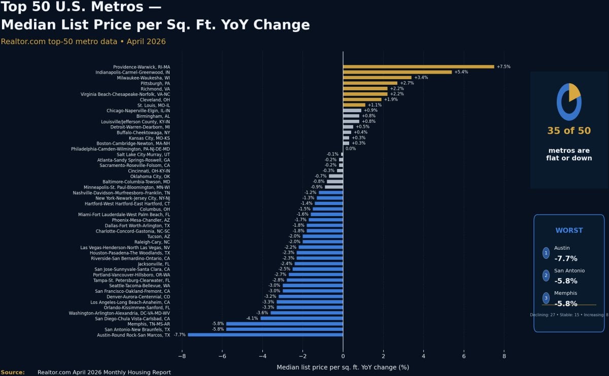
Realtor.com’s April 2026 top-50 metro data shows median list price per square foot flat or down in 35 of the 50 largest metros. That matters because price per square foot strips out some of the mix-shift noise that can distort median list price. It is not perfect, but it gives a cleaner read on whether sellers are losing pricing power at the unit-of-housing level.
The worst price-per-square-foot declines are not random. Austin is down 7.7%. San Antonio is down 5.8%. Memphis is down 5.8%. San Diego is down 4.1%. Washington is down 3.6%. Los Angeles is down 3.3%. Orlando is down 3.3%. Denver is down 3.2%. Seattle is down 3.0%. San Francisco is down 3.0%. Tampa is down 2.8%. Portland is down 2.7%. San Jose is down 2.5%. Jacksonville is down 2.4%. Houston is down 2.3%.
That is the pattern: expensive coastal markets, insurance-stressed Florida/Gulf markets, high-rate Western markets, and pandemic-boom Sun Belt markets are absorbing the pressure first. Meanwhile, Providence, Indianapolis, Milwaukee, Pittsburgh, Richmond, Virginia Beach, Cleveland, St. Louis, Chicago, Louisville, Birmingham, Detroit, Buffalo, Boston, and Kansas City are still positive or roughly stable on a price-per-square-foot basis.
This is exactly the structure Pattern Nexus has been writing about for months: not a clean 2008 replay, not a uniform crash, and not a healthy expansion. It is a fragmented, liquidity-gated, affordability-constrained housing plateau where geography, insurance, taxes, rates, inventory, and local income now matter more than national averages.
The public version of this story is simple: home prices are softening. That is not enough. The premium layer is the map, the metro table, the regression signal, the payment math, the stakeholder impact, and the match back into the Pattern Nexus housing framework already written before this data showed up in the headline cycle.
The important question is not whether the national median price rose or fell this month. The important question is where the marginal buyer is disappearing first, where sellers are losing pricing power, where insurance and taxes are eating the payment stack, and which markets are being protected by affordability, wage-to-price balance, local inventory discipline, or cash-flow realism.
That is where the professional data analysis matters. The map shows the geography. The full metro table shows the breadth. The price-cut regression shows the pressure channel. The mortgage math shows why the same rate shock breaks San Diego before it breaks Milwaukee. The prior Pattern Nexus articles show this was not random. It is the housing plateau turning into a visible repricing map.
This is not a national housing panic article. It is a systems-level housing brief for buyers, sellers, landlords, investors, lenders, builders, agents, local governments, insurers, and anyone trying to understand why one market is still clearing while another one is quietly cracking.
Housing is not one market.
It is a credit-embedded hard asset sitting inside local tax systems, insurance systems, wage systems, zoning systems, migration systems, landlord cash-flow systems, and debt-service math. National averages hide the fracture because national averages blend markets that are breaking with markets that are still functioning.
The current data does not show a broad 2008-style liquidation. It shows a regional repricing map. The first breaks are appearing where the buyer’s monthly payment cannot survive the full stack: price, rate, insurance, property tax, maintenance, HOA fees, commute cost, and income reality.
This is why the weakness clusters in coastal California, the Pacific Northwest, Florida/Gulf markets, and parts of the Sun Belt. Those markets share different surface stories, but the same underlying mechanism: the marginal buyer’s payment capacity is below the seller’s memory of 2021–2022 pricing.
Pattern Nexus already called out the structure. The Lock-In Economy explained the frozen-supply gear. The Quiet Crisis explained the slow-burn stress beneath the surface. The 2026 Landlord Outlook explained that geography, cash flow, insurance, rates, and efficiency matter more than narrative. October 2025: Housing, Wealth & the Interest Rate Reversal flagged expensive coastal markets as the extreme affordability edge. Pending Home Sales Confirm the Hard-Asset Rotation framed housing as a credit-embedded hard asset, not a normal consumer good.
The current data is not a new thesis. It is the map catching up to the framework.
This Is Not a National Crash Story
The lazy version of this story is that housing is finally crashing. That is not what the data says.
The opposite lazy version is that housing is fine because national home-price indexes are still positive. That is also not what the data says.
The actual read is more specific and more useful: housing is fragmenting. The national layer is still sticky, but the metro layer is already showing where the stress is clearing through price-per-square-foot declines, price cuts, inventory flow, longer listing cycles, and lower seller leverage.
That distinction matters because housing does not behave like a liquid stock chart. Prices do not update instantly. Sellers anchor to prior-cycle values. Buyers anchor to monthly payments. Lenders anchor to debt-to-income rules. Insurers anchor to risk models. Tax assessors anchor to local policy. Landlords anchor to cash flow. Local governments anchor to transaction revenue and assessed values.
So the market can look frozen before it looks broken. Volume slows first. New listings recover unevenly. Price cuts rise. Concessions show up. Pending contracts tell one story. Closed sales tell another. Repeat-sales indexes lag. Then the official headline arrives months late.
The housing market is not one national body. It is a network of local payment systems. The national average is the blur. The metro map is the signal.
That is why the April 2026 data matters. It does not show one clean cliff. It shows a sorting mechanism. Markets with broken payment stacks are repricing first. Markets with better affordability, lower insurance stress, stronger wage-to-price balance, or tighter inventory are holding better.
This is how the Great Housing Plateau starts to crack. Not all at once. Not everywhere. Not through one simple headline. It cracks through local bid failure.
The Data Stack: What Is Being Measured
The housing conversation usually gets sloppy because different people are talking about different layers without saying it. Median sale price is not median list price. Price per square foot is not the same as a repeat-sales index. Inventory is not the same as supply pressure if demand is also moving. A rising median can hide weakening unit pricing if the mix shifts upward. A falling median can exaggerate weakness if smaller homes dominate the sample.
For this article, the main layer is Realtor.com’s April 2026 top-50 metro data because it gives a broad listed-market snapshot across the largest metros. The most important metric in that table is median list price per square foot year over year. It is the best available current signal for listed-market repricing at the metro level. Realtor.com’s March report showed 31 of the top 50 metros already down on that measure, and the April report broadened that to 35 of 50. [1] [2]
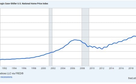
The confirmation layer is Case-Shiller / S&P Cotality because repeat-sales indexes are cleaner for home-price measurement, but they are slower. They confirm the direction later. That lag matters. Listed-market data is where seller behavior changes first. Repeat-sales data confirms after contracts close and the data is processed. [4]
The rate layer is Freddie Mac’s Primary Mortgage Market Survey. The 30-year fixed mortgage rate around 6.5% is the key payment constraint. Housing price is not just a sticker price. It is a financed payment. When the price of the mortgage changes, the same home becomes a different monthly liability. [3]
The insurance layer matters because coastal and Gulf markets are no longer just price-and-rate stories. Insurance has become part of the effective housing price. A $450,000 home with a low insurance burden is not the same asset as a $450,000 home with a rapidly repricing insurance stack.
| Layer | Primary dataset / source | What it captures | Why it matters | Limitation |
|---|---|---|---|---|
| Listed-market price pressure | Realtor.com April 2026 top-50 metro data | Median list price, price per square foot, active listings, new listings, days on market, price-cut share | Shows where sellers are losing pricing power first | List prices are asking prices, not closed prices |
| Repeat-sales confirmation | S&P Cotality Case-Shiller | Repeat-sales home-price index across national and major metro levels | Confirms the slower closed-sale price trend | Published with a lag and covers fewer metros |
| Payment pressure | Freddie Mac PMMS / FRED mortgage-rate data | 30-year fixed mortgage rate | Translates home price into monthly payment affordability | Does not capture borrower-specific credit, points, taxes, insurance, or fees |
| Insurance and risk pricing | GAO, Harvard JCHS, state insurance data, carrier withdrawal reporting | Insurance premium burden, availability, climate-risk pressure, insurer retreat | Explains why Florida, Gulf, and California markets can crack even without demand disappearing | Insurance data varies by state and is not always available at the same metro granularity |
| Pattern Nexus prior framework | Previous PN housing and hard-asset articles | Lock-in, plateau, liquidity gating, cash-flow compression, hard-asset rotation | Shows this was a structural framework before it became a headline | Framework is interpretive and must be checked against current data |
The main professional read is simple: use the listed-market data to identify where pressure is appearing, use repeat-sales data to confirm that the pressure is not just noise, use mortgage rates to explain the payment constraint, and use insurance/tax/local income layers to explain why the map is uneven.
That is the difference between a headline take and a usable market read.
Visual Board: The Four Research Graphics
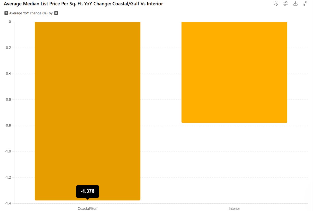
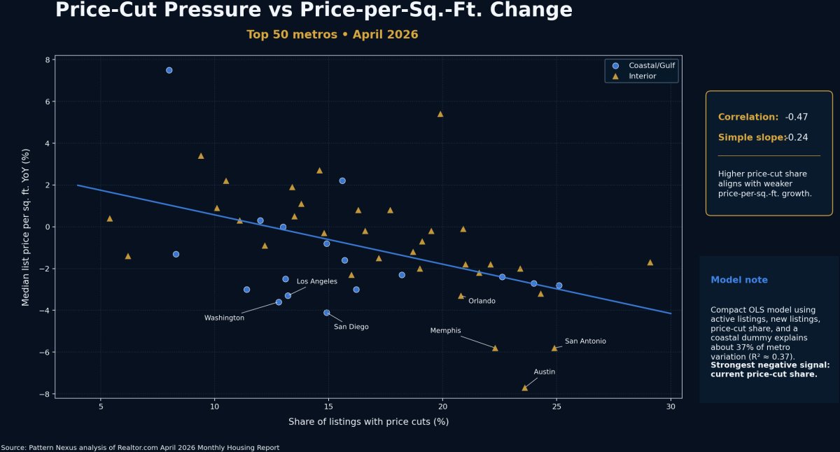
The article uses four visuals because each one answers a different question. The map answers where. The bar chart answers how much. The regression chart answers which pressure variable is lining up with weakness. The coastal/interior comparison answers whether the geographic thesis holds in aggregate.
The Metro Map: Where Weakness Is Concentrating
The map matters because the weakness is clustered. It is not equally distributed across the country. The biggest negative clusters sit in Texas reset markets, coastal California, the Pacific Northwest, Florida/Gulf stress markets, and over-reset pandemic-boom or rate-sensitive Western/Sun Belt metros.
Austin is down 7.7% and San Antonio is down 5.8% on median list price per square foot. These are not tiny moves. They show the post-pandemic pricing reset moving through the listed market.
San Diego is down 4.1%, Los Angeles is down 3.3%, San Francisco is down 3.0%, San Jose is down 2.5%, Riverside is down 2.3%, and Sacramento is slightly negative.
Tampa is down 2.8%, Jacksonville is down 2.4%, Miami is down 1.6%, Houston is down 2.3%, and Orlando is down 3.3% even though it is not coastal in the same way.
Indianapolis, Milwaukee, Pittsburgh, Cleveland, St. Louis, Chicago, Kansas City, Detroit, and Louisville show the other side of the map: markets where lower starting prices and more realistic payment math are still holding better.
This does not mean every coastal market is weak or every interior market is strong. Providence and Virginia Beach are positive. Columbus is negative. Memphis is deeply negative. The point is not a cartoon. The point is that the weakest clusters share a cost-stack problem.
In California, the cost stack is purchase price, rate sensitivity, insurance stress, and extreme price-to-income ratios. In Florida and Gulf markets, the cost stack is price, rates, insurance, taxes, storm-risk repricing, and investor-heavy supply. In several Sun Belt markets, the cost stack includes pandemic migration premium, investor saturation, new-construction competition, and seller anchoring. In parts of the Midwest, the cost stack is still more survivable.
That is why the same national mortgage rate produces different local outcomes. The rate is national. The payment failure is local.
Full Top-50 Metro Table
This is the working table behind the map. The status labels are based on median list price per square foot year-over-year change: declining is below -1%, stable is between -1% and +1%, and increasing is above +1%.
| Metro | Region type | Status | Median list price YoY | Price/sq. ft. YoY | Active listings YoY | New listings YoY | Price-cut share |
|---|---|---|---|---|---|---|---|
| Austin-Round Rock-San Marcos, TX | Interior / Sun Belt reset | Declining | -9.5% | -7.7% | -0.2% | -13.5% | 23.6% |
| San Antonio-New Braunfels, TX | Interior / Sun Belt reset | Declining | -4.5% | -5.8% | 9.5% | 7.3% | 24.9% |
| Memphis, TN-MS-AR | Interior / affordability-stress | Declining | -12.9% | -5.8% | 16.4% | 9.9% | 22.3% |
| San Diego-Chula Vista-Carlsbad, CA | Coastal/Gulf | Declining | -4.7% | -4.1% | -0.1% | -5.5% | 14.9% |
| Washington-Arlington-Alexandria, DC-VA-MD-WV | Coastal/Gulf | Declining | -6.1% | -3.6% | 11.2% | 4.9% | 12.8% |
| Los Angeles-Long Beach-Anaheim, CA | Coastal/Gulf | Declining | -8.1% | -3.3% | 6.8% | -3.3% | 13.2% |
| Orlando-Kissimmee-Sanford, FL | Interior / Florida exposure | Declining | -1.4% | -3.3% | -4.0% | -9.0% | 20.8% |
| Denver-Aurora-Centennial, CO | Interior / Western reset | Declining | -2.1% | -3.2% | 0.5% | -12.6% | 24.3% |
| San Francisco-Oakland-Fremont, CA | Coastal/Gulf | Declining | 0.3% | -3.0% | -12.9% | -1.5% | 11.4% |
| Seattle-Tacoma-Bellevue, WA | Coastal/Gulf | Declining | -0.8% | -3.0% | 32.3% | 2.4% | 16.2% |
| Tampa-St. Petersburg-Clearwater, FL | Coastal/Gulf | Declining | -0.9% | -2.8% | -7.0% | -15.7% | 25.1% |
| Portland-Vancouver-Hillsboro, OR-WA | Coastal/Gulf | Declining | -5.7% | -2.7% | 7.2% | -6.1% | 24.0% |
| San Jose-Sunnyvale-Santa Clara, CA | Coastal/Gulf | Declining | -0.1% | -2.5% | 8.6% | 0.9% | 13.1% |
| Jacksonville, FL | Coastal/Gulf | Declining | -1.2% | -2.4% | -21.3% | -8.1% | 22.6% |
| Houston-Pasadena-The Woodlands, TX | Coastal/Gulf | Declining | -2.7% | -2.3% | 6.9% | -3.5% | 18.2% |
| Riverside-San Bernardino-Ontario, CA | Interior / California exposure | Declining | -1.0% | -2.3% | -0.4% | -5.6% | 16.0% |
| Las Vegas-Henderson-North Las Vegas, NV | Interior / Western reset | Declining | 0.0% | -2.2% | 12.1% | -8.8% | 21.6% |
| Raleigh-Cary, NC | Interior / Sun Belt | Declining | -0.3% | -2.0% | 9.9% | 3.6% | 19.0% |
| Tucson, AZ | Interior / Western reset | Declining | -2.6% | -2.0% | 2.1% | -13.9% | 23.4% |
| Dallas-Fort Worth-Arlington, TX | Interior / Sun Belt reset | Declining | 0.0% | -1.8% | 0.1% | -5.9% | 22.1% |
| Charlotte-Concord-Gastonia, NC-SC | Interior / Sun Belt | Declining | -2.2% | -1.8% | 20.4% | 6.2% | 21.0% |
| Phoenix-Mesa-Chandler, AZ | Interior / Western reset | Declining | -5.0% | -1.7% | -0.2% | -4.9% | 29.1% |
| Miami-Fort Lauderdale-West Palm Beach, FL | Coastal/Gulf | Declining | -2.1% | -1.6% | -12.9% | -7.2% | 15.7% |
| Columbus, OH | Interior / Midwest | Declining | -1.3% | -1.5% | 12.7% | 18.0% | 17.2% |
| Hartford-West Hartford-East Hartford, CT | Interior / Northeast | Declining | 2.5% | -1.4% | -6.9% | -4.2% | 6.2% |
| New York-Newark-Jersey City, NY-NJ | Coastal/Gulf | Declining | -2.1% | -1.3% | 6.2% | 11.4% | 8.3% |
| Nashville-Davidson–Murfreesboro–Franklin, TN | Interior / Sun Belt | Declining | -1.9% | -1.2% | 15.7% | 7.3% | 18.7% |
| Minneapolis-St. Paul-Bloomington, MN-WI | Interior / Midwest | Stable | -3.3% | -0.9% | 16.5% | 10.7% | 12.2% |
| Baltimore-Columbia-Towson, MD | Coastal/Gulf | Stable | -3.1% | -0.8% | 11.3% | 3.6% | 14.9% |
| Oklahoma City, OK | Interior | Stable | -0.8% | -0.7% | 7.9% | 6.5% | 19.1% |
| Cincinnati, OH-KY-IN | Interior / Midwest | Stable | 0.0% | -0.3% | 26.5% | 13.7% | 14.8% |
| Atlanta-Sandy Springs-Roswell, GA | Interior / Sun Belt | Stable | 2.4% | -0.2% | 4.3% | -4.1% | 19.5% |
| Sacramento-Roseville-Folsom, CA | Interior / California exposure | Stable | -0.8% | -0.2% | 2.6% | -5.7% | 16.6% |
| Salt Lake City-Murray, UT | Interior / Western reset | Stable | -3.9% | -0.1% | 4.8% | 2.5% | 20.9% |
| Philadelphia-Camden-Wilmington, PA-NJ-DE-MD | Coastal/Gulf | Stable | -0.7% | 0.0% | 11.2% | 9.9% | 13.0% |
| Boston-Cambridge-Newton, MA-NH | Coastal/Gulf | Stable | -5.2% | 0.3% | 13.9% | -3.8% | 12.0% |
| Kansas City, MO-KS | Interior / Midwest | Stable | 3.3% | 0.3% | 26.1% | -2.5% | 11.1% |
| Buffalo-Cheektowaga, NY | Interior / Northeast | Stable | -5.4% | 0.4% | 20.5% | -0.4% | 5.4% |
| Detroit-Warren-Dearborn, MI | Interior / Midwest | Stable | -1.8% | 0.5% | 20.0% | 6.7% | 13.5% |
| Birmingham, AL | Interior | Stable | -0.1% | 0.8% | 7.5% | 2.5% | 16.3% |
| Louisville/Jefferson County, KY-IN | Interior / Midwest-South bridge | Stable | -4.2% | 0.8% | 33.9% | 19.2% | 17.7% |
| Chicago-Naperville-Elgin, IL-IN | Interior / Midwest | Stable | 0.7% | 0.9% | -2.6% | -5.2% | 10.1% |
| St. Louis, MO-IL | Interior / Midwest | Increasing | -3.1% | 1.1% | 14.8% | 4.6% | 13.8% |
| Cleveland, OH | Interior / Midwest | Increasing | -2.0% | 1.9% | 9.2% | 7.8% | 13.4% |
| Richmond, VA | Interior / Mid-Atlantic | Increasing | -2.0% | 2.2% | 4.7% | 6.3% | 10.5% |
| Virginia Beach-Chesapeake-Norfolk, VA-NC | Coastal/Gulf | Increasing | 3.7% | 2.2% | 4.0% | 23.8% | 15.6% |
| Pittsburgh, PA | Interior / Northeast-Midwest bridge | Increasing | 2.0% | 2.7% | 9.7% | 10.5% | 14.6% |
| Milwaukee-Waukesha, WI | Interior / Midwest | Increasing | 1.9% | 3.4% | 18.3% | 14.3% | 9.4% |
| Indianapolis-Carmel-Greenwood, IN | Interior / Midwest | Increasing | -3.3% | 5.4% | 32.4% | 21.1% | 19.9% |
| Providence-Warwick, RI-MA | Coastal/Gulf | Increasing | -1.3% | 7.5% | 7.7% | 3.8% | 8.0% |
The Coastal/Gulf Split
The coastal claim mostly holds, but it needs to be stated precisely. This is not “all coastal bad, all interior good.” That would be too simple. The data shows coastal and Gulf markets are weaker on average, but the strongest explanatory variable in the regression is not the coastal label by itself. It is price-cut pressure.
In other words, geography matters because geography carries different cost stacks. Coastal California carries extreme price-to-income pressure. Florida and Gulf markets carry insurance and storm-risk cost pressure. Pacific Northwest tech metros carry high price levels plus rate sensitivity. Sun Belt boom markets carry oversupply and pandemic-era pricing memory. The label “coastal” is not magic. It is a proxy for a bundle of stress channels.
| Group | Number of metros | Average price/sq. ft. YoY | Share of top-50 sample | Interpretation |
|---|---|---|---|---|
| Coastal/Gulf metros | 17 | -1.38% | 34% | Weaker average performance, with stress concentrated in California, Florida/Gulf, Pacific Northwest, and Washington, D.C. |
| Interior metros | 33 | -0.78% | 66% | Still slightly negative on average, but buffered by Midwest affordability and several positive interior markets. |
| All top-50 metros | 50 | -0.98% | 100% | The national top-50 listed market is already negative on price per square foot, even though closed-sale indexes remain only mildly positive. |
The important detail is that the coastal/Gulf average is more negative, but the interior average is also below zero. That means the weakness has moved beyond one narrow coastal story. The coastal map is where the pressure is easiest to see, but the broader system is also absorbing a national payment shock.
Professional read: geography is an exposure variable, not a complete explanation. The actual market stress has to be measured through clearing behavior. That means price cuts, days on market, listing growth, contract velocity, insurance quotes, and the gap between seller ask and buyer payment capacity.
Regression: What Actually Explains the Weakness?
To get past the visual map, I ran a compact OLS model using the top-50 metro table. The dependent variable is median list price per square foot year-over-year change. The explanatory variables are active listings YoY, new listings YoY, current price-cut share, and a coastal/Gulf dummy.
This is not a full causal model. It is a pressure-screening model. It asks: within the top 50 metros, which observable market variables line up with weaker price-per-square-foot growth?
| Regression variable | Coefficient | Std. error | t-stat | p-value | Plain-English read |
|---|---|---|---|---|---|
| Intercept | 2.372 | 1.246 | 1.904 | 0.063 | Baseline estimate before the listed pressure variables are applied. |
| Active listings YoY | -0.002 | 0.036 | -0.056 | 0.956 | Inventory growth alone is not enough to explain the price move in this compact model. |
| New listings YoY | 0.099 | 0.045 | 2.230 | 0.031 | More new listings can be positive when it reflects active two-sided market flow, not dead supply. |
| Price-cut share | -0.196 | 0.064 | -3.078 | 0.004 | The strongest negative signal: markets with more price-cut pressure tend to have weaker price-per-square-foot growth. |
| Coastal/Gulf dummy | -0.791 | 0.707 | -1.118 | 0.270 | Coastal/Gulf markets are weaker on average, but the dummy itself is not the strongest variable after price cuts and listing flow are included. |
| Model metric | Value | Interpretation |
|---|---|---|
| Sample size | 50 metros | Large enough for a directional top-50 screen, not large enough for a complete causal housing model. |
| Dependent variable | Median list price per square foot YoY | Measures listed-market unit-price pressure. |
| R² | 0.37 | The model explains roughly 37% of the metro-level variation in price-per-square-foot change. |
| Adjusted R² | 0.31 | Still meaningful for a compact four-variable screen. |
| Strongest negative variable | Price-cut share | Seller capitulation is the clearest current stress signal. |
| Price-cut correlation | About -0.47 | Higher price-cut share generally lines up with weaker price-per-square-foot growth. |
The regression matters because it prevents the article from becoming a geography cartoon. Geography is visible. Price-cut pressure is measurable. The Pattern Nexus frame is that geography transmits cost-stack pressure, but the market signal shows up through seller behavior.
Sellers cut prices when the old bid is gone. They may not admit the market changed. They may blame rates, seasonality, politics, buyers, or the media. But the cut itself is the revealed signal. It says the listing did not clear where the seller wanted it to clear.
Key regression read: the coastal/Gulf label helps identify where the weakness clusters, but the actual stress signal is price-cut pressure. The system breaks when sellers have to abandon the price memory of the last cycle.
The active-listing coefficient being close to zero is also important. Inventory growth is not automatically bearish if it reflects a healthier two-sided market. Some Midwest markets have rising active listings and still positive price-per-square-foot growth because buyers can still clear the payment. Dead inventory and functioning inventory are not the same thing.
That is the kind of distinction that gets lost in social media housing takes. More listings can mean supply pressure. It can also mean a market is thawing. The difference is whether buyers are showing up at the new price level.
The Payment Math: Why the Same Rate Breaks Different Markets Differently
Housing affordability is usually discussed as if home price is the main variable. That is incomplete. For financed buyers, the monthly payment is the real clearing mechanism.
The basic fixed-rate mortgage formula is:
Monthly payment = P × [ r(1+r)n / ((1+r)n - 1) ]
P = loan principal, r = monthly interest rate, n = number of monthly payments.
Using principal and interest only, before taxes, insurance, HOA, maintenance, utilities, or repairs, the payment shock from a 3.0% mortgage to a 6.51% mortgage is already severe.
| Loan principal | Monthly P&I at 3.00% | Monthly P&I at 6.51% | Monthly increase | Increase % |
|---|---|---|---|---|
| $300,000 | $1,265 | $1,898 | +$633 | +50.0% |
| $450,000 | $1,897 | $2,847 | +$950 | +50.1% |
| $600,000 | $2,530 | $3,796 | +$1,266 | +50.0% |
| $750,000 | $3,162 | $4,745 | +$1,583 | +50.1% |
| $900,000 | $3,794 | $5,695 | +$1,901 | +50.1% |
This is the piece that matters for coastal housing. A buyer looking at a $900,000 loan is not absorbing the same dollar shock as a buyer looking at a $300,000 loan. The percentage increase is similar, but the household cash-flow impact is completely different.
The same payment capacity now supports far less debt. A household that could support a $3,000 principal-and-interest payment could borrow roughly $711,568 at 3.0%, but only about $474,139 at 6.51%. That is a 33.4% drop in loan capacity before taxes, insurance, HOA, and repairs are added.
| Monthly P&I budget | Loan supported at 3.00% | Loan supported at 6.51% | Lost borrowing capacity | Capacity decline |
|---|---|---|---|---|
| $2,000 | $474,379 | $316,093 | -$158,286 | -33.4% |
| $3,000 | $711,568 | $474,139 | -$237,429 | -33.4% |
| $4,000 | $948,758 | $632,185 | -$316,573 | -33.4% |
| $5,000 | $1,185,947 | $790,232 | -$395,715 | -33.4% |
| $6,000 | $1,423,136 | $948,278 | -$474,858 | -33.4% |
That is the hidden repricing math. Sellers are often still anchored to the old home value, but buyers are constrained by the new payment capacity. A market can only hold the old price if buyers have enough income, cash, equity, or outside capital to bridge the gap.
Coastal markets rely on that bridge more heavily. If the buyer pool depends on dual high incomes, stock wealth, tech wealth, inherited equity, relocation packages, foreign capital, or cash-heavy buyers, the market can hold longer. But once the marginal financed buyer disappears, the list price becomes a negotiation fiction.
The mortgage math also explains why the Midwest is holding better in several metros. Lower starting prices mean the payment shock is still painful, but not always fatal. The buyer may still clear. The lender may still approve. The landlord may still underwrite. The investor may still see a path to cash flow. That does not make the Midwest immune. It makes the payment stack less broken.
Insurance Is Now Part of the Housing Price
Insurance used to sit in the background of most casual housing analysis. That is no longer realistic. In Florida, the Gulf, California, and other risk-exposed markets, insurance is now part of the effective purchase price.
A buyer does not buy the sticker price. A buyer buys the monthly obligation. That monthly obligation includes principal, interest, taxes, insurance, HOA, maintenance, utilities, and reserve risk. If insurance doubles, the market may look unchanged on paper while affordability deteriorates in real life.
This matters because insurance pressure is not evenly distributed. Hurricane risk, wind risk, wildfire risk, carrier withdrawal, state-backed insurance pools, reinsurance costs, and local rebuilding costs all change the housing equation. That means two markets with the same mortgage rate can have completely different affordability outcomes.
| Market exposure | Insurance / risk channel | Housing-market effect | Likely stakeholder impact |
|---|---|---|---|
| Florida / Gulf | Hurricane, wind, flood, carrier withdrawal, reinsurance cost | Higher monthly carry, weaker buyer affordability, lower investor yield | Buyers demand discounts, landlords face margin compression, sellers face narrower pools |
| Coastal California | Wildfire, FAIR Plan pressure, insurer pullback, high rebuild cost | Higher effective ownership cost and lower payment elasticity | High-income buyers can still compete, but marginal financed buyers thin out |
| Pacific Northwest | High price level, tech-cycle sensitivity, earthquake/wildfire pockets | Rate sensitivity shows up faster because starting price is high | Sellers face slower clearing, tech buyers become more cautious |
| Sun Belt boom markets | New supply, investor ownership, pandemic migration premium, heat/water constraints in some metros | Price cuts rise as sellers compete with builders and prior-cycle pricing memory | Builders offer incentives, resale sellers lose leverage |
| Midwest / interior | Lower starting price, generally more survivable insurance burden, local tax variation | Payment math holds better in many metros | Buyers still stretched, but the clearing price is less detached from wages |
The insurance point is also why a simple price chart can understate the damage. If a house is flat in price but the cost to insure it rises sharply, the buyer’s effective price rose. If taxes also rise, the effective price rose again. If maintenance and labor costs rise, the effective price rose again.
That is why Pattern Nexus keeps using the stack language. Housing is not just price. Housing is a stack of obligations attached to a physical asset. When the stack gets too heavy, the market does not need demand to vanish. It only needs the marginal buyer to fail the payment test.
Pattern Nexus Match: Where This Was Already Called
This data is not coming out of nowhere. It is the latest layer in a housing framework Pattern Nexus has been building for months. The current map is not a new story. It is a confirmation layer.
| Prior Pattern Nexus article | Original framework | Current data match | Internal link strategy |
|---|---|---|---|
| October 2025: Housing, Wealth & the Interest Rate Reversal | Flagged record price-to-income pressure and specifically called out expensive coastal markets such as San Jose, Los Angeles, and New York as affordability extremes. | California metros now show broad price-per-square-foot weakness: San Diego -4.1%, Los Angeles -3.3%, San Francisco -3.0%, San Jose -2.5%, Riverside -2.3%, Sacramento -0.2%. | Search PN |
| The Lock-In Economy: Why America’s Housing Market Remains Frozen | Housing was framed as a machine of interlocking gears: rates, existing-owner lock-in, supply, demand, demographics, and policy feedback. | The market is still not clearing normally. Some sellers remain locked in, while active listings and price cuts show where forced clearing is beginning. | Search PN |
| The Quiet Crisis: Rising Foreclosures, Falling Rents, and the Stress Building Beneath the U.S. Housing Market | The warning was not a 2008-style crash. It was a slower, stranger stress cycle where cash flows, tenants, rents, and household buffers weaken beneath the surface. | The current data matches that slow-burn thesis: broad weakness in price per square foot, but not a uniform national liquidation. | Search PN |
| 2026 Landlord Outlook: Cautious Optimism, Multifamily Strength, and the New Housing Map | The thesis was that housing is now selective: cash flow, density, geography, rates, taxes, insurance, and efficiency matter more than narrative. | The April map shows exactly that. Midwest and more affordable interior markets are holding better, while cost-heavy coastal/Gulf and reset markets are repricing. | Search PN |
| Pending Home Sales Confirm the Hard-Asset Rotation | Housing was described as a credit-embedded hard asset: not a normal consumer good, but a large liquidity sink dependent on financing conditions and policy expectations. | Case-Shiller still shows modest national gains, while listed-market data shows weakening breadth. That is how a credit-embedded asset adjusts: slowly, unevenly, and through local clearing pressure. | Search PN |
This is why the current data should not be read as a surprise. Pattern Nexus already had the right frame: housing would not crash cleanly because the system is too locked, too policy-sensitive, too locally fragmented, and too balance-sheet embedded. But it would also not normalize painlessly because the buyer’s payment capacity had been broken.
The result is a plateau with cracks. Not one cliff. Not one crash. A pressure map.
Stakeholder Breakdown
The same housing data means different things depending on who is exposed to the system. A buyer, seller, landlord, lender, builder, agent, insurer, and local government are not looking at the same risk. They are standing in different parts of the same machine.
| Stakeholder | Primary exposure | What the current data says | What to watch next | Pattern Nexus read |
|---|---|---|---|---|
| Buyers | Monthly payment, appraisal risk, insurance, taxes, future liquidity | More markets now show seller weakness through price-per-square-foot declines and price cuts. | Price cuts, concessions, days on market, insurance quotes, HOA reserves, local tax changes | Do not buy the national average. Buy the local clearing price. |
| Sellers | Price anchoring, stale listings, failed contracts, lower buyer capacity | Seller leverage is weakening first where the payment stack broke hardest. | Showing activity, offer quality, contract fall-throughs, nearby cuts, builder incentives | The first realistic seller clears. The stubborn seller becomes market inventory. |
| Landlords | Cash flow, vacancy, insurance, taxes, maintenance, refinance risk | Markets with thin yield and rising costs are vulnerable even without a headline crash. | Rent growth, vacancy, insurance renewals, capex, DSCR, tenant quality | The asset is only strong if the operating system still clears. |
| Investors | Basis, yield, liquidity, exit value, financing terms | Some weak markets may become opportunities after repricing. Some stable markets may still be poor buys if yield is gone. | Cap rate, DSCR, replacement cost, local wage base, insurance trend, supply pipeline | Cheap is not enough. Survivable cash flow is the filter. |
| Lenders | Collateral value, borrower qualification, default risk, refinance risk | Price-per-square-foot weakness can reduce collateral confidence in exposed metros. | Appraisal gaps, DTI fails, delinquency, investor concentration, local unemployment | The risk is not just default. It is collateral repricing under frozen transaction volume. |
| Builders | Inventory, incentives, absorption, land basis, financing cost | Builders can undercut resale sellers with incentives, especially in Sun Belt supply markets. | Cancellation rates, incentives, absorption pace, lot pipeline, construction lending terms | Builders may clear volume faster than resale sellers because they can buy down the payment. |
| Agents | Transaction volume and seller expectation management | The market is moving from order-taking to pricing discipline. | DOM, cuts, failed listings, buyer affordability, realistic comps | The agent who tells the truth wins later. The agent who buys the listing inherits the problem. |
| Local governments | Transfer taxes, assessed values, permitting, population flow | Weak transaction volume and lower clearing prices can pressure local revenue later. | Sales volume, permitting, tax appeals, migration, foreclosure filings | Housing stress becomes municipal stress with a lag. |
| Insurers | Risk pricing, claims exposure, regulatory limits, reinsurance costs | Risk-based pricing is now directly shaping affordability in exposed markets. | Premium increases, nonrenewals, state-backed plan growth, regulatory intervention | Insurance is no longer a background line item. It is part of the housing price. |
For Buyers
This is not a green light to assume every market is about to collapse. It is a reason to stop accepting list price as reality. The data says sellers are losing pricing power in specific metros, especially where price-cut share is high and price-per-square-foot trends are already negative.
The buyer advantage is not automatic. A lower price does not help if the insurance stack is exploding. A price cut does not help if the HOA is underfunded. A cheaper house does not help if the property needs $60,000 in deferred maintenance and the buyer has no reserves.
The buyer who wins in this market is not the one who simply waits for a crash. It is the one who underwrites the whole payment stack and understands where sellers have lost leverage.
For Sellers
The market is punishing stale 2021 pricing memory. The sellers who win are the ones who price into today’s payment reality from the start. The sellers who lose are the ones who list at yesterday’s fantasy, sit, cut, sit again, then eventually chase the market lower.
The regression makes this visible. Price-cut share is the strongest negative signal in the compact model. Once a market is crowded with cuts, buyers learn to wait.
That is the psychology of a slowing market. At first, buyers fear missing out. Then buyers fear overpaying. Once that switch flips, seller leverage changes fast.
For Landlords
The 2026 landlord question is not “Will real estate go up?” That is too broad. The real question is whether rents, vacancy, maintenance, taxes, insurance, and financing terms still clear the asset.
A landlord in a cash-flowing Midwest market is not in the same position as a landlord holding a thin-margin Florida property with rising insurance and tenant stress. A landlord with fixed long-term debt is not in the same position as an investor depending on refinancing into a higher-rate market.
This is why the Pattern Nexus landlord framework matters. Real estate is not automatically safe because it is tangible. A hard asset with broken cash flow is still a problem. A rental property can look wealthy on paper while draining the operator in real life.
For Investors
The opportunity is not the decline itself. The opportunity is mispricing between narrative and cash flow. Some markets will look weak but become attractive after repricing. Some markets will look stable but offer no yield after taxes, insurance, and capex. The investor’s job is not to buy the headline. It is to underwrite the actual system.
That means looking past the price drop and asking: Does the asset cash flow after real maintenance? Can the tenant base support rent? Is insurance stable? Are taxes rising? Is the local employer base healthy? Is supply coming? Is the exit buyer still there?
The wrong investor sees a 5% price decline and calls it a deal. The right investor asks whether the 5% decline is enough to compensate for a permanently higher carrying-cost stack.
Market Type Breakdown
The top-50 table can be sorted into market types. This is not a perfect classification, but it makes the pattern easier to understand.
| Market type | Examples | Pressure source | Current signal | Professional read |
|---|---|---|---|---|
| Pandemic boom reset | Austin, San Antonio, Phoenix, Las Vegas, Raleigh, Charlotte, Nashville | Migration premium, investor activity, new supply, seller anchoring | Price-per-square-foot declines and elevated price-cut share | The market is digesting a prior-cycle overextension. |
| Coastal affordability wall | San Diego, Los Angeles, San Francisco, San Jose, Seattle, Portland | Extreme price levels plus rate shock | Weak price-per-square-foot growth despite durable desirability | Demand remains, but financed demand cannot clear the old price. |
| Florida/Gulf insurance stack | Tampa, Jacksonville, Miami, Houston, Orlando | Insurance, storm risk, taxes, investor supply, rate shock | Weakening list prices and pressure on affordability | The effective price is higher than the sticker price because insurance changed the monthly cost. |
| Midwest affordability buffer | Indianapolis, Milwaukee, Pittsburgh, Cleveland, St. Louis, Chicago, Kansas City | Lower starting price and more survivable payment math | Positive or stable price-per-square-foot growth in several markets | The market is not immune, but the payment stack is less broken. |
| Northeast mixed signal | Providence, Boston, New York, Hartford, Buffalo, Philadelphia | Inventory scarcity, high prices, local wage structure, legacy supply constraints | Some markets positive, some flat/down | The region is fragmented and should be read metro by metro, not as one block. |
The market type breakdown shows why national housing commentary fails. Austin and Indianapolis are not the same market. Tampa and Milwaukee are not the same market. San Diego and Pittsburgh are not responding to the same payment stack.
They all sit inside the same national mortgage-rate environment, but they do not sit inside the same local affordability environment.
What Comes Next
The next phase depends on whether the pressure stays contained in listed-market data or begins showing up more aggressively in closed-sale indexes, delinquencies, foreclosures, builder incentives, investor exits, and local government revenue.
There are four signals to watch.
If more markets move into elevated price-cut share, seller capitulation is spreading.
Longer listing times show that sellers and buyers are not agreeing on the clearing price.
Insurance shocks can turn a flat price into a real affordability decline.
Case-Shiller and FHFA will show whether listed-market pressure is flowing into closed-sale price indexes.
If mortgage rates stay elevated, the pressure map likely expands. If rates fall meaningfully, the pressure may stabilize, but not evenly. Lower rates would help the payment stack, but they would not automatically fix insurance, taxes, maintenance, supply imbalances, or local wage mismatches.
That is the key. A rate cut can relieve one layer of the stack. It does not repair every layer.
The markets that recover fastest will likely be the ones where the only major problem was financing cost. The markets that remain under pressure will be the ones where financing cost exposed a deeper structural problem: overpricing, insurance stress, weak local incomes, oversupply, or poor rental economics.
Pattern Nexus Lens
Housing is where macro stops being abstract.
A 6.5% mortgage rate is not just a line on a Freddie Mac chart. It is a family failing a debt-to-income test. It is a seller cutting $25,000 after three dead open houses. It is a landlord realizing the insurance increase ate the rent increase. It is a builder slowing starts. It is a city seeing fewer transactions and lower transfer-tax flow. It is a young household staying a renter longer. It is an older household refusing to sell because the replacement payment is insane.
That is the control system.
The market does not need a single crash point. It can transmit pain through slower volume, fewer qualified buyers, longer listing times, rising concessions, falling price per square foot, weaker rents, higher insurance, local tax pressure, and cash-flow compression.
This is why the Great Housing Plateau framework matters. A plateau is not stability. It is trapped energy. Prices can look sticky at the national level while local markets quietly reprice underneath. Case-Shiller can still show a small national year-over-year gain while Realtor.com’s top-50 listed-market data shows 35 metros flat or down on price per square foot. Those are not contradictions. They are different layers of the same system.
The listed market moves first. Seller behavior changes first. Price cuts show up before the official closed-sale indexes fully absorb the shift. Repeat-sales data confirms later. Policy reacts later than that.
The Pattern Nexus call is this: the housing market is not crashing everywhere. It is sorting. Markets with broken payment stacks are repricing. Markets with better affordability and stronger two-sided flow are holding. The next phase is not national collapse or national recovery. It is local divergence.
That is the map. That is the signal. That is the frame.
Sources
- Realtor.com, “April 2026 Monthly Housing Report,” April 2026. Used for top-50 metro active listings, new listings, median list price, median list price per square foot, price cuts, and days-on-market variables. Source
- Realtor.com, “March 2026 Monthly Housing Report,” March 2026. Used as month-prior confirmation that 31 of the top 50 metros were already falling on price per square foot before April broadened to 35. Source
- Freddie Mac, Primary Mortgage Market Survey, May 21, 2026. Used for the 6.51% 30-year fixed-rate mortgage benchmark. Source
- S&P Dow Jones Indices / S&P Cotality Case-Shiller Home Price Indices, March 2026 release. Used as repeat-sales confirmation that national home-price growth slowed materially and that several major markets were already negative year over year. Source
- FHFA House Price Index and related March 2026 reporting. Used as a secondary national confirmation layer showing slower but still positive national home-price growth. Source
- Harvard Joint Center for Housing Studies, housing and homeowners insurance research. Used for the insurance-cost burden frame. Source
- U.S. Government Accountability Office, homeowners insurance and disaster-risk premium analysis. Used for wind and wildfire risk premium context. Source
- Pattern Nexus, “October 2025: Housing, Wealth & the Interest Rate Reversal.” Used for the prior affordability and coastal price-to-income framework. Pattern Nexus Search
- Pattern Nexus, “The Lock-In Economy: Why America’s Housing Market Remains Frozen.” Used for the housing-market-as-interlocking-gears framework. Pattern Nexus Search
- Pattern Nexus, “The Quiet Crisis: Rising Foreclosures, Falling Rents, and the Stress Building Beneath the U.S. Housing Market.” Used for the slow-burn stress and Great Housing Plateau match. Pattern Nexus Search
- Pattern Nexus, “2026 Landlord Outlook: Cautious Optimism, Multifamily Strength, and the New Housing Map.” Used for the cash-flow, geography, insurance, and selective-market framework. Pattern Nexus Search
- Pattern Nexus, “Pending Home Sales Confirm the Hard-Asset Rotation.” Used for the credit-embedded hard-asset framework. Pattern Nexus Search
Methodology Note
The metro-level regression is a compact directional OLS model using the Realtor.com April 2026 top-50 metro table. Dependent variable: median list price per square foot year-over-year change. Predictors: active listings YoY, new listings YoY, current price-cut share, and a coastal/Gulf dummy. Sample size: 50 metros. R² is approximately 0.37. This is not presented as a complete causal model. It is a pressure-screening model designed to identify which variables line up with visible price-per-square-foot weakness across the top-50 metro dataset.
The mortgage-payment math uses a standard fixed-rate mortgage formula for principal and interest only. It does not include taxes, insurance, HOA, PMI, maintenance, closing costs, or borrower-specific rate adjustments. That means the real-world payment burden in high-tax or high-insurance markets can be materially worse than the simplified principal-and-interest examples shown in the article.
Pattern Nexus Note: The housing market is not giving us one clean headline. It is giving us a map. The map says the same thing the Pattern Nexus framework has been saying: housing is a control system built out of credit, geography, insurance, taxes, liquidity, local wages, and human payment capacity. When that system breaks, it does not break evenly. It breaks where the stack is weakest.
Frequently Asked Questions
Hva er din reaksjon?
 Liker
0
Liker
0
 Misliker
0
Misliker
0
 Kjærlighet
0
Kjærlighet
0
 Morsom
0
Morsom
0
 Wow
0
Wow
0
 Trist
0
Trist
0
 Sint
0
Sint
0

Founder of Pattern Nexus. I research markets, macro, geopolitics, AI, history, ancient systems, and the patterns most people overlook. I’m also building Market Radar, a trading scanner designed to read pressure, risk, confirmation, and setup quality before chasing a move. Pattern Nexus is where I connect the dots between data, history, technology, and the bigger system playing out around us.




Kommentarer (0)