
Debt Without a Cliff: What the US Debt Clock Really Shows
A 35-year walkthrough of the US Debt Clock—from 1990 to 2029—showing how debt, GDP, and government spending really scale, why there is no magic “debt cliff,” and how this ties into CBDCs and tokenised Treasuries.
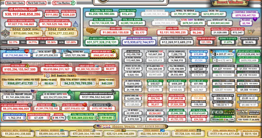
Why the Debt Clock matters (and what everyone misses)
Pull up the US Debt Clock and it looks like a casino floor wired directly into your nervous system – red numbers flying, ratios flashing, and the word “TRILLION” screaming at you from every corner. Most people look at it for 10 seconds, panic, and then go back to their lives convinced that there must be a hard “cliff” out there somewhere. The story goes something like this:
- “We can’t go past $10 trillion in debt.” (We did.)
- “Okay, but definitely not $20 trillion.” (We did that too.)
- “Fine, but $30 trillion is game over.” (We’re past that.)
- “So surely $40–50 trillion is the end.”
The problem is that this isn’t how sovereign balance sheets work – especially not for the issuer of the world’s reserve currency. The system doesn’t care about the raw number. It cares about ratios, collateral, and whether GDP and taxable activity can keep expanding.
In this piece, I’m taking nine snapshots from the US Debt Clock: 1990, 2000, 2004, 2008, 2012, 2016, 2020, 2025 (current) and the 2029 projection. I’m pulling out a handful of key metrics:
- US national debt
- US federal spending
- Total federal / state / local spending
- US gross domestic product (GDP)
- Major line items: Social Security, Medicare/Medicaid, defense
Then I tie those numbers into the bigger pattern: as the economy grows, the federal government is structurally incentivised to lever up alongside it. New debt isn’t just “spending more than we earn.” It’s also the engine that creates collateral, backs new digital rails, and – in the future – will sit underneath CBDCs and tokenised Treasuries.
If there was no hard cliff at $3 trillion, no cliff at $10 trillion, and no cliff at $30 trillion, you have to ask a serious question: why would there suddenly be a cliff at $40–50 trillion if GDP and the tax base scale with it?
That’s the core of what I’m unpacking here.
How I pulled and organized the numbers
All of the raw figures in this article come from the screenshots below, each one a snapshot of USDebtClock.org on a specific “On This Day” year. The years covered: 1990, 2000, 2004, 2008, 2012, 2016, 2020, 2025, plus the 2029 projection.
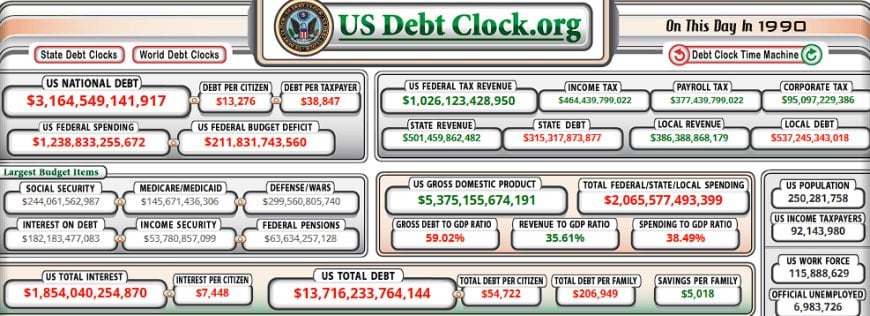
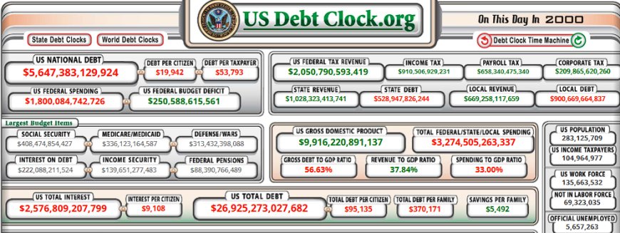
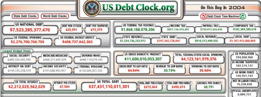
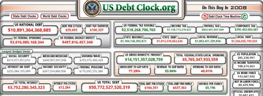
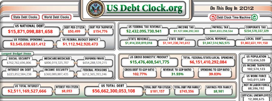
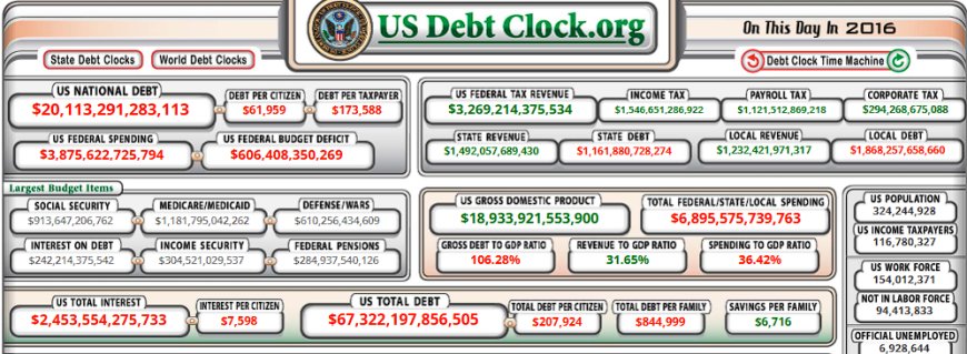
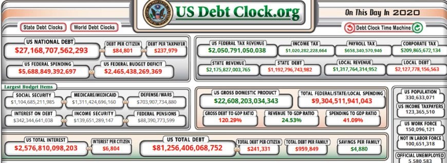
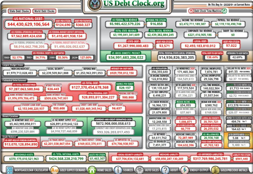
For each year, I pulled:
- US National Debt
- US Federal Spending (official)
- US Gross Domestic Product
- Total Federal / State / Local Spending
- Social Security outlays
- Medicare / Medicaid outlays
- Defense / war spending
I then computed three ratios:
- Debt-to-GDP (national debt ÷ GDP)
- Federal-spending-to-GDP (federal outlays ÷ GDP)
- Total-government-spending-to-GDP (federal+state+local ÷ GDP)
These are the same basic ratios you’ll find in FRED and CBO charts – federal debt as a share of GDP and government spending as a share of GDP. The Debt Clock just packs them into a more chaotic visual.
1990 → 2029: The nine snapshots
First, here’s the raw scoreboard for the big four numbers: national debt, federal spending, total government spending, and GDP. All figures below are rounded to the nearest billion.
| Year | US National Debt | US Federal Spending | Total Fed/State/Local Spending | US GDP | Debt / GDP | Fed Spending / GDP | Total Spending / GDP |
|---|---|---|---|---|---|---|---|
| 1990 | $3.16T | $1.24T | $2.07T | $5.38T | ≈59% | ≈23% | ≈38% |
| 2000 | $5.65T | $1.80T | $3.27T | $9.92T | ≈57% | ≈18% | ≈33% |
| 2004 | $7.52T | $2.28T | $4.12T | $11.60T | ≈65% | ≈20% | ≈35% |
| 2008 | $10.89T | $3.02T | $5.77T | $14.15T | ≈77% | ≈21% | ≈41% |
| 2012 | $15.87T | $3.55T | $6.15T | $15.48T | ≈103% | ≈23% | ≈40% |
| 2016 | $20.11T | $3.88T | $6.90T | $18.93T | ≈106% | ≈20% | ≈36% |
| 2020 | $27.17T | $5.69T | $9.30T | $22.61T | ≈120% | ≈25% | ≈41% |
| 2025 (now) | $38.20T | $7.03T | $12.27T | $31.58T | ≈121% | ≈22% | ≈39% |
| 2029 (proj.) | $44.43T | $7.56T | $14.94T | $34.99T | ≈127% | ≈22% | ≈43% |
Two things jump out immediately:
- The ratios move in ranges, not straight lines. Debt-to-GDP rises over time, but it rises in steps – spikes around the 2008 crisis, COVID, and post-COVID, then drifts sideways for a bit. You can see the same pattern in official FRED data for federal debt as a percentage of GDP.
- Government’s share of the economy has been big for a long time. In 1990, total government spending was already ~38% of GDP. Today we oscillate in the high-30s to low-40s. Trading Economics shows essentially the same picture: US government spending has averaged about 26% of GDP since 1900, and sits near 40% in the mid-2020s.
So if the “crisis line” was simply “government spends 40% of GDP”, we would’ve hit that a long time ago and never come back.
Entitlement and defense lines: what’s actually driving the outlays?
Now look at the big mandatory lines and defense:
- Social Security: ~$244B in 1990 → ~$1.60T in 2025 → projected ~$2.24T by 2029.
- Medicare/Medicaid: ~$146B in 1990 → ~$1.71T in 2025 → projected ~$1.98T by 2029.
- Defense: ~$300B in 1990 → ~$926B in 2025 → projected ~$1.25T by 2029.
This lines up with mainstream projections. The CBO has been very open that future deficits are driven mainly by Social Security, Medicare, and net interest, not some sudden explosion of random discretionary spending.
Put differently: we didn’t “suddenly” lose discipline. We intentionally built a system that:
- Pays retirees a defined benefit (Social Security)
- Medicalises aging (Medicare / Medicaid)
- Keeps a permanent global military footprint (defense budget)
Those three plus interest are the gravitational core of the federal budget. Everything else orbits around them.
Ratios, not raw numbers: the real signal
When you strip the noise out, the Debt Clock is basically screaming one simple truth: the system cares about whether GDP, cash flow, and collateral are big enough to support the leverage. Not whether a specific dollar number looks scary on Twitter.
Debt-to-GDP: from sub-60% to 120%+
In 1990, national debt sat just under 60% of GDP. By 2008 we’re in the high-70s. By 2012, post-GFC stimulus, we cross 100% of GDP. Today the Debt Clock has us in the low-120s, with CBO long-term projections showing public debt climbing toward 150%+ of GDP by the 2050s if nothing changes.
Does that mean we “break” at 130%, 150%, or 200%? History says no. Debt-to-GDP in Japan has been well over 200% for years without hyperinflation or default – because the relevant constraints are institutional, political, and collateral-based, not just arithmetic.
Government-spending-to-GDP: the band we live in
The spending ratios in those nine snapshots bounce around:
- 1990: ~38% of GDP
- 2000: ~33%
- 2008: ~41%
- 2012: ~40%
- 2016: ~36%
- 2020: ~41%
- 2025: ~39%
- 2029 projection: ~43%
That’s not a “runaway exponential” – it’s a band. Government’s share of the economy expands during crises, compresses a bit in normal times, and then ratchets up a level with each new structural program (Medicare expansion, wars, COVID, etc.).
FRED’s government-expenditure-to-GDP series shows the same long-wave pattern: higher during wars and deep recessions, plateauing afterwards.
So where exactly is the “cliff”?
If we were going to hit a hard numerical cliff, we should have seen it at one of the following:
- Crossing $1 trillion debt
- Crossing $10 trillion debt
- Crossing $20 trillion debt
- Crossing 100% debt-to-GDP post-GFC
- Crossing 120% debt-to-GDP after COVID
Instead, the system:
- Re-priced yields
- Altered Fed balance sheet size
- Introduced new liquidity facilities and regulations (Basel III, LCR, SRF, etc.)
- Shifted who holds the debt (public, foreign, Fed, money funds)
In other words: when the ratios stress the system, the architecture adapts. New rules, new facilities, new acronyms, new demand sources for Treasuries.
The US government as a leverage engine
Here’s the part that makes people really uncomfortable: as GDP expands, the US government – and the dollar system around it – is structurally encouraged to take on more debt, not less.
Debt as collateral, not just a bill
Treasuries are not just IOUs. They are:
- The base collateral of the global dollar system – repo markets, derivatives, money markets, bank HQLA, etc.
- The foundation of central bank balance sheets worldwide
- The benchmark “risk-free” curve that everything else prices off
- The main asset being tokenised in next-gen financial experiments – tokenised government bonds, on-chain repos, synthetic dollars
Every time the Treasury issues more debt, it’s not just “borrowing from our grandkids.” It’s also:
- Adding more collateral into the global plumbing
- Feeding more safe assets into banks, money funds, insurers, pensions
- Creating the raw material for future tokenised rails and CBDC back-end reserves
That doesn’t mean it’s free. But it does mean that the system has a built-in bias toward expansion.
Tax base and seigniorage: why GDP growth “authorizes” more leverage
Look back at 1990 vs 2025:
- GDP goes from roughly $5.4T → $31.6T – about a 6× increase.
- Federal spending goes from about $1.2T → $7.0T – about a 5–6× increase.
- National debt goes from ~$3.2T → $38.2T – about a 12× increase.
The government effectively “earns” the right to issue more debt in three ways:
- Direct taxation of a bigger nominal GDP. As incomes, profits, and spending grow in nominal terms, the same tax code throws off much larger dollar amounts.
- Inflation drift. A 2–3% target inflation rate slowly erodes the real value of old debt, making higher nominal levels sustainable over time.
- Seigniorage and financial repression. The state can shape the term structure of interest rates and force large pools of savings (banks, pensions, insurers) into government paper.
Put bluntly: the bigger the US economy gets in nominal terms, the more debt the system can carry without breaking. That’s exactly what the Debt Clock snapshots show.
Student loans, entitlements, and “assets” on the federal balance sheet
One of the least-understood parts of this machine is how federal “assets” and promises interact. Student loans are a clean example.
Student loans as revenue-linked assets
When a student takes out a federal loan, from the government’s perspective that is an interest-bearing asset. It’s cash out today in exchange for a future stream of payments. That asset:
- Sits on the government’s books as something with expected cash flow
- Can be securitised and used as collateral elsewhere in the system
- Supports higher levels of aggregate consumption and tuition spending
That doesn’t mean the program is “profitable” or well designed. It just means that the same government that shows you a giant red debt number on the Debt Clock also has substantial offsetting assets and tax claims in the background.
And when you zoom out, student debt is simply one more mechanism that enables the state to:
- Boost near-term GDP (through education and consumption spending)
- Increase the long-term tax base (higher lifetime earnings of degree holders)
- Justify a higher sustainable level of federal debt and spending
Entitlements as “soft collateral”
Social Security and Medicare are technically liabilities, not assets. But they also function as a form of political collateral: the promise that keeps the entire system socially stable.
Politicians can cut discretionary spending. They can trim some tax credits. What they cannot easily touch are the benefits that tens of millions of older voters are actively living on. Which means:
- The political system is locked into paying those lines first
- Everything else – tax code, interest rates, Fed facilities – gets configured around that
- Debt expansion becomes the quiet way to square the circle
CBO’s long-term analyses explicitly show that Social Security, Medicare, and net interest are what drive debt up as a share of GDP over the next 30 years.
Once you understand that, the Debt Clock stops looking like an accident and starts looking like the inevitable accounting outcome of politically locked-in promises.
CBDCs, tokenised Treasuries, and why the system is preparing for even more leverage
Now we connect this to the part almost nobody talks about when they panic over the Debt Clock: the digital rails being built underneath it.
Central banks are quietly standardising CBDC frameworks
According to the BIS, about 94% of surveyed central banks are exploring some form of CBDC, with a sharp rise in wholesale CBDC pilots that plug directly into existing financial market infrastructure. The IMF and OECD have both put out papers on CBDC design, governance, and even democratic constraints.
What matters here is not whether your grandma gets a “Fed Wallet” next year. What matters is that the next generation of dollar infrastructure is being designed around programmable, real-time settlement of claims that ultimately rest on government collateral.
Tokenised Treasuries as the new core collateral
The BIS has been blunt about where this is going: tokenised government bonds are expected to become the cornerstone of future financial market infrastructure – enhancing liquidity, collateral mobilisation, and supporting monetary policy operations in a more automated way.
Translate that into plain English: the system is building rails where every Treasury, every repo, every margin call, every liquidity backstop can be executed in real time on digital infrastructure.
Once those rails are live, the constraint on how much debt you can issue shifts even more away from “do we hit $40T or $50T” and toward:
- Is there enough global demand for dollar collateral?
- Can the Fed and Treasury keep yields inside an acceptable band?
- Can the system continue to roll and rehypothecate that collateral safely?
In that world, a CBDC isn’t just “digital cash.” It’s the front-end user interface for an enormous machine of tokenised Treasuries, automated repos, and dynamic collateral management.
And if that sounds far-fetched, look at the existing infrastructure: we already have a deep repo market, standing repo facilities, central clearing for Treasuries being rolled out, and new Basel rules around liquidity buffers. Tokenisation and CBDCs are just the obvious next step in that direction.
I go deeper into this in my other pieces: Dollar’s Last Stand: Liquidity, Collateral, and the AI Industrial Cycle and The Tokenized Reserve Era .
Answering the doom arguments
Let’s address the three big objections that always come up whenever you say “there is no magic cliff at $40 trillion.”
Objection 1: “But interest will eat the whole budget!”
It’s true that net interest is one of the fastest-growing line items on the Debt Clock. The CBO notes the same thing: as rates rise and debt stock increases, interest spending can rival or exceed defense.
But what gets missed is how rate policy is not exogenous. The Fed and Treasury are not helpless spectators here. They have options:
- Yield-curve control or soft versions of it (buybacks, twist-style operations)
- Forcing more demand into long-dated Treasuries through regulation and incentives
- Running policy that keeps average funding costs lower than nominal GDP growth
That’s basically how you manage a high-debt system: keep nominal GDP growth above the effective interest rate on the debt and let time do part of the work.
Objection 2: “But we’ll lose reserve currency status!”
People love to imagine a sudden flip where the world drops the dollar because the debt number looks big. In reality, reserve status is about:
- Depth and liquidity of your government bond market
- Rule of law and property rights (relatively speaking)
- Military power and geopolitical reach
- Network effects in trade, commodities, and finance
The whole CBDC + tokenisation trend is actually doubling down on dollar rails, not replacing them. Most global central banks exploring wholesale CBDCs are designing them to operate in a world where dollar collateral and FX settlement remain central.
Could that change someday? Sure. But you don’t overthrow a system built on $30–40T of deeply liquid Treasuries with a few bilateral swap lines.
Objection 3: “But the math says we’re insolvent!”
This is where people confuse household finance with sovereign monetary systems. The US is not a household:
- It issues the currency its debt is denominated in.
- It controls the central bank that can always make a market in that debt.
- It taxes the largest economy on Earth in that same currency.
That doesn’t mean there’s no constraint. The constraint shows up as:
- Inflation that is politically intolerable
- Currency devaluation that is geopolitically destabilising
- Loss of internal political cohesion if the distribution looks unfair
None of those constraints are located at a specific debt number. They’re located at the intersection of politics, inflation, and collateral demand.
Key takeaways for the next decade
Pulling all of this together, here’s what the nine Debt Clock snapshots, plus the broader macro plumbing, are actually telling us.
- The US has been a 35–40% government-of-GDP economy for decades.
1990 already had government spending near 38% of GDP. Today we’re hovering around 40%, and projections into 2029 are in the low-40s. That’s not a shocking new regime; it’s the continuation of a long-running pattern. - Debt-to-GDP moved from <60% to ~120%, but in discrete steps.
The sharp moves coincide with crises and policy shifts – 2008, 2012, 2020 – not arbitrary round numbers. Each step triggered institutional changes (Basel rules, QE, repo facilities) that made the new level workable. - The true drivers of “unsustainable” paths are entitlements and interest, not line-item waste.
Social Security, Medicare/Medicaid, and net interest are the core growth engines of the federal budget. That’s CBO’s view, and it’s exactly what the Debt Clock’s biggest line items show. - Student loans and other federal credit programs are part of the leverage loop.
They create assets on the federal side, support higher GDP and tax bases, and provide more justification for higher levels of leverage – even if the programs are messy and politically controversial. - CBDCs and tokenised Treasuries are being built to operate on top of this, not in spite of it.
Almost every major central bank is exploring CBDCs. BIS and others are openly pushing tokenised government bonds as core collateral in the next-gen monetary system. That is not what you do if you expect sovereign debt markets to implode at a magic number. - If there is a “cliff,” it’s not at $40T or $50T – it’s at the point where collateral demand, political cohesion, and inflation tolerance break down together.
That’s a dynamic, path-dependent threshold, not a single integer on the Debt Clock.
None of this means “debt doesn’t matter.” It absolutely does. It shapes who gets paid, who owns the collateral, and whose claims get protected when things wobble. But it does mean that the debate needs to move away from pointing at the raw number and screaming, and toward understanding:
- Who holds the debt?
- How is it funded and rolled?
- What rails is it settling on?
- How do CBDCs and tokenisation change the plumbing?
- And how does all of this feed back into real-world wages, housing, and opportunity?
That’s what I’m trying to map out piece by piece across Pattern Nexus. If you want the bigger macro framework this fits into, start here: The AI Industrial Flywheel and the New Liquidity Cycle and QE 2026 and the Next Liquidity Wave .
Further Reading: The System Behind the Numbers
If you want to go deeper into how debt, liquidity, and digital rails fit together, here are the core Pattern Nexus pieces that connect this Debt Clock walk-through to the broader macro operating system:
- The Tokenized Reserve Era: AI Industrial Dominance and the New Operating System of the World Economy – Why the next phase of USD dominance runs through tokenized Treasuries, AI infrastructure, and collateral liquidity rather than paper debt ceilings.
- Digital Sovereignty and the Global Race for Central-Bank Digital Currencies – How CBDCs become the UI layer over the same debt engine you just saw in the Debt Clock.
- The Dollar Isn’t Collapsing – It’s Evolving – The structural reasons the dollar survives higher debt loads and why “collapse math” keeps being wrong.
- Can You Print Money? How Money Creation Really Works – A clear breakdown of how government debt, bank credit, and central-bank balance sheets actually interact.
- The Reverse Repo Trap: How the Fed Controls Liquidity – The plumbing that lets the Fed stretch the same debt stock over multiple cycles without losing control.
- Fed Repo Surge: Liquidity Signals, November 2025 – Real-time evidence of how the system reacts when collateral or funding gets tight.
- QT Is Over: The System Just Crossed Its Reserve Floor – Why there’s always a practical limit to tightening, and how that feeds the next debt and GDP expansion.
- The Calm Before the Liquidity Storm – QE 2026 – A roadmap for how the next liquidity wave likely unfolds once the current debt “scare” passes.
- IMF Warns Global Debt to Exceed 100% of GDP by 2029 – How the global numbers line up with the projections you just saw on the US Debt Clock.
- AI Industrial Flywheel – The link between deficit spending, AI-power infrastructure, and why the “ceiling” on US debt keeps moving higher.
Together, these pieces show why there was no cliff at $10T, $20T, or $30T – and why the real story is how quickly we adapt the rails (CBDCs, tokenized collateral, AI-driven productivity) to keep the system stable while those numbers climb.
Sources & further reading
- Federal Debt: Total Public Debt as Percent of Gross Domestic Product (FRED)
- Government Current Expenditures / GDP (FRED)
- CBO – The Long-Term Budget Outlook (2024)
- Trading Economics – United States Government Spending to GDP
- BIS – Results of the 2023 BIS survey on central bank digital currencies
- BIS – The Next-Generation Monetary and Financial System (tokenised government bonds)
- IMF – CBDC Policy and Design Papers
- BIS – Liquidity Requirements, Basel III, and Treasury Market Structure
آپ کا ردعمل کیا ہے؟
 پسند کریں
0
پسند کریں
0
 نہ پسند
0
نہ پسند
0
 محبت
0
محبت
0
 مزاحیہ
0
مزاحیہ
0
 واہ
0
واہ
0
 اداس
0
اداس
0
 غصہ
0
غصہ
0

Founder of Pattern Nexus. I research markets, macro, geopolitics, AI, history, ancient systems, and the patterns most people overlook. I’m also building Market Radar, a trading scanner designed to read pressure, risk, confirmation, and setup quality before chasing a move. Pattern Nexus is where I connect the dots between data, history, technology, and the bigger system playing out around us.



















تبصرے (0)