
The 10-Year Isn’t Misbehaving — It’s Warning the System Is Out of Liquidity
The U.S. 10-year yield is rising into rate cuts — not because the market is irrational, but because the financial system is operating on the liquidity floor. This article explains how regional bank failures, QT exhaustion, and the September 18, 2024 rate-cut pivot created the wedge pattern now signaling the next major regime shift.
Introduction: The Chart That Changes the Narrative
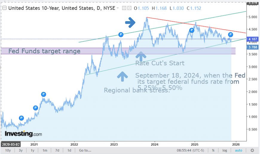
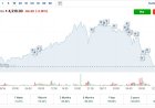
The updated 10-year chart reveals a truth most of the market refuses to acknowledge: the bond market is not confused, irrational, or mispriced. It is tracking the exact liquidity stress points that have defined this entire cycle. When you anchor the chart to real structural events—the March 2023 regional bank failures and the September 18, 2024 start of rate cuts—the pattern stops looking chaotic and starts looking predictable.
What looks like disorder is actually the long end behaving perfectly within the liquidity regime framework. The rising lower trendline, the compressing wedge, and the refusal of yields to fall despite rate cuts all align with a system that is operating on extremely thin collateral footing.
The Two Anchors: Bank Stress and Rate Cuts
The new chart highlights two major anchors:
1. Regional bank stress (March 2023)
The collapses of Silicon Valley Bank and Signature Bank marked the first liquidity rupture in this entire cycle. The move that followed on the 10-year was not about inflation. It was about the sudden recognition of systemic balance-sheet fragility and collateral instability.
2. Rate cuts beginning September 18, 2024
This is the key. The annotated line on our chart marking the start of cuts reframes everything. Once the Federal Reserve lowered the federal funds target from 5.25%–5.50% to 4.75%–5.00%, the system officially shifted into the “reactive phase.” In a healthy system, that would make yields fall. But a system on the liquidity floor does the opposite: the long end rises as the market anticipates stress, not relief.
The Wedge Is Not Technical — It’s Liquidity
The wedge pattern on the chart is not a technical artifact. It is a map of two opposing forces:
• Rising support line: the structural collateral tightness that increases long-end fragility over time.
• Descending resistance line: the artificial compression of duration volatility as policymakers try to “smooth” the system while QT continues to drain reserves.
The annotated areas in our new chart illustrate this beautifully. The push toward the apex of the wedge represents the system running out of road—QT on one side, rising Treasury supply on the other, and bank balance sheets incapable of absorbing duration.
Why the 10-Year Rose After Cuts Began
This is the part that confuses most people. The new chart annotation makes the timeline unimpeachable: yields did not fall after September 18, 2024. They rose. But that is exactly what a system at the liquidity floor does.
Rate cuts at the floor are not stimulative. They are defensive. They are a response to scarcity, not easing. When the Fed cuts into a thin reserve system, the long end interprets the move as confirmation that stress is present. Bills outperform, coupons underperform, and the 10-year drifts higher as the market waits for real liquidity relief—relief that has not arrived yet.
Fed Funds Target Zone vs. Long-End Disorder
The chart shows the Fed Funds “target zone” visually underneath the 10-year range. This is a critical illustration. The gap between where policy is and where the long end is trading represents the liquidity distortion. The more that gap widens, the more disorder the system is pricing in.
The long end is not ignoring policy. It is front-running the consequences of policy choices that have not yet delivered the collateral relief the market requires.
QT Ending and Collateral Rotation
QT ending is treated like an easing event by mainstream commentators, but the chart proves otherwise. The market knows that the switch from QT to “bill replacement” is not a liquidity injection. It is a collateral rotation. MBS continues to roll off, Treasury supply remains huge, and bills absorb near-term demand while coupons remain under stress.
In that environment, the 10-year does exactly what the chart shows: it drifts upward into the wedge apex, waiting for the eventual break.
The Coming Break: Disorder First, Collapse Second
The annotated chart’s trajectory into early 2026 aligns with the next structural event. The long end is not preparing for a soft landing. It is preparing for a disorder event—a funding disruption, collateral shortage, or balance sheet rupture that forces the Fed to step beyond cosmetic measures and into real liquidity injections.
Once that happens, the wedge breaks downward. Yields fall hard. QE-2026 begins. And the system transitions into the next monetary regime, one shaped by digital collateral rails, tokenized Treasuries, and a renewed demand for reserve assets.
The rise of the 10-year into cuts is not an error. It is the warning signal.
Sources
Hvad er din reaktion?
 Synes godt om
0
Synes godt om
0
 Dislike
0
Dislike
0
 Kærlighed
0
Kærlighed
0
 Sjov
0
Sjov
0
 Wow
0
Wow
0
 Trist
0
Trist
0
 Vred
0
Vred
0

Founder of Pattern Nexus. I research markets, macro, geopolitics, AI, history, ancient systems, and the patterns most people overlook. I’m also building Market Radar, a trading scanner designed to read pressure, risk, confirmation, and setup quality before chasing a move. Pattern Nexus is where I connect the dots between data, history, technology, and the bigger system playing out around us.













Kommentarer (0)