
Everything Bubble 3 — Markets Priced in Gold Reveal the Structural Melt-Up Ahead
Pricing markets in gold exposes the hidden structure behind today’s economy: emotional behavior, fiat distortion, global liquidity, and why Everything Bubble 3 is now inevitable.
Everything Bubble 3 — The Melt-Up No One Understands (Because They’re Measuring With the Wrong Ruler)
In dollars, markets look euphoric. In earnings, they look reasonable. In gold, they look undervalued. This shift in measurement reveals the true architecture of the world economy — and why the next melt-up is structural, not speculative.
People Feel the Market Before They Understand It
Humans react emotionally long before they think analytically. That’s why most investors see a “bubble” today but can’t explain the underlying structure. Bubbles aren’t defined by emotions — they’re defined by architecture. And once you study the structure, the entire picture shifts.
For the structural lens, start with the end of the bond supercycle and how post-2008 policy created a new baseline of intervention and collateral demand.
Unified Cross-Asset Table — Priced in Gold
This table presents major currencies, digital tokens, bonds, equities, and commodities priced in gold (grams or milligrams), along with week-over-week, monthly, yearly, and 5-year changes. This removes fiat distortion and exposes real value movement. For background on why gold front-runs liquidity, see Gold Front-Runs Liquidity (Again) and the gold vs. real yields dynamic.
| Asset | Price in Gold | Week Ago | Month Ago | Year Ago | 5 Years Ago |
|---|---|---|---|---|---|
| Currencies | |||||
| USD | 7.8 mg | 2.3% | -3.5% | -31.8% | -53.1% |
| CAD | 5.5 mg | 2.4% | -3.9% | -32.1% | -55.3% |
| EUR | 8.9 mg | 1.5% | -5.3% | -27.7% | -53.6% |
| JPY | 0.050 mg | 1.5% | -7.2% | -32.6% | -69.8% |
| CNY | 1.09 mg | 2.3% | -5.0% | -30.8% | -56.8% |
| Digital Tokens | |||||
| Bitcoin (BTC) | 849.59 g | 1.0% | -10.8% | 6.3% | 273.0% |
| Ethereum (ETH) | 29.83 g | 0.1% | -14.5% | 4.3% | 371.5% |
| Crypto Index (CCi30) | 5,531.67 g | 0.5% | -17.0% | -7.0% | 92.6% |
| Bonds | |||||
| US 1-3 Yr (SHY) | 0.64 g | 2.2% | -3.3% | -29.6% | -50.9% |
| US 20+ Yr (TLT) | 0.70 g | 1.0% | -2.4% | -31.9% | -70.8% |
| Equities | |||||
| DJIA | 368.78 g | 3.1% | -1.1% | -22.4% | -15.8% |
| S&P 500 | 53.04 g | 3.0% | -1.6% | -18.3% | -9.1% |
| Nikkei 225 | 2.64 g | 7.9% | 9.2% | -9.6% | -27.3% |
| Euro STOXX (FEZ) | 0.484 g | 1.5% | -4.1% | -15.3% | -12.7% |
| HUI (Gold Miners) | 4.50 g | 0.7% | -9.7% | 23.3% | -13.4% |
| Commodities | |||||
| Crude Oil | 0.473 g/bbl | 1.5% | -4.7% | -40.0% | -20.1% |
| Platinum | 12.32 g/oz | 1.2% | -2.5% | 8.8% | -12.5% |
| Palladium | 11.36 g/oz | 4.1% | 13.1% | 11.2% | -9.6% |
| Silver | 0.380 g/oz | 4.4% | 0.0% | -0.7% | -2.8% |
| Copper | 39.3 mg/lb | 1.8% | 1.2% | 0.0% | -22.0% |
| Coffee | 30.4 mg/lb | -0.5% | -1.4% | 8.7% | 76.2% |
| Cotton | 5.08 mg/lb | 4.5% | 0.2% | -35.8% | -55.4% |
Method (30-sec read): Quotes are converted to grams of gold (g) or milligrams (mg) using spot XAU as the denominator. For commodities, we keep native units (e.g., g per barrel for oil). Percentage changes are computed on the same gold basis across time. Source: pricedingold (reconstructed) + PN calc.
Legend: g = gram, mg = milligram (1 g = 1,000 mg). Commodity units preserve their native contract size (e.g., g per barrel for oil).
Markets Are Emotional Machines — Because We Are
My view is simple: markets behave emotionally because humans behave emotionally. And the algorithms we design replicate those same emotional biases — fear, greed, hesitation, FOMO, momentum chasing, flight-to-safety.
Most people only think about today or this week. They don’t see long-term structural trends. This is why short-term noise dominates the news cycle, while long-term liquidity cycles dominate history. For an example of liquidity signaling ahead of narrative, see the repo surge note.
Margin Debt Isn’t a Fed Indicator — It’s a Human Indicator
Someone sent me a margin-debt chart and asked whether it tracks QE or the Federal Reserve’s balance sheet. I compared it against every dataset that should matter — QE/QT cycles, balance sheet levels, Fed Funds, repo operations, reverse repo drains, TGA swings, even liquidity-adjusted risk windows.
The result is unambiguous: margin debt does not track the Fed.
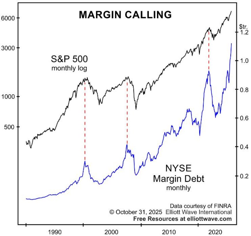
The correlation with QE/QT is effectively zero. In some years it even moves opposite Fed policy. What it does track is human behavior — specifically:
- euphoria
- risk appetite
- market momentum
- the expansion and contraction of collateral
- forced liquidation cycles
The Actual Chain of Causality (the part most analysts get wrong)
Most people assume:
But the real world works like this:
Margin debt is not reacting to monetary policy. It's reacting to prices, which are reacting to liquidity. The middle step is the driver — and virtually everyone misses it.
Margin Debt Peaks Because People Feel Invincible at the Top
Every major margin-debt peak happened at the same psychological moment:
- investors believe the trend will never end
- volatility has compressed
- returns look “guaranteed”
- brokers loosen collateral standards
- speculators lever up to chase what looks like free upside
Then reality hits. Prices drop. Collateral shrinks. Margin calls cascade. Leverage collapses violently—and only then does the chart make sense to people.
Why the QE/QT Connection Is an Illusion
Look at the history:
- QE ended (2014) → margin debt kept rising for 3 more years
- QT began (2017–2018) → margin debt rose throughout 2017, collapsed only when markets fell
- QE ended (2021) → margin debt hit all-time highs months later
- QT restarted (2023–2025) → margin debt is rising again anyway
The Fed influences the environment, but margin debt is a crowd-psychology indicator. Nothing more. Nothing less.
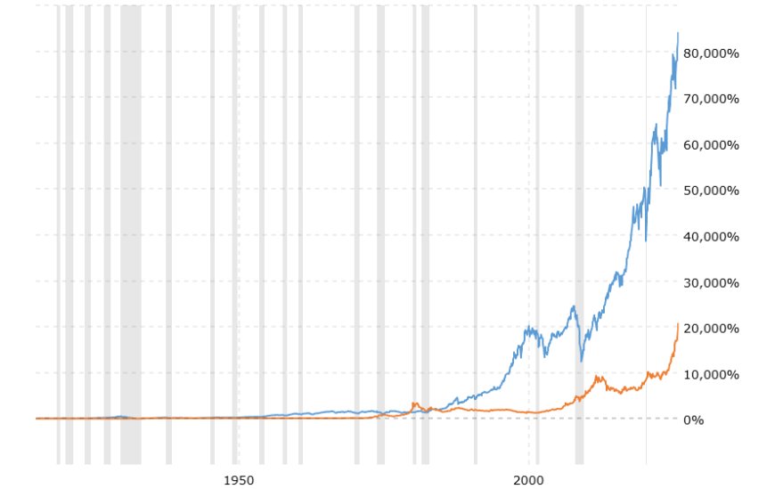
“If the Fed Prints With Margin Debt at All-Time Highs… Then What?”
Here’s the correct framework:
- If the Fed restarts QE at the top: it stretches the top, accelerates the melt-up, pushes markets parabolic.
- If QE hits during a crash: it accelerates the rebound; margin debt ramps again once prices stabilize.
- If QE hits during slowing momentum: it reignites the uptrend; investors lever up again.
Margin debt does not limit how high markets can go. It simply reflects how aggressively people respond to price trends.
Margin Debt in One Sentence
Bottom Line
Margin debt is not a signal of Fed policy, liquidity operations, QE/QT cycles, or monetary theory. It is a pure behavioral artifact of investor psychology.
It rises because people feel safe.
It collapses because people panic.
And it returns the moment collateral recovers.
The Two Deaths That Changed Everything: 2001 and 2008
There are three eras, and people constantly confuse them:
Pre-2001: Domestic credit cycles, limited global liquidity, traditional interest-rate dynamics.
2001–2008: Globalization explosion, eurodollar growth, complex collateral chains. The fuse is lit.
Post-2008: The old monetary system dies. A new system emerges — permanent liquidity, permanent intervention, and a global reliance on U.S. collateral.
We no longer live in a rate-driven economy. We live in a liquidity-driven operating system. See The Silent War Chest, Reverse Repo Trap, and the policy path outlined in QE 2026.
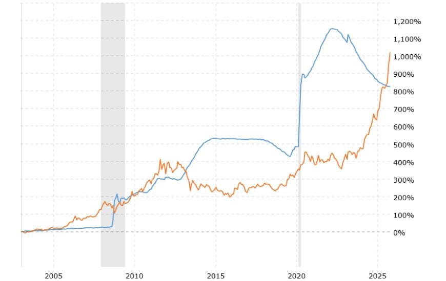
The Global Debt Trap: Why the System Must Expand
The global system cannot shrink.
Contraction = collapse.
Expansion = survival.
When sovereign debt surpasses real output capacity, there are only three options: inflate it, refinance it, or collapse.
This is why the Fed cannot normalize, why QT is temporary, and why liquidity injections always return. See QT Is Over — Reserve Floor and Treasury’s Line in the Sand.
The system doesn't inflate bubbles — the system requires expansion to avoid collapse.
The Dollar Is a Rubber Band, Not a Measuring Stick
Pricing assets in dollars — a fiat unit engineered to stretch — creates the illusion of “bubbles.” Dollars expand. Dollars absorb global liquidity. Dollars devalue quietly.
Measuring value in dollars is like measuring distance with a rubber band. For the strategic shift from “store of value” to “system utility,” read The Dollar Isn’t Collapsing — It’s Evolving and The Dollar’s Last Stand.
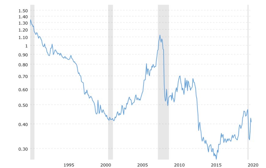
Gold Is the Reality — Fiat Is the Illusion
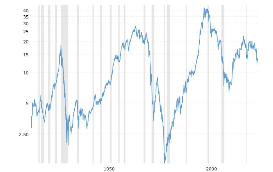
Some argue gold is too volatile to be a ruler. That volatility is not noise — it reflects shifts in real yields, collateral stress, and global liquidity. Gold moves because the system moves; the ruler is revealing the architecture.
When you price the world in gold, a stable reference point, the entire narrative reverses.
- Housing becomes undervalued — context in The Lock-In Economy and the Great Housing Plateau.
- Stocks become undervalued — particularly under fiscal dominance and falling real yields (gold vs. 10-year).
- Currencies collapse relative to gold — see Yen Carry Unwind.
- Commodities normalize — while AI-driven capex lifts long-cycle inputs (AI Industrial Flywheel).
This doesn’t mean every asset is cheap. It means the system is cheap in gold terms. Under the surface, dispersion is extreme: AI infrastructure, energy, and defense rerate higher, while legacy consumption sectors lag. The ruler exposes the regime shift.
The “everything bubble” disappears. What remains is long-term equilibrium driven by productivity, not money printing. Also see Gold, CBDCs & the Digital Return.
Everything Bubble 3 — Bigger Than Everything Bubble 2 (Because It Has to Be)
- Policy pivots → real yields trend lower → duration & equities re-rate.
- RRP/TGA plumbing → reserves rise → bank balance-sheet capacity improves.
- FX stress ex-US → safe-asset demand → USD collateral bid → US risk premia compress.
Everything Bubble 1 (1995-2001): Tech + leverage.
Everything Bubble 2 (2008–2022): Zero rates + QE + global liquidity.
Everything Bubble 3 (2026–2030): Debt trap + collateral hunger + global capital flowing into the U.S.
Demographics amplify this: aging societies, shrinking workforces, and rising dependency ratios force governments toward permanent liquidity to avoid contraction.
Everything Bubble 3 isn’t actually a bubble — it’s the system fulfilling its structural requirements.
If the Fed prints openly or stealthily — or global instability forces capital into U.S. assets — the melt-up will accelerate. See the market-implied path in Fed Cuts Then Holds and the earlier framework in Calm Before the Liquidity Storm.
This isn’t irrational exuberance. It’s the only path available within the current regime. For the broader geopolitical plumbing shaping flows, see Systemic Realignment and the Master Brief.
Unified Cross-Asset Table — Priced in Gold
When you strip out fiat distortion and price assets in gold, the illusion of overvaluation disappears.
Here’s the unified cross-asset table (modernized for PN readability):
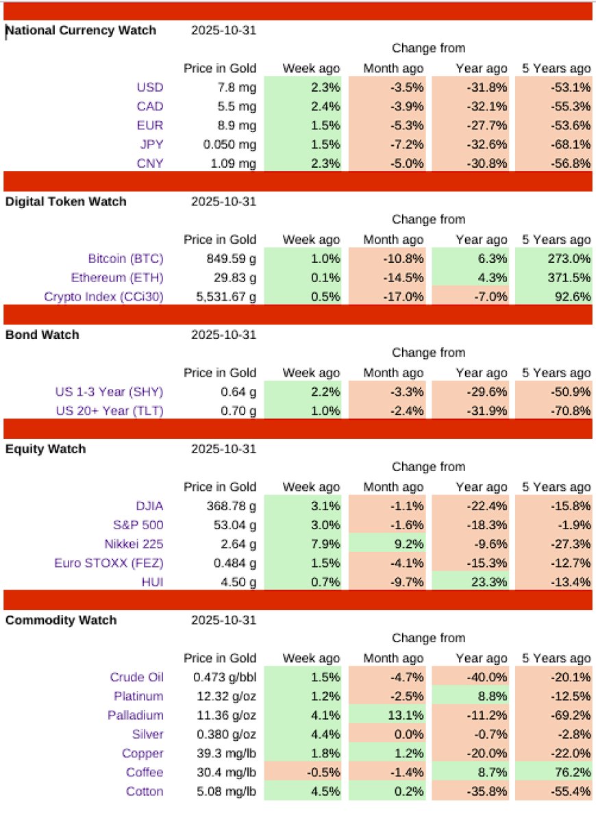
Source: Data derived and reconstructed from pricedingold.com.
We are entering the first cycle where the measurement error becomes visible in real time — a liquidity-driven regime colliding with an obsolete dollar-based lens.
Quick FAQ
- Is this gold evangelism? No—it's a measurement audit. Changing the ruler reveals structure.
- What if gold falls? Then collateral stress eased or real yields rose; the lens explains the shift.
- What’s the investable takeaway? Liquidity & collateral regimes drive re-ratings more than nominal rates alone.
Could delay/derail
- Sticky core inflation keeps real yields elevated
- Fiscal shock re-prices term premium
- Collateral scarcity persists post-QT
Could accelerate
- Front-loaded cuts + QE-lite (terming bills)
- Rapid RRP drain + TGA spend
- FX accidents overseas → USD asset stampede
The Truth: It Was Never a Bubble. It Was a Measurement Error.
The world priced in dollars is distorted. The world priced in gold is clear.
Markets aren’t irrational — they’re emotional. Liquidity isn’t stimulus — it’s survival. The next melt-up isn’t speculative — it’s structural.
Everything Bubble 3 is coming. It will be bigger, faster, and stranger than anything before it. And in gold terms, it will look perfectly normal.
What's Your Reaction?
 Like
0
Like
0
 Dislike
0
Dislike
0
 Love
0
Love
0
 Funny
0
Funny
0
 Wow
1
Wow
1
 Sad
0
Sad
0
 Angry
0
Angry
0

Founder of Pattern Nexus. I research markets, macro, geopolitics, AI, history, ancient systems, and the patterns most people overlook. I’m also building Market Radar, a trading scanner designed to read pressure, risk, confirmation, and setup quality before chasing a move. Pattern Nexus is where I connect the dots between data, history, technology, and the bigger system playing out around us.















Comments (1)