
Every President Is Inflationary: The Inflation Chart Both Parties Do Not Want to Read
A Pattern Nexus breakdown of U.S. inflation by presidential term from Nixon to today, showing why the argument over which party “caused inflation” misses the deeper system. Every modern president has governed inside an inflationary debt-based dollar structure. Some periods were worse than others, but the larger pattern is not partisan. It is monetary, fiscal, energy-driven, debt-driven, and structural.
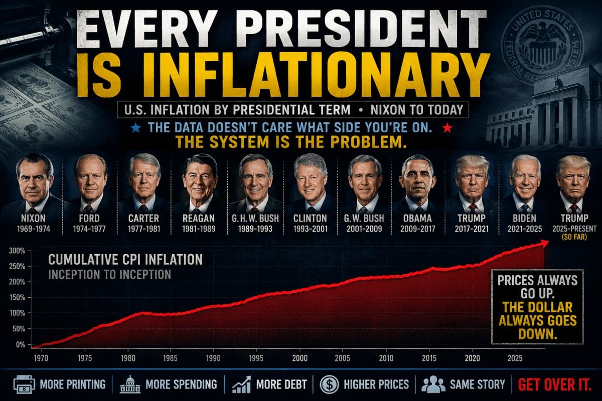
Every President Is Inflationary
The inflation chart both parties do not want to read.
Quick Read
I do not care what political side anyone is on. The inflation chart says the same thing either way: every modern president has governed inside an inflationary system.
Some terms were worse. Some were calmer. Some inherited supply shocks, energy shocks, war shocks, credit shocks, monetary tightening, fiscal excess, or structural policy mistakes. But none of them governed a truly non-inflationary economy.
That is the part people keep missing. Inflation is not just a partisan scoreboard. It is a structural feature of the modern debt-based dollar system.
The public gets told to argue over which president caused inflation. The deeper system keeps expanding underneath both parties.
The Point Is Not “My Side Good, Your Side Bad”
The dumbest version of the inflation debate is the partisan one.
One side wants to say inflation was all Biden. The other side wants to say inflation was all Trump. Someone else blames Reagan, Carter, Nixon, Obama, Bush, or whatever name fits the argument they already wanted to have.
That is not analysis. That is political mascot thinking.
The real pattern is much bigger than one president. The United States runs a debt-based monetary and fiscal system where credit expands, government spending expands, asset prices expand, deficits roll forward, and the cost of living slowly ratchets higher across time.
Presidents matter, but they do not sit alone at the control panel. The Federal Reserve controls monetary policy under a mandate tied to maximum employment and stable prices. Congress controls spending and taxation. Treasury finances the debt. Energy markets set the physical cost of movement and production. Global supply chains determine how much cheap foreign production can still suppress domestic prices. Wars, sanctions, tariffs, credit conditions, labor costs, commodities, housing, insurance, and foreign demand all feed into the same inflation machine. [1]
That is why this chart matters. It pulls people out of the emotional argument and forces them to look at the structure.
The Inflation Scoreboard Since Nixon
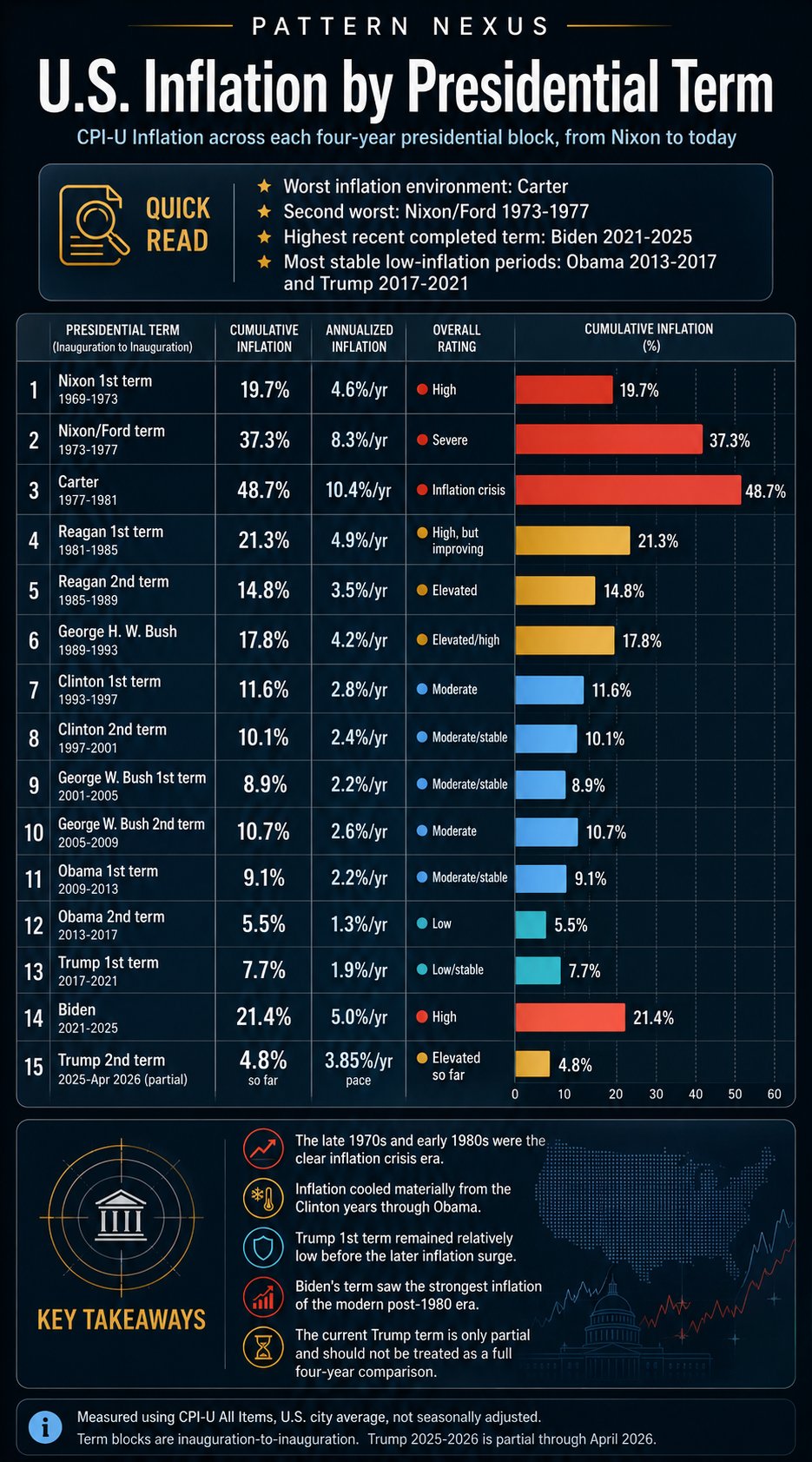
The table below uses CPI-U All Items, U.S. city average, not seasonally adjusted. The term blocks are measured inauguration-to-inauguration where possible. The current Trump term is partial through April 2026 because the full four-year block does not exist yet. The CPI source series is the Bureau of Labor Statistics CPI-U series, also published through FRED as CPIAUCNS. [2]
Formula used: cumulative inflation equals CPI at the end of the term divided by CPI at the start of the term, minus one. Annualized inflation is the implied yearly rate across the full block.
| Presidential Block | Cumulative Inflation | Annualized Inflation | Rating |
|---|---|---|---|
| Nixon 1st term, 1969–1973 | 19.7% | 4.6%/yr | High |
| Nixon/Ford term, 1973–1977 | 37.3% | 8.3%/yr | Severe |
| Carter, 1977–1981 | 48.7% | 10.4%/yr | Inflation crisis |
| Reagan 1st term, 1981–1985 | 21.3% | 4.9%/yr | High, but improving |
| Reagan 2nd term, 1985–1989 | 14.8% | 3.5%/yr | Elevated |
| George H. W. Bush, 1989–1993 | 17.8% | 4.2%/yr | Elevated/high |
| Clinton 1st term, 1993–1997 | 11.6% | 2.8%/yr | Moderate |
| Clinton 2nd term, 1997–2001 | 10.1% | 2.4%/yr | Moderate/stable |
| George W. Bush 1st term, 2001–2005 | 8.9% | 2.2%/yr | Moderate/stable |
| George W. Bush 2nd term, 2005–2009 | 10.7% | 2.6%/yr | Moderate |
| Obama 1st term, 2009–2013 | 9.1% | 2.2%/yr | Moderate/stable |
| Obama 2nd term, 2013–2017 | 5.5% | 1.3%/yr | Low |
| Trump 1st term, 2017–2021 | 7.7% | 1.9%/yr | Low/stable |
| Biden, 2021–2025 | 21.4% | 5.0%/yr | High |
| Trump 2nd term, 2025–April 2026 partial | 4.8% so far | 3.85%/yr pace | Elevated so far |
What the Chart Actually Shows
The worst inflation environment on this chart is Carter. That does not mean Carter personally created every force that produced the inflation crisis. It means his term sat inside the worst inflation block of the modern presidential sequence.
The second-worst block is the Nixon/Ford term from 1973 to 1977. That period followed the Nixon shock, the end of dollar convertibility to gold, wage and price controls, oil shocks, currency instability, and the broader breakdown of the old postwar monetary order. The Federal Reserve’s own history describes Nixon’s 1971 move as ending dollar convertibility to gold and helping bring the Bretton Woods system to an end. [3]
Reagan’s first term still had high inflation when measured cumulatively, but it also sat inside the disinflation transition after the Volcker shock. The early 1980s were not a clean low-inflation period. They were the painful period where inflation was being crushed through extremely restrictive monetary policy. Federal Reserve history describes Paul Volcker’s 1979 anti-inflation measures as an effort to rein in inflation that had afflicted the U.S. economy for years. [4]
The Clinton through Obama period was the most stable low-to-moderate inflation era in the chart. That period was not magic. It was globalization, cheap imports, labor arbitrage, post-Cold War integration, lower commodity pressure, financialization, and a world where U.S. consumers benefited from foreign production capacity.
Trump’s first term was low inflation on paper. Biden’s term was the strongest completed inflation block of the modern post-1980 era. The current Trump term is partial, and as of April 2026 the latest official CPI reading showed 3.8% year-over-year inflation, with the CPI-U all-items index at 333.020 in April 2026. [5]
That does not make the current term comparable to a full four-year block yet. It means the early pace is elevated and should be tracked, not politically spun.
The President Is the Logo, Not the Whole Machine
This is the part people do not want to hear.
The president is the visible logo on the economy. The president gets the blame when the price of groceries goes up. The president gets the credit when the market rallies. The president gets turned into the face of whatever the system is doing at that moment.
But the president is not the whole machine.
The machine is bigger. It includes the Federal Reserve, Congress, Treasury, banks, bond markets, energy markets, global shipping, insurance markets, labor markets, corporate pricing power, military spending, tax policy, entitlement spending, emergency stimulus, and foreign demand for dollars and Treasuries.
That does not mean presidents are innocent. It means the public argument is usually too small.
A president can throw gasoline on inflation. A president can help cool certain pressures. A president can sign spending bills, impose tariffs, pressure the Fed, restrict supply, subsidize demand, regulate industries, or run policy through executive agencies. But even then, that president is acting inside a structure already built to expand debt, defend liquidity, and protect the financial layer when stress appears.
That is why the inflation chart does not show one innocent party and one guilty party. It shows a continuous inflationary system with different speeds, different shocks, and different political wrappers.
The Warren Problem
This is where people like Elizabeth Warren and every other partisan inflation preacher miss the point.
They want inflation to be a moral weapon. They want to use it as a clean political attack. They want one villain, one party, one speech, one bill, one president, one election cycle.
That is not how the system works.
Every modern president governs inside the same expanding structure. They inherit debt. They add debt. They promise relief. They spend money. They defend asset prices. They protect the banking layer. They protect the Treasury market. They support liquidity when the system starts cracking. They blame the other side when prices rise.
Then the public gets handed a stupid argument about which politician “caused inflation,” while the actual inflationary machine keeps running underneath both parties.
So yes, get over the party-branded version of the story.
The dollar system itself is inflationary by design.
Inflation Is Not One Thing
Part of the problem is that people talk about inflation like it has one source.
It does not.
Inflation can come through money and credit. It can come through fiscal deficits. It can come through energy. It can come through war. It can come through labor shortages. It can come through supply chains. It can come through rents, insurance, healthcare, food, shipping, commodities, tariffs, regulation, or the collapse of cheap foreign input costs.
Sometimes inflation is demand. Sometimes it is supply. Sometimes it is currency debasement. Sometimes it is bottleneck pricing. Sometimes it is corporate margin protection. Sometimes it is the cost of rebuilding resilience after decades of fragile efficiency.
Sometimes official CPI looks calm while asset inflation is ripping underneath the surface. Housing, stocks, land, private equity, insurance, education, healthcare, and replacement costs can rise for years while the political class keeps pointing at a low headline number.
That is why the simple political version is useless.
A president can make inflation worse. A president can reduce pressure at the margins. A president can spend too much, regulate too much, stimulate too much, tariff too much, or respond too slowly. But the deeper structure is bigger than the presidency.
The presidency is one node inside the machine. It is not the whole machine.
The Real Inflation Layers
From a Pattern Nexus lens, inflation is not just prices going up. It is a signal that multiple control layers are moving at once.
The Monetary Layer
This is the Fed, interest rates, credit conditions, bank reserves, liquidity, and the cost of money. When credit is cheap, debt expands. When debt expands, purchasing power moves before real production necessarily catches up.
The Fed can raise rates and make credit more expensive. It can cut rates and make credit easier. It can expand or contract liquidity through its balance sheet and market operations. But none of that happens in a vacuum. It happens inside a political and financial system that panics whenever credit stress threatens the asset layer.
The Fiscal Layer
This is Congress, deficits, entitlement spending, stimulus, defense spending, subsidies, tax policy, and the constant political demand to keep the system funded.
Nobody wants to be the person who actually forces the system to shrink. Every election is built around promises. More benefits. More protection. More defense. More emergency response. More industrial policy. More support for households. More support for banks. More support for markets. More support for strategic industries.
The public is told spending can continue forever as long as the correct side is doing it.
That is the lie.
The Energy Layer
Energy is embedded in everything. Food, shipping, manufacturing, fertilizer, trucking, plastics, heating, cooling, data centers, construction, war logistics, and industrial production all depend on energy throughput.
When energy gets more expensive, the whole cost structure moves. It does not matter what side someone votes for. Diesel does not care. Natural gas does not care. Electricity demand does not care. Shipping insurance does not care. War risk does not care.
Energy inflation is not just a line item. It is a pass-through mechanism for the entire economy.
The Supply Chain Layer
Cheap prices were not just the result of good domestic policy. They were built on global supply chains, cheap labor zones, long shipping corridors, low-cost energy, just-in-time logistics, and a world where the United States could import deflation from the rest of the planet.
That system is not as clean as it used to be. Geopolitical fragmentation, sanctions, tariffs, reshoring, friend-shoring, war risk, shipping chokepoints, and industrial policy all make the cost structure less elegant and more expensive.
Resilience costs more than fragile efficiency.
The Labor Layer
Labor costs are another inflation layer. Wages are income for workers, but they are also costs for employers. When the price of labor rises, businesses either absorb the cost, reduce margins, automate, cut labor, or pass the cost forward into prices.
That does not mean wages are bad. It means wages are part of the inflation map. A system cannot suppress labor forever, inflate assets forever, and then act shocked when the public eventually cannot afford the cost of living.
The Asset Layer
Asset inflation is still inflation.
Housing, stocks, farmland, private businesses, insurance replacement costs, education, healthcare, and financial assets can rise for years while official consumer inflation looks manageable. Then the public gets told inflation is low while young people cannot afford homes, families cannot afford insurance, and small businesses cannot afford expansion.
This is one of the biggest distortions in the inflation debate. CPI measures consumer prices. It does not fully capture the way liquidity inflates the ownership layer of society.
The Narrative Layer
This is the layer where both parties fight over blame while the deeper machine continues.
The public gets emotionally routed into party warfare instead of structural analysis. One side screams about Biden. The other screams about Trump. Another group screams about corporations. Another group screams about the Fed. Another group screams about wages. Another group screams about oil.
They are all touching pieces of the system, but most of them refuse to map the whole thing.
Pattern Nexus Lens
The inflation debate is a perfect example of how control systems hide inside political arguments.
The public is told to fight over presidents. The deeper system runs through debt, liquidity, energy, credit, supply chains, monetary policy, fiscal spending, asset protection, and narrative management.
That is the permission stack.
The president becomes the visible face. The Fed becomes the technical layer. Congress becomes the spending layer. Treasury becomes the funding layer. Energy becomes the physical layer. Markets become the pricing layer. Media becomes the narrative layer.
By the time regular people feel it at the grocery store, the gas pump, the insurance bill, the rent payment, the mortgage quote, the used car lot, the electric bill, or the medical invoice, the argument has already been reduced into red team versus blue team.
That reduction is the trap.
Inflation is not just a policy failure. It is a structural output of a system that must keep expanding to survive.
Why Every President Ends Up Inflationary
Every modern president eventually faces the same basic reality: the system is politically allergic to contraction.
Voters do not want austerity. Markets do not want liquidity removed. Banks do not want credit stress. Corporations do not want collapsing demand. Homeowners do not want falling home prices. Retirees do not want falling portfolios. Congress does not want to cut popular programs. Defense contractors do not want smaller budgets. States do not want reduced federal support. Consumers do not want less purchasing power.
So the machine expands.
Sometimes it expands through direct spending. Sometimes through emergency stimulus. Sometimes through deficits. Sometimes through lower rates. Sometimes through asset support. Sometimes through guarantees. Sometimes through subsidies. Sometimes through war spending. Sometimes through tax policy. Sometimes through regulatory favors. Sometimes through financial rescue architecture.
The form changes. The direction usually does not.
That is why every president becomes inflationary in some way. Not always at the same speed. Not always through the same channel. Not always with the same consequences. But inside the same broader direction.
More debt. More liquidity. More spending. More promises. More claims on future production.
The CPI Number Is Only One Layer
CPI matters. It is one of the standard inflation measures, and it gives a clean way to compare consumer price changes across time. The CPI-U measure covers over 90 percent of the U.S. population and tracks prices paid by urban consumers for a basket of goods and services. [6]
But CPI is not the whole lived economy.
People do not live inside a clean index. They live inside rent, insurance, groceries, gas, repairs, interest rates, medical bills, energy costs, childcare, vehicle prices, home prices, taxes, and debt payments.
That is why the public often feels inflation before the official story admits it. The pressure shows up in the margins. It shows up in the monthly payment. It shows up in the cost to replace something that broke. It shows up in the insurance renewal. It shows up in the loan quote. It shows up in the grocery total that somehow keeps climbing even when the headline number says inflation is cooling.
CPI is useful. It is not God.
Term-by-Term Pattern
The Nixon and Ford years show the first major break in the modern inflation order. The gold link was severed, Bretton Woods broke down, oil shocks hit, and the old monetary structure gave way to a more flexible fiat-dollar system.
The Carter years show the inflation crisis in full force. This was not just normal price pressure. This was a broad loss of control, where inflation became the dominant economic reality.
The Reagan years show the painful transition out of that inflation crisis. Reagan’s first term still carried high inflation in cumulative terms, but the direction shifted as Volcker’s Fed forced disinflation through tight monetary policy. Reagan’s second term was lower, but not zero.
The George H. W. Bush term sat in an elevated environment relative to the later 1990s and 2000s. Inflation was no longer the 1970s crisis, but it was not the low-inflation calm that came later.
The Clinton years were the cleanest version of the post-Cold War disinflationary setup. Globalization, cheap imports, productivity gains, labor arbitrage, and expanding financial markets created the appearance of a more stable system.
The George W. Bush years were moderate by CPI, but they were not structurally clean. Housing, credit expansion, financial engineering, war spending, and the pre-2008 bubble all showed that inflationary pressure can hide in assets and leverage before it hits the consumer basket directly.
The Obama years were low by CPI, especially the second term, but that low CPI environment existed alongside emergency monetary policy, suppressed rates, quantitative easing aftermath, asset inflation, and a financial system rebuilt around central-bank support.
Trump’s first term was low by CPI, but it still operated inside deficit expansion, asset inflation, and a system already conditioned to expect intervention whenever markets started cracking.
Biden’s term was the strongest completed inflation block of the modern post-1980 era. Pandemic aftermath, supply-chain disruption, stimulus effects, energy pressure, labor shifts, housing costs, corporate pricing, and geopolitical stress all collided into a much harder consumer-price environment.
Trump’s current term is incomplete. It should not be treated like a full four-year block. But the early data through April 2026 shows inflation running hot enough to matter, with April CPI-U up 3.8% over the prior 12 months and energy up sharply in the BLS report. [5]
What This Means
The chart does not say all presidents are equally responsible. They are not.
It does not say policy choices do not matter. They do.
It does not say Biden’s inflation block was normal. It was not. Biden’s completed term had the highest cumulative inflation of any completed modern term after the early Reagan transition.
It does not say Trump’s first term was inflationary in the same way. It was much lower by CPI. But even that period was still inflationary, and it sat on top of asset inflation, deficit expansion, emergency liquidity structures, and a system already conditioned to defend markets whenever stress appeared.
The point is simpler and more uncomfortable:
Every president operates inside an inflationary dollar system.
Every administration inherits the machine.
Every administration feeds the machine in some form.
Every party blames the other party when the bill comes due.
And regular people keep paying more.
The Bottom Line
I do not care which side anyone is on.
The data is right there.
Carter was the worst inflation environment. Nixon/Ford was brutal. Reagan started inside the aftermath. Clinton through Obama was calmer. Trump’s first term was low by CPI. Biden’s term was the strongest completed inflation block of the modern post-1980 era. Trump’s current term is partial and already elevated enough to watch carefully.
But the deeper point is not partisan.
The modern system inflates. That is what it does.
Debt expands. Liquidity expands. Spending expands. Asset prices expand. The cost of living rises. Then everyone argues over which political mascot gets blamed for the cycle.
That is not the real story.
The real story is that the system itself is inflationary.
Prices always go up.
The dollar always goes down.
Both parties pretend they are shocked.
Get over it.
Sources
- Federal Reserve — What economic goals does the Federal Reserve seek to achieve through monetary policy?
- FRED / U.S. Bureau of Labor Statistics — Consumer Price Index for All Urban Consumers: All Items in U.S. City Average, CPIAUCNS
- Federal Reserve History — Nixon Ends Convertibility of U.S. Dollars to Gold and Announces Wage/Price Controls
- Federal Reserve History — Volcker’s Announcement of Anti-Inflation Measures
- U.S. Bureau of Labor Statistics — Consumer Price Index Summary, April 2026
- U.S. Bureau of Labor Statistics — Consumer Price Index Overview
Frequently Asked Questions
Aká je vaša reakcia?
 Páči sa mi to
0
Páči sa mi to
0
 Nehodnotiť
0
Nehodnotiť
0
 Láska
0
Láska
0
 Zábavné
0
Zábavné
0
 Wow
0
Wow
0
 Smútiť
0
Smútiť
0
 Rozhněvaný
0
Rozhněvaný
0

Founder of Pattern Nexus. I research markets, macro, geopolitics, AI, history, ancient systems, and the patterns most people overlook. I’m also building Market Radar, a trading scanner designed to read pressure, risk, confirmation, and setup quality before chasing a move. Pattern Nexus is where I connect the dots between data, history, technology, and the bigger system playing out around us.



Komentáre (0)