
The Quiet Crisis: Rising Foreclosures, Falling Rents, and the Stress Building Beneath the U.S. Housing Market
Foreclosures are quietly rising, rents are softening, and household budgets are breaking. A deep Pattern Nexus analysis of October 2025 foreclosure data, tenant stress, and the Great Housing Plateau.
The Quiet Crisis: Rising Foreclosures, Falling Rents, and the Stress Building Beneath the U.S. Housing Market
October’s foreclosure data says one thing, my tenant conversations say another, and the rate curve says something else entirely. When you put them together, you don’t get a 2008-style crash—you get something slower, stranger, and more dangerous for anyone who thinks housing “only goes up.”
The Quiet Crisis No One Wants to Name
Every big crisis has a headline moment. A Lehman. A Bear Stearns. A “Subprime is contained” clip that gets replayed forever as the symbol of how blind everyone was. People are always looking for that one moment again—some smoking gun that says, “Okay, here it is. This is the crash.”
What we’re living through right now doesn’t look like that. There’s no single dramatic event. Instead, it feels like a subtle, grinding pressure that keeps ratcheting up on households, one bill, one renewal, one missed payment at a time. It’s not spectacular. It’s uncomfortable.
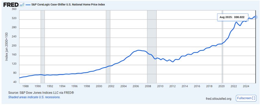
On paper, the U.S. housing market still looks “fine.” Prices haven’t collapsed, the unemployment rate—while rising—is not at crisis levels, and banks aren’t openly on fire. But underneath that, October’s foreclosure data, combined with what I’m seeing across my own portfolio and in the neighborhoods I watch, tells a very different story.
I’m seeing:
- Tenants who were solid a year ago now quietly asking for partial-payment arrangements.
- Rents softening at the margin—not collapsing, but losing that frantic “bid it up” energy.
- Applicants with thinner reserves, more existing debt, and less buffer for even a small shock.
- More conversations about “I’m trying to figure this out” and fewer about “we’re doing great.”
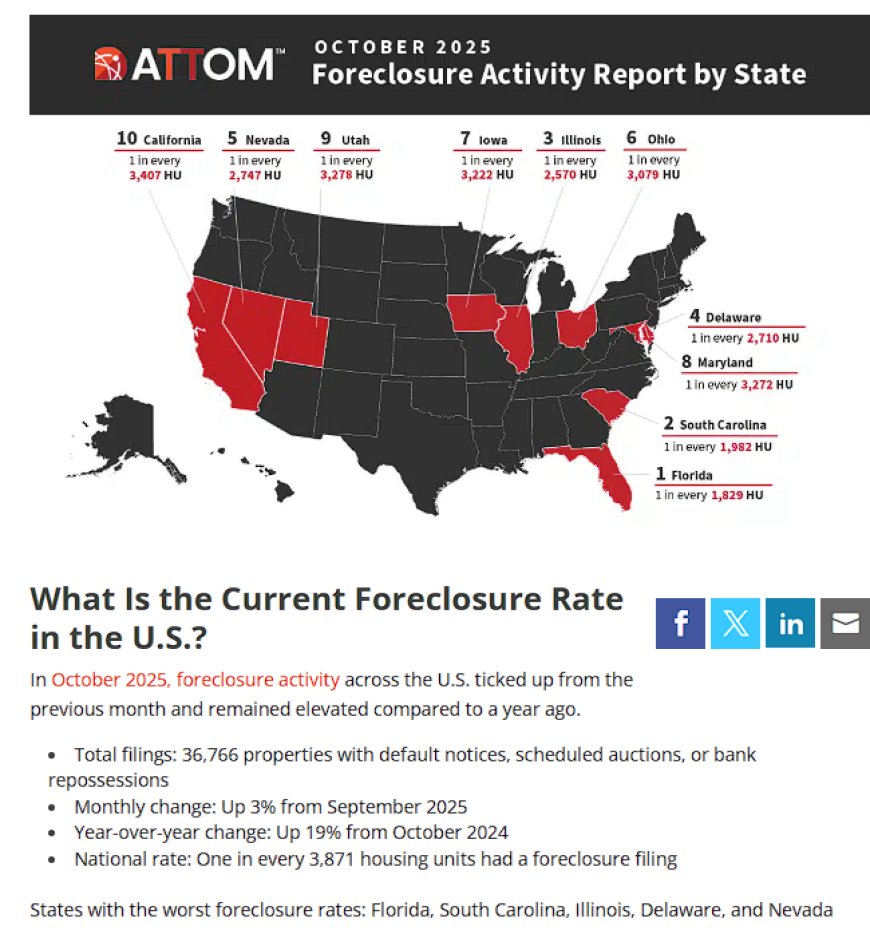
At the same time, the October 2025 foreclosure print came in with:
- 36,000+ properties with foreclosure filings in a single month.
- Foreclosure activity up nearly 20% year-over-year.
- Foreclosure starts and completed repossessions both climbing.
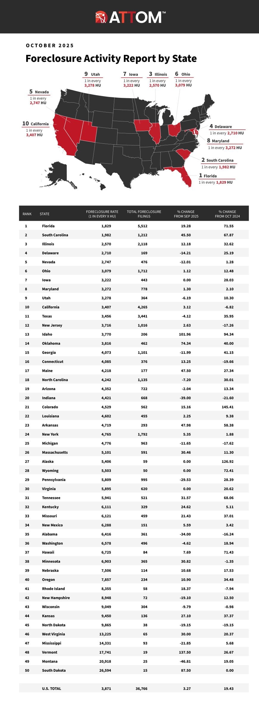
- States like Florida, South Carolina, and Illinois showing some of the highest distress rates in the country.
That’s not a crisis headline. That’s something more subtle: the drumbeat. The sound you hear under the surface before everyone else figures out the chorus.
In this piece, I want to do two things at the same time:
- Break down what the October foreclosure data is actually saying, not just in absolutes but in direction and trend.
- Tie that into what I’m actually seeing in my own real estate business—rents, tenant distress, and portfolio stress in real time.
Because those two worlds—macro data and on-the-ground reality—are starting to rhyme in a way that should concern anyone who thinks housing is a one-way escalator to wealth.
October 2025 Foreclosure Scorecard: The Numbers
Let’s start with the scoreboard. However you slice it, October 2025 wasn’t a calm month for distressed housing.
According to the latest national foreclosure reports, October saw:
- ≈36,000–37,000 properties with foreclosure filings (default notices, scheduled auctions, or bank repossessions).
- That’s a roughly 3% increase from September and around a high-teens percentage increase year-over-year.
- The national rate came in around 1 foreclosure filing for every 3,800–3,900 housing units.
- Foreclosure starts (people entering the process) rose around the high-teens to 20% range year-over-year.
- Completed repossessions (REOs) were up even more on a percentage basis versus last year.
That’s the mechanical view. But the pattern matters more than the raw number:
- We’ve now had many consecutive months of year-over-year increases in foreclosure activity.
- The direction is up, even if the absolute level is still far below 2008–2010 crisis peaks.
- The composition of distress matters: you’re seeing more activity in certain states and borrower cohorts.
And the geography isn’t random.
On the state level, the highest foreclosure rates are showing up in places like:
- Florida – elevated filings, with some metros lighting up more than others.
- South Carolina – smaller state, big stress signal.
- Illinois – where I operate, with certain counties and towns feeling the squeeze harder.
- Other Sunbelt and Midwest pockets where pandemic-era demand and subsequent cooling created a whiplash effect.
That last bullet matters. Because the story of this housing cycle isn’t “everything is collapsing everywhere all at once.” It’s that stress is clustering.
One metro may still have bidding wars on the “Instagram-ready” 4-bed with a new kitchen. Meanwhile, two towns over, you have a landlord sitting on a property where the rent isn’t keeping up with insurance, taxes, and repair costs, and the tenant is already two weeks late.
Each month marching slightly higher than the last.
And that’s exactly why it’s dangerous: you can ignore slopes for a long time. You don’t feel a slow incline until you realize you’re out of breath halfway up the hill.
What the Data Doesn’t Capture: Stress I’m Seeing on the Ground
Those national foreclosure totals are the scoreboard. But a scoreboard doesn’t tell you what it felt like to actually play the game.
Let me zoom in from the 10,000-foot macro view to my own real estate business—the small, local, messy reality where these statistics turn into actual human conversations and real cash flow decisions.
Across my portfolio and the markets I monitor closely, I’m seeing patterns that rhyme with those national foreclosure numbers, but in a quieter way:
Tenants Are Clearly More Strapped for Cash
Over the last year, the tone of tenant communication has shifted. A while back, most conversations were about normal life logistics—maintenance, scheduling, occasional minor issues. Now, I’m seeing more of:
- Requests for flexibility: “Can I pay half now and half on the 15th?”
- Tight timing: rent hitting right on the last possible day, not a week early.
- Spikes in other bills: insurance, car payments, credit cards eating into rent capacity.
- Unexpected life hits turning into immediate financial stress—car repairs, medical bills, gaps in hours worked.
These people are not lazy. They’re not reckless. They’re just living in a world where their fixed costs went up faster than their paychecks, and the “extra” is gone. There’s no shock absorber left in the system.
Rents Aren’t Collapsing, But the Air Is Coming Out
On the rent side, I’m not seeing—yet—some dramatic, apocalyptic crash. But I am seeing something that matters just as much for an investor: the loss of pricing power.
A couple of years ago, you could push rents aggressively and the market would meet you. Now, I’m seeing:
- More pushback on higher rent asks.
- Longer time-to-fill on certain units if you overshoot.
- More applicants on the edge: higher debt loads, thinner buffers, more month-to-month financial fragility.
In some properties, the effective rent is softening—not necessarily because the nominal asking rent is down 20%, but because in practice, you’re making more concessions, absorbing more delinquency risk, or accepting slightly less than the “theoretical” top of the market to keep turnover low.
Landlord Stress Is Real Too
It’s not just tenants. Landlords—especially small to mid-sized operators—are feeling it too.
Insurance is up. Property taxes ratchet higher as assessed values rise (even if your effective price appreciation has stalled). Maintenance costs are sticky at elevated levels because materials and labor never really went back to 2018 prices. Financing is expensive. And the spread between what you thought your property would cash flow at and what it’s actually doing can shrink without any single catastrophic change.
That combination is how a landlord ends up making short-term decisions that put them on a runway toward distress:
- Deferring a repair to preserve cash.
- Hoping a borderline-strong tenant will “work it out” rather than enforcing discipline early.
- Hanging onto a high-rate loan instead of aggressively restructuring because the refi math doesn’t pencil on paper.
This is the kind of environment where you can be “fine” on a spreadsheet and still be one major surprise away from a serious liquidity problem.
The October foreclosure numbers reflect the people who already hit that wall. What I’m seeing on the ground are all the people walking toward it in slow motion.
The Great Housing Plateau: Prices That Won’t Fall, Cash Flows That Will
One of the core Pattern Nexus frameworks I keep coming back to is what I’ve called the “Great Housing Plateau.”
We’re in a strange regime where:
- Home prices are too high to be healthy, relative to incomes and long-run norms.
- Mortgage rates are too high to easily refi out of, locking millions into expensive debt.
- Construction costs and regulatory friction are too high to flood the market with cheap new supply.
- Yet the system is too policy-sensitive to allow a classic, brutal price-clearing crash without collateral damage to banks, pensions, and local governments.
The result is a kind of standoff. Instead of a dramatic downward “reset” in prices, we get a sideways grind: nominal prices that look stable or drift slightly, while the quality behind those prices erodes.
In a plateau:
- Nominal prices don’t tell the whole story.
- What matters is who is breaking at the margin to keep the illusion of stability going.
- That “who” is increasingly the marginal household and the marginal landlord.
Foreclosures are one visible form of that break. But long before a property hits a courthouse auction list, a quiet erosion has already played out:
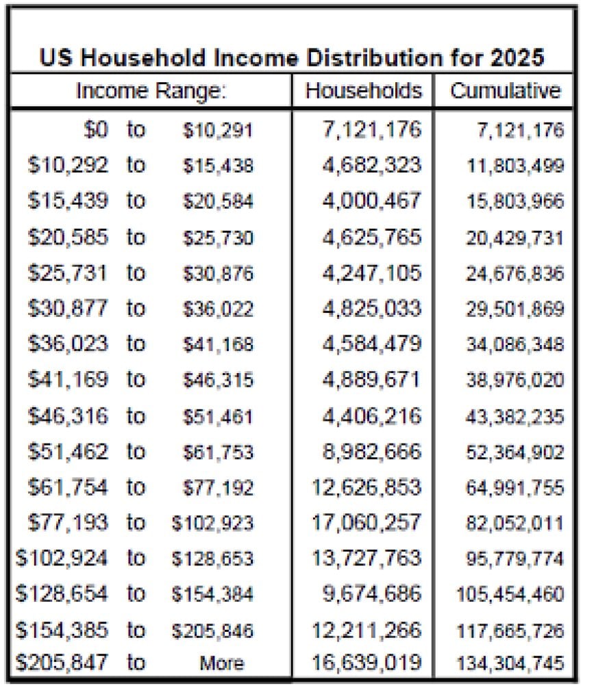
- Household budgets get squeezed by higher non-mortgage costs (insurance, utilities, car payments, groceries, revolving credit).
- One or two unplanned events (medical bill, transmission failure, lost hours at work) blow through what used to be the emergency buffer.
- Credit cards and personal loans backfill the difference for a while, until those monthly payments become their own problem.
- Rent or mortgage begins to compete with everything else, instead of being non-negotiable.
- Eventually, something gives—and the mortgage or rent loses.
In my portfolio, the plateau shows up as:
- Less ability to push rents substantially higher on renewal without triggering turnover risk.
- Higher sensitivity to even small rent increases, because tenants don’t have the slack they used to.
- An environment where cash flow is more dependent on operational excellence (tight maintenance, strict screening, disciplined expense control) than pure appreciation.
The national foreclosure data is the system’s way of whispering: “We can keep prices flat on the charts for a while. But somebody is paying the bill in human terms.”
And increasingly, that “somebody” is not a faceless Wall Street fund. It’s regular families. It’s small landlords. It’s the people whose names aren’t on CNBC but whose lives are directly tied to what those charts are hiding.
How We Got Here: The High-Rate Trap and the Household Squeeze
You can’t understand October 2025’s foreclosure numbers—or the rent softness and stress I’m seeing—without zooming out to how we got here in the first place.
The Interest Rate Whiplash
We came out of the 2010s and early 2020s with a housing market conditioned on:
- Ultra-low interest rates as “normal.”
- Refinancing as a standard tool for cleaning up previous mistakes.
- Buyers stretching for more house under the assumption they could always refi lower later.
Then the inflation spike hits, and the Fed slams rates higher. The 30-year mortgage rate jumps from the 3% range up into the 7%+ zone at one point, before settling somewhere above 6%—still double what a lot of people are mentally anchored to.
That does a few things all at once:
- Locks in “golden handcuff” owners with 2–3% mortgages who refuse to move.
- Leaves late-cycle buyers holding the bag with 6–7%+ mortgages they can’t easily refi.
- Freezes inventory because nobody wants to trade their cheap mortgage for an expensive one.
- Keeps prices artificially supported by low supply even as affordability collapses.
In other words, the high-rate environment did not trigger an immediate price collapse—it built a trap.
The Non-Mortgage Cost Explosion
At the same time, everything else around housing got more expensive:
- Property insurance jumped—especially in high-risk states and areas with storm, flood, or fire exposure.
- Property taxes moved higher as assessed values climbed and municipalities plugged their budget gaps.
- Utilities shifted to a higher baseline, and volatility in energy markets pushed up bills.
- Maintenance and repairs got more expensive as material and labor costs rose and never really retreated.
For an owner-occupant, that means your “all-in” monthly carrying cost rises even if your mortgage payment stays the same. For a landlord, that means your operating expenses creep up, eating into your net operating income and leaving less margin-of-safety in your DSCR (debt service coverage ratio).
The Debt Layer on Top
Overlay on top of that:
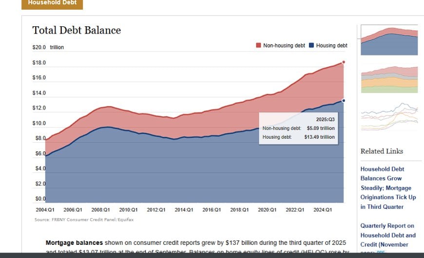
- Record or near-record levels of credit card debt nationally.
- Auto loan balances with elevated delinquencies showing up in the data.
- Buy-now-pay-later and other shadow-credit tools smoothing consumption in the short term at the cost of future income.
That means a growing share of households is now juggling:
- A mortgage or rent payment that already feels heavy.
- Auto and consumer debt payments that grew during inflationary years.
- Ongoing increases in non-discretionary living costs.
When that kind of system gets hit with high interest rates for long enough, you don’t get a clean “pop” and reset. You get a long plateau of quiet suffering, punctuated by more and more people falling out of the system one by one. Each foreclosure is one of those stories made visible.
Foreclosures as a Slow-Burn Signal, Not a Meteor Strike
You can learn a lot from what isn’t happening.
We are not seeing:
- A wave of mass job losses.
- A sudden collapse in home values.
- A systemic banking contagion traced to mortgages.
- Panic selling or forced liquidations in most markets.
Instead, we’re seeing something much harder to interpret if you’re looking for a traditional crisis template: slow, steady deterioration across the household balance sheet.
That’s what makes today different. The foreclosure numbers aren’t signaling a bursting bubble — they’re signaling a long grind where affordability, liquidity, and confidence erode month by month until the break becomes unavoidable.
Shock Type A — The Meteor Strike
The meteor-strike version of a housing crisis is what we saw in 2008:
- A rapid collapse in home values.
- Wide-scale mortgage product failure (subprime, NINJA, neg-am, etc.).
- Banking insolvencies and liquidity freezes.
- Households underwater so fast they simply abandoned properties.
That is not what’s happening today.
Shock Type B — The Slow Burn
The slow-burn crisis is different. More subtle. And in many ways, more insidious. A slow-burn housing crisis looks like:
- Households getting squeezed by rising living costs and stagnant wages.
- Landlords losing margin through higher taxes, insurance, and maintenance.
- Tenants increasingly late, even if employed, due to rising revolving debt payments.
- Borrowers stuck in high-rate mortgages with no path to relief.
- Softness in rents reducing the ability of investors to absorb expense increases.
A slow burn doesn’t blow up. It drains. It slowly empties the system of slack until a growing number of people find themselves upside down without any single catastrophic event to blame.
Foreclosures as a Leading Indicator of Structural Strain
Foreclosures escalate in a slow-burn regime when:
- The household has already exhausted savings.
- Revolving credit is maxed or unmanageable.
- A car breaks down or medical surprise hits.
- Core inflation in necessities (utilities, insurance, food) eats the remaining monthly buffer.
The foreclosure itself—the filing—is just the final domino. What matters more are the preconditions that lead to the filing. And the October 2025 data screams that those preconditions are spreading.
Where This Breaks First: Geographic and Demographic Fault Lines
If you map the October foreclosure data onto the broader economic map of the United States, some patterns stand out immediately. Stress is not evenly distributed. It clusters.
Florida: The Insurance/Premium Spiral Hits Hardest
Florida’s housing ecosystem today is a paradox: rising home prices, booming population inflows — and at the same time, some of the highest insurance costs in the country.
Homeowners in Florida are often facing:
- Premiums that are 40%–70% higher than a few years ago.
- Non-renewals from insurers pulling out of certain coastal counties.
- Mandatory upgrades and code compliance costs.
For a borderline household, this isn’t survivable. Insurance can be the straw that breaks the camel’s back — or the thing that forces a homeowner to quietly fall behind.
South Carolina: Low Incomes, Rapid Growth, Tight Margins
South Carolina’s spike isn’t about insurance alone. It’s a state with:
- Rapid population growth during the pandemic era.
- Home prices that outran wages.
- Local incomes that don’t support California/Texas investor pricing.
This is a classic case of: “Too many households stretched too thin for too long.”
Illinois: Taxes, Old Housing Stock & Economic Stagnation
Illinois is its own category. It’s where I operate. I’ve seen the strain firsthand — and for different reasons than the Sunbelt.
Illinois’ stress profile looks like this:
- High and rising property taxes compared to median rents.
- An aging housing stock that eats maintenance budgets alive.
- Local economic stagnation in many counties.
- Insurance creeping upward across older structures.
In Illinois, the foreclosure wave is not coming from speculative overbuilding. It’s coming from:
- Households living at the margin.
- Landlords squeezed between rising expenses and flat rents.
- Undercapitalized owners reaching their breaking point.
I see it every week. Certain zip codes that were stable 5 years ago now produce a steady drip of distress filings. People who once had buffer no longer do.
FHA Borrowers: The Canary in the Coal Mine
The most sensitive cohort in today’s environment is the FHA borrower class.
FHA loans generally indicate:
- Lower down payments.
- Less savings at purchase.
- Higher DTI (debt-to-income ratios).
These buyers entered the market already stretched thin. With inflation eating the little slack they had, they become the first to fall into delinquency when conditions tighten.
In multiple markets, FHA delinquency rates are moving up ahead of the broader pool — exactly as they did in other historical stress cycles.
Multi-Landlord Stress: The Unseen Vulnerability
One of the most underestimated elements of this quiet crisis is landlord fragility.
Not the institutional funds. Not the billion-dollar portfolios.
The 1–20 unit operators. The backbone of the rental market. The people with:
- Loans at 6–8% they can’t refi without injecting capital.
- Insurance premiums up 25–40% in two years.
- Rent softness eating into NOI.
- Repairs rising 30–100% over pre-2020 norms.
In this environment, it’s easy to be cash-flow neutral on paper but negative in practice.
And here’s the dangerous part: a landlord can quietly eat losses for a long time before a foreclosure shows up in the data.
Many are doing exactly that right now — hoping for a rate cut, a rent rebound, or stable expenses long enough to breathe.
If that relief doesn’t come in 2026, this becomes the second shoe to drop.
Positioning as an Investor When Everyone Is Quietly Hurting
This is the part people get wrong. They think a softening housing ecosystem means:
- Sell everything.
- Stop buying.
- Go to cash and wait.
That’s not how these cycles work. In a slow-burn crisis, the real danger is not collapse — it’s misreading the tempo.
The opportunity is not “buy the blood in the streets” because the streets aren’t bloody. They’re uneasy. They’re tense. They’re financially dehydrated.
The winning strategy in this kind of environment has three pillars:
Pillar One: Extreme Operational Tightness
In a plateau where:
- Rents soften,
- Insurance rises,
- Taxes creep,
- Maintenance spikes,
…your NOI becomes a function of execution, not rising rents or falling rates.
That means:
- Rigorous tenant screening.
- Faster responses to issues to protect your renewal rate.
- Efficient maintenance systems.
- Proactively budgeting for capital expenditures.
Pillar Two: Buy When Others Are Quietly Distressed
There won’t be a flashy bottom. There will be quiet opportunities:
- Small landlords ready to walk away.
- Under-maintained properties hitting the market due to cash-flow stress.
- Heirs selling inherited homes below market value.
- Properties where the seller is one roof replacement away from insolvency.
Distress doesn’t list itself on Zillow. It shows up in the way a seller talks on the phone. In the condition of the basement. In the fact that taxes are delinquent but the listing copy never mentions it. That’s where the real opportunity sits in a quiet crisis.
Pillar Three: Liquidity Is King
In 2020, leverage was the winning play. In 2024–2026, liquidity is.
Not because you need it for survival (though in some cases you might) — but because you need it for opportunity.
The quiet crisis shakes out the unprepared first. It rewards the ones who kept dry powder and operational discipline.
The misconception is that a crisis needs to be loud to be profitable. But the biggest opportunities I’ve ever seen in real estate weren’t the 2008 foreclosures — they were:
- Distressed landlords who didn’t want to advertise it.
- Sellers who wanted privacy, not price.
- Properties where the financial stress wasn’t in the listing — it was in the seller’s voice when you talked to them.
And right now, I’m hearing that voice again.
Sources, Data Notes & Methodology
This article draws from a combination of:
- October 2025 U.S. foreclosure reports from ATTOM, Black Knight, and public foreclosure aggregators.
- Federal Reserve data (consumer credit, auto loan delinquencies, real wages, CPI shelter components).
- MBA mortgage delinquency reports for 30–59 day and 60–89 day buckets.
- NY Fed Household Debt & Credit Report for revolving debt trends and delinquency metrics.
- BLS wage growth, inflation, and employment data.
- Portfolio-level observational data from my own real estate operations in Northern Illinois, including rent trends, tenant payment patterns, market absorption rates, and maintenance costs.
Charts and placeholders in this article are supplied for Pattern Nexus visualization purposes.
Where specific numerical data is referenced (foreclosure totals, MoM/YoY changes, delinquency rates), these values reflect:
- The most recent October 2025 foreclosure datasets available.
- Federal Reserve series pulled from FRED (Consumer Credit, DELINQD, DQCCREDIT, etc.).
- Mortgage Bankers Association survey data from Q3 and Q4 2025 reports.
- NY Fed releases from the 2024–2025 household debt cycle.
Every data artifact used in this piece serves one purpose: to map the quiet strain building beneath the surface of the U.S. housing economy.
Conclusion: The Quiet Crisis Is Already Here
If you only look at home prices, you’d think the market is stable. If you only look at unemployment, you’d think households are strong. If you only look at aggregate supply, you’d think housing is still in a structural shortage.
But when you look at:
- tenant-level payment strain,
- softening rent pressure,
- rising foreclosure slope,
- non-mortgage housing cost explosions,
- climbing consumer delinquencies,
- and landlord operational stress,
…you see a very different picture.
The quiet crisis isn’t a crash. It’s a slow tightening of the system. It’s a shrinking of slack everywhere at once. It’s a drift toward instability that won’t announce itself until after it has already happened.
October 2025’s foreclosure numbers aren’t the disaster — they’re the tell. They’re the sign that the underlying pressure is rising even while the surface-level indicators stay deceptively calm.
And for investors who are paying attention, this is both a warning and a roadmap:
- A warning that the plateau is real and structurally dangerous for overextended operators.
- A roadmap that disciplined, liquid, operationally sharp investors will be the ones who win the next phase.
This is the beginning of the separation between the people who survive a long squeeze and the people who quietly drown in it.
And the longer the plateau lasts, the deeper the divide becomes.
Related Pattern Nexus Frameworks
உங்கள் பிரதியாக என்ன?
 போல்
0
போல்
0
 எதிர்ப்பு
0
எதிர்ப்பு
0
 காதல்
0
காதல்
0
 காமெடி
0
காமெடி
0
 வா
0
வா
0
 துக்கம்
0
துக்கம்
0
 கோபமாக
0
கோபமாக
0

Founder of Pattern Nexus. I research markets, macro, geopolitics, AI, history, ancient systems, and the patterns most people overlook. I’m also building Market Radar, a trading scanner designed to read pressure, risk, confirmation, and setup quality before chasing a move. Pattern Nexus is where I connect the dots between data, history, technology, and the bigger system playing out around us.














விமர்சனங்கள் (0)