
The Bond Market Is Exposing the Fed’s Real Problem — And It’s Not Inflation
The 10-year yield reveals the Fed’s real challenge: a shrinking debt-sustainability corridor the market refuses to accept. Here’s why the system can’t stay here.
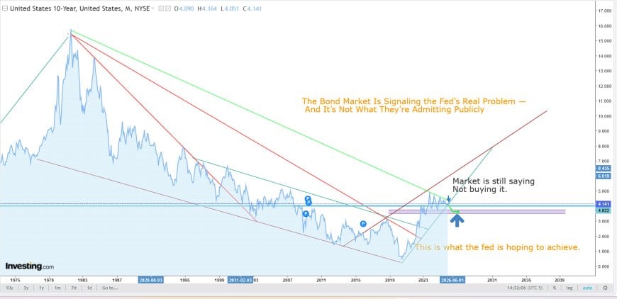
The Bond Market Is Signaling the Fed’s Real Problem — And It’s Not What They’re Admitting Publicly
The 10-year yield isn’t just “reflecting inflation expectations.” It’s mapping out the only rate corridor where a massively leveraged, deficit-driven system can survive — and the market is still rejecting the Fed’s story about how we get there.
Overview: What the Chart Is Really Showing
Over the last two years the Federal Reserve has tried to project control: “higher for longer,” data-dependent policy, and a supposedly resilient Treasury market. When you zoom out to a 50-year view of the U.S. 10-year yield, that narrative breaks.
The chart isn’t just a picture of interest rates. It’s a map of debt sustainability. It shows:
- a long structural decline in the true neutral rate,
- the recent breakout above that declining channel, and
- the narrow yield corridor where the current U.S. debt load can actually function.
The Fed wants yields to drift gently back into that corridor. The bond market keeps replying: “Not buying it.”
The Long Decline of the True Neutral Rate
Since the early 1980s, every major cycle has ended with yields lower than the one before. The 10-year has traced out a steady downward glide path driven by demographics, globalization, rising leverage, and the financialization of almost everything.
Each crisis — 1987, 2000, 2008, 2020 — pushed the system deeper into a world where lower and lower rates weren’t a choice, but a requirement for stability. That long-term declining channel is effectively the real neutral rate for a highly leveraged, dollar-centric world.
When yields ripped above that channel in 2022, the system entered an environment it was never built to tolerate:
- Federal interest expense starts to explode.
- Treasury rollover risk climbs with every auction.
- Banks sit on huge unrealized losses in their bond portfolios.
- Repo and collateral markets tighten and become more fragile.
- Global buyers begin to question whether U.S. debt is still the safest parking spot.
The Fed can say “higher for longer” into a microphone. The math of the long-term yield structure says otherwise.
The Full Chart: Structure of the Bond Regime
On the long-term chart, three structural elements stand out:
- The declining green trend lines. These trace the 40-year slide in the functional neutral rate. Every cycle tops out lower than the last.
- The breakout above that regime. In 2022–2023, the 10-year punched through the top of the channel. That is not just “rates are higher.” It is the bond market moving into a zone the system wasn’t designed for.
- The purple corridor. This band represents the approximate range where the U.S. can service and roll its debt without blowing the budget purely on interest expense or detonating bank balance sheets.
Above that corridor, debt-service costs and rollover risk start to dominate everything. Inside it, the system limps along. Below it, inflation risk returns, but the financial plumbing relaxes. That’s the real policy trade-off — not the clean textbook story of a single “neutral rate” somewhere on a dot plot.
The Zoomed View: Where Theory Meets Reality
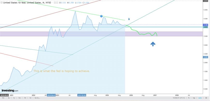
Zooming in on the recent years, the conflict between the Fed’s story and the market’s behavior becomes impossible to ignore.
1. The rejection at the structural ceiling
The 10-year yield runs straight into the long-term descending trend line and fails. That rejection is the bond market’s way of saying: “You are already above the level the system can actually tolerate.”
2. The Fed’s hoped-for glide-path
The smooth green curve on the chart is effectively the Fed’s dream scenario: a gentle drift lower into the purple band. Yields decline just enough to make the debt serviceable again, but not so fast that the move looks like panic or crisis.
On the chart this is labeled: “This is what the Fed is hoping to achieve.”
3. The market’s answer: “Not buying it.”
Instead of obediently following that path, the market stalls. Yields chop sideways near the top of the corridor. Every time the Fed hints at future cuts, the market partially prices them — then fades back, as if to say: “Show me the actual easing. I don’t believe the projections.”
The blue arrow and annotations on the chart capture this mood in plain language: the market still doesn’t accept the story the Fed is selling.
Inside the “Survivability Corridor”
The purple band on the chart isn’t aesthetic. It’s a rough visualization of where the system’s plumbing stops screaming.
In that corridor (roughly the high-3% to low-4% range on the 10-year):
- Federal interest expense is ugly, but not yet catastrophic.
- Treasury can roll its debt without every auction turning into a stress event.
- Banks can eventually bleed down their duration losses instead of realizing them all at once.
- Mortgage and real-estate markets can reprice without a complete freeze.
- Derivatives and collateral chains don’t get forced into mass margin and collateral calls.
- Repo markets and dollar funding stay tight, but functional.
That’s why the Fed is so desperate to guide yields into this zone and keep them there. The corridor is less a policy preference and more a minimum survivability requirement for a $35–$40 trillion sovereign issuer wrapped in layers of leverage, derivatives, and global dollar obligations.
Two Paths Ahead: Controlled Descent vs Disorderly Break
The clash between the Fed’s desired path and the market’s skepticism leads to two broad scenarios.
Scenario 1: Controlled Descent (the Fed’s best-case)
In the idealized Fed scenario, yields gradually move into the corridor through a mix of:
- careful forward guidance,
- quiet balance-sheet operations,
- buybacks and liquidity facilities, and
- Treasury issuance games (tenor changes, term premium management, etc.).
The public line remains: “Markets are functioning. Policy is restrictive, but working.” Under the surface, however, the Fed and Treasury are steadily nudging the curve into the only sustainable band they have left.
Scenario 2: Disorderly Break (the path of least control)
If the controlled descent fails, the adjustment happens the hard way:
- a failed or severely strained auction,
- a large bank or shadow-bank duration problem,
- a derivatives or collateral shock, or
- a geopolitical event that smashes growth expectations.
In that world, yields don’t glide into the corridor — they fall into it. The move looks less like “policy normalization” and more like “emergency response.” The labels change, but functionally you’re looking at some flavor of renewed QE and yield-curve control.
Key Takeaways
- The long-term decline in the 10-year yield mapped the true neutral rate of a leveraged, financialized system. 2022’s breakout above that regime was a structural alarm bell, not just another rate hike cycle.
- The purple corridor on the chart is effectively the “survivability band” for U.S. sovereign finance. Above it, interest expense and rollover risk dominate. Inside it, the system limps along.
- The Fed’s real goal is to guide yields back into that band without triggering a crisis or openly admitting that debt sustainability, not inflation, is now driving policy.
- The bond market is still rejecting the projected glide-path. The message embedded in prices is: “We don’t believe you can get there cleanly.”
- The next 12–24 months are about how we move into that corridor, not whether we do. The only open question is whether it happens as a controlled descent or a disorderly break.
In other words, the 10-year yield isn’t just reacting to inflation data. It’s tracing out the boundary between a strained but functioning system and a full-blown funding crisis. The Fed can change its language, its dot plots, and its narratives. It cannot change the math that’s written all over this chart.
Ποια είναι η αντίδρασή σας;
 Μου αρέσει
0
Μου αρέσει
0
 Μη Αγαπημένο
0
Μη Αγαπημένο
0
 Αγάπη
0
Αγάπη
0
 Αστείο
0
Αστείο
0
 Ουάου
0
Ουάου
0
 Λυπημένος
0
Λυπημένος
0
 Θυμωμένος
0
Θυμωμένος
0

Founder of Pattern Nexus. I research markets, macro, geopolitics, AI, history, ancient systems, and the patterns most people overlook. I’m also building Market Radar, a trading scanner designed to read pressure, risk, confirmation, and setup quality before chasing a move. Pattern Nexus is where I connect the dots between data, history, technology, and the bigger system playing out around us.













Σχόλια (0)