
Why a 150-Year-Old Market Chart Still Haunts Modern Finance
A deep Pattern Nexus breakdown of Samuel Benner’s 19th-century market cycle chart and why it still aligns with modern financial stress windows. This article explains the mechanics behind the “2026 crash chart,” why it appears accurate, what it gets wrong, and how to use it correctly as a risk-regime lens rather than a prediction tool.
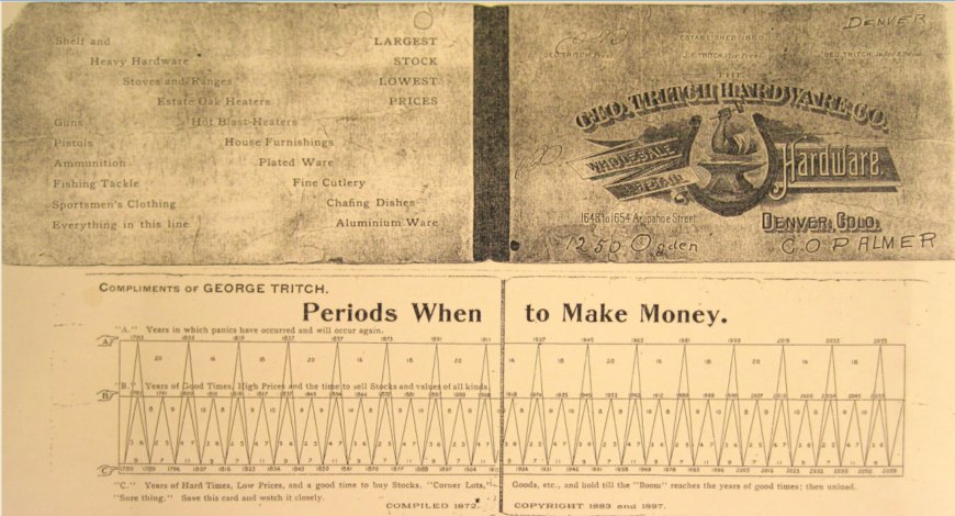
The “150-Year-Old Chart” That “Predicts” 2026
I bet you’ve seen this chart a bunch of times. It gets posted like a talisman: “Look, it called the last crash, now it’s calling 2026.” Most people stop there. They treat it like prophecy, or they dismiss it as nonsense. The truth is more interesting. This artifact is a crude but surprisingly instructive model of how credit, psychology, and commodity-led business cycles repeat. The chart doesn’t predict events. It predicts where the system is historically prone to break.
Executive Summary
The viral “Periods When to Make Money” chart is a derivative of Samuel Benner’s late-19th-century cycle work. Benner wasn’t doing mysticism. He was doing rough, early pattern analysis on commodity prices and financial panics. His core claim was simple: markets don’t move randomly, they oscillate through recognizable phases.
Why it feels so accurate: it is not forecasting specific headlines. It is marking windows where systems built on leverage, optimism, and marginal credit are historically more likely to fail. The mechanism is structural: credit expansion, speculative blow-off, balance-sheet stress, contraction, reset, repeat.
What it does and doesn’t mean: it does not mean “a crash must happen in 2026.” It means “if you’re running a fragile, leveraged system into a historically failure-prone window, the probability of a break rises.” The form of the break can be equity, credit, currency, geopolitics, policy regime shift, or a plumbing failure in the funding layer.
Pattern Nexus takeaway: treat the chart as a risk-regime backdrop. Then do the real work: watch liquidity, collateral, dealer capacity, funding spreads, and policy reaction function. The chart provides context, not a trade.
What You’re Looking At
The image people circulate usually looks like an old business card or pamphlet titled “Periods When to Make Money”, with three labeled bands and a jagged sawtooth pattern of years across the bottom. It’s often presented as a “150-year-old chart” that “predicts” modern crashes.
There are a few versions floating around, but the logic stays consistent. The chart is segmented into three categories that are usually described like this:
A: Panic Years “Years in which panics have occurred and will occur again.”
B: Good Times High prices, high confidence, frothy conditions, often described as “time to sell.”
C: Hard Times Low prices, depressed sentiment, tighter money, often described as “good time to buy.”
To understand why this thing keeps coming back every few years, you need one framing shift:
This chart is not a headline predictor. It’s a crude stress-window map for a leverage-based economy.
That’s the key. The chart is not saying “this event happens.” It’s saying “this is the kind of calendar window where leveraged systems have historically been prone to a discontinuity.”
Who Samuel Benner Was
Samuel Benner was not a Wall Street quant. He was a practical operator trying to survive a cyclical economy. His work is best understood as an early attempt to answer a brutally simple question:
“If the system keeps doing this, is there any repeatable rhythm to when it breaks and when it recovers?”
Benner published his cycle claims in Benner’s Prophecies of Future Ups and Downs in Prices, a commodity-anchored framework that focused on pig iron, hogs, corn, and provisions, plus broader “panic” periodicity. He built his argument by looking backwards at observed price and crisis patterns, then projecting forward using repeat intervals.
Two points matter here, and they matter more than the internet debate about whether he was “right.”
- Benner’s world was commodity-led. Industrial cycles were tightly coupled to physical throughput: iron, rail buildouts, agriculture, provisions, freight, and the credit that financed all of it.
- Even if the instruments change, the constraint logic doesn’t. Modern cycles still express through throughput, but now the “throughput layer” includes collateral chains, funding markets, and policy liquidity alongside physical commodities.
So when people ask “how could someone 150 years ago predict modern markets,” the answer is not “because he saw the future.” The answer is “because he was observing a repeating control-system behavior that remains intact.”
How the Chart Was Built
This is where most explanations fail. People either say “it’s magic” or “it’s dumb.” Neither is useful.
Benner’s cycle logic is typically summarized as three overlapping periodicities and a simple interpretation rule:
1) Panic periodicity (longer rhythm): a repeating spacing for major financial panics and system breaks.
2) High-price peaks (good times): a shorter rhythm for froth, high pricing, and risk-taking dominance.
3) Low-price troughs (hard times): a shorter rhythm for depressed pricing, constraint, and reset windows.
Interpretation rule: after a panic, the system tends to swing toward “good times,” then eventually into “hard times,” and back again, with lagged feedback.
Important nuance: the “Periods When to Make Money” card that circulates widely is not always a direct scan from Benner’s earliest editions. Many viral versions are later printings, simplified reproductions, or derivative calendars that preserve the A/B/C structure but compress or modify the year grid. That’s why you’ll see multiple year sequences depending on which scan you’re looking at.
That does not kill the framework. It just means you must treat the artifact correctly:
Use the chart as regime structure, not a sacred year list. The structure is the value. The “exact dates” are the lowest-quality part of the entire thing.
In modern terms, what Benner created is a primitive regime classifier:
- Regime A: systemic break risk is elevated
- Regime B: optimism and pricing power dominate
- Regime C: constraint dominates, values compress, opportunities appear
That’s already close to how serious macro shops think. Not because they believe in 19th-century numerology, but because they manage risk across regimes and constraints.
How to Read A, B, and C Like a Control System
Here’s the Pattern Nexus translation that makes this chart click.
Markets are not “a line.” They are a layered control system with delays, feedback loops, and thresholds. When you look at A/B/C, you should not be thinking “up year” and “down year.” You should be thinking in terms of system state:
A (Panic Years): threshold breach. A constraint somewhere in the system is hit hard enough that forced deleveraging begins. The trigger is variable. The forced unwind is the constant.
B (Good Times): positive feedback dominance. Credit expands, risk tolerance rises, volatility is underpriced, and price becomes its own justification.
C (Hard Times): negative feedback dominance. Constraint and repair. Pricing power breaks, funding gets selective, defaults rise, and opportunity appears only because patience and capital survive.
This is why the chart persists. It is describing a physical phenomenon in financial terms: overshoot and correction in a system that is always trying to balance growth, confidence, and constraints.
In the 1800s the constraint layer was frequently:
- bank reserves and specie convertibility
- overbuilding in railroads and land speculation
- commodity price collapse feeding loan losses
- international capital flows snapping back
In the modern era, the constraint layer often shows up as:
- funding-market stress (repo, dollar funding, collateral haircuts)
- dealer balance-sheet constraints and liquidity gaps
- shadow leverage breaking before bank leverage
- policy credibility limits (inflation constraints, political constraints, fiscal constraints)
The interface changed. The control-system logic did not.
Historical Precedent Inside the Chart
To answer your question the right way, we have to do something most posts never do: connect the “panic years” concept to what actually happened historically, and why those events rhyme with modern breakpoints.
Below are the classic U.S. panic episodes that define the economic memory of the 19th and early 20th century. These are the kinds of breaks Benner was studying and trying to time.
Pattern Nexus reminder: the “cause” is almost never a single factor. The trigger is usually one event. The collapse is almost always a buildup of leverage plus a constraint that finally bites.
Panic of 1819
This is the first major U.S. financial crisis after the War of 1812 expansion. The simplified mechanics are: post-war boom, commodity price declines, and a tightening of credit conditions that turns paper prosperity into a liquidation event. This is a classic case of expansion outrunning the system’s ability to absorb the risk, then the credit channel snapping shut. In control-system terms: positive feedback builds, then a reserve constraint forces negative feedback violently.
Panic of 1837
This one is land speculation, credit instability, and external conditions tightening at the wrong moment. You see bank failures, unemployment, deflation pressure, and a long recovery slog. It’s not “one policy did it.” It’s the same repeating chain: speculative buildup, fragile funding structure, confidence breaks, liquidation begins, and the real economy catches the impact with lag.
Panic of 1857
This is a railroad and financial-structure break. Overinvestment in railroads, a decline in rail securities, and banking stress combine into a broader panic. In modern language: too much duration risk and illiquid exposures sitting inside balance sheets that were assumed to be liquid. When the confidence regime flips, liquidity disappears and the unwind begins.
Panic of 1873
This is the railroad boom turning into a credit collapse, with major failures tied to railroad financing and bond distribution. The result is a long depression-like period with high unemployment and business failures. It’s the same repeating macro skeleton: overbuild, leverage, mispriced risk, then funding breaks and the unwind spreads. This is also the exact kind of episode that motivated Benner’s work in the first place.
Panic of 1907
By 1907 you have a modernizing financial system without a modern lender-of-last-resort structure. A trust and bank panic spreads quickly, confidence collapses, and private-sector stabilization (notably J.P. Morgan’s intervention) becomes the emergency backstop. This crisis is a direct historical bridge into why the Federal Reserve system was created. In control-system language: the system had no stabilizer, so it improvised one under stress.
These are not random. They share the same structural DNA: leverage buildup, risk mispricing, the marginal borrower dominating late cycle, then a constraint forcing liquidation. Benner wasn’t predicting “2008.” He was mapping this repeating mechanism and marking where it tends to cluster in time.
So why do the “panic years” often show up as a recognizable rhythm? Because investment and credit systems have memory, and humans build leverage in waves. Railroads and land in the 1800s. Equities and securitization in the 2000s. AI capex, duration, and funding sensitivity now. Different costume. Same behavior.
Why It Looks “Accurate”
The chart feels uncanny because it lines up with real stress points. But that is not the same thing as “predicting 2026.” The chart lines up because it is anchored to repeating structural conditions that keep reappearing.
1) Credit cycles are a stable engine
Whether you’re in 1876 or 2026, the system runs on a familiar loop:
- Credit expands
- Risk tolerance rises
- Leverage increases
- Marginal borrowers dominate the last leg
- A constraint appears (rates, defaults, collateral haircuts, funding stress)
- Forced deleveraging begins
- Prices overshoot downward
- Balance sheets repair
- Credit expands again
Benner’s world was pig iron and farm economics. Our world is repo, collateral chains, dealer balance-sheet constraints, and policy liquidity. The loop is the same. The labels changed.
2) Human behavior repeats under incentives
At the end of every expansion, the same psychological configuration appears:
- recent success is treated as permanent
- risk is priced as if volatility was “solved”
- leverage is framed as “efficient” not fragile
- narratives go deterministic and moralistic (believers vs skeptics)
- guardrails get relaxed because “we understand the system now”
This is why old cycle models can keep mapping to modern bubbles. The human substrate doesn’t evolve at the pace of financial engineering.
3) The chart is directional, not precise
People misread “year” as “date.” Benner-style artifacts are coarse. They point to windows, not Tuesdays. That coarseness is a feature: it absorbs variability in how stress expresses.
Sometimes the break is a clean equity crash. Sometimes it’s credit. Sometimes it’s a currency or a policy regime flip. The chart doesn’t know the form. It only suggests where the system historically becomes fragile.
4) Selection bias makes it look sharper than it is
Humans remember panics. They don’t remember normal years. If you highlight a handful of major “panic” windows across a century, it will always feel dramatic, because the mind stores discontinuities, not stability.
5) Modern policy clusters stress into fewer, larger events
Modern policy can suppress small recessions and keep liquidity flowing. That reduces frequency of minor resets. But it also allows leverage to compound. When the reset finally happens, it tends to be larger, faster, and more systemic.
So the chart can look “more accurate” today because the system has become more binary: long stability, then sudden discontinuity.
Why Modern Policy Didn’t Break It
People assume central banks invalidate old cycle models. The opposite is closer to true. Central banks changed the amplitude and transmission path. They did not remove cyclicality.
Policy can delay losses. It cannot delete them. It can move them through time, sectors, and balance sheets.
In a modern fiat system, stress can be displaced into:
- asset inflation instead of wage inflation
- housing affordability compression instead of immediate recession
- shadow leverage instead of visible bank leverage
- funding-market fragility instead of “old style” bank runs
- political constraint and legitimacy fights instead of purely economic constraint
This is why Pattern Nexus treats the economy like a control system with layers. The break can show up in the layer that is most constrained at the time: collateral, funding, energy, geopolitics, fiscal capacity, or institutional legitimacy.
Benner didn’t have our instrumentation. But he was observing the same control-system behavior: overshoot, constraint, correction.
The Last 35 Years: Why It Feels Like a Hit-List
When people say “this chart has been accurate for the last 35 years,” what they usually mean is: it seems to align with the major discontinuities that dominate memory.
Here is the correct framing. The chart doesn’t “call” the event. It highlights a higher-probability stress window. Then the real world supplies the trigger.
1987
A leverage and market-structure break. Portfolio insurance and mechanical selling created a feedback loop. That’s a control-system failure, not a valuation debate.
1990–1991
Balance-sheet repair and recession dynamics. In commodity and credit terms, this is a contraction and regrouping phase.
2000–2002
Speculation saturates, narratives peak, capital gets misallocated, then funding and expectations collapse. Old cycle models love this because it rhymes with prior manias: public participation and overconfidence spike into an air pocket.
2007–2009
Classic credit supercycle mechanics: marginal credit, securitization feedback, collateral impairment, systemic deleveraging. If you want one modern episode that makes Benner-style charts look like prophecy, it’s this one.
2020
Liquidity shock and sudden stop. It wasn’t a “fundamentals” crash first. It was a plumbing stress event: the system froze, then policy brute-forced liquidity back into the pipes.
Notice the commonality: these are not “normal” bear markets. They are discontinuities. That’s what people remember. That’s why the chart looks like it has supernatural precision.
Key Pattern Nexus point: the market does not “decide” to crash. A leveraged system is forced to unwind when the funding and collateral layer stops clearing smoothly.
What It Gets Wrong
If you treat this chart as a literal forecast calendar, it will eventually make you look stupid. Here are the failure modes, explicitly.
1) It cannot predict the trigger
The chart can’t tell you whether the break comes from commercial real estate, sovereign funding, geopolitical escalation, an energy constraint, or a collateral event. It only gestures at fragility windows.
2) It cannot predict policy response
Policy is an adaptive opponent. The reaction function changes. The institution learns. Or it overreacts. This can shift timing, shift form, or convert an equity crash into an inflation problem, and vice versa.
3) It can be “right” for the wrong reasons
Sometimes the chart aligns simply because broad stress windows occur often enough that you can map them onto large cycles. That does not validate the specific numeric grid. It validates the existence of cyclicality.
4) It overstates regularity
Real cycles are not metronomes. They’re control systems with feedback, delays, and nonlinear thresholds. The “period” can stretch, compress, or be interrupted by shocks.
5) The viral versions mix artifacts with analysis
Many versions floating around the internet combine Benner’s core regime idea with later year projections and later printing layouts. That’s fine as a historical artifact. It’s dangerous as a precision instrument. Treat it accordingly.
How to Use It in the Pattern Nexus Lens
Here is the Pattern Nexus method for extracting value from this artifact without turning it into superstition.
Step 1: Treat Benner as a regime backdrop. A possible “risk clustering” map, not a date forecast.
Step 2: Identify the current system’s true constraint layer: funding, collateral, energy, fiscal capacity, labor, geopolitics, or legitimacy.
Step 3: Watch the plumbing, not the narratives. Funding spreads, dealer capacity, collateral quality, liquidity operations, and policy posture.
Step 4: Translate “panic year” into “fragility conditions.” If fragility is low, the window can pass quietly. If fragility is high, the window can host a discontinuity.
So what about 2026 specifically?
The responsible statement is not “crash confirmed.” The responsible statement is:
If the system enters 2026 with elevated leverage, tight collateral, constrained dealer balance sheets, and a policy reaction function that is slower or politically constrained, then the probability of a nonlinear break rises.
That’s the only honest way to use long-cycle charts in a modern liquidity framework. As context. As a warning label. Not as a clock.
FAQ
Is this chart actually 150 years old?
The underlying framework is rooted in Samuel Benner’s late-19th-century work, with multiple editions and later reproductions. The exact “business card” layout that circulates is often a derivative print, not necessarily a direct page from the earliest edition. The cycle logic tracks back to Benner’s published work and documented reprints.
So is 2026 “real” or not?
It’s “real” only in the sense that the chart’s projection grid labels it as a higher-risk window. That is not the same as a guaranteed crash. If liquidity and balance sheets are healthy, it can pass as noise. If fragility is high, it can host a discontinuity.
Why does it seem to work even with central banks?
Because central banks alter transmission paths, not human incentives. They can delay and reshape downturns, but they cannot eliminate leverage cycles or the eventual need for balance-sheet repair.
What’s the best way to use it without getting trapped?
Use it as a regime prompt. When the chart flags “panic windows,” you tighten your standards. You stop believing deterministic narratives. You focus on plumbing signals and policy constraints. You treat complacency as risk.
What would invalidate it?
If the economy became structurally noncyclical, meaning leverage didn’t build, incentives didn’t chase yield, and shocks didn’t trigger forced deleveraging. In other words, it would require humans and institutions to stop behaving like humans and institutions.
Sources
- Samuel Benner, digitized public domain scan: Archive.org PDF
- HathiTrust bibliographic record and editions: HathiTrust Record
- Benner cycle overview (secondary reference, useful for locating cycle claims): Benner Cycle (Wikipedia)
- Panic of 1819 (context and causes): Encyclopaedia Britannica
- Panic of 1857 (rail and banking stress mechanics): Encyclopaedia Britannica
- Panic of 1873 (railroad finance break, Jay Cooke failure): PBS American Experience
- Financial Panic of 1873 (Treasury history summary): U.S. Department of the Treasury
- Panic of 1907 (systemic context and why the Fed was later created): Federal Reserve History
- Second Bank of the United States (credit expansion then contraction dynamic tied to early panics): Federal Reserve History
- New York Fed Liberty Street Economics (Panic of 1857, crisis mechanics): Liberty Street Economics
Disclosure: This article treats the Benner chart as a historical artifact and a regime-context tool. It is not financial advice. If you use a calendar chart as a standalone trading system, the market will eventually punish you for it.
Apa Reaksi Anda?
 Suka
0
Suka
0
 Tidak Suka
0
Tidak Suka
0
 Cinta
0
Cinta
0
 Lucu
0
Lucu
0
 Wow
0
Wow
0
 Sedih
0
Sedih
0
 Marah
0
Marah
0

Founder of Pattern Nexus. I research markets, macro, geopolitics, AI, history, ancient systems, and the patterns most people overlook. I’m also building Market Radar, a trading scanner designed to read pressure, risk, confirmation, and setup quality before chasing a move. Pattern Nexus is where I connect the dots between data, history, technology, and the bigger system playing out around us.




















Komen-komen (0)