
The Gravity Zone: How the 10-Year Treasury Revealed the Real Neutral Rate
The 10-year Treasury has been oscillating around a hidden 3–4% neutral zone since 2022, revealing the true equilibrium rate the Fed keeps missing. This article breaks down why long rates refuse to fall, why the market no longer trusts traditional rate cuts, how the Treasury’s trillion-dollar TGA fits into the picture, and why quiet yield-curve management is becoming the new operating system of U.S. monetary policy.
The Gravity Zone: How the 10-Year Treasury Revealed the Real Neutral Rate
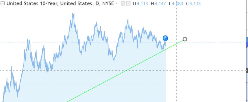
Everyone argues about where “neutral” is. The bond market already showed us. Since 2022, the 10-year has been bouncing around a hidden equilibrium between 3% and 4% while the Fed stayed late, then stubborn — and now can’t cut without quietly managing the curve.
The Chart That Gives It Away
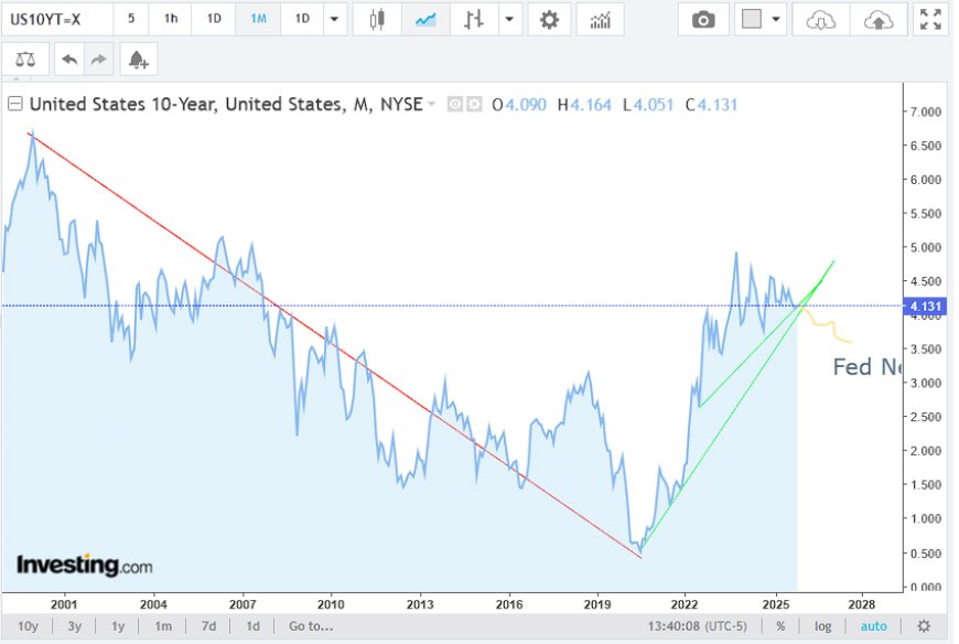
Forget the Fed speeches for a second and just look at the 10-year Treasury chart. On the long-term view, you have the red line: a 20-year downtrend in yields that ended with the COVID shock and the everything-bubble liquidity peak. Then you get the green line: the violent repricing higher in 2022–2023 as the market front-ran the Fed’s “we were wrong on inflation” moment.
Now zoom in on the recent action. Since that spike, the 10-year has stopped behaving like a runaway uptrend and started acting like it’s orbiting a point in space. Call that point 3–4%. When we get meaningfully above 4%, things start to break. When we move meaningfully below 3%, the market doesn’t believe it — sellers show up, and the curve cheapens again.
In other words: the bond market is trading as if there’s a neutral gravity zone for long rates, and we’ve been oscillating around it for the better part of this cycle.
Backing Into a 3–4% Neutral Rate
I’m not interested in academic R* models that get revised every quarter. I’m interested in the price that actually clears the market with $38 trillion of federal debt on the table and another trillion-plus in fresh annual interest costs barreling toward us. That neutral is different from the textbook version.
Here’s the simple way to think about it:
- Below ~3% on the 10-year in this environment, you’re basically pricing in either a very hard landing or some form of explicit yield management. With nominal growth still positive and fiscal still loose, that’s hard to sustain without a major accident.
- Above ~4%, you start stressing everything that’s been rebuilt on cheap money: CRE, housing, small-business credit, zombie corporates, and the federal interest bill itself. You can sit there for a while, but the longer you do, the more things crack.
- In between — that 3–4% corridor — the system feels “least bad.” Debt is expensive but not lethal, and the Fed can tell itself it’s restrictive without actually blowing up the Treasury market.
That middle zone is where real-world neutral lives: the level where you’re not stimulating, not outright crushing, and not forcing emergency interventions every few months. The chart is just the visual proof of the tug-of-war around that level.
The Fed Is a Lagging Indicator, Again
Now layer the Fed onto that chart. The 10-year started blowing out in early 2022 before the Fed got serious. Inflation had already slipped from “transitory” meme status to “oh no, this is real,” and the market repriced long rates violently higher while policy was still near zero.
Then we got the usual pattern:
- Late hiking: the Fed finally moved, trying to catch up to where the market had already dragged the curve.
- Overstaying: they held the policy rate at restrictive levels for roughly two and a half to three years relative to where the 10-year was trying to settle.
- Late easing: by the time the data and funding markets forced the first cuts, stress was already visible in credit, housing turnover, and bank funding.
On the screen, you can literally see the policy rate and the front end parked above what looks like that 3–4% neutral zone, while the 10-year keeps mean-reverting back toward it. The Fed isn’t leading the cycle here. It’s reacting to it.
Why the Market Won’t Price a “Normal” Cutting Cycle
In past cycles, once the Fed started cutting, the curve bull-steepened and the long end would often break lower in anticipation of a soft landing or outright recession. This time, the market keeps refusing to price that clean story.
Why? Because a “normal” cutting cycle assumes:
- Debt levels that can handle lower yields without exploding issuance.
- No structural need for constant rollovers and refundings at massive scale.
- A central bank that can shrink its balance sheet without hitting reserve scarcity and repo stress almost immediately.
None of those conditions are true anymore. With U.S. debt around $38 trillion and rising fast, interest costs are already set to dwarf most discretionary spending over the next decade. Cutting short rates aggressively while letting the long end collapse would dump even more leverage into the system just as the public balance sheet is maxed out.
So the bond market is basically saying: “Sure, you can cut. But if you want the 10-year to follow you down in a big way, you’re going to have to manage it. Explicitly or implicitly.”
The TGA and the Coming Liquidity Pivot
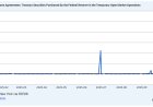
Now bring in the Treasury General Account — the government’s checking account at the Fed. As of late 2025, the TGA has been hovering around $900–1,000 billion, with recent prints near the top of that range
That’s not an accident. A cash balance that large gives Treasury and the Fed room to:
- Weather debt-ceiling drama and funding hiccups without missing a beat.
- Adjust auction sizes and tenors tactically to relieve pressure in specific maturities.
- Coordinate, quietly, with the Fed’s decision to halt balance sheet runoff and eventually stabilize or re-grow reserves.
In other words, the TGA is sitting at nearly a trillion dollars for a reason. It’s not just “prudence.” It’s optionality — the ability to blend fiscal and monetary tools when the long end resists the story the Fed is trying to tell.
Yield Curve Control Without Calling It That
I’m not saying we wake up tomorrow with a Bank of Japan–style hard cap on the 10-year. But we’re already seeing the building blocks of quiet yield management:
- QT ending: the Fed is set to stop shrinking its balance sheet and reinvest maturing Treasuries, especially into shorter tenors, easing some pressure on longer bonds.
- Bill-heavy issuance: Treasury can shift borrowing toward bills when the back end gets stressed, flattening funding pressures without calling it “control.”
- Standing repo facilities: high and persistent usage is already a sign that the Fed is indirectly supporting collateral values when money markets tighten.
Put together, this is yield curve control in practice, but not in branding. The goal is simple: keep the long end from spiraling higher (which would blow up the fiscal math) without allowing it to collapse in a way that screams “recession” and triggers another leverage boom. Once again, you end up back in that 3–4% gravity zone.
What This Means for Housing, AI Capex, and Risk Assets
If the real neutral zone is 3–4% on the 10-year, that sets the playing field for everything built on top of it:
- Housing: mortgages are unlikely to revisit the 2–3% fantasy world without an outright crisis and emergency buying. But it also means the system can’t tolerate 8%+ mortgages for long without foreclosure and abandonment problems spreading. You get a grinding plateau — not a clean crash, not a new boom.
- AI and energy capex: the government and mega-corps need predictable long-term funding to build out data centers, grids, and generation. A semi-pinned long end is effectively industrial policy: it keeps the AI–energy build-out financeable.
- Equities and “risk”: if the market believes the long end is unofficially managed into a 3–4% channel, the equity risk premium gets defined off that anchor. Every time yields threaten to break out, multiples compress. Every time they slide back toward neutral, the AI and growth stories reprice higher again.
None of this looks like the old cycles with clean peaks and troughs. It looks more like a managed corridor, with the 10-year pinned loosely in the middle while everything else has to adjust around it.
Key Takeaways
- The 10-year chart since 2022 behaves as if there’s a 3–4% neutral gravity zone — a level the market keeps returning to.
- The Fed has been late on the way up and late on the way down, holding policy above that zone for ~2.5–3 years while the long end tries to normalize.
- With debt near $38T and interest costs exploding, a “normal” deep cutting cycle is hard to square with reality unless you assume some form of yield management.
- A TGA near a trillion dollars isn’t random — it gives policymakers the cash and flexibility to smooth the curve when markets test the limits.
- We’re drifting toward de facto yield curve control — not with a hard cap, but with a soft corridor centered on that neutral band.
- For housing, AI infrastructure, and risk assets, this corridor is the new operating system: not too low to restart the everything bubble, not too high to detonate the debt tower, just tight enough to keep the machine grinding forward.
You don’t have to guess where neutral is. The market has been trading around it for years. The real question now is how long policymakers can pretend they’re in control of it.
Kakva je vaša reakcija?
 Sviđa mi se
0
Sviđa mi se
0
 Dislike
0
Dislike
0
 Ljubav
0
Ljubav
0
 Smešno
0
Smešno
0
 Vau
0
Vau
0
 Žalostan
0
Žalostan
0
 Besan
0
Besan
0

Founder of Pattern Nexus. I research markets, macro, geopolitics, AI, history, ancient systems, and the patterns most people overlook. I’m also building Market Radar, a trading scanner designed to read pressure, risk, confirmation, and setup quality before chasing a move. Pattern Nexus is where I connect the dots between data, history, technology, and the bigger system playing out around us.
















Komentari (0)