
The Plumbing Update (2003–2025) Q4 2025 + Jan 26
A full rebuild of the Pattern Nexus liquidity framework using end-of-month data, z-scores, and a PCA composite (WALCL, TGA, RRP, M2). If you want to understand housing, gold, and tech, stop arguing CPI and start watching the pipes.

You’re watching the same argument replay forever: inflation vs wages vs rents vs “bubble.” Meanwhile the actual driver sits underneath the entire system: liquidity. In this post, I rebuild the full framework end-to-end (EOM data, z-scores, and a PCA composite) using WALCL, TGA, RRP, and M2 — then I overlay that liquidity signal against housing, gold, and the NASDAQ. The result is not philosophical. It’s mechanical: when liquidity expands, hard assets rise; when liquidity drains, hard assets break.
The “economy” people argue about (CPI, wages, rent) is not the system that prices assets. Assets are priced by liquidity + credit capacity.
If you don’t track the pipes, you’re trading narratives. Narratives are downstream. Plumbing is upstream.
“Prices going up” is often just the denominator collapsing. If your measuring stick gets debased forever, everything “goes up” forever in that stick.
The Real System People Ignore
I’m going to say this clean: the reason markets “don’t make sense” to most people is because they’re staring at the wrong system. They keep trying to explain asset prices with consumer variables. That’s not how this works.
Housing is not priced by your paycheck. Gold is not priced by your grocery bill. The NASDAQ is not priced by your rent. Those are consumer realities. Markets are a capital system.
Hard assets are collateral. Collateral reprices when liquidity changes. That’s it. That’s the cycle. Everything else is commentary.
What is liquidity (in real terms)?
Liquidity is the availability of deployable money and funding capacity inside the financial system. When liquidity is abundant, financing is easy: credit spreads compress, funding markets behave, leverage is easier to roll, and marginal buyers can pay higher multiples. When liquidity is scarce, the system ration-bids collateral, refinancing gets harder, and the repricing becomes sudden and violent.
Here’s the core distinction most people miss: consumer economics describes lived reality (prices, wages, rents). Liquidity describes the operating conditions of the capital machine (reserves, collateral, funding, credit creation). Asset prices respond first to the capital machine, then the consumer layer catches up later.
This post is the framework rebuild — no vibes, no cherry-picked time windows, no scale tricks. End-of-month alignment, z-scores so you can compare apples to apples, and a PCA composite that extracts the shared liquidity signal across the four pipes that matter.
If you want to understand why “bad news” can rally markets, why CPI can fall while assets melt up, why wages can lag while housing rips — this is the missing map.
Method: End-of-Month + Z-score + PCA (No More Sloppy Charts)
Here’s how this rebuild is done, and why it matters. Most charts people argue over are contaminated by one of three problems: timing mismatch, scale mismatch, or “one variable pretending to be the whole system.”
- End-of-month (EOM): every series is converted to monthly frequency using the last available observation each month.
- Forward-fill: if a series updates slower than others, the last value carries forward to the next EOM point (that’s how macro data works in real life).
- RRP pre-history: before the facility existed, RRP is treated as 0 (no drain). You don’t get to “start the dataset” in 2013 and pretend 2008 didn’t happen.
- Z-score: each series is standardized so cross-series overlays are meaningful.
- Liquidity-positive sign: TGA and RRP are inverted because rising TGA/RRP drains liquidity; falling TGA/RRP injects liquidity.
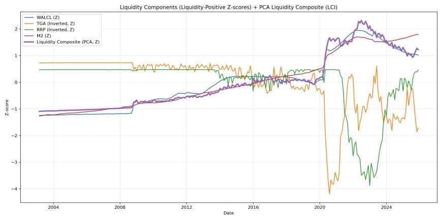
- PCA composite: the first principal component is extracted from WALCL, -TGA, -RRP, and M2 to form the Liquidity Composite Index (LCI).
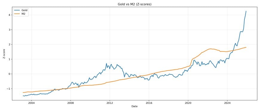
The purpose of z-scoring is simple: it prevents fake arguments. If you overlay raw levels, M2 looks like a “flat line” next to NASDAQ because you’re comparing different units and different magnitudes. Z-score fixes that by comparing each series in standard deviations relative to itself.
If your chart makes one variable look “dead,” that’s usually a scaling problem — not a reality problem. Standardize first. Then talk.
Why EOM alignment matters (and why people accidentally lie with data)
These series update at different speeds. Some are daily (gold, NASDAQ, RRP), some weekly (WALCL, TGA), some monthly (M2, Case-Shiller, CPI components). If you don’t align them, your “signal” becomes a timing artifact. End-of-month snapshots avoid the constant problem of comparing a daily market series to a macro series that arrives with a lag.
Forward-filling is not a hack. It mirrors reality: if you’re trading or analyzing in real time, you operate on the last known print until the next print arrives. The goal is not perfect hindsight; it’s a coherent apples-to-apples regime lens.
Why PCA is the correct way to stop the “which pipe matters” fight
WALCL, TGA, RRP, and M2 don’t move independently. They interact, offset, and sometimes synchronize. PCA extracts the shared component across the standardized pipes, so you can track the system-level “pressure” without hand-waving a single series as the whole truth.
The Four Pipes (WALCL, TGA, RRP, M2)
This is the liquidity engine. Four pipes. One system. People obsess over the Fed and ignore the Treasury. Or they obsess over rates and ignore reserves. Or they obsess over CPI and ignore collateral dynamics. That’s why they stay confused.
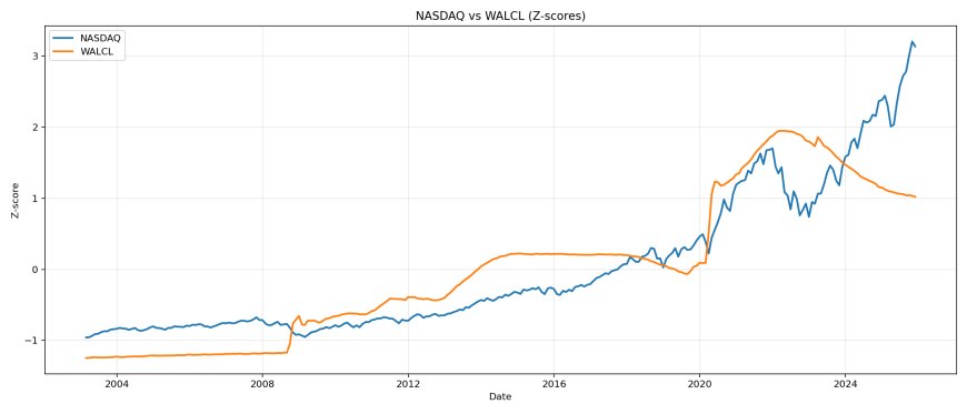
Pipe 1: WALCL (Fed Balance Sheet)
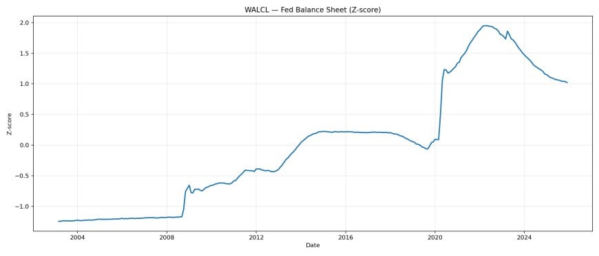
WALCL is the blunt-force instrument everyone knows: Fed assets expanding or contracting. When it ramps, the system gets oxygen. When it shrinks, the system starts fighting over collateral and funding.
Mechanically: when the Fed buys Treasuries or MBS, it credits reserves into the banking system. When it runs off holdings (QT), reserves are withdrawn over time. The market impact is not “political.” It’s a funding condition shift: spreads, leverage appetite, and duration sensitivity all change when reserves and collateral conditions change.
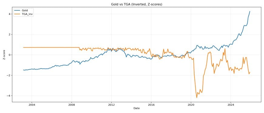
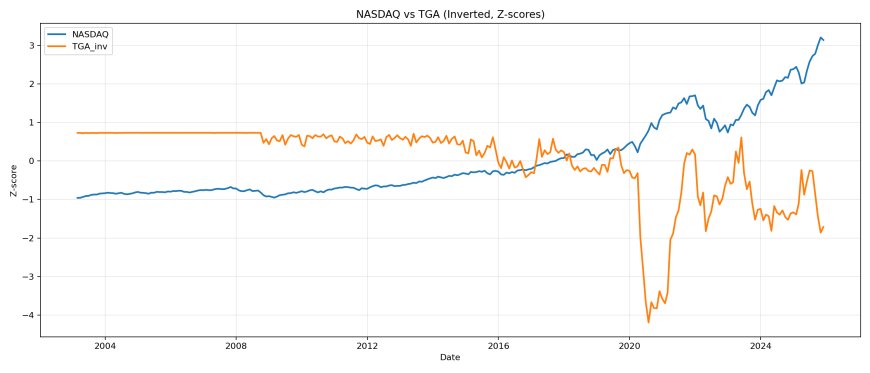
Pipe 2: TGA (Treasury General Account) — Inverted
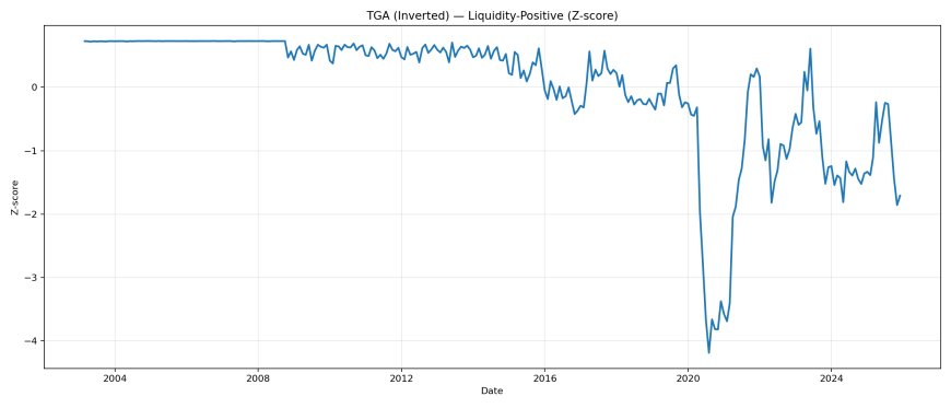
TGA rising is the Treasury vacuuming cash out of the private sector and parking it at the Fed. TGA falling is Treasury spending that cash back into the economy — which injects reserves and liquidity into markets. That’s why we invert it.
Think of TGA as a giant liquidity throttle that often matters as much as (or more than) what the Fed is doing in a given window. Tax receipts, debt-ceiling episodes, and issuance/spend timing can slam liquidity negative or positive without a single “Fed headline.”
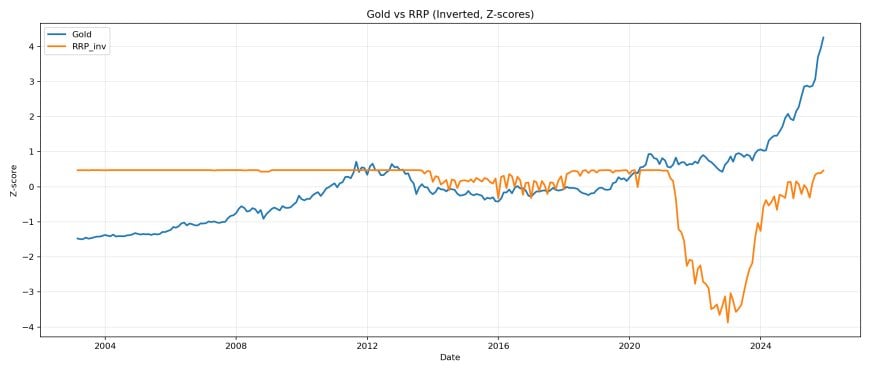
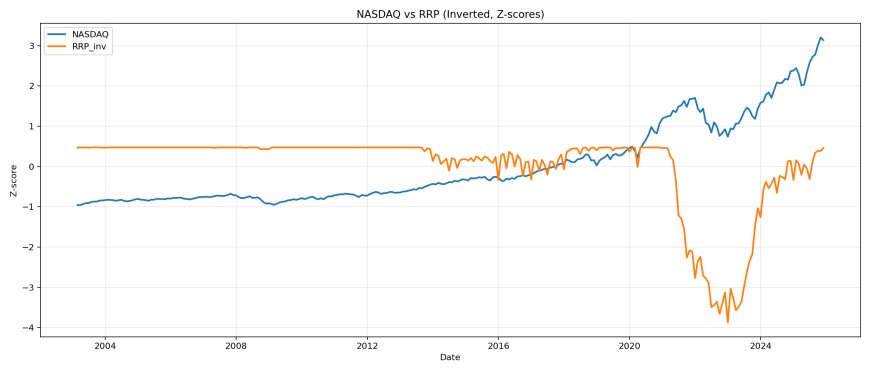
Pipe 3: RRP (Reverse Repo) — Inverted
RRP is the liquidity sink / collateral drain. When balances pile into RRP, money is pulled out of risk assets and money markets. When RRP drains, that liquidity re-enters the system and chases assets. Again: invert it.
RRP is also where you see plumbing linkages in the wild. In 2021, one of the cleanest examples was the Treasury drawing down TGA and flooding the system with cash, while money-market funds had limited bill supply to park in, pushing take-up into ON RRP. That’s not “mystery.” That’s pipes interacting.
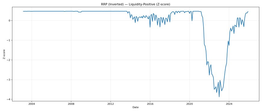
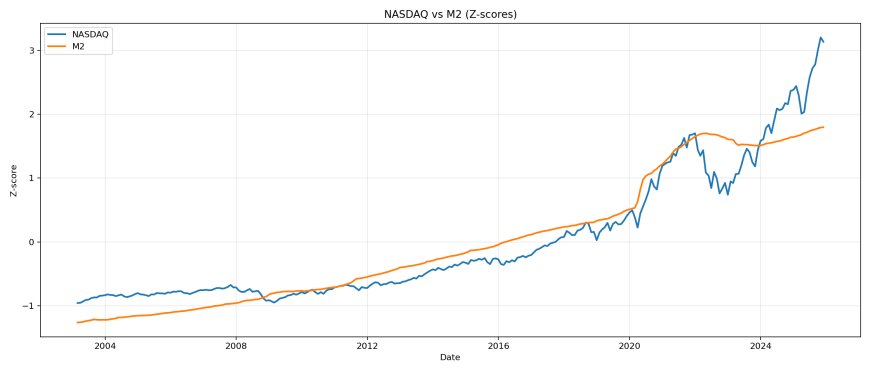
Pipe 4: M2 (Broad Money)
M2 is not the flashy pipe. It’s the background field. It doesn’t always mark turning points cleanly, but it shapes the long drift of the system. And when you standardize it correctly, it’s absolutely not “flat.”
Translation: M2 is the slow tide. It won’t call the exact turn on a dime the way a sharp TGA drain can, but it tells you whether the long-run nominal environment is supportive of a persistent repricing of collateral in the chosen unit of account.
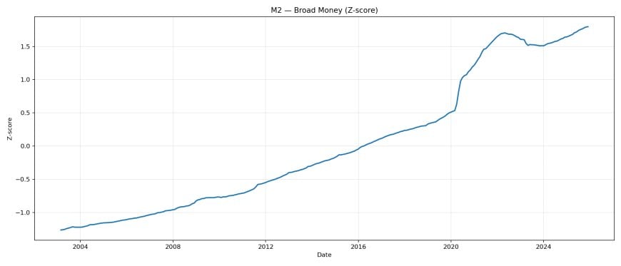
The mistake people make is arguing each pipe like it’s the whole truth. The truth is the combined effect. The system is a four-body machine.
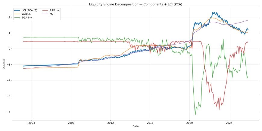
The Liquidity Composite (LCI) — One Signal to Rule Them All
This is where it gets unfair for the narrative crowd. PCA is basically saying: “stop arguing which pipe matters most, and extract the shared signal they all produce together.” That shared signal is the Liquidity Composite Index (LCI).
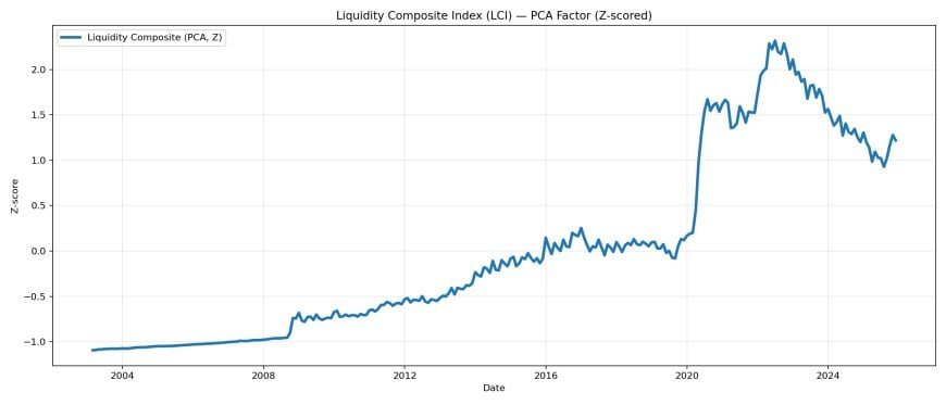
Think of LCI as the “system pressure gauge.” When it rises, leverage is easier, refinancing is easier, funding spreads relax, and valuations expand. When it falls, the system starts rationing credit, collateral gets scarce, and assets stop levitating.
If you have LCI, you can stop arguing “inflation vs recession” like it’s a sports team. Liquidity can drive asset inflation even during economic stress. It can also drain and break assets even if CPI is still elevated. Different system. Different rules.
What LCI is doing conceptually
LCI is not an “opinion index.” It’s the extracted shared movement across the pipes after standardization and sign correction. When multiple pipes become liquidity-positive together, LCI moves sharply and the collateral stack reprices faster. When the pipes offset each other, LCI flattens and the market becomes a chop regime where narratives fight because the system pressure is ambiguous.
Hard Assets vs Liquidity (Gold, NASDAQ, Housing)
Now we do the part everyone pretends is controversial — even though it’s in the data. Overlay LCI against hard assets. Z-score both so the overlay is clean. Watch what happens across two decades.
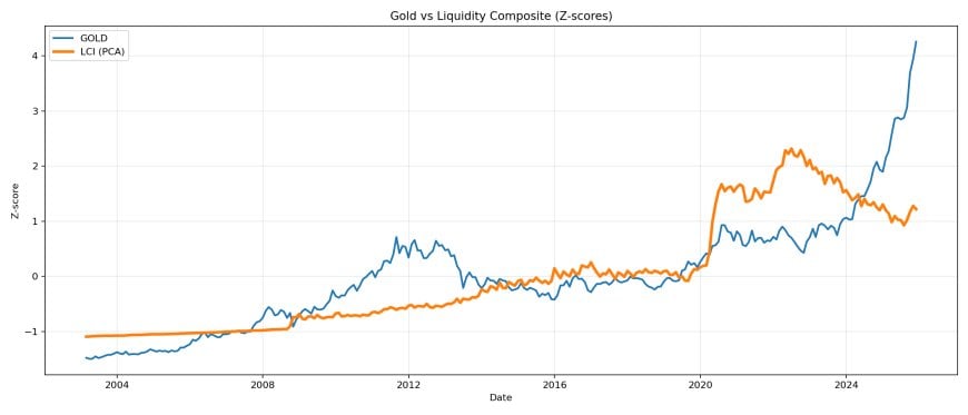
Gold
Gold is a monetary pressure gauge. It sniffs liquidity, stress, and debasement. It doesn’t need CPI permission to move.
Gold behaves like a hybrid asset: it responds to real rates, stress hedging demand, reserve behavior, and the debasement impulse. Liquidity is the fuel source underneath those regimes. When liquidity expands and the system is willing to pay for protection, gold tends to trend. When liquidity tightens and yields bite, gold can stall or correct.
NASDAQ
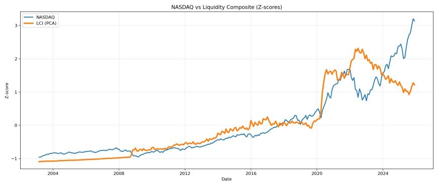
Tech is liquidity beta. It amplifies the cycle. When liquidity is abundant, duration assets get bid like crazy. When liquidity tightens, the air comes out fast.
Mechanically: the NASDAQ is a duration-heavy index. When discount rates and funding conditions loosen, future cash flows get capitalized at higher multiples. When liquidity tightens, the exact same math turns into a valuation guillotine, even if “the companies are fine.” This is why tech can feel detached from the “economy.” It’s detached from the consumer layer because it is being priced through the capital layer.
Housing (Case-Shiller)
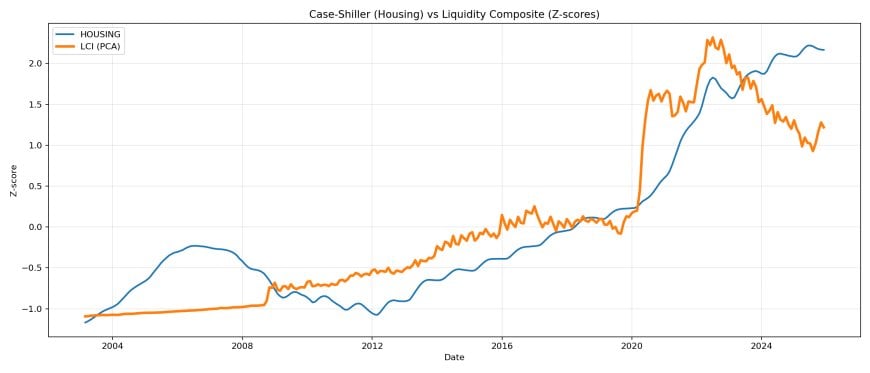
Housing is the slow orbiter. It doesn’t twitch like equities, but it follows liquidity with brutal consistency. It reprices with mortgage credit availability and the collateral regime — not with wage narratives on Twitter.
Housing is financed. That means it’s a credit asset even when people talk about it like a consumption good. The marginal buyer’s monthly payment is a function of mortgage rates, underwriting constraints, and the availability of funding. Liquidity conditions set the tone for mortgage credit, and then housing follows with a lag because transaction velocity is slower than markets.
Pipe-by-Pipe Breakdown: What Each Pipe Does to Each Asset
If you want to trade this framework, you need to understand the texture. Sometimes WALCL dominates. Sometimes TGA dominates. Sometimes RRP draining is the entire show. Sometimes M2 is the slow tide that keeps lifting everything even while people argue.
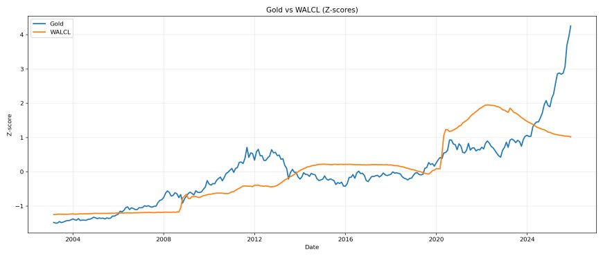
Gold vs Pipes
Gold responds to the combined regime, but the mix changes. Some phases are “Fed-driven.” Some are “Treasury-driven.” Some are “stress-driven.” The point is: you don’t need to guess which narrative is correct if you can identify which pipe is moving and whether it’s synchronized with the others.
NASDAQ vs Pipes
NASDAQ is the amplification chamber. It reacts quickly because the capital stack reprices quickly. When liquidity shifts, the NASDAQ doesn’t negotiate. It updates.
Housing vs Pipes
Housing is slower, but it’s not immune. It’s a credit asset. The difference is latency. Mortgage channels and transaction velocity introduce a lag, but the regime still governs.
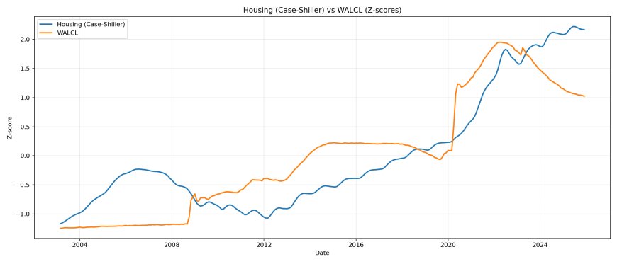
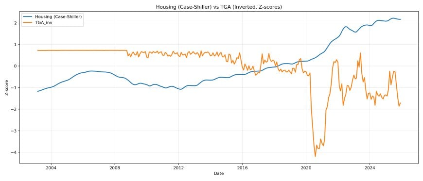
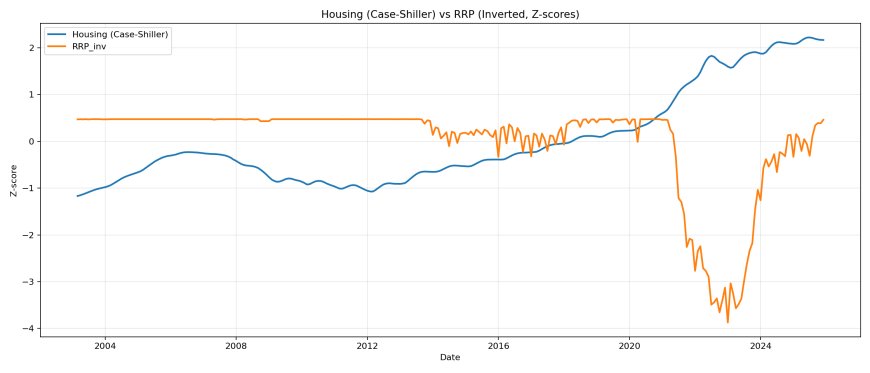
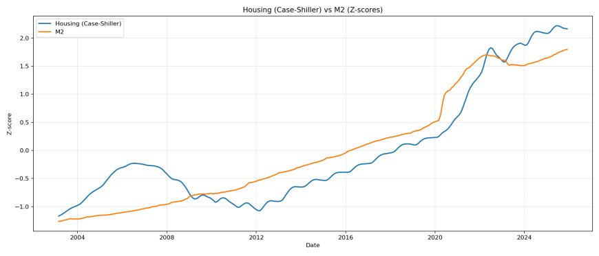
This is how you stop being surprised. You don’t ask “why did markets rally on bad CPI?” You ask “which pipe injected liquidity, and how did the collateral stack reprice?”
Why CPI, Rent, and Wages Are the Wrong Anchors
Let’s deal with the mindset error directly. People see housing rising faster than wages and they immediately scream “bubble.” But that’s a category mistake. Housing is a collateral asset. Wages are a consumer variable. The capital system can reprice assets even while consumer capacity lags.
Here’s the classic framing — indexed to 100 so people can eyeball divergence.
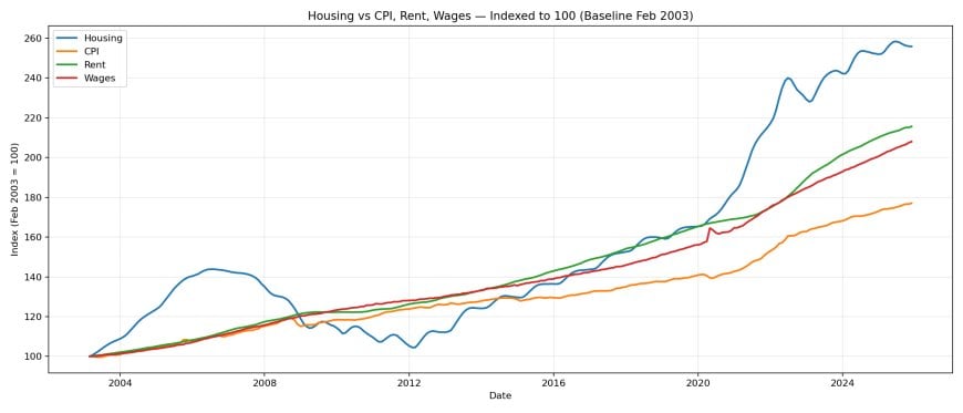
And now the corrected framing: put liquidity on the chart in a comparable unit (z-score) so you can see the governing variable.
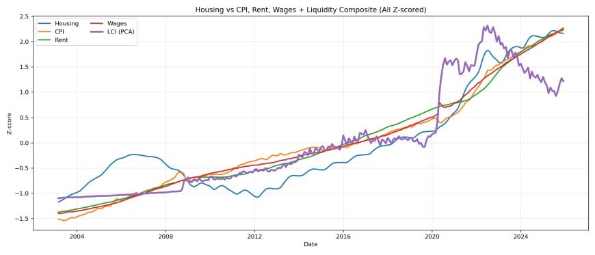
CPI and wages can stay “high” or “sticky” while liquidity turns and reprices assets anyway. That’s why the CPI narrative keeps failing. The CPI argument is consumer logic trying to explain capital mechanics.
And to address the “$40 orange juice” type of comment: if I measure everything in a unit that gets debased forever, the “price” of everything will go up forever in that unit. That doesn’t tell you the thing is scarce. It tells you your measuring stick is collapsing.
That’s literally what “liquidity expansion” is: more claims, more base, more leverage capacity, more nominal repricing. If your base layer expands persistently over decades, the collateral stack reprices persistently over decades.
Consumer variables lag by design
Rent resets on lease cycles. Wages move on labor market dynamics and bargaining power. CPI is a basket with substitution effects and measurement assumptions. Asset prices are continuously repriced by marginal capital. If you anchor to lagging consumer variables, you will always be late to the regime shift.
Stat Proof: Rolling Correlations
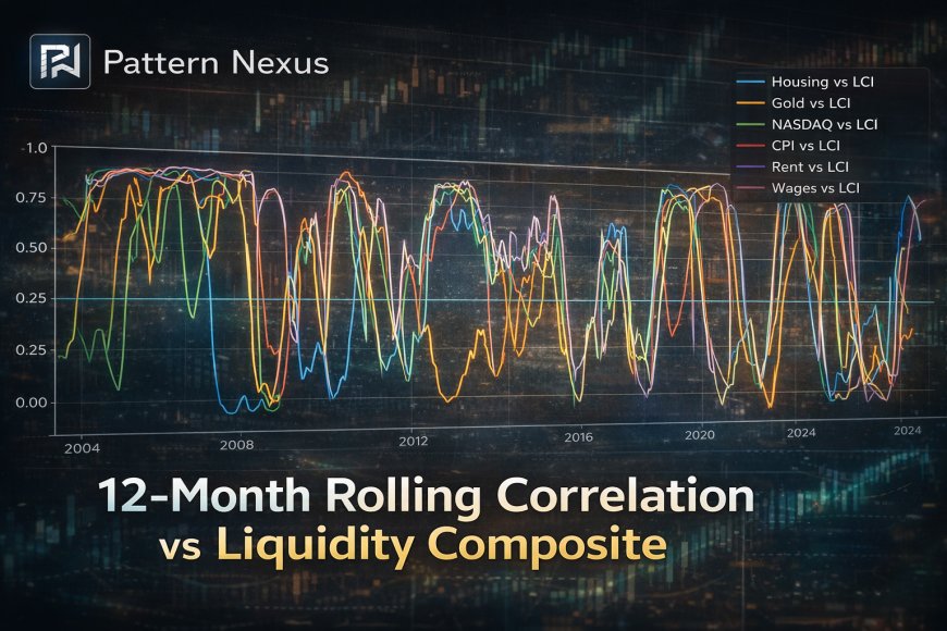
“Correlation isn’t causation” is the laziest defense line in macro. Yes, correlation isn’t causation — but sustained, cyclical, regime-aligned correlation across decades is a signature of structure. This chart measures 12-month rolling correlation between LCI and each series.
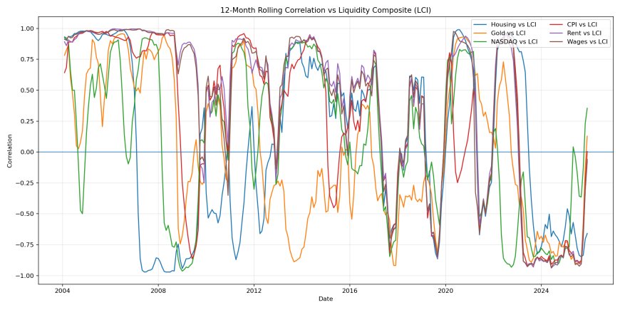
Read it like this:
- Hard assets: tend to cluster high and positive vs LCI during liquidity-driven regimes.
- Consumer variables: wobble, lag, and often go flat/negative depending on regime timing.
That’s not “a coincidence.” That’s the system telling you what it is.
What “regime-aligned” means
In stable liquidity regimes, correlations stabilize because the system is operating under a consistent funding logic. In transition regimes, correlations flip and chop because the pipes are offsetting or because the market is pricing a policy transition before it arrives in consumer data. This is exactly why “macro takes” fail when they’re anchored to a single variable.
Where We Are Now + What To Watch Next
This is the operational part: how to use the framework in real time. You don’t need to predict the future with “feelings.” You track the pipes and you track whether they’re synchronized.
When multiple pipes turn liquidity-positive at the same time, you get melt-ups. When pipes reverse, you get air pockets, funding stress, and repricing.
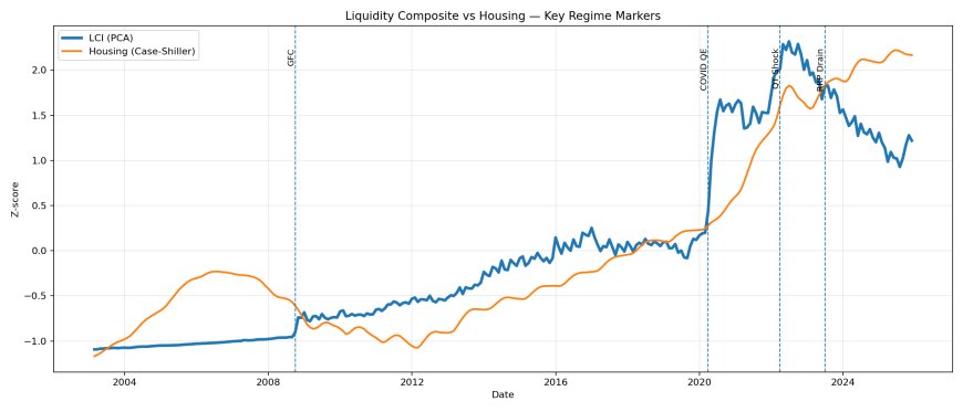
Here’s the checklist I care about going forward:
- WALCL: is balance sheet contraction ending or reversing?
- TGA: is Treasury draining cash into the private sector (liquidity-positive) or rebuilding balances (liquidity-negative)?
- RRP: is money still trapped in the facility, or is it draining back into markets?
- M2: is broad money accelerating, flat, or rolling over?
- Synchronization: are 2–3 pipes moving together, or are they offsetting each other?
The next major repricing wave will not announce itself with headlines. It will show up in the plumbing first. Watch the pipes, not the narrative.
Where we are now (framework read, using the same pipe lens)
When you run this framework into early 2026, the point is not the exact number on a given day. The point is the pipe configuration and whether they’re in-phase.
- WALCL: still elevated vs history, but drifting lower under QT in the recent regime.
- TGA: high balances can be liquidity-negative (cash parked at the Fed). A drawdown (spend) is liquidity-positive.
- RRP: dramatically lower than peak usage; when it’s near empty, it stops acting as the dominant liquidity sink and the system becomes more sensitive to other drains.
- M2: slower-moving and trend-defining; when it’s accelerating, it supports nominal repricing across the collateral stack even if people argue about “real economy” stress.
Collectively, the LCI can bounce without being at prior peaks. That’s the typical “partial reflation” environment: enough liquidity to levitate some assets, not enough to make the consumer layer feel good, and that gap is exactly where narrative wars explode.
How to monitor liquidity in real time (without turning it into a religion)
- WALCL: weekly H.4.1 cadence. Watch slope, not headlines.
- TGA (WTREGEN): weekly. Watch rapid rebuilds (drain) vs spenddowns (inject).
- RRP (RRPONTSYD): daily. Watch “sink behavior” during risk-off vs “drain behavior” during reflation.
- M2 (M2SL): monthly. Watch direction and persistence.
- Synchronization: the regime driver is whether 2–3 pipes are moving the same way at the same time.
That’s the whole thesis: if you remove liquidity, the world looks chaotic. If you add liquidity, the chaos collapses into a cycle.
Liquidity is the hidden controller. CPI, wages, and rent are downstream outputs. Hard assets follow liquidity because the collateral stack is priced by funding conditions, not by consumer narratives.
Pattern Nexus Lens
This is a control system. The economy people argue about is the visible layer. The liquidity layer is the hidden controller underneath it. When the controller changes state, everything downstream reconfigures — asset prices first, consumer data later.
That’s why you can get “inflation down” while markets rally. That’s why you can get “strong jobs” while credit is rotting underneath. The consumer layer is slow. The capital layer is fast.
Liquidity is not a “macro opinion.” It’s a measurable input to the control system. If you want to understand outcomes, track inputs.
FAQ
“Isn’t this just money printing?”
Sometimes, yes. But the broader point is system liquidity — reserves, collateral, and funding conditions. “Money printing” is a headline phrase. The pipes are the mechanics.
“Does supply/demand matter for housing?”
It matters over long horizons. Liquidity reprices the entire curve faster than supply can react. That’s why you can get explosive repricing even while real constraints barely move.
“Why does everything go up over time?”
Because the denominator gets debased. If the unit you measure in loses purchasing power forever, nominal prices rise forever. That doesn’t automatically mean scarcity. It often means dilution.
“So is $40 orange juice a liquidity crisis?”
Depends on the framing. If the currency denominator is being debased and your purchasing power collapses, nominal prices rise. If the supply chain is broken and there is no alternative supply, that’s scarcity. The point is: don’t confuse “price up” with “real scarcity” without checking the denominator and the plumbing.
“How do I watch liquidity in real time?”
Track WALCL, WTREGEN (TGA), RRPONTSYD (RRP), and M2SL. The key is not one series — it’s the synchronization across multiple pipes.
“Does this predict the next crash?”
It doesn’t “predict” like a fortune teller. It tells you what regime you’re in and whether the system is tightening or loosening. Crashes are often liquidity accidents.
Sources
All series pulled from official data sources (primarily FRED). Liquidity Composite Index (LCI) is constructed from standardized (z-scored) WALCL, -TGA, -RRP, and M2 using PCA (first principal component).
- WALCL — Federal Reserve Total Assets
- WTREGEN — Treasury General Account (TGA)
- RRPONTSYD — Overnight Reverse Repo (RRP)
- M2SL — M2 Money Stock
- CSUSHPINSA — Case-Shiller National Home Price Index
- NASDAQCOM — NASDAQ Composite
- GOLDAMGBD228NLBM — London Bullion Market Gold Fix
- CPIAUCSL — CPI (All Urban Consumers)
- CUUR0000SEHA — CPI: Rent of Primary Residence
- AHETPI — Average Hourly Earnings (Production & Nonsupervisory)
Qual é a sua reação?
 Curtir
0
Curtir
0
 Não gostei
0
Não gostei
0
 Amor
0
Amor
0
 Engraçado
0
Engraçado
0
 Uau
0
Uau
0
 Triste
0
Triste
0
 Bravo
0
Bravo
0

Founder of Pattern Nexus. I research markets, macro, geopolitics, AI, history, ancient systems, and the patterns most people overlook. I’m also building Market Radar, a trading scanner designed to read pressure, risk, confirmation, and setup quality before chasing a move. Pattern Nexus is where I connect the dots between data, history, technology, and the bigger system playing out around us.



















Comentários (0)