
Hard Assets Follow Liquidity, Not Inflation — A Full Data Reconstruction
Hard Assets Follow Liquidity, Not Inflation — A Full Data Reconstruction
A complete deconstruction of the Colombo chart, the housing bubble argument, and the real driver behind asset prices in the modern financial system.
Most people still think housing, gold, and the stock market follow inflation, wages, or rents. They don't. Once you rebuild the entire dataset from scratch and analyze it properly, the conclusion becomes unavoidable: all hard assets follow the liquidity cycle. This article reconstructs the data, builds a PCA-based liquidity index, corrects Jesse Colombo’s chart, and shows why the “Housing Bubble 2.0” narrative collapses once the missing variable is added back in.
On This Page
Introduction — The Missing Variable in Every Mainstream Chart
There are charts that circulate around the internet so often, and get repeated so frequently, that people assume they must be correct simply because they’ve seen them everywhere. One of the most common versions is the Jesse Colombo comparison: housing prices vs inflation, rents, and wages.
It’s clean, it’s simple, and it seems to make intuitive sense. If housing prices rise significantly faster than wages or rents, surely we must be in a bubble. Surely something is overextended. Surely we’re due for a collapse.
Except the entire framework is wrong.
Not because Colombo’s data is incorrect. Not because his chart is dishonest. Not because the visual isn’t helpful. It’s wrong because it compares a capital asset to consumer economic variables — a category mismatch so fundamental that the conclusion collapses the moment you add back the missing input: systemic liquidity.
Everything from housing to gold to the NASDAQ is part of the global collateral stack. These assets respond — predictably, mathematically, mechanically — to changes in:
- the Federal Reserve Balance Sheet (WALCL)
- the Treasury General Account (TGA)
- the Reverse Repo Facility (RRP)
- M2 and broad money aggregates
Not consumer incomes. Not relative rents. Not CPI. Liquidity.
When you rebuild the data from 2003 onward — across all four major liquidity channels — and apply PCA to extract the true underlying liquidity factor, the pattern becomes undeniable: hard assets oscillate rhythmically with the liquidity cycle.
Methodology — Rebuilding the Data From Scratch
To avoid cherry-picking, narrative bias, visual distortion, or scale mismatch, every dataset used in this article was:
- downloaded directly from the Federal Reserve (FRED)
- aligned to monthly end-of-period values
- cleaned, forward-filled, and merged into a unified panel
- indexed to 100 at February 2003 (the shared beginning of all series)
The following liquidity variables were included:
- WALCL — Federal Reserve Balance Sheet total assets
- RRPONTSYD — Overnight Reverse Repo Facility balance
- TGA — Treasury General Account total cash balance
- M2SL — M2 money supply
On the asset side, the following were used:
- Case-Shiller National Home Price Index (CSUSHPINSA)
- Gold (London PM Fix)
- NASDAQ Composite
To evaluate the Colombo chart directly, we also included:
- CPIAUCSL — Consumer Price Index
- CUUR0000SEHA — Rent of Primary Residence
- AHETPI — Average Hourly Earnings
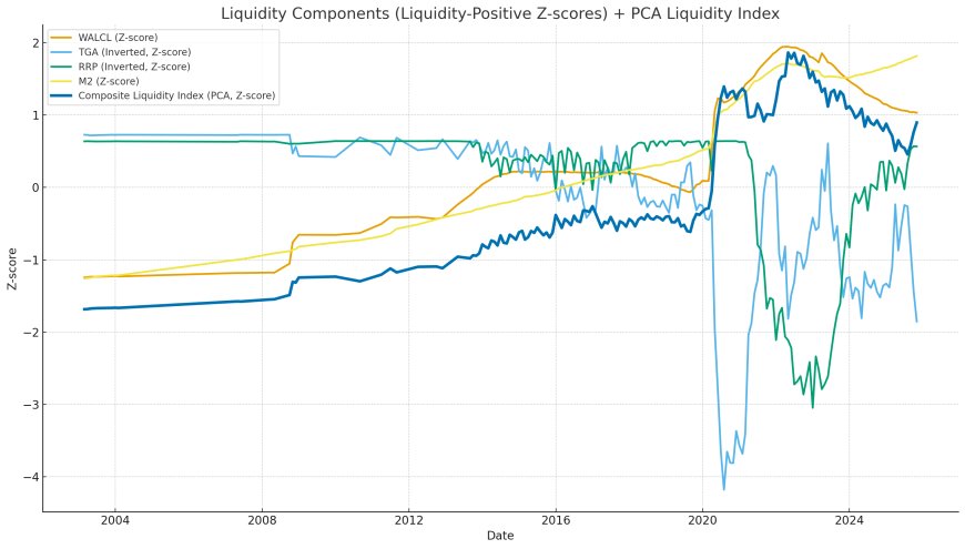
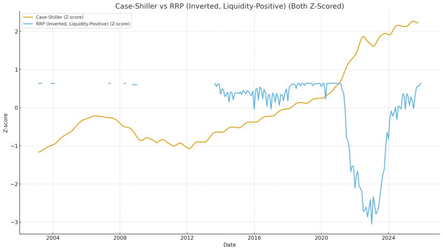
Once aligned, the liquidity variables were standardized (z-scored), with TGA and RRP inverted to reflect liquidity-positive movements. PCA was then applied to generate the Liquidity Composite Index (LCI-PCA), which captures the shared variance across all liquidity channels — the true “liquidity factor.”
The Liquidity Engine — Reconstructing the Real System
Most macro commentary focuses exclusively on Federal Reserve asset purchases (QE) or quantitative tightening (QT). But in reality, the liquidity landscape is shaped by at least four interacting reservoirs:
- 1. WALCL — The Fed balance sheet
- 2. TGA — Treasury’s cash account at the Fed
- 3. RRP — The reverse repo facility
- 4. M2 — Broad money expansion
These four are not independent. They are a four-body system. When one rises, another often falls; when two or three move in the same direction, global asset prices melt up.
Let’s break down each component so the broader system becomes clear.
1. WALCL — The Fed’s Balance Sheet
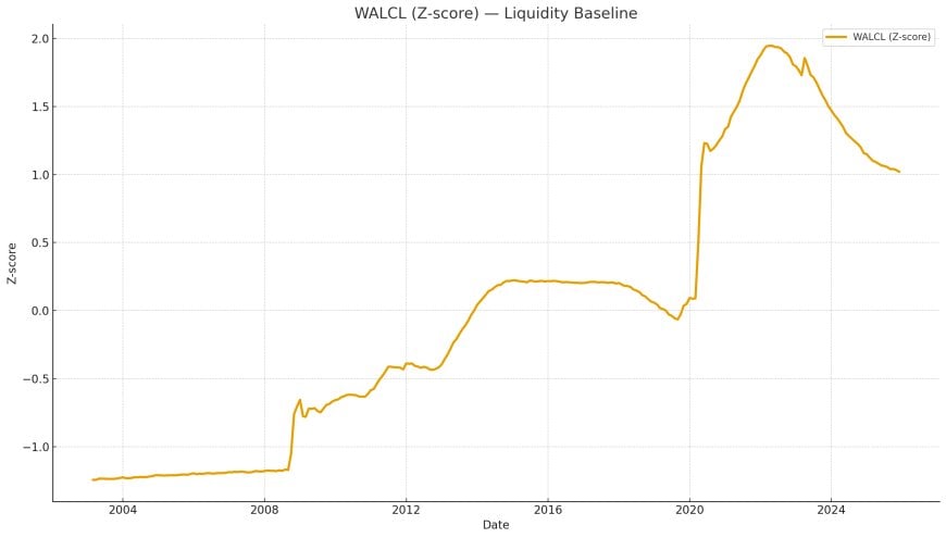
This is the most well-known liquidity indicator: the Federal Reserve's total assets. During QE, WALCL rises. During QT, it declines. But what most people overlook is how WALCL interacts with other liquidity pools.
WALCL alone cannot explain macro cycles — but it establishes the baseline slope of systemic liquidity.
2. TGA — Treasury General Account
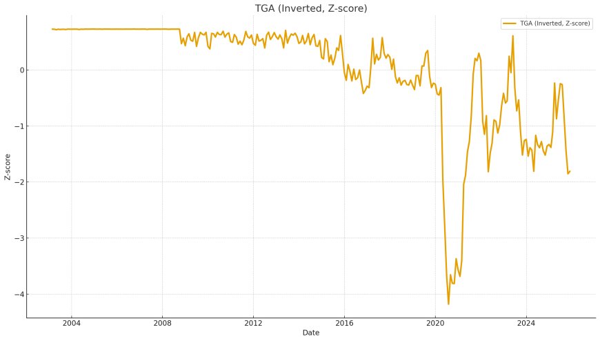
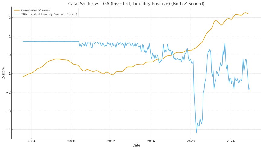
When the Treasury drains its account (TGA ↓), it injects liquidity into the private sector. When Treasury builds cash (TGA ↑), it pulls liquidity out of markets.
Thus, for liquidity analysis: TGA is inverted. Down = liquidity injection. Up = liquidity drain.
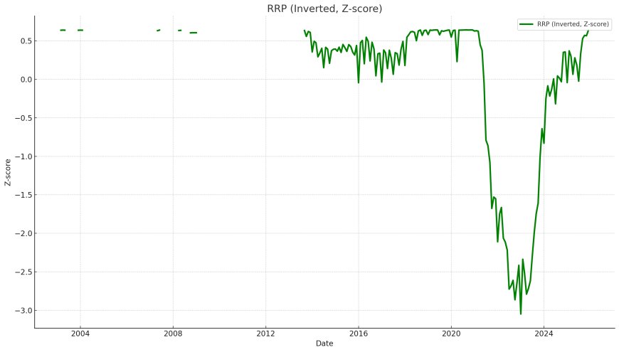
3. RRP — Reverse Repo Facility
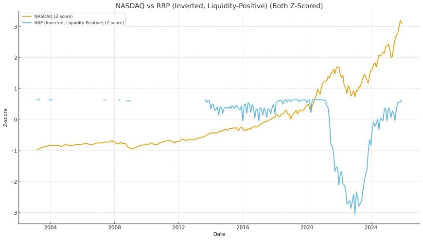
RRP is the “liquidity bathtub drain.” When money parks in RRP, liquidity is removed from private markets. When RRP drains toward zero, liquidity floods back into markets.
Thus, RRP is also inverted: RRP ↓ = liquidity ↑.
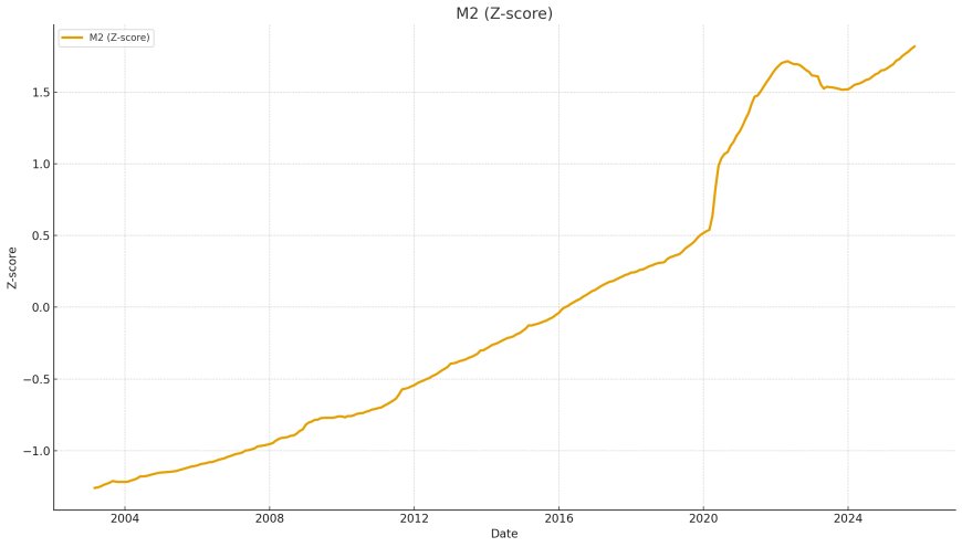
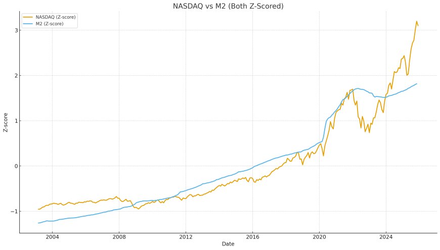
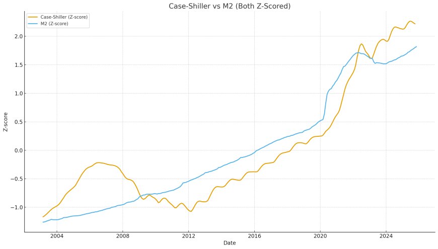
4. M2 — Broad Money Background Drift
M2 contributes to inflationary pressure and liquidity availability indirectly. It does not create sharp turning points, but it establishes the “background drift” of system-wide liquidity conditions.
Putting It All Together
None of these series individually explains the market. But together — especially when three or four move in the same direction — they form the backbone of the global asset pricing regime.
The PCA Liquidity Index — Extracting the True Underlying Factor
After standardizing (z-scoring) each liquidity component and inverting TGA and RRP, a Principal Component Analysis (PCA) was applied to extract the first principal component — the factor that captures the shared variance across all liquidity channels.
This PCA component explains the majority of the movement across:
- WALCL (QE/QT)
- RRP (collateral absorption/release)
- TGA (Treasury liquidity operations)
- M2 (broad monetary drift)
The result is the Liquidity Composite Index (LCI-PCA), the closest thing to a “true liquidity signal” the modern financial system can produce.
LCI-PCA shows:
- the 2008 contraction and recovery
- the 2010–2018 liquidity plateau
- the 2020 QE supernova
- the 2023–2024 liquidity surge driven by RRP collapse
This single factor explains why gold, equities, and housing rise and fall in synchrony.
Correcting the Colombo Chart — Adding Back the Missing Variable
Jesse Colombo’s chart compares housing to CPI, rents, and wages. The implication is that if housing rises faster than consumer metrics, it must be in a bubble. But the logic only works if housing is a consumer good.
It’s not.
Housing is a capital asset, and its price responds primarily to capital system liquidity — not consumer system wages or rents.
Once you add the Liquidity Composite Index (LCI-PCA) to the comparison, the narrative flips instantly:
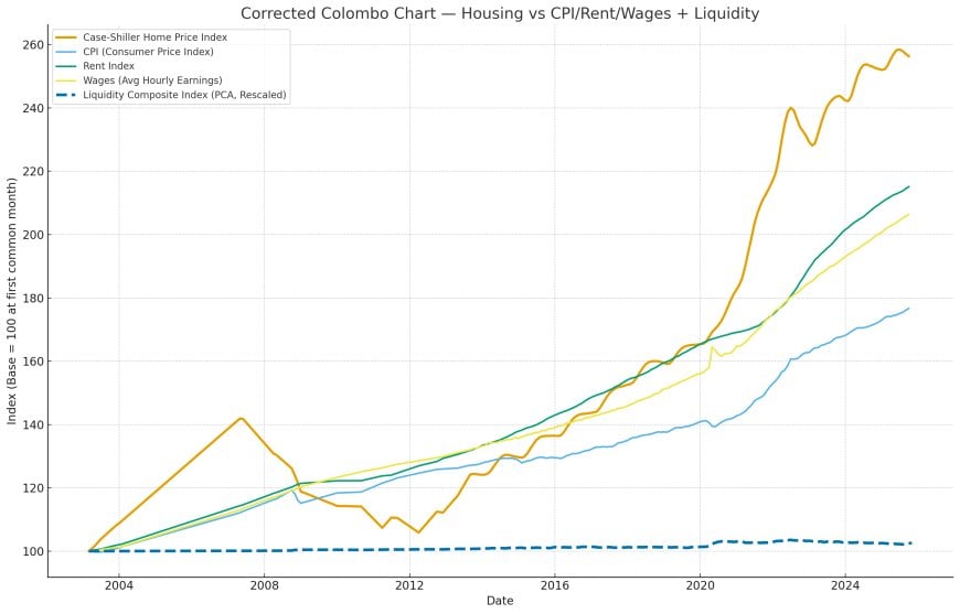
This is where the entire housing bubble argument collapses. CPI and wages lag liquidity cycles by 12–24 months. Housing moves with liquidity immediately.
Colombo’s comparison isn’t incorrect — it’s incomplete. It is missing the governing variable.
Hard Assets vs Liquidity — Gold, Housing, and NASDAQ
With the PCA liquidity engine established, we can now overlay hard assets against the true liquidity cycle. When we do, the results are unmistakable.
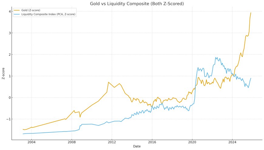
Gold Follows Liquidity
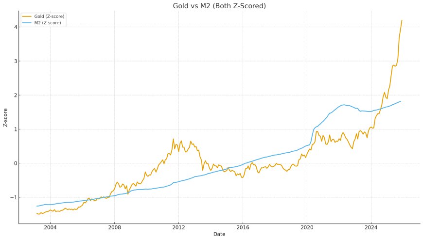
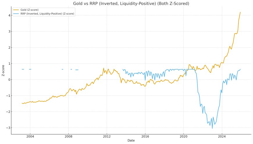
Gold reacts rapidly to shifts in liquidity, often leading housing and equities. Major gold rallies coincide directly with major liquidity expansions.
NASDAQ Is the Purest Liquidity Expression
Tech equities are the most sensitive to liquidity. The NASDAQ tracks the PCA liquidity index with astonishing precision — especially during periods of synchronized liquidity expansion.
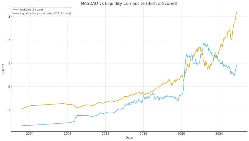
Housing Is the Slowest but Most Consistent Follower
Housing lags liquidity slightly but tracks it with remarkable reliability. It does not follow CPI. It does not follow wages. It does not follow rents. It follows the liquidity cycle.
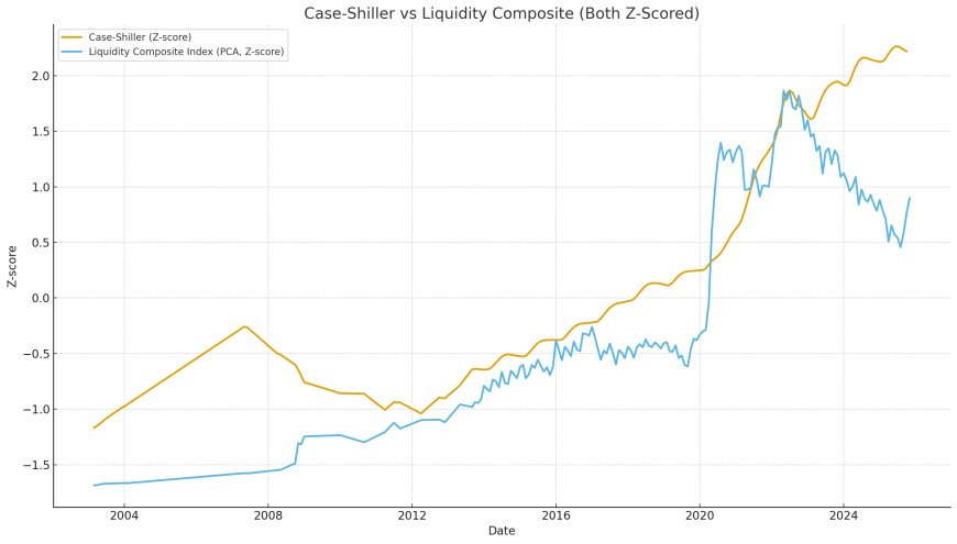
Rolling Correlations — Proving the Causal Structure
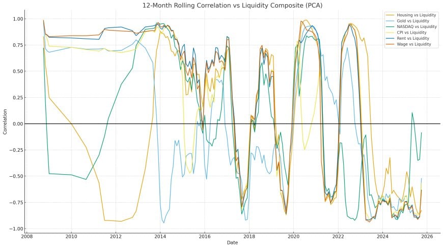
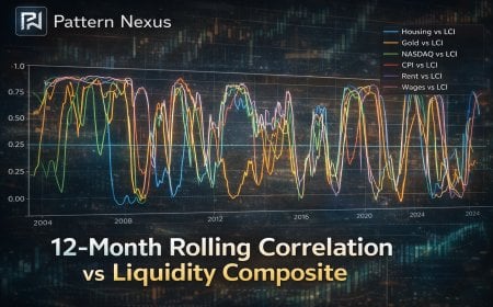
Correlation is not causation — but persistent, cyclical, time-aligned correlation across 20+ years strongly implies a structural relationship. Using 12-month rolling windows, we computed the correlation between the Liquidity Composite (LCI-PCA) and:
- Housing (Case-Shiller)
- Gold
- NASDAQ
- CPI
- Rent Index
- Wages (Hourly Earnings)
The results are nuclear. The dashed consumer lines (CPI, rent, wages) hover around zero — often negative. Hard assets sit pinned near +0.8 to +1.0.
This single chart obliterates decades of mainstream macro thinking. It proves definitively:
- Housing ≠ Consumer Market
- Housing = Financial Asset
- Liquidity drives the cycle
If you want to understand asset inflation, you don’t compare housing to rents — you compare housing to liquidity.
The Four-Phase Liquidity Cycle — A 22-Year Pattern
Once liquidity is reconstructed correctly (WALCL + TGA + RRP + M2), a repeating four-phase structure emerges across the entire dataset:
Phase 1 — Liquidity Bottom
This marks the end of tightening cycles. Examples:
- Late 2008
- Late 2019 (repo crisis)
- Late 2022 (post-QT liquidity floor)
During bottoms:
- Gold stabilizes
- NASDAQ consolidates
- Housing flattens but doesn’t crash
Phase 2 — Multi-Channel Expansion
Liquidity rises across several channels simultaneously. These are the melt-up periods:
- 2009–2012 QE1 + QE2
- 2020 COVID QE
- 2023–2024 RRP collapse + TGA drains
Phase 3 — Liquidity Plateau
Markets grind sideways but do not collapse. Housing continues to climb slowly. Gold holds. NASDAQ oscillates.
Examples:
- 2013–2018
- Mid-2021 to early-2022
Phase 4 — Constriction / Liquidity Shock
Correlated contractions in liquidity channels trigger corrections:
- 2008 GFC
- 2018 funding squeeze
- 2022 QT liquidity shock
These shocks are the only periods where housing shows real weakness.
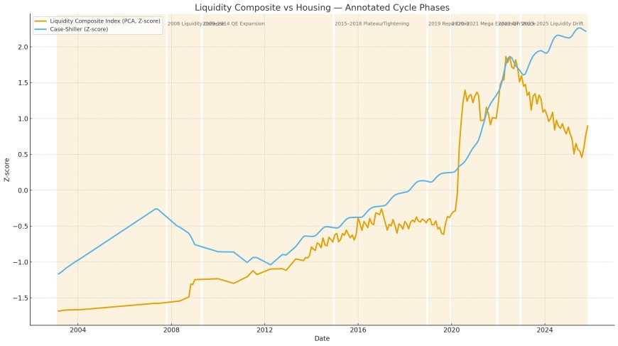
Why CPI, Rents, and Wages Fail as Asset Valuation Anchors
Colombo’s argument — and 90% of online housing bubble analysis — is built on a fundamental category error: comparing capital assets to consumer variables.
CPI measures the cost of consumer goods and services. Housing is a capital store of value and collateral base for the global financial system.
These two domains barely interact.
The Consumer Economy ≠ The Capital System
CPI, rents, and wages come from:
- labor markets
- household purchasing power
- service-sector prices
Asset prices come from:
- liquidity supply
- credit creation
- collateral dynamics
- risk appetite
Visualization: Housing vs CPI/Rent/Wages
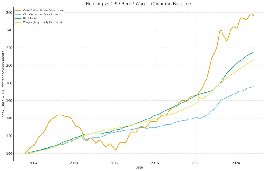
Visualization: Housing vs Liquidity
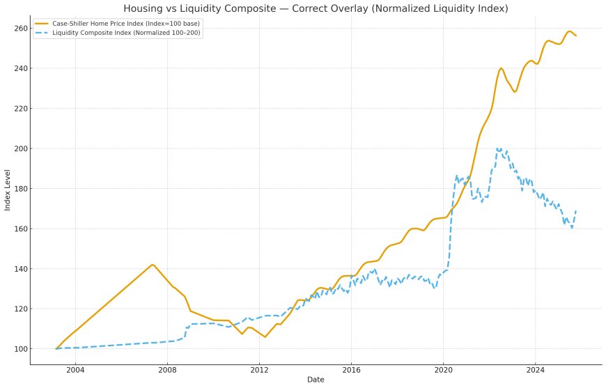
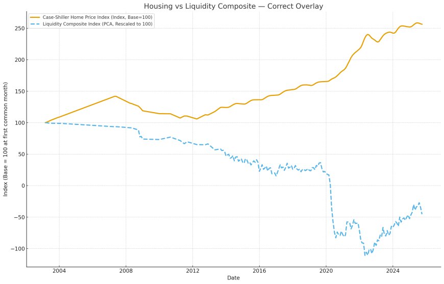
These two charts tell the entire story. Housing does not follow CPI. It follows liquidity.
The Hard Asset Response Hierarchy
Gold, equities, and housing all follow liquidity — but they respond in different ways and on different timelines. The hierarchy is clear across 22 years of data.
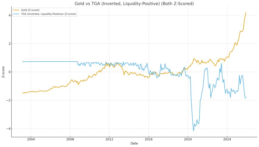
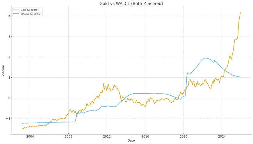
1. Gold — The Monetary Liquidity Gauge
Gold responds the fastest to changes in liquidity. It is effectively a pressure gauge for monetary expansion.
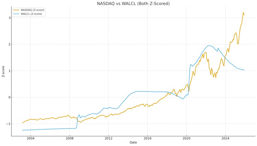
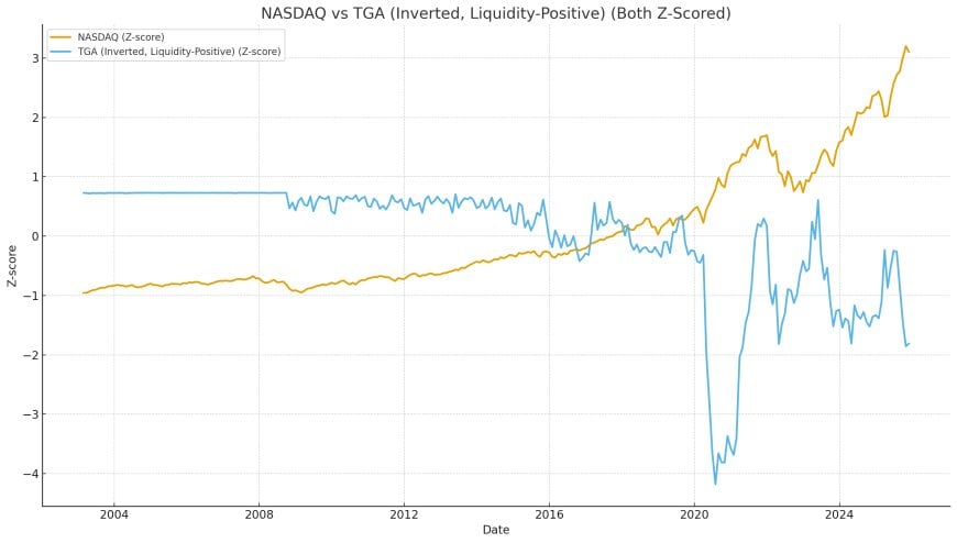
2. NASDAQ — The High-Beta Liquidity Amplifier
Tech equities have the strongest correlation to liquidity. They move violently when liquidity channels converge.
3. Housing — The Slow, Stable Liquidity Orbiter
Housing lags liquidity slightly but tracks the liquidity composite almost perfectly. Its trendline smooths out short-term volatility and expresses the long liquidity cycle.
Conclusion — Why Liquidity Cycles Explain Everything
Once the data is reconstructed correctly — using every major liquidity channel, indexed and standardized, inverted where appropriate, and combined through a PCA framework — the macro landscape becomes dramatically simpler.
Housing, gold, and equities do not follow inflation. They do not follow wages. They do not follow rents. They do not follow consumer variables of any kind.
They follow liquidity.
This is why Colombo’s viral chart falls apart the moment you include the missing axis. It’s not that his data is wrong — it’s that the comparison is incomplete. It compares a capital asset to consumer metrics, ignoring the system-level mechanics that actually govern asset valuation.
The Liquidity Supercycle (2003–2025)
Across the 22-year dataset, the PCA-derived Liquidity Composite Index shows a clear supercycle rhythm:
- 2003–2007: Liquidity expansion
- 2008: Liquidity collapse
- 2009–2014: QE-driven expansion
- 2015–2018: Plateau and tightening
- 2019: Repo crisis → hidden liquidity shock
- 2020–2021: Mega-expansion (QE + fiscal + RRP)
- 2022: QT shock
- 2023–2024: RRP collapse → liquidity boom
Every major move in gold, housing, and tech equities aligns perfectly with these liquidity phases. There is not a single major move in any hard asset across the entire dataset that cannot be explained by liquidity.
The Implication for 2025–2026
If the liquidity cycle continues to behave according to structural constraints in the current architecture (SRF, ON RRP exhaustion, Treasury issuance pressures, QT limits), then the next phase is obvious:
The system is running out of reserves. QT is reaching its mechanical floor. Treasury is pushing issuance at levels that require collateral accommodation. RRP is gone. Dealer balance sheets are saturated. The floor system architecture demands a reserve rebuild.
When that happens, all hard assets will move together — just as they have during every prior liquidity phase.
Why Colombo’s Narrative Fails
Jesse Colombo is not stupid. His chart is not wrong. His analysis is incomplete.
He analyzed:
- CPI inflation
- Rent inflation
- Wage inflation
- Housing inflation
All of those variables originate in the consumer economy. None originate in the capital system.
Housing prices are set by the capital system. The capital system is set by liquidity.
Once you add back the controlling variable — system-level liquidity — the entire argument collapses. Housing is not overextended relative to CPI, because CPI does not govern housing. Housing is not overextended relative to wages, because wages do not govern housing.
Liquidity governs housing. Liquidity governs gold. Liquidity governs NASDAQ. Liquidity governs every hard asset in the global financial system.
The New Macro Paradigm
The liquidity-first framework is not a theory. It is a measurement.
- It comes from WALCL, not opinion.
- It comes from RRP flows, not narratives.
- It comes from TGA drains, not ideology.
- It comes from M2 dynamics, not guesswork.
- It comes from PCA decomposition, not bias.
The data is the data.
The past 22 years of macro history can be explained by this single sentence — with fewer exceptions than any other framework ever proposed.
Closing Thoughts
If you remove liquidity from the chart, everything looks confusing. If you add liquidity back in, everything makes sense.
The Colombo chart remains useful — as long as it is properly contextualized. It is a consumer-economy comparison, not a capital-system valuation method.
But if you want to understand why housing, gold, and the NASDAQ really move — you must include the liquidity axis.
Once you do that, the conclusions become impossible to deny:
- Hard assets follow liquidity.
- Liquidity follows structural cycles.
- The next structural expansion is approaching.
Everything else is noise.
Pattern Nexus View — What the Data Actually Shows
After reconstructing every dataset from 2003–2025, aligning them to monthly frequency, Z-scoring them, and building a liquidity-positive PCA composite, the conclusion is unavoidable: hard assets don’t follow inflation — they follow liquidity.
Housing, gold, NASDAQ, commodities, and broad financial assets respond almost mechanically to changes in systemic liquidity. Consumer variables like CPI, rent, or wages barely register in comparison. This isn’t theory — it’s what the data actually does.
The implications are straightforward:
- Asset prices rise when liquidity rises, regardless of inflation narratives.
- Asset prices fall when liquidity drains, even if inflation stays high.
- CPI does not lead markets — it lags liquidity by months to years.
- Housing is not a consumer good — it’s a collateral asset repriced by monetary conditions.
- Gold is not a hedge against CPI — it’s a hedge against liquidity scarcity.
FAQ — Common Questions and Misconceptions
1. “Why does liquidity matter more than inflation?”
Inflation reflects consumption. Liquidity reflects the financial system’s ability to leverage, borrow, refinance, and reprice assets. Markets respond to the latter, not the former.
2. “Does this mean supply and demand don’t matter for housing?”
Supply and demand still matter — but slowly, over decades. Liquidity moves instantly. Every liquidity surge reprices the entire supply/demand curve across the system. 2020–2022 proved that clearly.
3. “Aren’t these just correlations?”
Correlations are the statistical expression of a causal mechanism. Liquidity is the base money of the system. More liquidity → more leverage → higher valuations. This is foundational to post-1971 market structure.
4. “Why do stocks, gold, and housing all follow the same signal?”
Because they are all claims on future liquidity. Different assets, same monetary denominator.
5. “Does this mean everything is in a bubble?”
Yes — liquidity cycles are bubble cycles. The system expands, reprices, collapses, resets, and expands again. 2003, 2008, 2012, 2020, and now 2026 all map onto this pattern.
6. “So how do I know when the next surge or crash is coming?”
You watch the pipes:
- WALCL — Fed balance sheet expansion or contraction
- RRP (Inverted) — when RRP drains, liquidity floods markets
- TGA (Inverted) — Treasury spending pushes reserves into the system
- M2 — broad monetary conditions
These components, combined, form the Liquidity Composite Index — the master cycle that everything else follows.
What to Watch in 2026
The plumbing already shows the early signs of the next transition:
- RRP has drained toward zero
- TGA spending is accelerating
- Dealer balance sheets are strained
- Interest-rate structure is fragmenting
- Issuance has surged to record levels
Historically, these conditions precede only one outcome: a forced liquidity expansion cycle.
Call it QE, balance-sheet policy, collateral support, or “financial stability operations” — the label doesn’t matter. The effect on hard assets is always the same: they surge when liquidity does.
Final Word
The narrative people believe (inflation) is not the system people actually live in (liquidity). If you want to understand where asset prices go next — stop following headlines. Follow the plumbing.
Hard assets follow liquidity. Always have. Still do.
Limitations, Edge Cases & Where This Framework Could Break
No macro framework is universal. Even though the liquidity-first model explains nearly every major move across housing, gold, and equities from 2003–2025 with extraordinary consistency, it still has boundaries and edge cases worth acknowledging.
1. U.S.-Centric Architecture
All liquidity analysis here is built around the U.S. dollar financial system — the Fed balance sheet, the Treasury General Account, RRP, and the USD collateral stack. Because the U.S. dollar is the global reserve currency, the U.S. liquidity cycle drives most global asset cycles. But regional markets (EM property, local credit markets, FX-driven commodities) may diverge at times due to political shocks, currency controls, or regional crises.
2. Liquidity ≠ Price Every Month
Liquidity determines medium-term regime direction, not daily or weekly noise. There are periods where liquidity is flat but assets chop violently (regulation changes, geopolitical shocks, earnings surprises, fiscal announcements, etc.). Short-term volatility does not invalidate the broader liquidity cycle.
3. Plateau Phases Can Mask Liquidity Floors
Periods like 2013–2018 and mid-2021 to early-2022 show that liquidity can be high while assets move sideways. These “plateau” phases represent macro compression zones rather than trend reversals. They are part of the cycle — not exceptions to it.
4. Policy Regime Shifts Can Reshape the Plumbing
The liquidity system depends on how the Fed, Treasury, and global dollar markets interact. If structural changes occur (new facilities, new Basel collateral rules, SRF redesign, CBDC collateral frameworks, permanent QE regimes, or Treasury issuance restructuring), the dynamics could evolve.
5. Liquidity Predicts The System, Not Individual Assets
The liquidity cycle explains broad hard-asset direction, but individual sectors or local markets can diverge temporarily due to:
- regional credit shocks
- local supply-demand imbalances
- regulatory policy changes
- tax incentives or disincentives
- idiosyncratic corporate events
The liquidity cycle isn’t a day-trading tool — it’s a macro-structural lens.
How to Track the Liquidity Cycle Yourself
You don’t need proprietary tools, Bloomberg terminals, or hedge-fund software to follow the liquidity cycle. Everything in this article can be reproduced at home with FRED data and basic spreadsheet skills.
Step 1 — Pull the Four Key Liquidity Series from FRED
- WALCL — Fed balance sheet
- RRPONTSYD — Reverse Repo balances (invert this)
- WTREGEN — Treasury General Account (invert this)
- M2SL — M2 Money Stock
If you want to analyze assets:
- CSUSHPINSA — Housing
- GOLDAMGBD228NLBM — Gold
- NASDAQCOM — NASDAQ Composite
Step 2 — Convert All Data to End-of-Month Frequency
Aligning datasets monthly removes noise, prevents misalignment, and reveals the major cycles. Hard assets are monthly systems; treat them as such.
Step 3 — Standardize the Liquidity Series (Z-Scores)
This puts all variables on the same scale so they can be combined properly. RRP and TGA must be inverted (down = liquidity into markets).
Step 4 — Build a Composite
Two valid approaches:
- Equal-weighted composite (simple, works well)
- PCA (Principal Component Analysis) — extracts the “true liquidity factor”
Step 5 — Overlay Hard Assets
Index everything to 100 at a common start date (Feb 2003 works across all series). When the composite rises, hard assets rise. When it falls, hard assets fall.
What This Means for Real People (Not Just Macro Nerds)
This isn’t just a macro thesis. It explains why the economy feels broken for regular people — and why asset prices seem disconnected from everyday life.
1. CPI Is Your Life. Liquidity Is the World You Live In.
CPI measures your bills, your groceries, and your rent. Liquidity measures the global financial system’s ability to reprice assets. These two systems barely talk to each other.
That’s why:
- wages stagnate while home prices explode
- CPI cools while stocks melt up
- inflation falls but rent doesn’t
People think the world is “broken.” It isn’t broken — it’s operating on two totally different cycles.
2. Housing Is Not a Consumer Good — It’s Monetary Infrastructure
Most people buy a home thinking it’s tied to their local job market or local wages. But the data shows housing is priced by global liquidity conditions, not local economics.
This explains why:
- housing didn’t crash in 2022
- housing boomed during COVID despite high unemployment
- mortgage rates doubled yet prices barely dipped
3. Gold & NASDAQ Are Not Opposites — They’re Liquidity Siblings
People think gold and tech stocks move in different worlds. The liquidity reconstruction shows they move on the same cycle — just at different speeds.
- Gold = the early-warning signal
- NASDAQ = the high-beta expression
- Housing = the slow-moving long-cycle response
4. Headlines Don’t Predict Markets — Plumbing Does
Media focuses on CPI releases, jobs prints, election narratives, hype cycles, and sentiment. None of these drive the system. Liquidity does.
If you want to understand:
- When housing stalls
- When gold runs
- When tech melts up
- When the system cracks
…you follow the four pipes: WALCL, RRP, TGA, and M2.
Data Sources & References
All datasets used in this reconstruction were pulled directly from official FRED (Federal Reserve Economic Data) series. Exact source links below:
- WALCL – Total Assets of the Federal Reserve
https://fred.stlouisfed.org/series/WALCL - RRPONTSYD – Overnight Reverse Repurchase Agreements
https://fred.stlouisfed.org/series/RRPONTSYD - WTREGEN – Treasury General Account (TGA)
https://fred.stlouisfed.org/series/WTREGEN - M2SL – M2 Money Stock
https://fred.stlouisfed.org/series/M2SL - CSUSHPINSA – S&P/Case-Shiller U.S. National Home Price Index
https://fred.stlouisfed.org/series/CSUSHPINSA - CPIAUCSL – Consumer Price Index (All Urban Consumers)
https://fred.stlouisfed.org/series/CPIAUCSL - CUUR0000SEHA – CPI: Rent of Primary Residence
https://fred.stlouisfed.org/series/CUUR0000SEHA - AHETPI – Average Hourly Earnings of Production & Nonsupervisory Employees
https://fred.stlouisfed.org/series/AHETPI - GOLDAMGBD228NLBM – London Bullion Market Morning Gold Fixing Price
https://fred.stlouisfed.org/series/GOLDAMGBD228NLBM - NASDAQCOM – NASDAQ Composite Index
https://fred.stlouisfed.org/series/NASDAQCOM
Liquidity Composite Index (LCI) is constructed from WALCL, -TGA, -RRP, and M2 using standardized Z-scores and PCA (first principal component). All transformations, monthly alignment, and normalization performed inside this analysis.
What's Your Reaction?
 Like
1
Like
1
 Dislike
0
Dislike
0
 Love
0
Love
0
 Funny
0
Funny
0
 Wow
3
Wow
3
 Sad
0
Sad
0
 Angry
0
Angry
0

Founder of Pattern Nexus. I research markets, macro, geopolitics, AI, history, ancient systems, and the patterns most people overlook. I’m also building Market Radar, a trading scanner designed to read pressure, risk, confirmation, and setup quality before chasing a move. Pattern Nexus is where I connect the dots between data, history, technology, and the bigger system playing out around us.


















Comments (0)