
Can the 10-Year Treasury Predict Recessions? A 40-Year Pattern Nexus Lens Analysis
A 40-year structural analysis of the US 10-Year Treasury futures market, showing how recessions consistently collide with long-term yield channels, why yield curve inversions continue to matter, and what today’s setup means for the next macro cycle. A full Pattern Nexus Lens breakdown.
Can the 10-Year Treasury Predict Recessions?
A 40-year structural look at US 10-Year T-Note futures, recessions, and the yield curve — and why the bond market keeps screaming “something’s about to break” long before the headlines ever do.

Key idea: the 10-Year Treasury doesn’t “predict” recessions by magic. It sits inside a long-term structural channel, and every time yields slam into the lower rail of that structure, the business cycle snaps. The yield curve tells you the timing; the 10-year’s channel tells you the stress point.
The visual intuition: every recession hits the same “pressure rail”
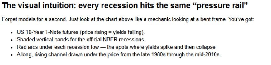
Forget models for a second. Just look at the chart above like a mechanic looking at a bent frame. You’ve got:
- US 10-Year T-Note futures (price rising = yields falling).
- Shaded vertical bands for the official NBER recessions.
- Red arcs under each recession low — the spots where yields spike and then collapse.
- A long, rising channel drawn under the price from the late 1980s through the mid-2010s.
Every single recession in that window — 1990-91, 2001, 2007-09, and the Covid shock — sees the 10-year slam into some version of that lower trendline and then violently reverse. In yield terms, those are the last rate-hike blow-offs: the moment the bond market says, “that’s it, you over-tightened, you’re going to have to cut.”
That’s the pattern I circled in red: recession lows in futures prices clustering right along the same structural “rail.” It’s not random, and once you see it, it’s very hard to un-see.
Visually: recessions are not scattered across the chart. They’re pinned to the same line — the stress boundary of the long-term yield regime.
The classical story: yield curves and recession odds
In mainstream macro, the 10-year’s predictive power doesn’t come from its absolute level. It comes from the yield curve — the spread between long-term rates and short-term policy rates like the 3-month T-bill or the 2-year note.
When the Federal Reserve hikes aggressively, short rates chase policy up. Long rates, meanwhile, care about future growth and inflation. If investors think the Fed is going too far and will be forced to cut later, the long end stops following. The result is a curve that flattens… and then inverts.
Historically, every US recession since the 1950s has been preceded by a yield curve inversion (typically 10Y–3M or 10Y–2Y). Not every inversion produces a deep recession, but nearly every recession shows up first as a negative term spread.
New York Fed researchers like Estrella & Mishkin built models in the 1990s showing that the 10Y–3M spread outperformed a lot of complicated macro indicators at forecasting whether a recession would hit within the next year. Later work from the Cleveland Fed, St. Louis Fed, and others basically confirmed the same thing: the curve is one of the few indicators that consistently earns its reputation.
But that’s only half the story. The yield curve tells you that something is likely to break. our chart goes further and shows where the system tends to break inside the long-term structure of rates.
The structural channel nobody talks about
Look again at the long-term channel we drew under the 10-year futures from the late 1980s through roughly 2016. It’s not random noise — it’s a multi-decade rising-yield / falling-price corridor in real terms, shaped by the slow bleed of disinflation, demographics, and Fed reaction functions across multiple cycles.
Inside that corridor, every major US recession lines up with the lower boundary of the channel:
- 1990-91: early-90s tightening + S&L cleanup → recession as the lower Mid-rail is tagged.
- 2001: dot-com excess + Fed hikes → curve inversion → price low exactly into the recession band.
- 2007-09: housing + credit bubble → another inversion → massive crisis as we slam and then rip off the rail.
- 2019–20: curve inversion and late-cycle slowdown → Covid shock nukes yields and blows the whole thing out.
The common pattern: the Fed tightens into the bottom of the channel, term spreads invert, the real economy starts to buckle, and something eventually snaps — credit, housing, dot-com equity, shadow banking, or just global demand.
The 10-year doesn’t know what will break. It just knows that when yields push into that historical stress boundary, the cost of capital is high enough relative to income and cash flow that the system can’t take much more.
Regime shifts: when the channel itself breaks
The next important feature on our chart is that the original rising channel doesn’t last forever. Around the mid-2010s, we finally see a regime break:
- Post-GFC QE and negative rates in Europe/Japan distort the entire term structure.
- Secular demand from pensions, insurers, and global reserve managers compresses term premia.
- The Fed dances between QE, “normalization,” QT, and then back to emergency easing.
In price terms, the 10-year futures break above the old channel into a blow-off top around the 2012–2016 zone, then roll over into a new downward-sloping correction channel — the smaller set of lines I drew from roughly 2016 through the 2023 low.
Think of it like this: the original 30-year regime was the “Great Disinflation” channel. The new one is a post-QE, post-Covid, “financial repression vs. inflation shock” channel.
Inside that new structure you still see the same mechanics:
- Fed hikes off the zero bound, curve flattens.
- Yields push toward the upper boundary, financial conditions tighten hard.
- When the curve inverts and the economy buckles, yields collapse again and futures bounce off the lower boundary.
The pattern survived the regime change. The geometry of the channel changed; the stress physics did not.
Where we are right now on the map
The most important part of our chart is the last red arc on the right: the 10-year futures bottoming in 2023–24 along the lower rail of the new downward channel, just as the economy digests:
- the fastest hiking cycle since the Volcker era,
- QT running in the background,
- record Treasury issuance,
- and an AI-driven capex boom that’s colliding with the physical limits of the grid.
Structurally, this point on the chart rhymes with 1989, 2000, 2006, and 2019: we’re sitting right on the stress rail again. Historically that’s when either: (a) something breaks and the Fed is forced into easing and liquidity support, or (b) policy blinks early and engineers a soft-ish landing by reflating financial conditions.
That doesn’t mean “guaranteed shallow-or-deep recession by date X.” It means we’re at the same kind of pressure configuration that has historically birthed recessions and major policy pivots — with the added twist that this time we’re sitting in the middle of an AI-industrial build-out that is brutally rate-sensitive and power-hungry.
If the old pattern holds, the 10-year isn’t just another chart. It’s the stress dial for an entire regime shift.
Pattern Nexus Lens
Most macro commentary about the 10-year stops at the yield curve: “when the 10Y–3M spread inverts, watch out.” That’s true, but shallow.
The 40-year view here suggests a deeper rule:
The 10-year doesn’t “predict” recessions by level. Recessions cluster where the 10-year’s structural channel and aggressive policy tightening collide.
In other words:
- The yield curve tells you when policy and expectations are out of balance.
- The 10-year channel tells you where the system is close to its stress limit.
- The recession bands are just timestamps on the moments the system actually snapped.
Right now, the configuration of that triad — curve, channel, and policy — looks a lot more like a late-cycle stress point than a comfortable mid-cycle expansion. Layer that on top of the AI-industrial demand shock, tokenized dollar rails, and the coming QE-style liquidity response, and the 10-year stops being a boring bond chart. It becomes a map of where the next regime begins.
Care este reacția ta?
 Îmi place
0
Îmi place
0
 Dezaprobat
0
Dezaprobat
0
 Iubire
0
Iubire
0
 Amuzant
0
Amuzant
0
 Wow
0
Wow
0
 Tristețe
0
Tristețe
0
 Înfuriați
0
Înfuriați
0

Founder of Pattern Nexus. I research markets, macro, geopolitics, AI, history, ancient systems, and the patterns most people overlook. I’m also building Market Radar, a trading scanner designed to read pressure, risk, confirmation, and setup quality before chasing a move. Pattern Nexus is where I connect the dots between data, history, technology, and the bigger system playing out around us.















Comentarii (0)