
When Breakouts Fail: What the Dow’s Long-Term Structure Is Quietly Signaling
The Dow’s secular uptrend remains intact, but repeated failures to break above its long-term trajectory are historically significant. A Pattern Nexus framework read of structure, regime support, and what failed breakouts tend to precede.
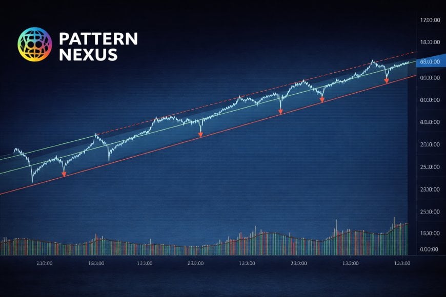
![[HERO_IMAGE_ALT]](https://patternnexus.com/uploads/images/202602/image_870x_69855af3c41b6.jpg)

A trend can stay “intact” while the market becomes structurally fragile. The warning is not the first breakdown. It’s the repeated inability to expand above the secular path, which usually means marginal demand is thinning and the system is leaning harder on maintenance flows.
Failed breakout cycles don’t usually resolve with a clean upside continuation. They tend to resolve with a grind lower, repeated support tests, and eventually either a policy/liquidity override or a deeper repricing once credit and confidence get forced into price discovery.
If you want a clean bullish read, you need more than “it went up.” You need sustained expansion, improving participation, and a supportive liquidity/credit backdrop. Otherwise it’s a carry regime: altitude maintained, expansion absent, fragility accumulating.
The key signal here is not that the Dow is weak—but that upside attempts are being structurally rejected despite supportive narratives.
The secular channel and what “normal” actually looks like
When you zoom out far enough, the Dow stops being a collection of stocks and starts behaving like what it actually is: a long-duration financial instrument embedded inside a policy system. Since the 1970s, that system has produced a remarkably consistent rising trajectory. That’s not because markets are inherently stable. It’s because the incentives around capital preservation, credit expansion, and political tolerance for sustained asset deflation all point in the same direction.
That secular channel is not “growth.” It’s structural accommodation. It reflects decades of liquidity bias, rollover-friendly debt structures, and the quiet assumption that prolonged asset deflation is politically unacceptable. In that environment, major indices don’t just drift upward. They are repeatedly pulled back toward a rising baseline whenever stress emerges.
This is why many historical drawdowns mean-revert. Not because fundamentals suddenly improve. Because the system tends to intervene—sometimes explicitly, sometimes indirectly—to prevent contraction from cascading through credit, employment, pensions, and fiscal solvency. The index is not only a market. It’s a pressure gauge for a political economy that cannot tolerate certain outcomes.
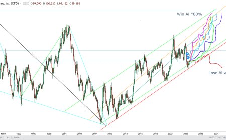
The “trend” is not the story. The story is how price behaves relative to it. Healthy cycles expand away from the long-term line and build distance. Late cycles ride the line, repeatedly failing to reclaim expansion.
Distance matters. Altitude matters. A market that repeatedly falls back to its long-term line isn’t proving strength. It’s proving dependency. That’s how you get years that feel “fine” right up until they aren’t.
![[IMAGE_1_ALT]](https://patternnexus.com/uploads/images/202602/image_870x_698558a4e460e.jpg)
Why failed breakouts matter more than headlines
Markets don’t need to “break” to become vulnerable. Most structural damage happens while people feel calm, because the index is still elevated and the narrative still sounds reasonable. The tell is not the first down leg. The tell is what happens before it: repeated attempts to break higher that fail to hold.
A failed breakout is a statement about marginal demand. It tells you incremental buyers are thinning at higher prices, which forces the market to rely on narrower support mechanisms: passive allocation, index concentration, buybacks, volatility suppression, or liquidity-driven multiple expansion. These can maintain altitude for a time. They do not repair structure. They postpone resolution.
Multiple rejection points, diminishing follow-through, volatility compression that releases downward, and a market that keeps returning to its trendline instead of expanding away from it.
- Repetition: One rejection can be noise. Repeated rejection is structure.
- Diminishing upside: Each attempt travels less distance before stalling.
- Compression: Volatility tightens until it snaps into a directional move.
- Support dependency: The market leans on the long-term line instead of building distance above it.
- Asymmetry: Down legs resolve faster than up legs as exhaustion builds.
![[IMAGE_2_ALT]](https://patternnexus.com/uploads/images/202602/image_870x_698558a6112ee.jpg)
This is why the most useful question is not “Will it crash?” The useful question is: “Is this an expansion regime, or is this a carry regime?” Expansion regimes break and hold above prior ceilings. Carry regimes test ceilings repeatedly, then roll over and force repricing—often slowly first, then suddenly.
If a market needs increasingly artificial support to stay elevated, it’s not in an expansion regime. It’s in a maintenance regime. It can go higher. It just does it with less stability.
The 2001–2007 analog and what people usually misunderstand
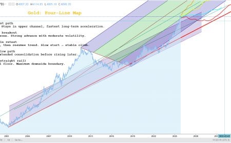
The early 2000s are often misremembered because people anchor on the crash, not the structure that preceded it. From 2001 to 2007, the Dow did not instantly violate the long-term baseline. That’s precisely why the period lulled participants into complacency.
What actually happened was a prolonged failure to reclaim expansion. The index oscillated under a ceiling. Attempts to break higher repeatedly failed to hold. Momentum weakened. Participation narrowed. Credit quietly became more fragile. The market looked “stable” until it wasn’t, because stability was being maintained—not generated.
The eventual outcome wasn’t caused by one candle or one headline. It was accumulated structural fatigue meeting a credit event. The system can tolerate stagnation for a long time. It cannot tolerate leverage stress layered on top of stagnation.
The analog is not “2008 is coming tomorrow.” The analog is that repeated failure to reclaim expansion tends to precede a reset, and the reset is usually slow until it isn’t.
Analog thinking only becomes dangerous when it turns into lazy prediction. Used correctly, it’s a structural map: it tells you what fragility looks like before it announces itself in price.
Today’s structure: supported, but momentum-exhausted
Now zoom into the present. The long-term channel still exists. The Dow is still above the secular baseline. On the surface, that reads as strength.
But structure is not about surfaces. It’s about behavior at boundaries. The signal today is hesitation: repeated stalls near the upper channel, breakouts that don’t follow through, and rallies that feel increasingly fragile. That’s what momentum exhaustion looks like inside a system that is still functioning.
The market can maintain elevation. The question is whether it can sustain expansion. Those are not the same thing.
The cleanest way to describe the current read is this: structurally supported, but momentum-exhausted. In that condition, rallies tend to be shorter and more fragile, pullbacks deepen, and the market repeatedly returns to its baseline. That creates the illusion of strength (because “it’s still high”), while preparing the ground for repricing (because the market can’t add altitude).
![[IMAGE_4_ALT]](https://patternnexus.com/uploads/images/202602/image_870x_698558a7485de.jpg)
- Multiple rejections: Each attempt meets the same ceiling behavior.
- Downside asymmetry: Rejections resolve into sharper down legs than the advances that preceded them.
- Trend reliance: The market keeps needing the long-term line as a crutch instead of building distance above it.
- Fragility drift: It stays elevated while becoming easier to tip.
Most people wait for the breakdown to start paying attention. The breakdown is usually just the final act. The earlier signal is repeated failure to expand.
50,000: a logical target—without the structural fuel
We said the Dow would break 50,000 by February. The directional logic wasn’t crazy. In a system built on nominal expansion, round numbers eventually get printed. Over long enough timelines, they are almost inevitable.
But markets don’t move on inevitability. They move on marginal conditions. Breakouts require support. Not hope. Not narrative. Not “it should.” Support is participation, liquidity impulse, and a credit backdrop that allows incremental buying power to keep showing up at higher prices.
When those inputs aren’t present, you get the exact behavior the chart is showing: approach, stall, reject. Not invalid. Unsupported.
50,000 can still print. The question is whether it prints as a sustained expansion move—or as a late-cycle spike that fails and forces the next leg of repricing.
A healthy breakout doesn’t need constant defense. It holds. It extends. It builds a new floor. If it doesn’t do those things, you don’t have a regime change. You have a momentary print.
What tends to happen next: erosion or override
When you see repeated failed breakouts against a secular ceiling, history suggests two common paths. Neither requires a dramatic “end of the world” narrative. Both require respecting what the structure is saying.
Base case (higher probability): a prolonged erosion phase inside the long-term channel. Lower highs. Deeper pullbacks. Repeated tests of the long-term baseline. Momentum bleeds out slowly while participants argue about whether “anything is actually wrong.” People call it chop. It’s not chop. It’s reset-by-attrition.
Override case (lower probability, but real): a policy or liquidity impulse forces a late breakout. The number prints. The headlines celebrate. But the regime still has to prove itself. If the breakout happens without structural repair, it can be violent—and fragile.
A healthy bullish resolution requires sustained expansion above the ceiling with improving participation. A single spike above a round number is not regime change. It’s a data point.
Pattern Nexus Lens
In the Pattern Nexus framework, the important question is not “what is the chart doing,” it’s “what is the system doing.” Charts are the surface. The system is liquidity, credit, incentives, and the political constraints around asset deflation.
This is why failed breakouts matter. They’re often the market’s way of saying: the system can maintain elevation, but it can’t sustain expansion without new fuel. When that happens, the market typically rotates into a reset phase until one of two things changes: liquidity support returns in force, or the market reprices enough to restore organic demand.
That’s the part most people miss. They treat every major index as if it’s “free price discovery.” It isn’t. Not anymore. Not at this scale. The index is a stabilized instrument in a managed system. That doesn’t mean it can’t fall. It means the system tries to delay and shape the fall—until it can’t.
The most dangerous regimes aren’t when people are scared. They’re when structure degrades while confidence stays high. Plateaus are where the system quietly loads the spring.
A sustained breakout would require not just price extension, but confirmation via duration support and regime-level liquidity expansion.
FAQ
Is this a crash call?
No. This is a structural read. The most common outcome after repeated failed breakouts is a grind lower inside the channel, repeated support tests, and only later a sharper repricing if credit or liquidity breaks. The failure signal comes before the violation signal.
Does the secular uptrend still hold?
Yes. That’s the core point. The warning is not “trend broken.” The warning is “expansion failing.” Those are different states. A trend can remain intact while the market becomes more fragile and more dependent.
What would invalidate the bearish structural read?
Sustained expansion above the upper boundary that holds, with improving participation and a supportive liquidity/credit backdrop. Not a one-day pop. Not a round-number print. A regime change has to prove itself with follow-through and durability.
Why focus on the Dow?
Because it’s a long-duration behavioral instrument. When the broad, legacy benchmark struggles to reclaim expansion, it often signals late-cycle stress under the surface even if pockets of the market still look strong.
What’s the simplest way to think about this?
Expansion builds altitude. Carry maintains altitude. When the market keeps returning to its long-term line instead of building distance above it, you’re watching carry behavior—not healthy expansion.
Sources
These sources support the charting context and macro-regime background referenced throughout the structure discussion.
- Federal Reserve Bank of St. Louis FRED – Dow Jones Industrial Average historical data (daily index values back decades).
- Yahoo Finance – Dow Jones Industrial Average historical prices (downloadable daily/weekly/monthly trends).
- Bank for International Settlements Annual Economic Report 2025 (global financial conditions and liquidity context).
- International Monetary Fund – Global Financial Stability Report (October 2025) (macro-financial vulnerabilities and equity/credit risk trends).
- Federal Reserve Economic Data (FRED) database (policy rates, liquidity indicators, credit series, volatilities, and more).
- NBER Working Paper – Volatility and risk premia dynamics in asset pricing (background on regime behavior and risk repricing).
- BIS Quarterly Review archive (ongoing research on credit conditions, financial cycles, and market structure).
Vad är din reaktion?
 Gilla
0
Gilla
0
 Ogilla
0
Ogilla
0
 Kärlek
0
Kärlek
0
 Rolig
0
Rolig
0
 Wow
0
Wow
0
 Ledsen
0
Ledsen
0
 Arg
0
Arg
0

Founder of Pattern Nexus. I research markets, macro, geopolitics, AI, history, ancient systems, and the patterns most people overlook. I’m also building Market Radar, a trading scanner designed to read pressure, risk, confirmation, and setup quality before chasing a move. Pattern Nexus is where I connect the dots between data, history, technology, and the bigger system playing out around us.













Kommentarer (0)