
From 1665 to QE Infinity: Answering a 2012 Inflation Question
In January 2012 I stared at a 350-year price chart and wondered what all the post-2008 “money printing” would do to inflation. More than a decade, a pandemic, and a historic rate shock later, this is the answer I wish I could have given my 2012 self.
Inflation, QE, and the long arc of the dollar
Summary of US Price and Inflation Data 1665–Estimated 2013, Revisited
Back on January 3, 2012, I wrote a short blog post with a big question: after the Federal Reserve’s post-2008 money printing, what would inflation look like? This is that question, answered from the 2020s.
The 2012 question
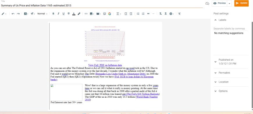
“As you can see after The Federal Reserve Act of 1913 inflation started its up word tick in the US. Due to the expansion of the money system over the last decade, I wonder what the inflation will be? Although Fed said it world never Monetize The Debt … in 2008 the Fed started (QE1) then (QE2) (Operation Twist) … Wow! that is a large expansion of the money system in only a few years time or we can call it what it really is money printing.”
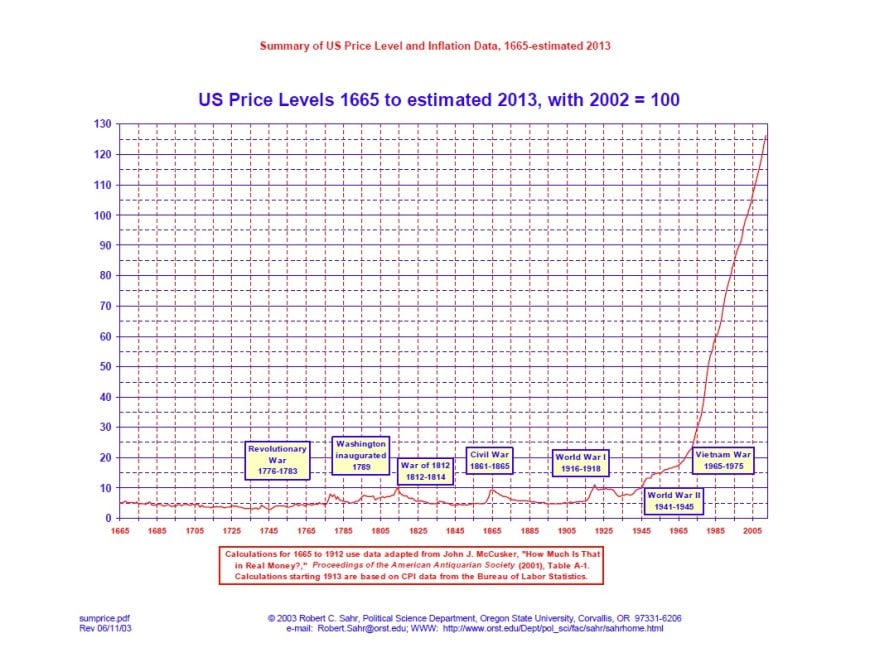
In early 2012, I was staring at this chart of US price levels from 1665 to 2013, trying to make sense of the vertical wall of prices in the modern era. QE1, QE2, and Operation Twist were still fresh. “Money printing” was the phrase of the moment. Gold bugs, doomers, and a good chunk of the internet were convinced the United States was inches away from a dollar collapse.
My question back then was simple and honest: if we just expanded the money system this much, how bad will inflation get? I didn’t have a complicated framework yet. I just had a long-run chart, some quotes from Bernanke, and a gut feeling that something structural had changed.
More than a decade later, we have the data. We’ve seen another round of QE on steroids, a once-in-a-century pandemic, the sharpest rate hiking cycle since the 1980s, and a bond market that went from coma to panic and back again. So let’s take that 2012 question and answer it properly.
What the 1665–2013 chart is really showing
The chart that hooked me in 2012 compresses 350+ years of US price history into one picture. For most of that timeline, prices wiggle around a low base. Wars show up as small humps: the Revolutionary War, the Civil War, World Wars I and II. Prices rise, then drift back. The overall slope is shallow.
Then the modern era hits. You get three big structural breaks:
- 1913 – The Federal Reserve Act: the US gets a central bank and a modern banking system.
- 1930s–1940s – Depression and World War II: massive fiscal mobilization, financial repression, and the birth of the post-war order.
- 1971 – The end of Bretton Woods: the dollar fully breaks from gold, the system becomes purely fiat, and inflation stops mean-reverting the way it used to.
By the time you reach the right edge of that chart — late 20th and early 21st century — the line is a near-vertical climb. On a visual level, it looks like the value of money has simply fallen off a cliff. That’s what I was reacting to in 2012, especially with QE layered on top.
But the chart doesn’t tell you why the line is doing what it’s doing — or how the plumbing of the modern dollar system actually channels “money creation” into different parts of the economy. That’s the piece I didn’t have yet.
What actually happened after 2012
Let’s start with the basic scoreboard. In 2012, people were bracing for double-digit inflation. What we actually got through most of the 2010s was boring:
- CPI inflation mostly fluctuated around 1–2.5% a year through 2019.
- Long-term interest rates stayed historically low. The 10-year Treasury spent years below 3%.
- Asset prices — stocks, housing, and financial assets — climbed far faster than wages or goods prices.
So on the surface, my 2012 fear — an immediate, visible surge in consumer prices — didn’t show up. The “money printing” seemed to vanish into the system with very little CPI drama.
But under the hood, a lot was happening:
- QE1, QE2, QE3 (2008–2014) massively expanded the Federal Reserve’s balance sheet, swapping newly created reserves for Treasuries and mortgage-backed securities held by banks and investors.
- Regulation and risk aversion kept banks from turning those reserves into explosive credit growth.
- Global demand for safe dollar assets absorbed a huge share of US debt issuance.
- Globalization and technology kept goods prices in check even as financial assets inflated.
In hindsight, a big part of the “missing inflation” puzzle is that QE mostly rearranged the asset side of balance sheets instead of directly stuffing cash into household budgets. It pushed up the price of financial assets, compressed yields, and quietly reshaped who held the risk. But it didn’t immediately blow up the price of eggs and rent.
The pandemic decade and the inflation spike
The real test of that 2012 question came with the pandemic. In 2020, the system didn’t just repeat the post-2008 playbook — it stacked emergency QE on top of direct fiscal transfers, business support, and massive deficit spending.
For the first time in the modern QE era, huge amounts of government support landed straight in household and business cash flows while supply chains were simultaneously constrained. Demand was boosted, supply was impaired, and the system was flooded with liquidity.
The result showed up quickly:
- US CPI inflation stayed low in 2020, then accelerated sharply in 2021–2022.
- Headline inflation peaked at roughly 9% year-over-year in mid-2022, the highest since the early 1980s.
- Housing, vehicles, energy, and food all repriced upward in a tight window.
That spike wasn’t just about “too much money.” It was a convergence: disrupted logistics, energy shocks, under-investment in key sectors, and years of suppressed price pressure suddenly given room to express themselves once demand came roaring back.
Once inflation was loose, the Fed finally did what it didn’t do in the early 2010s: it hiked aggressively. Policy rates went from near zero to restrictive territory in record time.
As of the mid-2020s, the picture looks like this:
- Inflation has fallen off its 2022 peak but is still hovering around the ~3% zone instead of the old 2% comfort band.
- Some prices — especially services, insurance, and housing — have ratcheted up and are unlikely to go back to pre-pandemic levels.
- The system is now living with a structurally higher price level and a different relationship between government deficits, central bank policy, and inflation.
In other words, the 2012 question did get answered — just on a delay, and in a form that looked more like a step-change in the price level than an endless exponential blow-off.
Why all that “money printing” didn’t instantly turn into inflation
Back in 2012, I looked at the Fed’s balance sheet and the long-run price chart and assumed a fairly direct line between the two: more money in the system, higher prices. Over time, it became clear that the connection is more conditional. A simplified way to think about it:
- Where does the new money land? Is it reserves inside the banking system, or income in the hands of households and businesses?
- What is the state of real capacity? Can the economy produce more goods and services to meet new demand, or is it bottlenecked?
- What constraints exist on credit creation? Regulation, capital rules, and risk appetite all determine whether banks multiply base money into broader credit or just sit on reserves.
- What is happening globally? As long as the world is willing to hold dollar assets, a lot of US deficit spending shows up as someone else’s savings rather than immediate domestic price pressure.
QE decade one (2008–2014) was mostly about repairing balance sheets and compressing yields. It inflated asset prices and lowered term premiums, but it didn’t dump cash into grocery store aisles.
The pandemic response was different. It fused:
- QE as market backstop – stabilizing funding markets and keeping yields under control.
- Large-scale fiscal transfers – stimulus checks, enhanced unemployment, PPP loans, and other direct income injections.
- Constrained supply – supply chains, labor participation, and energy capacity all under strain.
That combination finally did what the original inflation hawks expected: it pulled inflation out of dormancy and forced the Fed into a belated tightening cycle. But it did so on a foundation built by the previous decade of policy — a world already conditioned to zero rates, elevated asset prices, and a central bank that was expected to quietly absorb shocks.
What I got right in 2012 — and what I missed
Looking back at that short January 2012 post, a few things stand out.
Things I was directionally right about
- The post-1913 and post-1971 shift is real. Once the US locked in a central bank and moved off gold, the price level stopped cycling back to its old baseline. The chart still tells the truth about the long-term erosion of purchasing power.
- The scale of monetary expansion mattered. The experiments after 2008 set the template for an even bigger intervention in 2020. QE went from “unthinkable emergency tool” to “standard operating procedure.”
- The system was always going to resolve through higher price levels. Maybe not hyperinflation, but a higher nominal floor under everything: assets, wages, and goods.
Things I underestimated or misunderstood
- Timing. I implicitly expected a short fuse between QE and visible inflation. The real fuse ran through a decade of financial repression, balance-sheet repair, and global demand for Treasuries, and only detonated when fiscal and supply shocks lined up.
- The role of global dollar demand. In 2012 I wasn’t yet thinking in terms of the dollar as a global security export. As long as the world wants dollar assets, the US can issue a lot of debt before it shows up as domestic CPI.
- The difference between reserves and spendable income. QE reshapes who holds what risk more than it directly hands cash to households. The inflation profile is completely different when the Treasury runs big deficits that pay people directly.
- How politics would evolve. I didn’t fully see how fiscal dominance, populism, and geopolitical fragmentation would interact with monetary policy to create the specific patterns we’ve seen since 2020.
Key takeaways for the next decade
That 1665–2013 chart still matters, but not as a simple “line goes up, therefore doom” story. It’s a reminder that:
- Price levels in fiat systems rarely go backwards. Once a shock has repriced the system upward, the new floor tends to stick.
- Inflation risk is about structure, not just money supply charts. Where the money lands, how constrained supply is, and how global flows are configured all matter.
- Financial asset inflation and consumer inflation can run on different clocks. A decade of cheap money can quietly build fragility in balance sheets long before CPI notices.
- The next regime shift will likely blend monetary tools with explicit fiscal and industrial policy. We’re already drifting into an era where deficits, industrial build-outs, and central bank balance sheets are intertwined.
In 2012, I was just starting to sense that the old playbook for understanding inflation was broken. The last decade and a half didn’t just answer my original question — it opened a much bigger one: how do you navigate a world where money, policy, and real capacity are all being rewritten at the same time?
That’s the thread this new Pattern Nexus era pulls on: mapping the structures behind the line on that chart, and tracing how the next vertical move in price levels will be tied to energy, AI infrastructure, and the evolving architecture of the dollar system itself.
Sources
Hyperlinks are provided here only, with no in-text external linking per Pattern Nexus style.
- Historical US price level and CPI data – Bureau of Labor Statistics and Minneapolis Fed historical CPI series.
- World Bank – US inflation (consumer prices, annual %) and long-run price indices.
- Federal Reserve and FOMC documentation on QE1, QE2, QE3 and emergency facilities during the 2008 crisis and COVID-19 pandemic.
- IMF, BIS, and academic work on quantitative easing, balance-sheet policies, and global demand for dollar assets.
- US inflation and CPI releases through the mid-2020s, including the post-pandemic spike and subsequent moderation.
Tepkiniz Nedir?
 Beğen
0
Beğen
0
 Beğenmiyorum
0
Beğenmiyorum
0
 Aşk
0
Aşk
0
 Komik
0
Komik
0
 Vay
0
Vay
0
 Üzgün
0
Üzgün
0
 Öfkeli
0
Öfkeli
0

Founder of Pattern Nexus. I research markets, macro, geopolitics, AI, history, ancient systems, and the patterns most people overlook. I’m also building Market Radar, a trading scanner designed to read pressure, risk, confirmation, and setup quality before chasing a move. Pattern Nexus is where I connect the dots between data, history, technology, and the bigger system playing out around us.











Yorumlar (0)