
Đồng hồ bắt đầu tại Hormuz: Các hành lang dầu mỏ, sự thất bại có thời gian, và kiến trúc thực sự của sự phụ thuộc
đồng-hồ-bắt-đầu-tại-các-hành-corridor-dầu-hormuz-thất-bại-theo-thời-gian
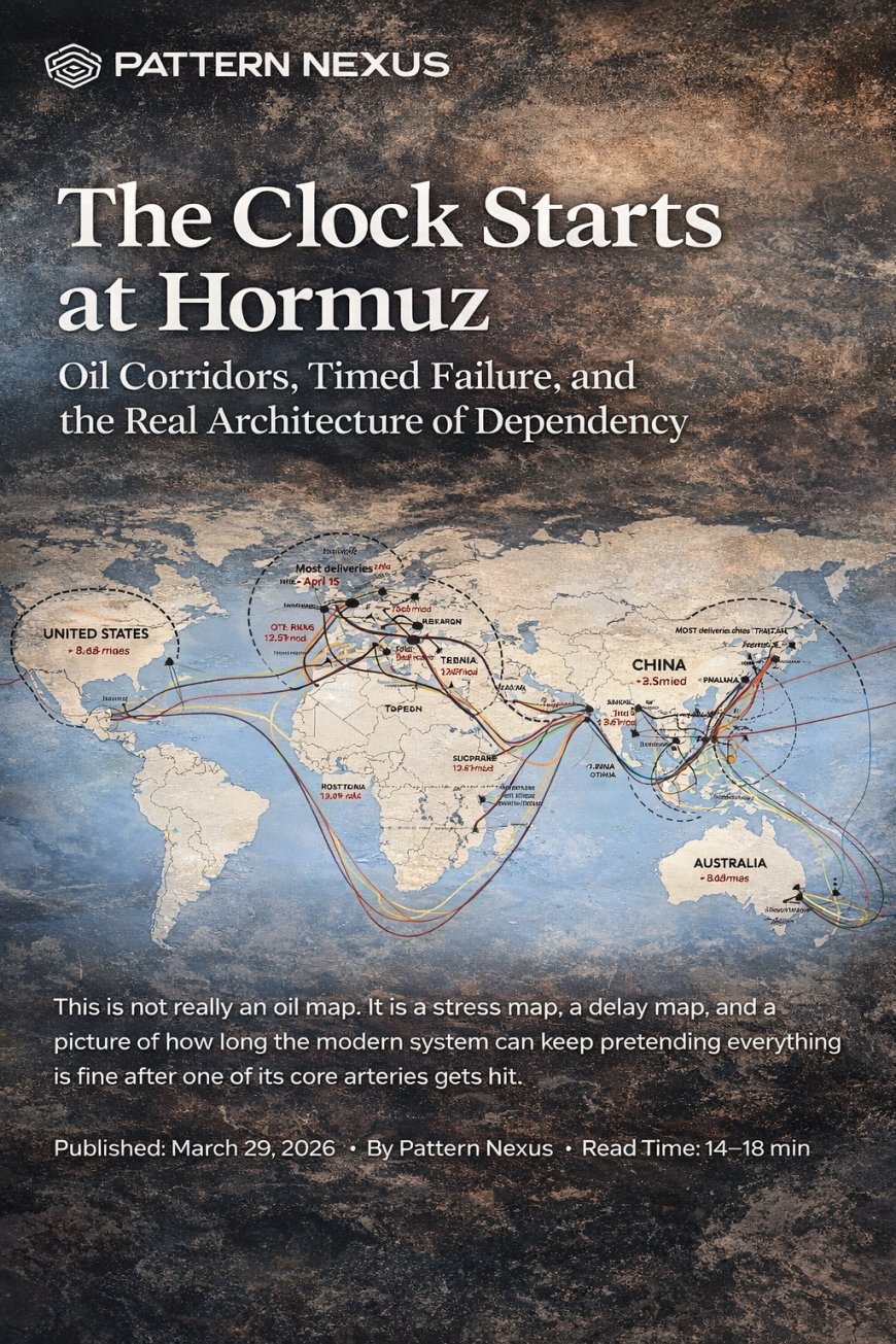

Most people will look at this figure and see a trade map. That is the shallow reading. What it actually shows is a timed dependency structure. The important part is not just where the oil goes. It is how the disruption moves through the system in waves, who gets hit first, who gets squeezed later, and which states still have real access once the corridor starts failing. Hormuz is not just a regional issue. It is one of the world’s base-layer control points, and when that artery gets stressed, the effects do not stay inside energy. They move into shipping, insurance, refined products, inflation expectations, bond markets, credit conditions, and political stability. The modern economy keeps talking like it is one giant fluid market. It is not. It is a corridor system with chokepoints, relay nodes, and delayed failure built into it.
The world does not run on “markets” in the abstract. It runs on corridors, timing, throughput, and access.
When one core artery gets hit, the system does not fail evenly. It fails in waves, and the timing difference is where the real damage hides.
Money upstream does not guarantee access downstream. Corridor leverage does.
A lot of what gets called diversification is really just one fragile handoff feeding into another fragile handoff.
This Is Not an Oil Map
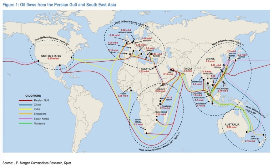
Most people are going to misread this figure immediately. They are going to see colored lines, country labels, and little barrel numbers and think the point is simple trade exposure. They will read it like a logistics chart. They will flatten it into a commodity story. That is the weak reading, and it misses the actual structure sitting in front of them.
This is a timing map. This is a dependency map. This is a picture of how a physical disruption moves through a system that pretends to be fluid, global, and infinitely adaptable right up until one of the narrow gates underneath it gets hit. The circles matter. The stop dates matter. The routing matters. The point is not just where the oil goes. The point is who loses flow first, who can absorb the hit for a little while, who gets squeezed later through products and freight, and who eventually finds out their assumptions about access were mostly just that: assumptions.
A lot of modern analysis is too financial, too abstract, and too detached from the physical layer. Everything gets translated into price so people can act like the market “handled it.” But price is not the whole event. Timing is the event. Distance is the event. Refining compatibility is the event. Shipping is the event. Insurance is the event. Inventory is the event. If a molecule cannot move where it needs to move on time, then the whole elegant narrative layer sitting on top of it starts cracking whether the media wants to admit it or not.
That is what this chart is really showing. It is showing the gap between the world people talk about and the world that actually exists. People talk like the global economy is one giant liquid market where supply can always be rerouted, capital can always find a path, and disruption is mostly just a temporary pricing inconvenience. In reality, the system is narrow, layered, delayed, and much more physically constrained than the average person understands. It is held together by corridors pretending to be markets.
This is not “where oil goes.” This is how dependency travels, how disruption cascades, and how long it takes different parts of the system to realize they were never as insulated as they thought.
What Hormuz Actually Is
Hormuz keeps getting discussed like it is just another geopolitical hot zone. That framing is lazy. Hormuz is not important because it is dramatic. It is important because it is structural. It is one of the narrow physical gates sitting underneath a huge share of global energy movement, which means it sits underneath a huge share of the system’s practical stability whether people want to frame it that way or not.
Once you understand that, the conversation changes. This stops being some regional military side story and starts becoming what it actually is: a systems trigger. When you impair one of the core arteries of energy flow, you do not just “raise oil prices.” You start degrading timing, confidence, flexibility, redundancy, and political room for error all at the same time. Shipping tightens. Insurance stress builds. Replacement gets slower. Strategic stocks start mattering more. Refining compatibility starts mattering more. Freight economics start shifting. Product markets start wobbling. By the time the public notices it in a clean and obvious way, the repricing is already underway.
That is the part people keep missing. Finance does not sit below physical flow. Finance sits on top of it. Markets can paper over a lot for a while. Governments can jawbone. Analysts can say the word “reroute” like it is a magic spell. But if the corridor underneath the system starts breaking, then the abstractions sitting on top of it are going to run into limits whether anybody likes it or not.
This is one of the broader Pattern Nexus themes in plain sight. The modern world loves pretending that all major problems are really policy problems, market problems, messaging problems, or sentiment problems. That is because people are used to living several layers above the physical base. But the base is still there. The molecule still has to move. The fuel still has to be delivered. The ship still has to clear the water. The refinery still has to process the crude it was built to handle. The truck still has to move the product. When that physical continuity gets threatened, everything above it starts showing its dependency very fast.
- Hormuz is a corridor problem before it is a headline problem.
- The first damage is not always visible in price alone.
- The real issue is loss of reliable flow, not just loss of nominal supply.
Corridors Matter More Than Countries
One of the biggest reasons people keep misunderstanding global fragility is because they still think in country boxes. They think in flags, governments, and bilateral relationships. That matters, but it is not the deepest layer. The deeper layer is corridor architecture. The actual game is not just Iran, Saudi Arabia, China, India, Japan, Europe. The actual game is Hormuz, Bab el-Mandeb, Suez, Malacca, the South China Sea, relay refining hubs, export platforms, and the shipping lanes tying them all together.
This matters because countries can look diversified on paper while still being trapped in the same corridor logic in reality. They can source from different suppliers, buy through different traders, refine through different systems, and still all be riding on the same narrow plumbing underneath. That is what makes the modern system look more resilient than it really is. The architecture is broader at the top than it is at the base. That creates an illusion of flexibility right up until stress shows you how concentrated the real dependencies are.
In other words, the map is not telling you which country buys what. It is telling you that whole regions are tied together by the same channels whether they like it or not. It is telling you that a hit at the artery level can create very different outcomes at the state level depending on storage, distance, refining capacity, and political coordination. It is also telling you that the world is not one market clearing at one honest price. It is a hierarchy of access built on corridor leverage.
That is why I keep coming back to this point in different forms. Chokepoints are not side notes to the global economy. They are the architecture. If you do not understand the physical gates, then you do not understand the real power structure underneath trade, diplomacy, inflation, or liquidity. You are just watching surface motion and pretending you saw the machine.
Southeast Asia Is the Relay Layer Most People Ignore
This is where a lot of mainstream coverage starts falling apart. They talk about the Gulf as the source and major economies as the endpoints, like this is some clean straight-line relationship. That is not how this system actually functions. Southeast Asia is not just sitting there consuming oil. It is part of the relay architecture. It is part of the conversion architecture. It is part of the redistribution architecture.
Singapore matters because it is not just a dot on the map. It is a refining and transit node. India matters not only because it consumes large volumes, but because it refines, transforms, and sends products back out into the broader system. South Korea matters. China matters at massive scale. Other regional nodes matter more than people think because they sit in the middle of the handoff chain. So when Gulf disruption hits, it does not just move from the Gulf to some final buyer. It moves through a layered set of refining, storage, transshipment, and re-export relationships.
That is why this figure is stronger than a normal supply chart. It shows layered dependency. Some places import direct. Some refine. Some redistribute. Some act like buffers until the pressure gets too big. Some help spread the shock instead of absorbing it. Once you start looking at it that way, you stop seeing a bunch of independent importers and start seeing a relay system with stress multipliers built into it.
This is also where the diversification illusion breaks down. A lot of what looks like multiple independent flows is really corridor handoff. The barrel changes hands. The product changes form. The invoice changes counterparty. But underneath all of that, the same artery logic is still there. The same chokepoints are still there. The same exposure is still there. The system looks more distributed than it really is because the relay nodes create a false impression of optionality. Under stress, that false comfort disappears very fast.
The Second Chokepoint Problem
One of the dumbest default reactions in these discussions is when people say, “They’ll just reroute it.” Reroute it where, exactly? Through what? At what cost? With what shipping availability? Through which insurance regime? To which refineries? Over what timeline? People say “reroute” the same way they say “the market will adjust,” like the phrase itself solves the physical problem.
Hormuz does not exist in isolation. That is the next part of the trap. A huge amount of the flow leaving the Gulf still needs to move into a broader chokepoint system shaped by Bab el-Mandeb, Suez, Malacca, and the South China Sea. So the idea that one bottleneck can be bypassed cleanly without consequence is mostly fantasy. In a lot of cases, all you are really doing is handing one dependency into another dependency and hoping the public does not notice the difference until later.
That is how fragile systems hide fragility. On a flat map, everything looks open. On a shipping chart, everything looks like there are alternatives. On television, every analyst talks like the world is one giant circulation loop with endless flexibility. But once you bring time, distance, volume, insurance, naval risk, and refining compatibility back into the conversation, the system starts looking much narrower and less forgiving very quickly.
What people call diversification is often not real diversification at all. It is just vulnerable corridor handing off into vulnerable corridor. It is the same narrow architecture wearing multiple labels. Under normal conditions, that can look stable. Under stress, it turns out to be stacked concentration.
A lot of what people call diversification is not true diversification. It is one vulnerable corridor handing off into another vulnerable corridor.
This Becomes a Products Crisis Fast
The public hears “oil shock” and immediately thinks about crude prices on a screen. That is not how society actually experiences the event. The real pain tends to show up through products. Diesel matters. Jet fuel matters. LPG matters. Feedstocks matter. Shipping fuel matters. Freight timing matters. Agricultural inputs matter. Construction costs matter. Power generation can matter. Petrochemical chains matter. Once you move out of the abstract commodity frame and into how the economy actually functions, the exposure gets a lot broader very quickly.
That is one of the reasons these events become politically dangerous faster than a lot of clean macro models assume. The public is not living inside a theoretical barrel balance sheet. They are living inside freight bills, airline pricing, heating costs, delivery times, food inflation, industrial slowdowns, and squeezed margins. Businesses feel it first through inputs and movement. Consumers feel it later through the general cost stack. Governments feel it through the political consequences once daily life starts inheriting the pressure.
This is why crude-only analysis is weak. Even when supply does not disappear in some total dramatic way, the system can still become materially more unstable because product balances tighten, transit times stretch, insurance costs rise, and the overall cost of maintaining continuity goes up. That is enough to create inflation pressure, margin compression, and broader financial tightening even before people start screaming about shortages.
In a real stress scenario, the question is not only “How many barrels are available?” The more important question becomes, “Can the right inputs reach the right places in the right form on the right timeline without blowing out the cost structure?” Once that answer starts drifting toward no, the event has already moved beyond energy commentary and into systemic repricing.
Europe Is Not Outside This, and Asia Feels It First
Asia obviously sits closest to the artery in practical terms because that is where a huge share of Gulf flow already points. That means Asia tends to feel the stress earliest and most directly through crude exposure, refining stress, freight competition, and product balancing. But that does not mean the rest of the world is outside the event. It means the event arrives in phases.
Europe is a good example of how shallow narratives distort exposure. People hear “Middle East disruption” and still instinctively treat it like somebody else’s problem unless there is an obvious headline tying Europe directly to the source. That is not how the system works. Europe is connected through product flows, replacement complexity, shipping lanes, insurance conditions, and the broader global rebalancing that starts happening once Asian buyers, Middle Eastern suppliers, and refining hubs all begin shifting behavior under stress.
Post-Russia adjustments did not remove Europe’s exposure. They changed the shape of it. That is a huge difference. A system can move dependency around without eliminating dependency. It can reduce one obvious vulnerability and increase a more layered one. That is exactly the kind of thing the public often misses because the replacement structure looks cleaner on paper than it behaves in a real stress event.
So yes, Asia tends to get hit first because the corridor already points that way. But Europe remains tied into the consequences through products, freight, insurance, and broader price competition. The map is not just a geography lesson. It is a sequence lesson. It is showing the order in which reality arrives.
From Energy Shock to Liquidity Shock
This is the part where shallow analysis usually breaks down completely. People like to talk about oil as if it is just one market among many, like it rises, maybe causes some inflation chatter, and then everything gets absorbed. That is not how this works when the disruption is serious enough and the corridor architecture underneath it is this concentrated.
Energy pressure moves into inflation expectations. Inflation expectations move into bond repricing. Bond repricing tightens financial conditions. Tighter financial conditions hit credit, business margins, public budgets, refinancing risk, housing sensitivity, and political tolerance. That chain matters because it reminds people that energy is not some side sector floating around the edge of the economy. It is upstream to the broader liquidity environment.
This is one of the core Pattern Nexus points and one of the places where the article needs to hit hard. Money upstream does not guarantee access downstream. A country can look fine on paper and still get squeezed badly if it sits too far down the corridor, lacks refining flexibility, lacks storage, lacks shipping leverage, or gets outcompeted by states with more direct corridor power. That is what a liquidity-gated world actually looks like. Access stratifies under pressure.
The winners in a real stress event are not just the countries with nominal wealth. They are the ones with corridor leverage, logistics depth, refining capacity, inventory, state coordination, and enough political power to secure flow while other states are paying up and hoping. Everybody else eventually finds out the hard way that balance-sheet comfort and delivered reality are not the same thing.
That is also why the broader macro implications matter so much. Once energy stress starts feeding inflation again, the fantasy that policymakers have endless room to cushion everything starts breaking down. Central banks become more constrained. Bond markets become less forgiving. Credit starts repricing against worse assumptions. The political layer gets uglier because people start feeling higher costs at the same time policymakers have less room to respond cleanly. That is how a corridor event becomes a system event.
Pattern Nexus Lens
This figure fits the broader PN theory almost too perfectly. The modern world keeps pretending it is one giant abstract market clearing at a price. It is not. It is a corridor system. It is a chokepoint system. It is a relay system. It is a delay system. Physical flow still sits under finance, narrative, and politics whether people are comfortable with that or not.
When one of the core arteries gets hit, the system does not fail cleanly. It does not fail honestly either. First it tries to narrate around the damage. Then it tries to price around the damage. Then it tries to reroute around the damage. Then it starts discovering that timing, throughput, and physical continuity were doing more of the stabilizing than the abstractions sitting on top ever admitted.
That is why “liquidity” has to be understood as more than reserves, balance sheets, central bank facilities, and screen-level pricing. Real liquidity includes movement. Real liquidity includes corridor continuity. Real liquidity includes the actual ability to convert nominal claims into delivered reality. Once that chain starts weakening, the system may still look liquid on paper while becoming less liquid in real terms where it actually matters.
This is also where the deeper dependency structure becomes visible. The world does not just discover that energy got more expensive. It discovers who still has access, who only had assumptions, who can absorb timing loss, and who built their whole stability model on uninterrupted flow through a few narrow gates. That is the larger lesson. The map is not just showing a trade pattern. It is showing the hidden architecture of modern fragility.
The world does not just discover that energy got more expensive. It discovers who still has access, who only had assumptions, and how much of modern stability was built on uninterrupted flow through a few narrow gates.
FAQ
Why does this map matter more than a normal oil supply chart?
Because it shows sequence and routing, not just volume. It shows how stress moves through the system over time instead of pretending everything clears at one clean global price the second something goes wrong.
Why is Southeast Asia so important in this story?
Because Southeast Asia is not just receiving energy. It is helping relay, refine, redistribute, and transmit the shock through the wider regional and global system.
What is the bigger Pattern Nexus takeaway here?
Corridor control matters more than most headline narratives. The modern system is much more dependent on narrow physical gates than most people realize, and that only becomes obvious once stress starts breaking timing.
Is this mainly an Asia problem?
No. Asia tends to feel the direct pressure first because of how the corridor points, but Europe and the wider global system inherit the stress through products, freight, insurance, inflation, and broader financial tightening.
Why tie this to liquidity at all?
Because access is not just about money. It is about whether nominal purchasing power can still be converted into real delivered flow inside a stressed corridor system. Once that starts breaking, liquidity becomes a physical problem too.
Sources
These sources support the corridor, chokepoint, refining, and macro-stress framing behind the article.
- IEA – Strait of Hormuz and global oil security exposure
- IEA – The Middle East and global energy markets
- U.S. EIA – South China Sea petroleum trade and corridor analysis
- U.S. EIA – Europe diesel flow changes after Russia sanctions
- U.S. EIA – Strait of Malacca as a critical Asia energy chokepoint
- ECB – Energy shock, inflation pressure, and growth risk
Phản Ứng Của Bạn Là Gì?
 Thích
0
Thích
0
 Không Thích
0
Không Thích
0
 Yêu
0
Yêu
0
 Hài hước
0
Hài hước
0
 Wow
0
Wow
0
 Buồn
0
Buồn
0
 Giận dữ
0
Giận dữ
0

Founder of Pattern Nexus. I research markets, macro, geopolitics, AI, history, ancient systems, and the patterns most people overlook. I’m also building Market Radar, a trading scanner designed to read pressure, risk, confirmation, and setup quality before chasing a move. Pattern Nexus is where I connect the dots between data, history, technology, and the bigger system playing out around us.












Các bình luận (0)