
Housing in 2026: Prices Are High, but the Market Is Barely Moving
The July Case-Shiller index reached another nominal high, but inflation, financing costs and weak sales tell a different story for the marginal buyer. Pattern Nexus reconstructs national prices from 1987, tests pre-2008 and 2019 inventory baselines, separates vacant homes for sale from rental vacancies, compares a 2019 and 2026 purchase payment, checks credit and construction, maps metro divergence and scores earlier PN housing claims. Includes 18 original charts and a practical guide for housing stakeholders.
Pattern Nexus Research Desk · September 30, 2026 · Data through July prices, August sales and 2026 Q2 housing stock
A homeowner with a 3% mortgage can often afford to wait. A buyer facing a rate near 7% has to make the payment work now. A builder with completed homes cannot always wait. A renter may find more vacant apartments even while the number of vacant homes offered for sale remains low. Those are different sides of the same housing market, and they explain why the national price index can reach a record while transactions stay slow.
The September 29 Case-Shiller release measured homes that sold through July, not prices negotiated on release day. Its national index reached 337.31, up 1.93% from July 2025. In dollars, that is a new index high. Consumer prices rose faster over the same twelve months, so the index lost about 1.34% of purchasing power in our matched-month calculation. Since June 2022, the index is roughly 9.5% higher in dollars and 3.0% lower after inflation. A record price and a real decline can happen together. S&P release · CPI history
- For a current owner: The national index still supports nominal equity, and the latest aggregate credit indicators do not resemble the 2007–10 mortgage crisis. That does not mean your local house would sell at the index gain. Check comparable closed sales, the cost of replacing your mortgage and your total tax and insurance bill.
- For a buyer: The monthly payment is the main obstacle. Our same-assumption illustration moves from about $1,009 in August 2019 to $2,291 using the 2026 median sale price and the September 24 mortgage benchmark, before taxes and insurance. The corresponding share of national median household income rises from 17.6% to 31.4%. It is an illustration, not a quote for your loan. NAR August 2019 · NAR August 2026 · Freddie Mac
- For a realtor or seller: August existing-home sales ran at 3.98 million a year, down from 5.49 million in August 2019. Supply measured in months rose from 4.1 to 4.9, even though the count of homes in NAR inventory fell from 1.86 million to 1.62 million. The market feels slower because fewer buyers close, not because a 2007-sized pile of homes is on the national market.
- For a landlord or investor: Rental and ownership supply are splitting. Census estimated 3.727 million units vacant for rent in 2026 Q2, up from 3.229 million in 2019 Q2, while the count vacant for sale was about 1.019 million, slightly below 2019. Underwrite achieved rent, vacancy and costs for the specific property. A national home-price gain does not pay an operating bill. Census for-rent · for-sale
- For anyone making a housing forecast: Six of the nineteen reported Case-Shiller metros fell year over year in July, while thirteen rose. Seattle, Las Vegas and Denver were negative; Chicago and New York were strongly positive. The national average is a starting point. Your decision turns on the local payment, supply, employment and insurance picture. S&P release
This article updates the Great Housing Plateau, Lock-In Economy, Coastal Repricing Map, mortgage-rate compression analysis and 2026 Landlord Outlook. The earlier work gives the mechanisms. The charts below show where new data support them, where local exceptions matter and where a forecast still awaits a fair test.
Read this chart: The dollar index climbs much faster than the inflation-adjusted line. A homeowner may have a higher sale value and still have less purchasing-power gain than the nominal figure suggests. Neither line includes upkeep, tax, insurance or the interest paid to own the property.
+1.93% nominal
July Case-Shiller from a year ago; about −1.34% after matched CPI.
1.019 million vacant for sale
Census 2026 Q2; less than half the 2007 Q2 for-sale vacancy count.
$2,291 monthly principal and interest
Illustrative 20%-down purchase at the 2026 median and 7.03% mortgage benchmark, before other costs.
01 · HOUSING DATA
1 · What the new home-price report actually measures
Case-Shiller is a repeat-sales measure. It compares prices on the same properties when they transact again, with the index methodology intended to reduce changes in the mix of homes sold. It does not quote a typical house in dollars, count listings, give an instant contract price, or reveal an individual property’s value. The national series is not seasonally adjusted in the historical panel used here. S&P’s July release gives 337.31 national NSA, +1.93% year over year, +0.12% month over month NSA; on a seasonally adjusted monthly basis, +0.29%. The 20-city composite was 350.36, +2.47% year over year; the 10-city composite 373.86, +3.39%. The different growth rates are not interchangeable national measures. S&P release
The FRED table captured for our reproducible panel ended in June 2026 at 336.663. The Python script appends S&P’s rounded July value to that full historical table, and says so in the code. Comparing the rounded July value with FRED’s then-current July 2025 observation gives +1.92%, a one-basis-point difference from the release’s official +1.93% that can reflect rounding or revision vintage. The publication should quote S&P’s +1.93% as the release statistic and use the scripted series for the internally consistent history. Case-Shiller can revise recent months; save the vintage when making a later forecast scorecard. FRED table
Our real-price calculation uses seasonally adjusted all-items CPI on like July dates: July 2026 CPI was about 3.30% above July 2025, yielding −1.34% for the national index after inflation by the exact ratio of index factors. The BLS headline on a non-seasonally adjusted basis was 3.4%, and S&P’s published 1.93% against that rounded headline implies approximately −1.42%. These are two disclosed index/vintage choices, not a conflict over whether real appreciation was negative. Do not subtract rounded percentages and present the result as a precise real return; use (1 + home-price growth)/(1 + CPI growth) − 1. FRED CPI · BLS July CPI release
FHFA’s purchase-only house-price index reported +2.6% year over year and +0.3% seasonally adjusted month over month for July. That alternative sample and index construction corroborate slower positive national nominal growth, not an exact match to Case-Shiller. NAR’s median existing-home sales price of $429,100 in August, +1.6% year over year, is yet another object: a transaction median affected by what sold. A lower new-home median of $393,700, −5.8% year over year, is a different market with mix shifts, builder incentives and a wide estimate interval. None of these measures can be pasted into a Case-Shiller chart as another month of that series. FHFA · NAR · Census new homes
Why this matters. A chart with August sales, July prices and September rates is a dashboard, not a synchronous causal test. July prices are a lagged observation based on transactions; September financing conditions affect later bids and closings. The date on the release is not the date on the housing transaction.
02 · HOUSING DATA
2 · A price record against 39 years of history
The raw index starts at 63.732 in January 1987 and reaches 337.31 in July 2026. That is a 429.3% cumulative nominal gain, or 4.31% annualized, over 39½ years. Measured against CPI, the increase is 77.2% cumulative, or 1.46% annualized. These figures do not say the representative household’s equity grew by that amount; they are changes in a national price index before financing, maintenance, transaction costs and cash flow. They do say that July’s roughly 1.9% twelve-month nominal appreciation is below the full-period annualized path.
The full-period number itself hides three radically different regimes. Between January 1987 and January 2000, appreciation was 3.53% nominal but only 0.25% real per year. The January 2000 to June 2006 boom ran 10.02% nominal and 7.05% real annualized. The June 2006 to February 2012 contraction ran −5.49% nominal and −7.53% real annualized. If an analyst quotes one historical “normal appreciation” without showing the endpoint selection, the number can be engineered by choosing the boom, the bust or the recovery. Our table prints them separately.
| National Case-Shiller interval | Nominal total | Nominal annualized | CPI-adjusted total | Real annualized |
|---|---|---|---|---|
| Jan 1987–Jan 2000 | +56.9% | +3.53% | +3.2% | +0.25% |
| Jan 2000–Jun 2006 | +84.5% | +10.02% | +54.8% | +7.05% |
| Jun 2006–Feb 2012 | −27.4% | −5.49% | −35.8% | −7.53% |
| Feb 2012–Jul 2019 | +57.7% | +6.33% | +40.8% | +4.72% |
| Jul 2019–Jun 2022 | +45.8% | +13.80% | +26.4% | +8.38% |
| Jun 2022–Jul 2026 | +9.5% | +2.25% | −3.0% | −0.73% |
| Jan 1987–Jul 2026 | +429.3% | +4.31% | +77.2% | +1.46% |
The national nominal peak of 184.607 in July 2006 gave way to 133.987 in February 2012, a 27.4% decline. The correction was severe enough to depress building, destroy equity, tighten credit and reshape risk appetite for years. Low 2010 starts of roughly 586,000 SAAR on the annual average are not a sustainable benchmark. Nor is the 2.073 million average starts rate of the 2005 boom. The aftermath involved underbuilding in some places, surplus in others, low fixed mortgage rates, institutional capital, household formation, migration and zoning constraints. The right question in 2026 is whether the marginal market clears under today’s income and financing conditions, with the stock inherited from those past decisions. Census starts via FRED
From February 2012 to July 2019, national repeat-sale prices gained 57.7% nominal and 40.8% after CPI. That recovery is not consistent with a claim that housing remained universally “deflated” after 2008; some measures were suppressed by the initial bust, then recovered strongly. From July 2019 to June 2022, they jumped 45.8% nominal in less than three years. The post-2022 plateau followed an unusually rapid run-up, not a long flat prehistory. From June 2022 to July 2026, the national index added 9.5% in dollars but lost 3.0% against CPI. This is real repricing without a national nominal collapse, precisely one channel the PN plateau framework proposed.
The distribution reinforces the point. The average trailing twelve-month nominal gain across January 1988–December 2006 was about 5.59%, with a 6.06% median. Across 2013–19 it was 5.84%, with a 5.28% median. These are overlapping year-over-year observations, so they are descriptive distributions, not independent samples for a statistical significance claim. A rolling year-over-year gain can stay elevated for many adjacent months. July 2026’s 1.93% sits below both period medians. This does not force a forecast of further declines; it establishes a measurable slowdown.
For a reader: A claim that appreciation is above or below “normal” needs a time window and a dollar-or-inflation-adjusted label. A nominal 1987–2026 CAGR is 4.31%; a CPI-adjusted 1987–2000 CAGR is 0.25%; the post-2012 recovery is much faster. Their average is not a timeless natural law. A premium report should let the reader reproduce the choice.
The trailing ten-year calculation supplies a useful check against a convenient recent endpoint. The ten years ending July 2026 still compounded at 6.31% nominal and 2.89% real per year, because that window includes the 2019–22 jump. The window ending July 2019 yielded 3.43% nominal and 1.64% real, and the one ending July 2006 yielded 8.27% nominal and 5.53% real. In other words, a weak current twelve-month rate does not erase a strong decade of gains; a strong decade does not tell us the next year's direction. The December-to-July CPI data and endpoint choice are stated, and the ten-year windows overlap heavily, so they are not independent model tests.
03 · HOUSING DATA
3 · Why homes sit longer when fewer are listed
A buyer can see more listings and still live in a market with fewer homes offered relative to its size. A seller can face a longer wait even as the national listing count remains low. The missing piece is the number of buyers who are actually closing. We compare all three measures below: listings, sales and the size of the housing stock. Realtor.com’s August portal inventory was 1,140,035 active listings, +3.6% year over year but −7.7% versus August 2019. This is the portal’s active-listing universe, not NAR’s active-plus-pending existing-home inventory and not Census’s homes for sale by builders. Its August price-cut share was 20.4%, its median list price $424,500, −1.3% year over year, and its median time on market 60 days. Each is evidence of seller negotiation, but none is a national repeat-sale price decline. Realtor.com August inventory report
NAR’s August 2026 measure is 1.62 million existing homes, up 5.9% from August 2025, with 4.9 months of supply. For a same-month historical comparison, the 2019 NAR release reported 1.86 million and 4.1 months. A contemporaneous NAR-derived 2007 report recorded 4.58 million and about ten months. The 2007 count was an unfolding glut, not a “normal” amount every market ought to reproduce; 2019’s count was already commonly described as tight. Our matched-month anchors expose the illogic of picking either as an unconditional equilibrium. NAR August 2026 · NAR August 2019 release · 2007 contemporaneous report
| August comparison | NAR inventory | Months of supply | U.S. housing stock near that date | Inventory per 1,000 units |
|---|---|---|---|---|
| 2007 | 4.58m | ~10.0 | 129.3m, 2007 Q3 | 35.4 |
| 2019 | 1.86m | 4.1 | 139.7m, 2019 Q3 | 13.3 |
| 2026 | 1.62m | 4.9 | 149.5m, 2026 Q2 | 10.8 |
The units matter. NAR inventory in 2026 is 12.9% below the comparable August 2019 count, 64.6% below the 2007 crisis count and about 18.6% below 2019 after scaling by total housing units. Yet months of supply is 19.5% higher than in August 2019. The denominator explains it: NAR recorded 5.49 million annualized sales in August 2019, compared with 3.98 million in August 2026, about 27.5% lower. A market can have fewer homes listed relative to housing stock and still feel easier to a buyer because fewer buyers complete transactions. That is the lock-in economy: a simultaneous squeeze in offers and moves, with the local balance deciding bargaining power.
This simple scaling is not a completed structural supply model. The Census housing stock includes occupied and vacant units, rentals, second homes and units not realistically available for purchase. The inventory numerator includes existing for-sale homes only. The 2026 stock estimate is Q2 versus August NAR listings. This is a rough check of how much of the built stock is listed, not a vacancy rate. It cannot say whether a buyer can afford a suitable home nearby. That would require local listings by price and property type, household income and migration, and comparable new-home supply. Those inputs are not available as one consistent national history here.
Read this chart: The middle panel can rise even when the left panel falls. Months of supply divides listings by the current sales pace; when closings slow, a small inventory can take longer to clear. A realtor should pair months of supply with the listing count and local closed-sale volume before describing seller leverage.
The geographic inventory distribution adds another layer. Realtor.com finds August active listings 46.5% below 2019 in the Northeast and 33.0% below in the Midwest, but 4.7% above in the South and 10.0% above in the West. A national percentage hides markets where sellers have little nearby competition and markets where builders, migration changes or insurance are shifting bargaining power. A price cut is a listing event, not the same as a closed-sale loss; a long time on market can reflect unrealistic initial asking prices as well as weaker buyers. Realtor.com
The August NAR median time on market was 31 days, which differs from Realtor.com’s 60-day median listing measure because of samples and definitions. The 27% cash-buyer share and 2% distressed-sale share do not resemble a wave of forced liquidation nationally. But low distressed share today does not preclude a future increase if employment or refinancing stress broadens. The correct real-time watch list is inventory and contracts, cancellation, concessions, delinquencies, local employment and insurance renewals—not a single count.
For a seller or realtor: A 2019 baseline can help compare the same provider before the pandemic. It is not a proof of long-run normal supply. A 2007 baseline is useful for stress comparison. It is not a healthy target. The stock denominator and sales-flow denominator must appear beside the count, with provider definitions kept separate.
The vacancy audit: what is actually empty, and available to whom?
The Census Housing Vacancy Survey offers a third lens independent of NAR's listed existing homes and Realtor.com's active portal listings. It estimates the occupancy status and use of the entire residential stock, including rental units, seasonal properties and homes off the market. A vacant home might be awaiting a renter, held for occasional use, undergoing repairs or simply not offered at any price. Adding every empty unit to the inventory of purchasable homes is a category error. Nor should a survey estimate of vacant for-sale units be equated to all active listings: an occupied home offered by its owner can be an active listing without being vacant. Census HVS definitions · FRED vacancy total
| Q2 Census stock, millions of units | 2007 | 2019 | 2026 | What the category means here |
|---|---|---|---|---|
| All vacant | 17.547 | 17.031 | 15.643 | Across availability and use types |
| Vacant for sale | 2.055 | 1.043 | 1.019 | A physical home offered to purchasers |
| Vacant for rent | 3.763 | 3.229 | 3.727 | A unit offered to prospective tenants |
| Seasonal/recreational/occasional | 4.371 | 3.884 | 3.425 | Often not part of ordinary local supply |
| Other vacant, off market | 2.985 | 4.136 | 3.495 | Reasons differ; not automatically offerable |
| Usual residence elsewhere | 1.119 | 1.369 | 1.007 | Vacancy classification distinct from listing |
| Remaining HVS vacancy categories | 3.254 | 3.370 | 2.970 | Residual calculated to reconcile total; includes rented/sold but not occupied and related categories |
| For-sale vacant per 1,000 total units | 15.94 | 7.48 | 6.82 | Physical availability scaled to housing stock |
The crisis comparison is stark: 2.055 million units were vacant for sale in 2007 Q2, about twice the 2026 Q2 count. The 2026 for-sale count is also slightly below 2019, and its stock-normalized ratio is roughly 8.9% below 2019. This does not prove every neighborhood lacks saleable homes. It says a national argument that a pre-crisis-level physical for-sale overhang has returned is inconsistent with this particular survey. The total vacancy share of all units fell from 12.22% in 2019 Q2 to 10.47% in 2026 Q2, while the number vacant for rent moved the opposite way. A local apartment surplus may therefore coexist with a thin stock of vacant for-sale houses, especially where product type and neighborhood do not match the household seeking to buy. For-sale vacant · For-rent vacant · total units
Read this chart: The dark-blue for-sale slice is small in 2026 compared with 2007. Much of the total vacant stock is for rent, seasonal or off the ordinary sale market. A buyer cannot purchase every vacant unit; a planner needs to know which type of unit is empty and where.
The tenure-specific rates show the same split over a longer horizon. The homeowner vacancy rate was 1.2% in 2026 Q2, versus 1.3% in 2019 Q2 and 2.6% in 2007 Q2. Rental vacancy was 7.3%, versus 6.8% in 2019 Q2 and 9.5% in 2007 Q2. These percentages use eligible owner and rental inventories as their respective denominators, rather than all housing units. The rate gap does not tell a tenant whether an empty apartment is in the right location or affordable, but it prevents us from treating one blended vacancy total as a universal market-clearing signal. Sampling error, unit classification and quarterly seasonality counsel against reading a few tenths of a point as precise causal change. Owner vacancy · rental vacancy
For a local supply study, the proper reconciliation is a bridge, not a sum: NAR active-plus-pending existing stock; portal active asking listings; Census vacant-for-sale units; builder new-home inventory; and the off-market occupied homes whose owners could list at a viable replacement payment. Geography, dwelling size, price tier, accessibility and mortgage qualification then determine which units compete for the same household. The public national series cannot identify that matched choice set. The PN lock-in framework survives this audit precisely because physical availability, advertised availability and transacted turnover are separate margins.
04 · HOUSING DATA
4 · What it costs to enter the market
The national repeat-sales index measures an asset price. A prospective buyer faces a payment. These are connected, but the connection is nonlinear: a change in mortgage rate alters the payment on a given principal without changing the recorded Case-Shiller index. At a fixed $429,100 purchase price, 20% down gives a $343,280 loan. The thirty-year principal-and-interest payment is approximately $1,447 at 3%, $1,843 at 5%, $2,058 at 6%, $2,291 at 7.03%, and $2,519 at 8%. The 7.03% point matches Freddie Mac’s September 24 survey for a standard mortgage benchmark; an individual borrower’s rate differs. Freddie Mac archive
Read this chart: The columns hold the purchase price fixed at $429,100. Only the rate changes. The large payment difference explains why a buyer can be priced out without any new national price jump and why an existing owner may delay a move that would replace a low-rate loan.
Relative to 3%, 7.03% adds about $843 per month in principal and interest on that fixed loan. That is more than $10,000 per year before insurance and property tax. A nominal house-price gain of 1.93% does not repair that payment gap. Conversely, a homeowner with an existing 3% fixed loan may rationally avoid selling and taking a new 7% loan. The lock-in mechanism suppresses supply and demand simultaneously: fewer listed homes, fewer buyers willing or able to pay, fewer chain transactions, and a price index based on the transactions that do occur. It explains why volume can adjust far more than price for a long time.
The earlier PN coastal map emphasized the full stack: price, mortgage interest, insurance, property tax, maintenance, HOA and income. That was analytically stronger than a single price-to-income ratio. Insurance and tax bills vary greatly by location and property; neither can be inserted as a national scalar without matching policies, deductibles and assessment rules. A Florida buyer may face a very different insurability constraint than an Illinois buyer at the same purchase price. The property-tax liquidity essay captures another asymmetry: assessed value can rise while an owner’s spendable cash does not. This report therefore treats insurance and taxes as mechanisms and local questions, not as an unverified nationwide percentage point estimate.
The long-run price-versus-earnings proxy deserves a counterargument. Between March 2006, when BLS’s all-private-employee average hourly earnings series begins, and July 2026, the national Case-Shiller index rose slightly less than average hourly earnings in proportional terms: the home-price-to-hourly-earnings proxy is about 1.8% lower at the endpoint. This does not establish that houses are affordable. Average hourly earnings are not median family income, hours worked, wealth needed for a down payment, a local matched wage, or the qualification income for the houses transacting. Mortgage rates, taxes and insurance can make payments unaffordable even with a flat index-to-wage ratio. It does demonstrate why an unqualified claim that prices alone are “90% too high” relative to a unique historical norm is not a result of this national wage comparison. BLS earnings via FRED
Price and rate work together. The sale price determines how much a buyer borrows; the rate determines the cost of carrying that debt. Tax and insurance add bills outside the loan. A low existing coupon can keep an owner from listing, while a builder can reduce a buyer’s payment through a rate buydown. For a purchase decision, calculate the full monthly obligation and the cash needed to close.
Entry affordability versus the aggregate balance sheet
The word affordability has at least three empirically different meanings: a prospective household's ability to finance a representative current purchase; the debt burden borne by all incumbent mortgage borrowers relative to aggregate income; and the payment and down-payment burden in a specific local price band. These measures diverged after the 2020–22 fixed-rate refinancing period. A household with no home cannot inherit a 3% coupon, while many established owners continue paying one. A lender observes the new borrower's income, credit and loan-to-value; a federal debt-service ratio averages payments on an older book of debt. Treating that aggregate ratio as the buyer's qualification ratio would be an ecological fallacy.
Here is a deliberately simple cross-period purchase illustration using the same 20% down and 360-payment rule at both dates. The sale prices are NAR national medians in August 2019 and August 2026, the rates are Freddie Mac's August 29, 2019 and September 24, 2026 weekly 30-year benchmarks, and incomes are Census 2019 and 2025 nominal median household incomes—the latest available annual value for the 2026 illustration. Thus the right-hand price, rate and income do not describe one observed borrower in one month. They show the direction and approximate size of the entry hurdle under disclosed choices. NAR 2019 · NAR 2026 · Freddie Mac PMMS archive · Census income via FRED
| Illustrative purchase | August 2019 | August 2026 price / September 2026 rate | Change or interpretation |
|---|---|---|---|
| NAR median existing-sale price | $278,200 | $429,100 | +54.2% nominal; sold-home mix can change |
| Annual median household income used | $68,700 (2019) | $87,460 (2025) | +27.3% across available income years |
| Price / annual household income | 4.05× | 4.91× | +21.2% in the ratio; no matching of buyers to sold homes |
| Freddie Mac 30-year rate | 3.58% | 7.03% | Survey benchmarks on different dates |
| Loan after 20% down | $222,560 | $343,280 | No private mortgage insurance in this assumed structure |
| Monthly principal and interest | $1,009 | $2,291 | +$1,281; excludes every nonmortgage housing cost |
| Annual principal and interest / annual household income | 17.6% | 31.4% | An illustrative ratio, not NAR's formal affordability index |
The mortgage-payment increase combines a larger principal and a higher amortization factor. Holding the 2026 price fixed isolates the rate channel in Figure 8; moving from one actual period's median to another combines price, rate and sales mix in Figure 10. Applying 2025 household income to a September 2026 financing quote is an explicit data-availability compromise. Neither calculation assumes that the person buying the median-priced home earns the national median household income, that every sale involves a mortgage, or that a median household has the required down-payment wealth. A more realistic local underwriting study would join a matched closed-sale distribution with borrower incomes, quoted APR, property tax, homeowner insurance, association charges, maintenance reserves and applicable assistance. It would report a distribution of feasible bids, not one national yes-or-no label.
Read this chart: We let both the sale price and the rate change between 2019 and 2026, then compare principal and interest with available median household income. This is an example household, not a lender approval decision. Taxes and insurance would raise the total payment further.
NAR's published housing affordability index offers an independent contemporary check. Its fixed index was 104.7 in August 2026, compared with 101.2 in August 2025. An index above 100 means the median-income family has just enough income under NAR's assumptions to qualify for the median-priced home. The roughly 3.5-point improvement from a year earlier does not erase the severity of our 2019-to-2026 illustrative payment comparison. NAR uses median family income, qualifying mortgage assumptions and its own timing; our table uses median household income and a September rate. The accessible FRED table for this copyrighted NAR series shows only a recent window, so we do not draw a full postwar NAR affordability history from a partial capture. NAR affordability measure · FRED FIXHAI
The Federal Reserve's mortgage debt-service series provides a different perspective. Required mortgage payments across households were 8.95% of aggregate disposable personal income in 2007 Q4, bottomed at 4.76% in 2021 Q1, and stood at 5.83% in 2026 Q2. That rise from the exceptional low-rate trough is a real deterioration, while the level is still far from the pre-crisis peak on this particular aggregate measure. It is a ratio of total required quarterly mortgage payments to total quarterly disposable income, not a median buyer's principal-and-interest share, and its denominator includes disposable income outside the class of potential first-time buyers. It is affected by the stock of existing fixed loans, deleveraging and the distribution of debt. Federal Reserve via FRED MDSP
Delinquency is a second, narrower credit outcome. The Federal Reserve bank-call-report series for single-family residential mortgages booked at commercial banks reached 11.48% in 2010 Q1 and stood at 1.86% in 2026 Q2. This is neither the rate for all U.S. mortgages nor a foreclosure rate. Changes in which loans banks retain, underwriting, forbearance rules and refinancing composition complicate decade-to-decade comparability. It still provides no evidence of a bank-held national delinquency cascade of 2010's magnitude at the latest observation. Local high-cost, recently originated and nonbank-serviced segments could be stressed even if this national booked-loan aggregate remains low. Federal Reserve via FRED DRSFRMACBS
Read this chart: Existing borrowers collectively pay a smaller share of national disposable income toward mortgages than before the financial crisis, and bank-held loan delinquency is much lower than its 2010 peak. That cushions the national market today. It tells us little about a new buyer, a recent high-leverage vintage or a stressed county.
The apparent paradox is therefore informative: fewer marginal households can qualify at current prices and rates, while the median surviving owner has equity, a seasoned loan and often a low fixed coupon. A frozen market can be hard to enter without being forced to liquidate. That is a transmission mechanism for the plateau, not proof that every household is secure. Labor losses, insurance shocks, adjustable-rate or refinancing exposure and investor concentration can change the credit channel. The scorecard has to track those margins, rather than equating weak sales with imminent defaults or low aggregate delinquency with healthy access.
05 · HOUSING DATA
5 · Why builders can move first
An existing homeowner can delay a listing. A builder with land, labor, interest carry and a completion schedule often has less freedom to wait. That is why a national index that heavily reflects existing-property resale can remain firm while new-home sellers change the effective offer through smaller floor plans, closing-cost credits, mortgage buydowns, upgrades or outright discounts. The buyer sees a payment; the published new-home median sees the mix of homes sold. The same numerical decline in a median can come from lower comparable property prices, smaller units, a regional change in transactions or a different share of homes sold at each stage of construction.
Census estimated 684,000 new single-family homes sold at a seasonally adjusted annual rate in August, up 6.4% from July but with a published monthly margin of error around ±19.5 percentage points. It estimated 483,000 for sale, equivalent to 8.5 months at that pace, and a $393,700 median sale price, down 5.8% from August 2025. The month-to-month point estimate should not be turned into a confident acceleration claim when the interval covers a decline. NAR’s 4.9-month existing-home inventory and Census’s 8.5-month new-home supply represent different products and market participants. Census new residential sales
Our historical FRED new-sales series begins in 1963, not in 2016 or 2019. It gives perspective to the current 684,000 SAAR: the United States has experienced much higher booms and far deeper busts. A 12-month average damps volatile monthly estimates, but can lag a turning point. The chart shows the whole series; it does not equate a given sales rate to a national housing deficit because population, household formation, property size and homebuilding share have changed. Census new-home sales via FRED
August total housing starts were 1.275 million SAAR, with permits at 1.394 million and completions at 1.128 million. Starts are a future supply flow, completions are a nearer delivery flow, and permits are permissions that need not become starts on schedule. Neither “construction is surging” nor “America built nothing” describes the full record. The national starts series averaged about 2.073 million in 2005, 0.586 million in 2010, 1.292 million in 2019, 1.370 million in 2024, and registered 1.275 million in August 2026. The post-crisis trough matters for cumulative supply; the boom matters for exposure to speculative overbuilding. A national rate is not a local absorption test. Census construction release · FRED historical starts
Read this chart: Builders are adding homes, but the current start rate resembles 2019 more than the 2005 boom. The 2010 trough shows why the years after the financial crisis matter to the stock available now. A local builder still needs to compare deliveries with nearby jobs and buyers rather than apply the national line to a subdivision.
The stock denominator supplies essential context. Census’s total housing units rose 28.8% from roughly 116.0 million in 2000 Q2 to 149.5 million in 2026 Q2. More physical units do not automatically mean more affordable homes for sale: location, tenure, floor area, condition, second-home use, vacancies and borrowing costs matter. But the expansion means a raw listing count equal to 2019 represents a thinner fraction of the built stock today. That is one reason an inventory percentage should be normalized before it is used to declare an aggregate shortage finished. Census stock via FRED
Households, tenure and the denominator problem
Counting units without counting households can overstate a shortage; counting households without the actual tenure and geography of available units can understate one. We paired the Census total-unit estimate in each second quarter with the Census annual household estimate for the same calendar year, where both are available. The crude units-per-household ratio was 1.108 in 2000, 1.111 in 2007, 1.084 in 2019 and 1.098 in 2025. The 2025 ratio is above 2019's, but below the 2000 and 2007 readings. It is not a target vacancy rate: households can share housing, one household can own multiple homes, some units are seasonal or uninhabitable, and the two surveys differ in timing and design. There is no published 2026 annual household count in this captured series, so we do not fabricate a 2026 ratio. Census total units via FRED · Census households via FRED
The denominator test exposes why two national claims can sound persuasive while answering different questions. Relative to 2019, all units per household increased, suggesting the sheer count of structures did not deteriorate on that crude scale through 2025. Yet vacant for-sale units per 1,000 total units fell, and the similarly normalized August NAR existing inventory count fell. The apparent contradiction dissolves when rental, second-home, off-market and occupied low-coupon stock are separated. A larger stock per household does not imply that the marginal household can buy a suitable vacant home at a qualifying payment. Equally, a thin list of saleable homes does not prove there are physically too few dwellings for every population group everywhere. We need the joint distribution of location, income, tenure and usable stock to answer that policy question.
The homeownership rate adds a distributional caution. It peaked at 69.2% in 2004 Q2 in this Census series and was 65.0% in 2026 Q2. Its decline from the pre-crisis peak does not by itself quantify the number excluded by prices today: age mix, credit standards, household formation, renting preferences and immigration can all shift the rate. But it does prevent a story of uniformly shared homeowner wealth creation. If repeat-sale values rise while access to ownership remains below a past high, the collateral gain accrues unevenly. This is a core dimension of PN's housing collateral engine: collateral supports incumbent borrowing and local fiscal capacity, while new entrants face the current asset price and financing terms. Census ownership via FRED
For builders the practical question is net realized selling price after incentives, land and construction cost, financing carry, cancellation rate and the competing existing-home offer. For existing owners it is the after-sale replacement payment and any tax or insurance difference. For lenders it is debt-service coverage and collateral quality. These agents can react differently to the same national Case-Shiller print. That is why builders often lead the local price negotiation and the repeat-sale national index follows later.
06 · HOUSING DATA
6 · Where prices are falling, and where they are rising
The May PN coastal repricing map hypothesized weakness in expensive California markets, insurance-stressed Florida and the Gulf, rate-sensitive Pacific Northwest metros, and over-reset Sun Belt markets, with relatively firmer Midwest and interior cities. July’s S&P table offers a disciplined partial test. Seattle −1.57%, Las Vegas −1.29%, Denver −1.09%, Tampa −0.73%, Portland −0.65% and Dallas −0.44% are down from July 2025. Chicago +6.86%, New York +5.78% and Cleveland +4.22% are strong. Phoenix +0.05%, Atlanta +0.28%, Charlotte +0.29% are roughly flat in nominal terms. This pattern fits the broad idea of a fragmented national market.
But the exceptions are part of the result. Miami +3.53% and San Francisco +3.48% are positive year over year in S&P’s metro repeat-sale measure; Boston +2.68%, Washington +2.16%, San Diego +1.63% and Los Angeles +1.24% also remain positive. They may have weaker listing prices, softer submarkets, more concessions or negative inflation-adjusted appreciation; July’s index alone cannot prove those propositions. A claim that the entire Florida coastline or all California metros already show nominal repeat-sale declines would misstate this release. Of 19 reported metros, six are negative and thirteen positive; Detroit has a reporting gap. S&P release
Read this chart: Six reported metros are below their price level of a year earlier, while thirteen are above. The Chicago gain does not make a Dallas seller whole; the Seattle decline does not predict the next sale in Miami. The local price band and property type determine the useful comparable.
The methods differ. The April PN map used median list price per square foot across Realtor.com top-50 metros. Case-Shiller uses repeat sales and a different metropolitan geography. A listing can be reduced while a repeat-sale index is positive if the list started too high, the sold mix differs, or the two series respond at different times. The contradiction is meaningful enough to investigate, not grounds to discard either measure. A serious local follow-up should put for each metro: asking price per square foot, closed repeat sales, new-home share, active listings versus local households, median household income, insurance premium and tax burden, delinquency, net migration and wage/employment trend on one matched calendar.
National NAR region medians confirm that pressure differs. In August, the West’s median existing-home sale price was $619,100 and down 0.2% year over year; the Midwest’s was $340,400 and up 3.3%. These medians are not repeated-property appreciation and should not be averaged to reproduce the national Case-Shiller number. They do, however, show different entry prices and a different regional outcome. NAR regional snapshot
What the Reventure material can and cannot establish
The September Reventure post shows an August inventory graph and state map, and a North Dallas article highlights ZIP codes 76227, 75068 and 75009 as roughly 18.8%, 17.3% and 16.6% below their 2022 peaks. The images identify local stress worth checking against closed sales. Their source definitions still matter. A state inventory map relative to 2019 cannot prove a long-run structural surplus. A ZIP-level fall from a selected 2022 peak cannot be averaged into a national year-over-year Case-Shiller forecast; the provider’s valuation method, selection and revision policy would need disclosure. A listing’s asking-price cut is not a closed-sale loss. Reventure inventory article · Reventure North Dallas article


This audit is not a dismissal of local price declines. North Dallas, Tampa, Seattle and parts of the West can reprice significantly while the national index sets nominal highs. PN’s “plateau” is a map of where adjustment occurs and in which unit, not a promise that each asset never falls. The right burden of proof is symmetrical: a national crash advocate must demonstrate propagation from weak pockets to forced sales, collateral and employment; a plateau advocate must demonstrate that cash-flow stress and inventory do not overwhelm local demand.
07 · HOUSING DATA
7 · Rents, rental cash flow and the collateral channel
Realtor.com’s August report for 50 large metros placed the median asking rent for zero-to-two-bedroom units at $1,699, down about 0.9% year over year, with concessions across 43.5% of observed rental listings. Cotality’s July single-family rent index was up 1.8% year over year. These findings are not mutually exclusive: apartment-heavy, active-listing asking rents in selected metros differ from a single-family occupied-property rent measure. BLS rent CPI is slower and broader again. Put all three beside the tenure and geography before making a “rents are falling” claim. Realtor.com rental report · Cotality single-family rental index
PN's March 2026 Landlord Outlook interpreted an Innago landlord survey as a move toward cash-flow discipline, multifamily and selective Midwest/South opportunities. That is an account of respondents' plans and perceived opportunity, not a representative count of profitable investments or a proof that multifamily vacancy is low. The Census for-rent vacant stock's rise from 3.229 million in 2019 Q2 to 3.727 million in 2026 Q2, and rental vacancy's move from 6.8% to 7.3%, require a more selective underwriting claim. A metro with abundant new apartments can give renters leverage and pressure achieved rents even while another market's single-family rent rises. A landlord comparison must use effective rent after free-month concessions, occupancy, property tax and insurance, repairs, debt service, refinance timing and capital expenditures. Survey optimism is a sentiment observation; the property's cash-flow waterfall is the economic test. Census rental vacancy · vacant for rent
A household choosing between rent and own compares monthly cash cost, space, tenure security, mobility and risk. A landlord compares the achieved rent with vacancy, turnover, insurance, tax, repairs, reserves, management and financing. If home prices appreciate 2% but expenses rise faster than net rents, a levered investor’s cash flow can deteriorate even while the headline asset index rises. If rents soften and new apartment deliveries compete aggressively, would-be buyers may delay a purchase. If migration, family formation or local jobs strengthen, both rental and ownership demand can recover. None of those mechanisms is captured by a single national price-growth percentage.
The Housing Collateral Engine is a useful PN systems frame. Houses are shelter, but also collateral. Equity changes refinancing capacity, household balance sheets, consumer spending through wealth and credit channels, bank loss severity, construction finance and tax assessments. Nominal national index gains may cushion incumbent collateral while a thinner flow of transactions reduces brokers’ income and builders’ throughput. Real price erosion transfers purchasing power away from an asset holder without showing up as a dollar-price decline. A high mortgage rate limits extraction even when nominal equity is large. One needs asset value, debt balance, cash flow and tradability, not just one line on a chart.
This also defines the genuine bearish countercase. If job losses rise, the rate structure can stop protecting prices: borrowers may become compelled sellers. If insurance becomes unavailable or a property becomes difficult to finance, its theoretical collateral value may not clear at yesterday’s comparable sale. If builders unload enough homes into an already soft local market, concessions can lead to closed-sale repricing. PN’s property-tax liquidity analysis correctly emphasizes that a paper gain can coexist with a cash bill. The national 2% distressed-sales share is low today, not a theorem that forced supply cannot rise.
08 · HOUSING DATA
8 · Rates, liquidity and the collateral system
The PN gold–housing study proposed a hierarchy: gold can reprice rapidly as a monetary reference; housing is slower, financed and politically embedded. The idea remains useful as a relative-value and regime hypothesis. It must be applied with exact units. Case-Shiller is an index, not the dollar cost of a typical house. Dividing CSUSHPINSA by gold dollars per ounce yields an index-points-per-dollar-per-ounce ratio, useful for proportional changes after rebasing, not a literal number of ounces needed to buy a home. A literal ounces-per-home calculation requires a matched home-dollar-price series. PN previously insisted on the unscaled national Case-Shiller series; this reconstruction keeps it intact and labels any rebasing as display only.
The World Bank Pink Sheet listed gold at approximately $4,228 per troy ounce in June 2026, $4,073 in July, and $4,411 in August as monthly averages. Matching the June and July home-price observations, gold fell approximately 3.7% from June to July while Case-Shiller rose approximately 0.2%; the housing-index-to-gold ratio increased roughly 4.0% in that single matched month. August gold cannot be matched to an August Case-Shiller observation yet. A one-month rebound in the ratio neither reverses nor confirms a multiyear gold-leads-housing hypothesis. Rebuilding the full long-run ratio needs the full same-provider monthly gold history and an explicitly shared sample. The prior premium liquidity study did this with a full-sample World Bank replacement; this release does not pretend that three current points are a new backtest. World Bank commodity prices
The Pattern Nexus four-pipe liquidity framework combines Fed balance sheet assets (WALCL), inverted Treasury General Account, inverted overnight reverse repo, and M2 after month-end alignment and standardization. Its first principal component can track the long trend in asset prices, but the July PN premium rebuild itself found that levels can be strongly correlated while month-to-month changes and leads are weak. Housing’s 0.875 level correlation with LCI4 in the February 2003–June 2026 sample was accompanied by only about +0.053 correlation between monthly changes and a best tested positive lead near 0.125 at twelve months. The PCA loadings on already-inverted cash-absorber pipes also raise a sign interpretation issue. Those prior results are a warning against writing “liquidity mechanically determines next month’s home prices.”
Our independent housing panel repeats the identification check with CPI and rent. National home-price and CPI levels correlate 0.959 on the overlapping 1987–2026 observations; national home-price and rent CPI levels correlate 0.970. On trailing twelve-month changes, the corresponding correlations are only 0.282 and 0.145. The 2025-10 missing CPI/rent reading is left missing in the transformed comparisons. This does not demonstrate that CPI is irrelevant or that rents are the cause; it demonstrates how easy it is to create a persuasive-looking co-trending level chart. A causal claim needs shock identification and controls for rates, income, supply, credit, timing and common trends. The separate LCI work, meanwhile, should be updated with its own exact-vintage inputs before asserting a September reading.
PN’s pending-home-sales rotation essay expected improved credit conditions eventually to transmit from faster assets into housing. August 2026 pending contracts were +0.3% month over month but −4.7% year over year. That is not confirmation of a broad housing acceleration; it is a mixed monthly signal. A sustained rise in contracts and closings, alongside easing payment burdens and stable underwriting, would strengthen the rotation hypothesis. A continued decline in contracts during easier liquidity would weaken the claim that macro liquidity alone suffices. NAR pending sales
The September macro read-through, with timing disciplined
The Federal Reserve's September 16 decision set the federal funds target range at 3.75–4.00%. The widely quoted Freddie Mac 30-year mortgage rate was still 7.03% on September 24. Those are different markets: mortgage quotations reflect longer-term Treasury yields, the mortgage-backed-security spread, servicing and credit costs, and expectations, not the policy rate plus a permanent constant. A shift in the short rate alone does not guarantee a corresponding reduction in a new buyer's payment. The ten-year Treasury benchmark was 5.24% on September 28 in the latest FRED observation available in this freeze, also a different date from Freddie's weekly survey. Mortgage basis, duration and prepayment risk make a direct subtraction only a rough contemporaneous spread, not a borrower APR. Federal Reserve September decision · Freddie Mac archive · FRED DGS10
That structure is exactly why PN's January mortgage-rate compression essay focused on mortgage-backed-security demand and spreads rather than equating a Fed cut with a mortgage quote. The mechanical channel is plausible: a narrower MBS basis and primary-secondary margin can lower borrower coupons without the policy rate falling proportionately. Its stronger propositions—that policy can reliably prevent a broad correction, that a nationwide 3–4 million-unit shortfall is settled, or that cheaper mortgage credit must clear at higher prices—are not established by the July/August dashboard. We have not independently reproduced the cited nationwide shortage model or a causal estimate of the January intervention's pass-through. Its century-long up/down table is a distinct historical construction; our Case-Shiller panel begins in 1987 and must not be advertised as a replication of that century. Even if a quote falls, demand and incumbent listings can unlock together; the price result depends on the local stock, jobs, borrowing standards and which side moves first. The September policy hike and ten-year yield above 5% make the long-end and spread conditions testable, rather than a promise that the intended compression has reached households.
Labor conditions are the primary potential bridge from a slow market to forced sales. The September 29 JOLTS release for August estimated 7.1 million job openings, 5.2 million hires, 5.1 million separations, 3.1 million quits and 1.6 million layoffs and discharges. These aggregate flows do not identify the homeowners who might list, the metro in which a mortgage is at risk, or the timing of a foreclosure. They should be paired with unemployment, continuing claims, local payrolls and loan-performance cohorts before assigning a national housing-crash probability. A softening labor market can reduce marginal offers first; sustained income loss then may raise delinquencies and involuntary listings. That sequence remains a scenario, not something the July price index or one JOLTS print has proved. BLS August JOLTS release
The PN liquidity framework can be operationalized as a set of separate channels: policy and market rates into a qualifying payment; bank and nonbank underwriting into available credit; employment into household income and loan performance; collateral marks into incumbent borrowing capacity; and construction finance into future supply. A claim that one asset's top mechanically dates the top in another would require a forecast-origin timestamp, data vintage, precise response variable, lag distribution and a holdout across rate regimes. The simple regression below is an intentionally narrower stress test, not a substitute for that identification.
A regression that has to face a later sample
To make the statistical discipline concrete, we fit a deliberately limited linear model to the 1988–2018 monthly forecast origins. At each origin, the inputs are that observation month’s trailing twelve-month log growth in national Case-Shiller, CPI, rent CPI and housing starts. The target is Case-Shiller’s trailing twelve-month log growth one year later. There are 372 training origins and 79 held-out origins from January 2019 through July 2025, whose outcomes are observed through July 2026. The model is fixed at the 2018 cutoff; it is not refit to the pandemic. Because the housing index is published later, an origin month is not a real-time decision date. This is a diagnostic of how much these four observable histories carry across regimes, not a claim that those four factors fully determine prices.
In training, the fitted model explains about 62.9% of the variance in the future year-over-year growth target. On the later sample, its root-mean-squared error is 5.32 percentage points, compared with 7.38 for a simple forecast that next year’s growth equals the current growth and 6.86 for a constant pre-2019 training mean. The model is better than those two simple baselines in this particular holdout, but still misses by several percentage points on a typical squared-error scale and has a −1.85-point average forecast error (it underpredicts the subsequent average). Pandemic financing and migration generated a break the small linear model could not describe. A favorable relative RMSE is not proof of stable structural coefficients.
Read this chart: The blue model made fewer large errors than two simple baselines in this holdout, but its typical squared-error measure remains more than five percentage points. It missed much of the pandemic surge. A fitted line is a way to test discipline, not a price target for a household.
The coefficients, especially the negative fitted CPI term, should not be read as causal price elasticities. CPI, rents, starts and home prices move together under changing rates, income and credit; the annual windows overlap month to month, residuals are autocorrelated, and the omitted variables include mortgage coupons, insurance, bank lending, local construction and household demographics. The regression can show that a numerical relation does not collapse in the holdout, and exactly how large its errors are. It cannot decide whether policy, money supply or wages “caused” the next housing cycle. The Python package prints its coefficients and the observation dates so a future edition can repeat the holdout with added variables and real-time vintages.
For an investor: A gold ratio can show how housing performed against another asset; a liquidity measure can describe the funding environment. Neither can clear a mortgage for a household, insure a Florida roof, build a home in a constrained county or make a seller surrender a 3% fixed loan on its own. Pattern Nexus is strongest when those layers are mapped together and weakest when one layer is promoted into a universal mechanical law.
09 · HOUSING DATA
9 · How earlier Pattern Nexus claims hold up
| Prior Pattern Nexus claim | Latest test and verdict | What could overturn it |
|---|---|---|
| Great Housing Plateau: adjustment through slow transactions, concessions, inflation and local repricing rather than a uniform 2008 repeat | Supported so far, not guaranteed. July national +1.93% nominal, negative real appreciation; August sales 3.98m and existing supply 4.9 months; six of nineteen reported metros negative. Distressed share remains 2%. | Broad increase in forced listings, unemployment, credit losses and widespread repeat-sale declines. |
| Lock-in freezes movement on both sides | Consistent with data, mechanism not separately identified here. 2026 NAR listings below 2019 while sales are roughly 27.5% lower than August 2019 and payment gap large. A clean causal estimate would stratify owner mortgage coupons and local moving rates. | Strong sales and listings normalization despite a wide gap between incumbent and new mortgage rates. |
| Mortgage-basis compression protects the collateral layer | Mechanism plausible, outcome not guaranteed. Mortgage pricing depends on Treasury and MBS spreads, not only the Fed funds rate. The September 24 quote was still 7.03% after the September 16 policy hike; July prices predate both. The article's universal shortage and deterministic higher-clearing-price language is stronger than this audit can support. | Observed spread narrowing transmitted to actual quotes, then contracts and prices after listings, underwriting and local labor are controlled. |
| 2026 landlord outlook: multifamily and cash-flow-first selection | Operating discipline supported as a framework, survey sentiment not a return estimate. For-rent vacant stock and rental vacancy rose versus 2019, while single-family and apartment asking-rent measures diverge. A cash-flow claim needs achieved rents and property-level expenses. | Comparable property cohorts with positive after-cost cash flow and stable occupancy across identified metros and financing vintages. |
| External counterclaim: physical oversupply is returning everywhere | Not supported as a national all-tenure statement. Census vacant-for-sale units were 1.019m in 2026 Q2, below 2019's 1.043m and far below 2007's 2.055m; owner vacancy 1.2%. But for-rent vacant units were 15.4% above 2019 and rental vacancy 7.3%. Local, product-specific oversupply remains possible. | A sustained rise in for-sale vacant units per stock, matched local listings and concessions, rather than rental or seasonal vacancies alone. |
| External counterclaim: high prices imply 2008-style incumbent credit distress | Not supported by these national bank and household aggregates. 2026 Q2 mortgage debt service 5.83% of disposable income versus 8.95% in 2007 Q4; bank-held single-family delinquency 1.86% versus 11.48% in 2010 Q1. Entry affordability is much worse in the illustrative 2019-to-2026 purchase comparison. | Delinquency by vintage and servicer, unemployment, forced listings and loss severity rising together, especially outside bank-retained loans. |
| Regional coastal/Sun Belt repricing with relatively firm Midwest/interior | Partially supported. Seattle, Portland, Tampa, Dallas, Denver and Las Vegas negative; Chicago/Cleveland strong. Exceptions: Miami and San Francisco positive in Case-Shiller. Different listing and repeat-sale metrics must be reconciled. | Sustained national and local convergence in the opposite direction across consistent repeat-sale and transaction data. |
| Gold moves first, housing later | Unresolved by this release. June-to-July ratio rebound ~4%, but only two matched recent points are used here; August gold lacks August home prices. Prior full-sample work warned that lead correlations are weak and unstable. | Full-vintage, shared-window lead/lag test showing no stable out-of-sample relationship; or a persistent divergence explained by financing constraints. |
| Housing follows liquidity | Descriptive regime claim only. Prior LCI4 level correlation was high, but its monthly change and lead tests were weak. CPI and rent also correlate strongly in levels. No causal attribution to one pipe is justified. | A controlled, out-of-sample liquidity model that consistently predicts housing changes would strengthen the claim; persistent misses would weaken it. |
| Nasdaq/gold top followed by a Case-Shiller top, except the 2007 correction; 30/90/180-day test from August 26 | Too early for a valid score. The September 29 national release describes July, before the August 26 claim. A new nominal July high cannot score a post-August forecast. Preserve the prediction timestamp and test future observation months as released, with revision vintages and a predeclared definition of “top.” | The September, November and February observation windows will adjudicate 30, 90 and 180-day horizons only after their lagged releases. |
The scorecard is deliberately more demanding than a narrative victory lap. Some older PN wording used absolutes about assets “following” liquidity or the housing-bubble case “collapsing.” The revised statistical evidence supports an upstream funding influence and a collateral transmission channel, but does not identify a universal cause or a deterministic forecast. Likewise, the plateau claim describes a current adjustment regime; it is not insurance against a credit event. Updating a framework means changing its confidence when data changes.
Bias and identification audit
The pessimistic inventory selection. Choosing 2019 as a universal equilibrium makes any recovery in active listings look like a completed supply repair. Choosing 2007 makes even a large future increase look negligible. We retain both as dated anchors, scale NAR listings by the built stock, compare against sales pace, and independently examine Census vacant-for-sale units. This weakens a simple national glut interpretation without denying Sun Belt price cuts or the possibility that a lower sales denominator can make months of supply jump. Selection of a ZIP after it has fallen from its own peak creates a further upward bias in the apparent typical loss if one then generalizes to all ZIP codes. We have not estimated such a generalization.
The optimistic collateral selection. Pointing to a nominal record ignores CPI, taxes, insurance and the fact that repeat-sale indices measure traded properties. Quoting 2026 Q2 aggregate mortgage debt service as a buyer-affordability measure ignores the low-coupon incumbent book and households without mortgage debt. The real national index is down about 3% from June 2022 in this CPI method, and our disclosed buyer illustration shows a much larger entry payment. The low bank delinquency rate does not rule out stress in a high-LTV vintage or in loans held outside commercial banks. We need originations and servicing cohorts for that question.
The forecast-selection problem. Selecting a pandemic or 2006 high after observing the path can make a subsequent reversal look predictable. Selecting a favorable lead of gold or Nasdaq and reporting only that horizon can make two trending assets appear mechanically linked. The August 26 PN top claim should be frozen in its original words before observing the post-claim Case-Shiller months, including how a top is defined and whether revisions may change it. Our pre-2019 fixed regression and 2019–25 holdout are limited diagnostics; its overlapping annual changes and non-real-time data vintage mean its five-percentage-point errors cannot be promoted into confidence bands or causal elasticities.
The geography and composition problem. A national income and price median do not describe a matched buyer and home. Asking rents in fifty metros differ from national rent CPI, single-family rent and signed leases; the median new-home sale shifts with floor plans and regions; the Case-Shiller metro is not a ZIP-code appraisal; bank-held delinquencies omit other holders. We present each with its numerator, denominator, population and observation month. For decisions about a household, county, builder subdivision or municipal budget, replace the national proxy with matched local price tiers, insurance, taxes, wages, debt cohorts and actual market-clearing transactions.
10 · HOUSING DATA
10 · What each group can use now
| Stakeholder | Present exposure | Next data that changes the decision frame |
|---|---|---|
| First-time buyer | Payment shock, down payment, tax/insurance uncertainty; more negotiating room in some metros | Actual lender quote and total-cost budget; comparable closed sales; local inventory by price band; insurance binding quote; concessions and appraisal gap |
| Move-up owner | Embedded low-rate mortgage has economic value; sale and replacement may raise monthly costs | Net sale proceeds, replacement loan payment, tax reset, portability and household need; how local days on market and contingent offers evolve |
| Renter | Asking-rent concessions in some large metros versus rising single-family and CPI rent measures | Renewal quote, comparable achieved rent, local delivery pipeline and commuting/job stability |
| Builder/developer | Longer absorption, construction carry, incentives and competing resale stock | Net realized price after buydowns, cancellation, starts-to-completions, local lot inventory, construction financing and labor costs |
| Landlord/investor | Nominal equity can rise while cash flow weakens | Net operating income after insurance, taxes, vacancy, repairs and debt service; refinancing maturity and lender terms |
| Lender/servicer | Collateral valuations slow; transaction mix and local concentration matter | Early delinquencies, loan-to-value and debt-to-income at origination, insurance lapses, local price indices and loss severity |
| Local government/planner | Higher assessments do not guarantee household liquidity; more units may not be locally accessible | Permit conversion, infrastructure capacity, vacancy by tenure, affordability by wage group, migration and property-tax delinquency |
| Macro investor/policymaker | National price resilience alongside weak turnover can coexist with local stress | Contracts, sales, real prices, employment, credit spreads, household formation, construction, gold and independently checked liquidity pipes |
These are research indicators, not instructions to transact. The same metro can offer more buyer choice and contain households unable to purchase. A banker’s collateral comfort and a renter’s affordability can move in opposite directions. The word “housing” contains all of these balance sheets.
A common dashboard for decisions without a common conclusion
For a research committee, a city housing office, a lender and a builder to discuss the same month, the dashboard should name both the clock and the unit. The September 29 price headline is July repeat sales; the August NAR price is a transaction median; the latest vacancy stock is 2026 Q2; Freddie's financing quote is September 24. A slide that labels all four “September housing” invites false sequencing. The following matrix specifies the question each layer can answer and a condition that would materially change our current interpretation.
| Layer | Latest observation in this freeze | Current read | Discriminating next observation |
|---|---|---|---|
| Repeat-sale level | S&P national July 337.31; +1.93% y/y | Nominal high, slow growth | Several observation months of national NSA declines and diffusion across metros, versus renewed acceleration |
| Purchasing-power value | July national roughly −1.34% y/y against same-month CPI; ~−3.0% since Jun 2022 | Real plateau | Sustained real recovery or broader real erosion with positive nominal prices |
| Listed stock and turnover | NAR August 1.62m, 4.9 months, sales 3.98m SAAR | Thin physical list relative to total stock but weak sales | Whether supply rises from listings, falls from stronger closings, or rises only because closings stall |
| Vacant sale and rental stock | HVS 2026 Q2 1.019m for sale, 3.727m for rent | Different tenure pressures | Same-quarter local for-sale vacancy growth with widening concessions; rental absorption separately |
| Entry payment and incumbent debt | 7.03% weekly rate Sep 24; MDSP 5.83% 2026 Q2 | High new-buyer hurdle, lower aggregate incumbent burden | Actual rate quotes and local total payment; fixed-loan refinance exposure and debt-service cohort trends |
| Credit and labor | Bank-held delinquency 1.86% 2026 Q2; August JOLTS 1.6m layoffs | No national bank-held distress cascade in current observation | Cohort delinquency and forced listings rising alongside local job loss |
| Construction | August 1.275m total starts SAAR, 483k new homes for sale | Future flow and builder-held competition | Permits turning into starts and completions; realized prices after incentives, absorption and cancellations |
These are conditional signposts, not thresholds fitted to a backtest. For example, 4.9 months of existing supply should not be declared healthy or distressed in every metro, nor should 1.86% bank-held delinquency be applied to nonbank investor portfolios. A falsification should involve multiple consistent observations with matched geography and release lag. The common dashboard enables stakeholders to disagree about exposure while agreeing on what has actually been measured.
11 · HOUSING DATA
11 · Four possible paths from here
A. Slow nominal plateau / real erosion. Mortgage rates stay elevated, labor holds, owners with low coupons continue to withhold listings, builders use incentives, and annual national nominal growth remains positive but below inflation. Volume stays subdued. The July price and August flow data fit this case, but do not prove its continuation. We would expect low distressed share, positive but weak national repeat-sale change, uneven local declines, and stable or slowly higher months of supply.
B. Credit and labor break. Unemployment, arrears, insurance nonrenewal or refinancing stress forces listings despite lock-in. Months of supply rises because the numerator jumps as well as the sales denominator falls. Closed-sale price declines spread beyond high-supply local pockets; lender loss severity and builder cancellation increase. This scenario would falsify a strong “no national nominal decline” reading of the plateau. A household should not infer a crash is inevitable merely because a third-party map has more orange states.
C. Rate relief with simultaneous unlocking. A sustained mortgage-rate decline lowers payment on a given house, raises qualified demand and makes existing owners more willing to move. Whether prices accelerate depends on which side unlocks faster and local construction capacity. A 50- or 100-basis-point drop is not enough to specify the net effect without observing listings and contracts. A hard-asset rotation hypothesis would gain credibility if contracts and closings strengthen broadly while incentives normalize.
D. Inflationary nominal rebound with deteriorating real access. Nominal prices may rise alongside wages, fiscal demand or easier credit, while tax, insurance and consumer prices erode real homeowner gains and payment access. This would be a nominal “housing high” that fails to repair the affordability ladder. It is why the dashboard must retain real prices and total payments beside nominal Case-Shiller.
No single probability is assigned. Estimating one from the present small set of release-month observations would create false precision. The update cadence should precommit to measurable tripwires: national and metro Case-Shiller at the observation month, NAR inventory and sales on the same August-style basis, pending contracts, builder incentives and cancellations, permits/starts/completions, borrower delinquencies, total payment-to-income, and insurance affordability in exposed counties. Score each against the four scenarios rather than selecting a fresh story after each print.
The scenarios have different near-term signatures. Under A, existing sales can remain weak while for-sale vacancy and delinquency stay low; nominal national growth hovers near zero to low positive rates while CPI erodes value. Under B, the decisive shift is involuntary supply and worsening credit cohorts, not merely orange on a listing map. Under C, signed contracts and closings should broaden across price bands; a falling coupon alone is insufficient if Treasury spreads or credit standards counteract it. Under D, a nominal price rebound with higher total monthly obligations and weak real wage purchasing power would widen the divide between collateral values and access. These are directions to test, not numerical forecasts hidden inside labels.
For the August 26 30/90/180-day price-top claim, define whether the outcome means a national NSA local maximum, SA local maximum, a year-over-year growth peak, or an inflation-adjusted high. They differ. Because the index has a roughly two-month publication lag and possible revisions, the September 29 release’s July observation is pre-claim evidence. The first subsequent observation needs its own later release. A claim timestamp must never be silently aligned to a later release date as though it predicted the earlier observation.
12 · HOUSING DATA
12 · How to reproduce the numbers
The analysis package contains a Python script, dated CSV transcriptions from public FRED data tables, eighteen original PNG figures, an anchor table and machine-readable output metrics. The script validates monthly and quarterly index continuity and preserves the FRED missing-value marker as missing, calculates exact ratio-based growth and CAGRs, estimates descriptive correlations in levels and twelve-month changes, fits and scores the disclosed holdout regression, and reproduces the payment factor with 360 monthly installments. It appends only the S&P July national index level to the FRED national series, which was at June when captured. Re-run the script after replacing an upstream source to test revisions. No synthetic observations or annual-to-monthly interpolation are inserted. The holdout regression is a diagnostic rather than a production housing forecast.
The chart units and transformations are printed in captions. An index is not a dollar home price. Case-Shiller and CPI comparisons use matched month; rent and wages have different sample starts. Quarterly stock is matched to an August inventory point with its quarter named. NAR inventory and Realtor.com active listings are never joined in one series. The NAR inventory anchors are only three verified August points, not a fabricated 2007–26 line. A historical NAR monthly file would make a much stronger full-sample flow test; it was not available in the captured public FRED table, which showed only the most recent year. The 2007 anchor uses a contemporaneous report of NAR figures and is flagged as such.
The national index is an aggregate of transacting homes and is subject to the index methodology, sampling lag and revision. The CPI-deflated series answers a broad purchasing-power question, not individual owners’ realized after-cost return. CPI rent, asking rent and single-family rent measure different populations. Average hourly earnings are a compositional average, not a local median buyer income. The total housing stock contains units outside for-sale inventory. The mortgage payment is a controlled sensitivity, not a lender approval model. The nineteen reported metro comparisons and Detroit missingness follow S&P’s release. Gold’s June–July comparison uses two matched observations only; no long-horizon cross-asset test is claimed here. Correlation in trending levels does not identify causality.
For the added physical-stock audit, the Census HVS quarterly units, vacant-for-sale, vacant-for-rent, seasonal, other-vacant and usual-residence-elsewhere series are aligned by the quarter's first month; the remainder of HVS vacant classifications is a calculated residual. Owner and rental vacancy rates have their own eligible-tenure denominators. The stock-per-household diagnostic matches Q2 total units with the annual household observation for that calendar year and ends in 2025 because the annual household series does. The sale-vacancy-per-1,000 ratio extends to 2026 Q2. The mortgage debt-service series covers all household required mortgage payments against aggregate disposable personal income; the delinquency series covers bank-booked single-family loans. Neither is the new buyer's payment. The 2019/2026 purchase illustration deliberately juxtaposes price, income and weekly rates with their exact observation dates and a shared 20% down assumption. The 2026 income denominator is from 2025; no unpublished 2026 income has been inferred.
The public FRED table captures are reproducible snapshots of available values at collection, not real-time historical vintages. The case for local causal identification would require a panel that joins cohorts of mortgages, property types, transaction dates, local jobs, taxes, insurance, permits, migration and provider-specific listings. The national tests here identify arithmetic inconsistencies and describe correlated movements; they do not estimate an equilibrium home shortage, a causal effect of central bank policy, an individual property's fair value or a precise 30/90/180-day top probability. The figures cover vacancy composition, credit conditions, household denominators, tenure, rolling baselines and entry payments.
The original PN framework is best stated as a conditional map: liquidity and credit establish possible asset-price ranges; income and payment capacity determine who can bid; construction and geography determine competing supply; incumbent mortgage coupons govern turnover; taxes and insurance impose cash costs; psychology delays asking-price changes; employment and forced sales decide whether the plateau can break. The July and August data strengthen parts of that map, narrow others, and leave the future tests open. A professional housing report should make its uncertainty as reproducible as its charts.
Source register and observation dates
| Evidence | Provider and date | Use and caveat |
|---|---|---|
| National and metro Case-Shiller release | S&P, released Sep 29 for July 2026 | Official headline, metro table, NSA and SA distinction; recent revisions possible |
| CSUSHPINSA history | S&P via FRED, Jan 1987–Jun 2026 in captured table | Original national index; rounded July 337.31 appended from S&P PDF |
| CPIAUCSL and rent CPI | BLS via FRED through Aug 2026 | Seasonally adjusted monthly deflator and rent comparator; missing Oct 2025 retained as missing |
| Average hourly earnings | BLS via FRED, Mar 2006–Aug 2026 | Aggregate wage proxy; not median borrower income |
| Starts, new-home sales, housing stock | Census via FRED; starts 1959–Aug 2026, sales 1963–Aug 2026, stock 2000 Q2–2026 Q2 | Distinct flows and stock; SAAR versus total thousands |
| Existing-home sales and inventory | NAR, Aug 2026 | Closing flow, listing stock, months supply, median, regions |
| August 2019 NAR release and 2007 contemporaneous NAR report | NAR figures for August 2019 and August 2007 | Sparse same-month inventory anchors; 2007 was a crisis glut |
| FHFA HPI | FHFA, July 2026 | Alternative purchase-only sample, not same units as S&P |
| Freddie Mac PMMS | Freddie Mac, Sep 24, 2026 | Current finance reference; later than Case-Shiller July observation |
| Census new-home sales and construction | Census, Aug 2026 | New-home estimate uncertainty; supply and pipeline |
| Realtor.com August listings and rents | Realtor.com, Aug 2026 | Active portal listings and selected metro asking rents; not NAR stock or CPI rent |
| Census HVS and HVS vacancy series | Census via FRED, 2000 Q2–2026 Q2 components; rates back to 1956 | Total vacant, for sale, for rent, seasonal, other and tenure rates; quarterly survey estimates |
| Census households and homeownership | Census via FRED, households to 2025, ownership to 2026 Q2 | Crude stock-to-household ratio and tenure distribution; different frequencies |
| Median household income and NAR affordability index | Census 2019/2025; NAR Aug 2026 | Illustrative purchase denominator versus distinct median-family index; limited NAR FRED history |
| Mortgage debt service and bank-held loan delinquency | Federal Reserve, 2026 Q2 | Aggregate incumbent and booked-bank-loan gauges; not a marginal buyer or all-servicer panel |
| FOMC statement, 10-year Treasury and JOLTS | Fed Sep 16; Treasury Sep 28; BLS Aug release Sep 29 | Macro backdrop; observation dates differ and no causal effect inferred |
| World Bank Pink Sheet | World Bank, Jun–Aug 2026 | Gold monthly averages; only matched June–July to current housing release |
| Reventure inventory commentary and Dallas commentary | Reventure, Sep 10 and 15, 2026 | Third-party claims under audit, not the analytical baseline |
Data note: The research cutoff is early September 30, 2026 U.S. Central time. Later observations and revisions should be recorded with their own dates so earlier forecasts can be scored fairly.
Reader questions
Are prices falling?
National repeat-sale prices were still higher in dollars in July. After consumer inflation, their purchasing-power value was lower than a year earlier. Six of nineteen reported metros had nominal annual declines. Check your own metro and comparable closed sales.
Does more inventory mean a crash?
It depends on why supply rose. August months of supply was higher than in 2019 mainly because fewer purchases closed, while the comparable NAR listing count and the stock-adjusted count were lower. Forced listings and credit losses would signal a different process.
Why is buying so hard if existing owners are doing okay?
Many owners carry older fixed-rate loans. New buyers finance a current price at a current rate. The national mortgage debt-service series averages the existing book; it does not measure the new applicant's payment.
Which number should I use for my decision?
Use a local closed-sale comparable and a current all-in payment for a purchase. For a rental property, use achieved rent and the full operating-cost and debt schedule. National data provide context and risk indicators.
Sources and research notes
Download the captured source CSVs, analysis code and figure index (ZIP). The file is embedded in this article body and does not require an image or media URL. The separate 18-chart PNG and SVG pack accompanies this report.
Links in the article go to the source where each figure is discussed. This list preserves the provider and the research chain. Observation dates and series limitations appear in section 12.
- [1] S&P release · press.spglobal.com
- [2] CPI history · fred.stlouisfed.org
- [3] NAR August 2019 · www.prnewswire.com
- [4] NAR August 2026 · www.nar.realtor
- [5] Freddie Mac · www.freddiemac.com
- [6] Census for-rent · fred.stlouisfed.org
- [7] for-sale · fred.stlouisfed.org
- [8] Great Housing Plateau · patternnexus.com
- [9] Lock-In Economy · patternnexus.com
- [10] Coastal Repricing Map · patternnexus.com
- [11] mortgage-rate compression analysis · patternnexus.com
- [12] 2026 Landlord Outlook · patternnexus.com
- [13] S&P release · www.spglobal.com
- [14] FRED table · fred.stlouisfed.org
- [15] FRED CPI · fred.stlouisfed.org
- [16] BLS July CPI release · www.bls.gov
- [17] FHFA · www.fhfa.gov
- [18] Census new homes · www.census.gov
- [19] Census starts via FRED · fred.stlouisfed.org
- [20] Realtor.com August inventory report · www.realtor.com
- [21] 2007 contemporaneous report · www.inman.com
- [22] Census HVS definitions · www.census.gov
- [23] FRED vacancy total · fred.stlouisfed.org
- [24] total units · fred.stlouisfed.org
- [25] Owner vacancy · fred.stlouisfed.org
- [26] rental vacancy · fred.stlouisfed.org
- [27] property-tax liquidity essay · patternnexus.com
- [28] BLS earnings via FRED · fred.stlouisfed.org
- [29] Census income via FRED · fred.stlouisfed.org
- [30] NAR affordability measure · www.nar.realtor
- [31] FRED FIXHAI · fred.stlouisfed.org
- [32] Federal Reserve via FRED MDSP · fred.stlouisfed.org
- [33] Federal Reserve via FRED DRSFRMACBS · fred.stlouisfed.org
- [34] Census new-home sales via FRED · fred.stlouisfed.org
- [35] Census construction release · www.census.gov
- [36] Census stock via FRED · fred.stlouisfed.org
- [37] Census households via FRED · fred.stlouisfed.org
- [38] PN's housing collateral engine · patternnexus.com
- [39] Census ownership via FRED · fred.stlouisfed.org
- [40] Reventure inventory article · reventureapp.blog
- [41] Reventure North Dallas article · reventureapp.blog
- [42] Realtor.com rental report · www.realtor.com
- [43] Cotality single-family rental index · www.cotality.com
- [44] PN gold–housing study · patternnexus.com
- [45] World Bank commodity prices · www.worldbank.org
- [46] pending-home-sales rotation essay · patternnexus.com
- [47] NAR pending sales · www.nar.realtor
- [48] Federal Reserve September decision · www.federalreserve.gov
- [49] FRED DGS10 · fred.stlouisfed.org
- [50] BLS August JOLTS release · www.bls.gov
- [51] rent CPI · fred.stlouisfed.org
- [52] JOLTS · www.bls.gov
Data freeze: Early September 30, 2026 U.S. Central time. July home prices, August sales and construction, 2026 Q2 vacancy and credit, and the September 24 mortgage survey. The 2026 buyer illustration uses 2025 annual household income because a 2026 annual figure was not available.
What's Your Reaction?
 Like
0
Like
0
 Dislike
0
Dislike
0
 Love
0
Love
0
 Funny
0
Funny
0
 Wow
0
Wow
0
 Sad
0
Sad
0
 Angry
0
Angry
0

Founder of Pattern Nexus. I research markets, macro, geopolitics, AI, history, ancient systems, and the patterns most people overlook. I’m also building Market Radar, a trading scanner designed to read pressure, risk, confirmation, and setup quality before chasing a move. Pattern Nexus is where I connect the dots between data, history, technology, and the bigger system playing out around us.
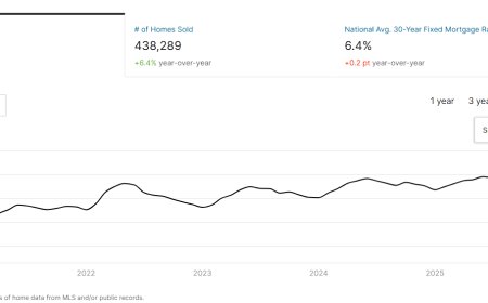
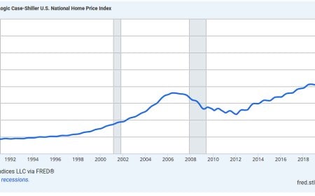



Comments (0)